Katja Novitskova

Katja Novitskova

Work from Reality Check and others.

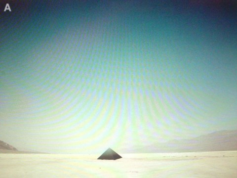
“Cartography has been the domain for manifestations and negotiations of physical, political and symbolical properties of reality. Despite the obvious differences each era claims their maps to represent the world in the most adequate way. At the moment we are subjected to emergence of real-scale & time maps. Considerable amount of glitches and mistakes in Google Earth blends the intentional transformations with random, leveling the politically significant blur of a censored military base and an accidental broken highway to one effect. The resulting image-reality are distorted and noisy. The emerging chaotic grid suggests multidimensional reality, where tangible concepts and virtual things occupy the same time and space. It’s a world with pixelated censored terrains, broken highways, vertical tennis courts, ocean chessboards, accidental surveilance comedy, color glitches, ghost ships and defying the laws of gravity perspectives etc.” – Katja Novitskova

Ulrike Brückner

Ulrike Brückner

Work from space for.

Please pardon any errors in translation, for the original German, see here.

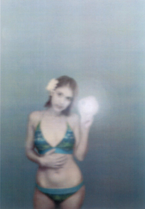
“The starting point of this work is private photographs published on the internet. The subtitle of the work, “Would you like to comment?” is analogous to photo captions found on internet photoportals and blogs.

I have cut out the figures from their original environment and placed them in an imaginary, artificial undefined, empty space. The space is reduced mostly to matte, colored surfaces and a horizon line. Thus, the focus is placed on the body language. Through the newly created picture-fragment, the effect that the figure has is concentrated. The blurry depersonalization of the figures function not as representatives, but rather, icons.

The processed images are divided into different categories: winners, kids, pets and profiles. This clinical archiving is a contrast to the emotionality of the images and carries with it a new level of contemplation.” – Ulrike Brückner

DIS Magazine

DIS Magazine

Work from DIS Spring Trends and DIS Summer Trends.

The art and design behind DIS Magazine is unlike any other fashion publication to date. Its contributors eschew the standard conventions of print publication to create an ever evolving series of related threads, organized around categories such as distaste, dystopia, discover, and dysmorphia. DIS is a collaborative project amongst artists, designers, stylists, writers and friends. They are Lauren Boyle, Solomon Chase, S. Adrian Massey III, Marco Roso, Patrik Sandberg, Nicholas Scholl, and David Toro, along with guest contributors that include artists such as Ryan Trecartin, Anna Lundh and Scott Hug. I recently conducted this Q&A via email with the members of DIS, in which they discuss the magazine’s goals, its unique use of digital media technologies and the Web, and the future of the publication.

What are the goals of DIS? What is your motivation in producing (this type of) fashion magazine?

DIS provides an optimistic and critical voice that upends the notion that fashion moves in a single direction from “high” to “low”. To DIS, fashion is choral, rather than oracular. The value of DIS is in the horizontal exploration of fashion and the collaborative nature of the Internet.

The format of DIS is very unique. The magazine doesn’t resemble a blog, but it doesn’t seem to emulate a paper magazine either. What is your intent in producing the magazine this way? Is there something about the Web that lends itself to this style?

Our focus was to develop options of format and platform that are appropriate and flexible to the content. A blog format, for instance, requires a persistent connection to the content and flow of that content. Although the desire for that type of connection is a valid one, it’s not always appropriate. Some of DIS’s editorials necessitate a more granular method of apprehension. In these cases, we seek to provide a “digital analog” to the experience of flipping pages.

The title “DIS” seems in keeping with the deconstructive tone of much of the magazine’s content. Do you see the work as a form of critique or parody in this sense?

DIS falls somewhere between commentary and celebration. The prefix “dis-” tends to have negative connotations, and we adopt and apply that critical tone as much to ourselves as to our subjects.

You state in your “About” section that the magazine is a “dissection of fashion, art and commerce.” Do you see these three categories as separate aspects of DIS, or are all three necessarily connected? Will we see future issues devoted specifically to art?

All of us have broad backgrounds connected to art or the arts. We’re all involved with fashion to varying degrees. And we are all—audience included—participants in commerce. We don’t want to distinguish between fields. We’re interested in the integration and infiltration of all three into the banality and novelty of product and image making. We’re happy just to contribute to the database of Google image search.

The magazine’s content seems both future-oriented toward fashion trends of the not-yet-here, but also deeply invested in figures and styles of the recent past (IKEA, Second Life, cholo fashion, etc.). What is the temporality of DIS and who is its fashion for?

If there is a temporality that DIS explores, it is mostly imagined. What is more pertinent to this project is the fact that our generation has a blurred point of view on values and on temporality itself. The past, present, and future—or at least a visually skewed representation of them—are immediately accessible by typing a few keywords into an engine. In this way, reality is multivalent, personal, and constantly in flux. The fashion in DIS is not “high” nor “low.” It is simply Medium. Our fashion is for everyone but not everyone knows it.

What else do you have slated for future issues, and where do you see the publication heading? Any Web-specific content that would not be available to a more traditional print magazine?

We would like to clarify that, in concept and practice, DIS is not issue-based. We are excited about the possibility and immediacy of audio, video, and interactive features. We are currently developing and filming a live-action role-playing, documentary soap opera about DIS Magazine to be released serially, very soon.

What do you see as the future of fashion magazines generally, given the current crisis in print media and the reliance of fashion blogs on using professional photography lifted from official sites and sources?

Fashion magazines are dependent on their medium, as in all of media. As long as the medium is available, it will surely be put to use. However, printing technology will evolve, and future magazines will augment physical reality to a more advanced degree. It is our belief that media should be afforded multi-sensory actualizations. For more of our thoughts on the future of fashion magazines, you can consult our predictions for styles and customs of the Twenty-Teens at the following link:

Styles and Customs in the Twenty-Teens

Do you have plans to create a print edition? If so, how would you manage this given the technological specificity of the magazine in its current form?

We certainly have plans for a print object, but we are not prepared to disclose the details at dis time.

Any other comments or concluding remarks?

=)

– interview with Jacob Gaboury for Rhizome.

Robert Barta

Robert Barta

Work from his oeuvre.

Barta’s work is an playful recontextualization of commonly used objects that one would expect is intended to increase our awareness of our daily interactions with technology. These installations are works that rely on defied expectations and the existence of pre-formed relationships with these objects in order for the viewer to be “in on the joke”. At the same time that these pieces inform our understandings with objects in our daily lives, they are also rendered useless by Barta’s modifications. Therein lies the rub of the work, in order for us to consider the functionality of an object, we must remove all traces of it; except perhaps for the escalator ladder.

copyright artist and VG-Bild Kunst Bonn.

Pablo Valbuena


Pablo Valbuena

Work from the Augmented Sculpture Project.

The Augmented Sculpture Project, by Pablo Valbuena, focuses on the temporary quality of space, investigating space-time not only as a three dimensional environment, but as space in transformation.
For this purpose two layers are produced that explore different aspects of the space-time reality. On the one hand the physical layer, which controls the real space and shapes the volumetric base that serves as support for the next level. The second level is a virtual projected layer that allows controlling the transformation and sequentiality of space-time.
The blending of both levels gives the impression of physical geometry suitable of being transformed. The orverlapping produces a three-dimensional space augmented by a transformable layer suitable to be controlled, resulting in the capacity through the installation of altering multiple dimensions of space-time. These ideas come to life in an abstract and geometric envelope, enhanced with synesthetic audio elements and establishing a dialogue with the observer.” – Valentina Tanni for Random Magazine.

Tanner America


Tanner America

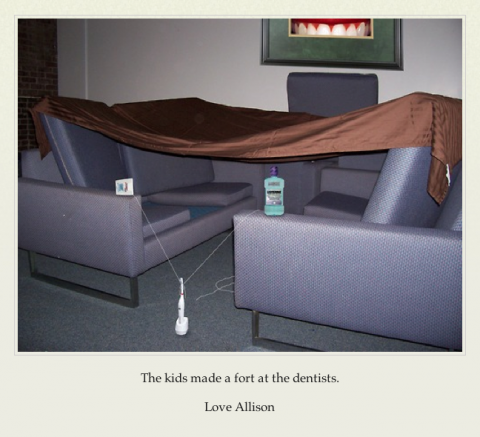
“Tanner America is critical satire in the form of a Tumblr blog. The site is updated several times a week with “snapshot” style images and brief accompanying captions. Each image depicts a moment from the daily lives of the Tanner family of Colorado Springs, CO: the kids’ science projects, camping trips, remodeling the house, purchases from Home Depot, and their neighbor Linda. The images are purposefully mundane and would be of little interest to anyone outside the Tanner’s immediate family and friends.

What makes the images satire is the fact that they are clearly, intentionally fabricated. Each image has been noticeably photoshopped in such a way that it becomes an implicit critique. In many ways they resemble JOGGING-style sculptures or performance, as the strange juxtaposition of objects announces itself as fabricated and implies some form of intentionality, some form of critique.

The clearest commentary would seem to be a general critique of white, middle class, heterosexual Middle America. The Tanner’s lives are dull, they have too many kids, they are uncritical and indulge in consumerist behavior, they watch Fox News, their Facebook page lists their political views as “Tea Party”, etc. In a way Tanner America is poking fun at the suburbs, at the concept of “normal, everyday Americans,” and in doing so reinforcing the kind of snide elitism that the Tanners would no doubt accuse “us” of, if they were real.

At the same time there is another critique, not of the values and lives of people like the Tanners, but the way they use the Internet and what it means to them. Taking a look at the default Tumblr theme the Tanners “chose” to use it seems grossly mismatched with the style and tone of the images and captions they post. It looks like a McSweeny’s book cover, all minimalist design and Helvetica font. The cultural implications of the design seem completely absent from the Tanner’s actual blog, as though it was chosen because it simply “looked nice,” or it was a default that they simply never changed. It brings to mind Olia Lialina’s series of essays on the vernacular web, but while she is trying to identify the kind of early everyday uses of the web that have been lost or forgotten, Tanner America seems to point to a contemporary vernacular that is not especially informed or interested. It doesn’t necessarily understand how to use the technology it has, nor does it make conscious decisions about the aesthetic or brand it is trying to produce. The demographic depicted on Tanner America seems to point to a kind of Parent Web, for lack of a better term – the Web for people who have come to use and even rely on it, but for whom the technology is an afterthought. Like many parents of a certain generation out there, one could imagine the Tanners being deeply concerned about computer viruses, getting overpriced tech support at Best Buy or emailing photo attachments that have not been resized. Perhaps it is best to read Tanner America not as a critique of that vernacular use, but of the assumption that we all use these technologies in the same way.” – Jacob Gaboury for Rhizome.

Mel Bochner


Mel Bochner

Works from Misunderstandings (A Theory of Photography) and a few extras.

“HANS ULRICH OBRIST:
And transgenerational too. Before we were talking about misunderstandings, (and I was curious about this in relation to science and engineering) there can sometimes be productive misunderstandings, and this was just at the moment that you made the amazing work entitled Misunderstandings. Could you talk a little about these issues and this work?

MEL BOCHNER:
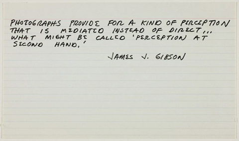
When I realized in 1967, that my work had become about photography without wanting it to – I thought, I should do some research, look into the history of the medium and find out what’s been written about it, what the issues are. What I found was really pretty dumb – it had no value in any theoretical terms. And the more I read, the more I began to see it all as a colossal misunderstanding. So I started compiling a set of misunderstandings. After a while I had quite a large number of these quotations which I wanted to publish. The first title was “Dead Ends and Vicious Circles”…

HANS ULRICH OBRIST:
That’s a beautiful title.

MEL BOCHNER:
…I submitted it to Artforum but Philip Leader said ‘we’re not a goddamn photography magazine, this is an art magazine, don’t give me anything on photography, we don’t do photography!’ Then I sent it toArt in America and they were not interested either, but suggested that I send it to a photography magazine! Like Popular Photography! Well I knew that no photography magazine could possibly be interested in this, so I put it in a drawer and forgot about it. Then in 1970, Marian Goodman, who then had a gallery called Multiples Gallery, came up with the idea of doing a boxed multiple set of artists’ photographs. She made this box which was quite an amazing thing, it had Smithson, Graham, Ruscha, Dibbets, Rauschenberg, LeWitt, myself and a number of other artists. My contribution was a version ofDead Ends and Vicious Circles, a compilation of quotations I titled “Misunderstandings( A Theory of Photography).” And to further add to the confusion, three of the quotes were fakes, I made them up. The last card in the envelope is a reproduction of a negative of a Polaroid, but of course Polaroids don’t have negatives!”” – interview excerot with Hans Ulrich Obrist.

via horses think.

William Wegman

William Wegman

Work from his oeuvre.

While some of the shorts may be duplicates due to the nature of various compilations, they are all well worth watching.

“As he describes such influences — Nauman, Allen Ruppersberg, Ed Ruscha — his tone is measured, respectful, sort of Wall Street Journal meets Artforum. He really lets go when I ask about his favorite comedians. “My heroes were always Bob and Ray,” he says, recalling the Boston radio team of Bob Elliott and Ray Goulding, who did dry, Down East bits, describing summer vacation photos on air or running spelling bees where one contestant gets “interfenestration” and the other gets “who.” Wegman gushed about them — their minimalist approach, how they could be so funny with so little. “They were kind of lazy, too. They didn’t try very hard, it seemed,” he says. “But you can’t if you’re going to be funny.”

Wegman’s videos — his contribution to the conceptual canon — combine these approaches. He’s a combiner by nature (Can’t walk along a river without a fishing rod, he explains, because “just to take a walk in the woods isn’t interesting, but to pursue trout!?”), so when Man Ray, the Weimaraner he got in his first months in L.A., kept barging into the videos he was making, he decided to go with it. Wegman compares this offhand video work to drawing — sketch comedy, as it were — and Man Ray fits perfectly into the mood of straight-faced ludicrousness. In one, Wegman, on his hands and knees, backs across the floor, and the dog follows, licking off the line of milk that Wegman spits out onto the tiles.” – excerpt from an article on Salon.com by Kevin Conley.

Tom Verbruggen


Tom Verbruggen

Work from Crackle-canvas.

“The Crackle-canvas is a painting that produces sound. It contains a circuitboard, speaker, knobs, switches, wood and canvas. Each one makes sounds by itself but can be connected thrue cables (patched) with other Crackle-canvasses. This way the paintings start to react on eachother. Each patch creates a different sound and drawing of cables on the wall or in the space the paintings are presented.” – Tom Verbruggen

Krist Wood

Krist Wood

Work from his oeuvre.

Krist Wood is a scientist, musician and artist currently working at the department of Molecular, Cellular and Developmental Biology at Yale University. His PhD work involved the genetic engineering of nanomotors; molecular devices capable of converting energy into movement. As an artist, his work challenges the bounds of technology, to create a greater experience through art. His piece, Mausoleum, takes the viewer on a journey of discovery and mystery, one which he had experienced through GeoCities. He tells me, “The environment of the site symbolizes the way I felt when I originally surfed GeoCities and discovered websites like these.”…”My experience surfing the internet during that time was quiet and unnerving and fascinating. I think of those feelings when I reflect on GeoCities.” – text via http://www.internetarchaeology.org.