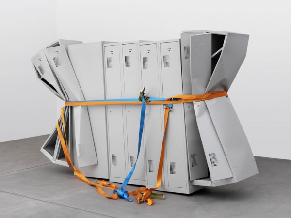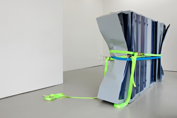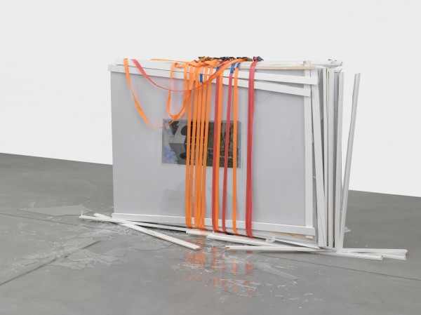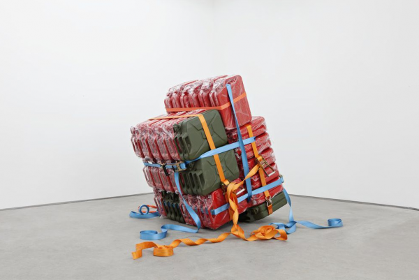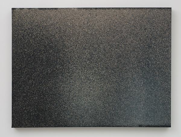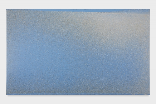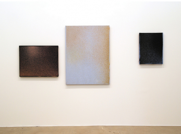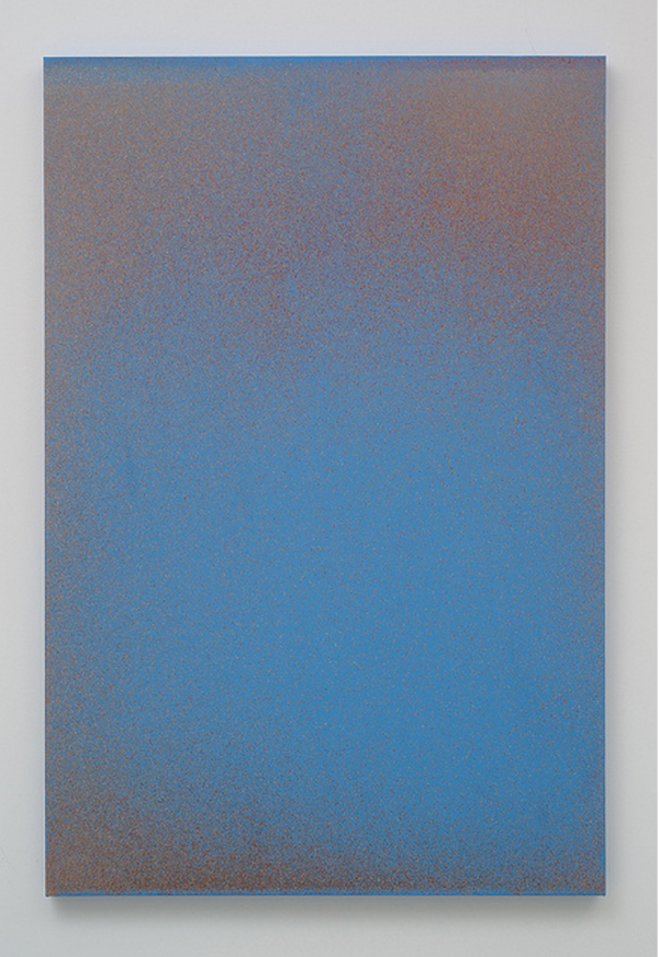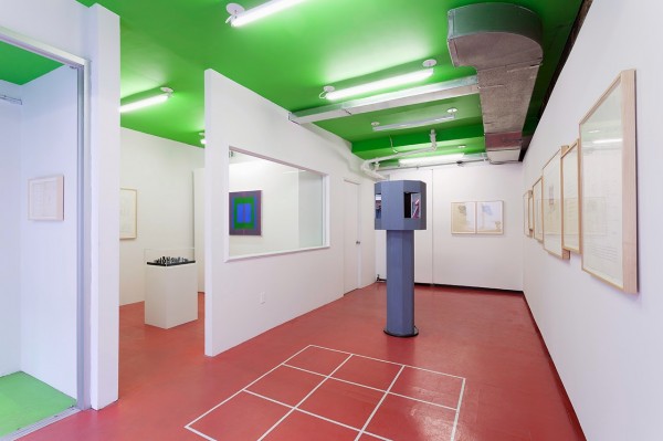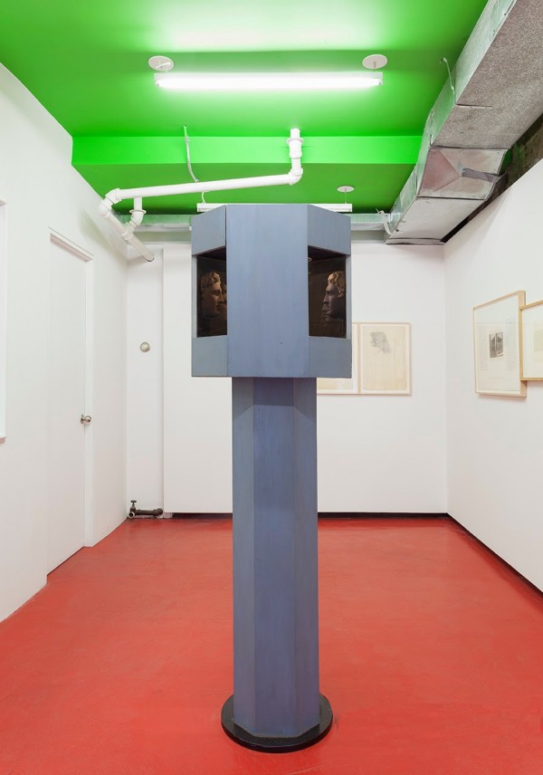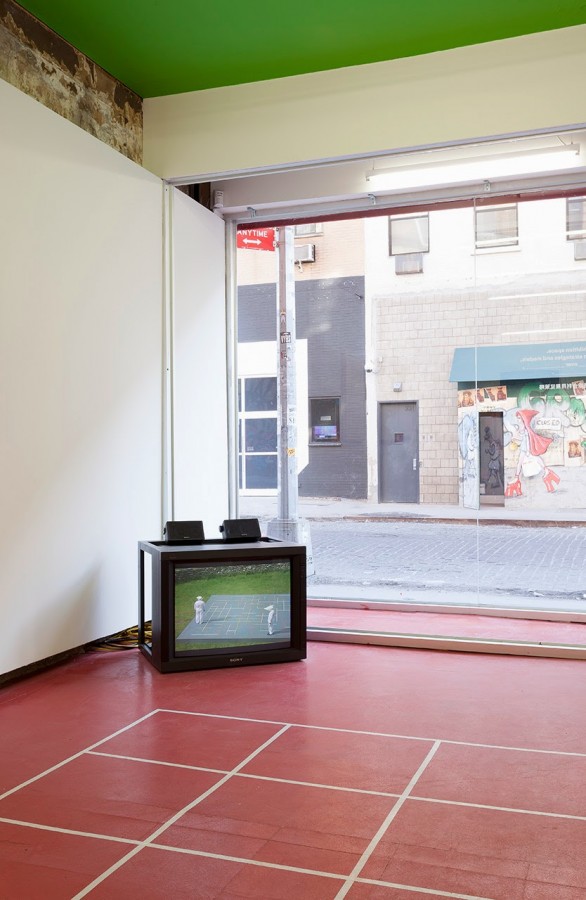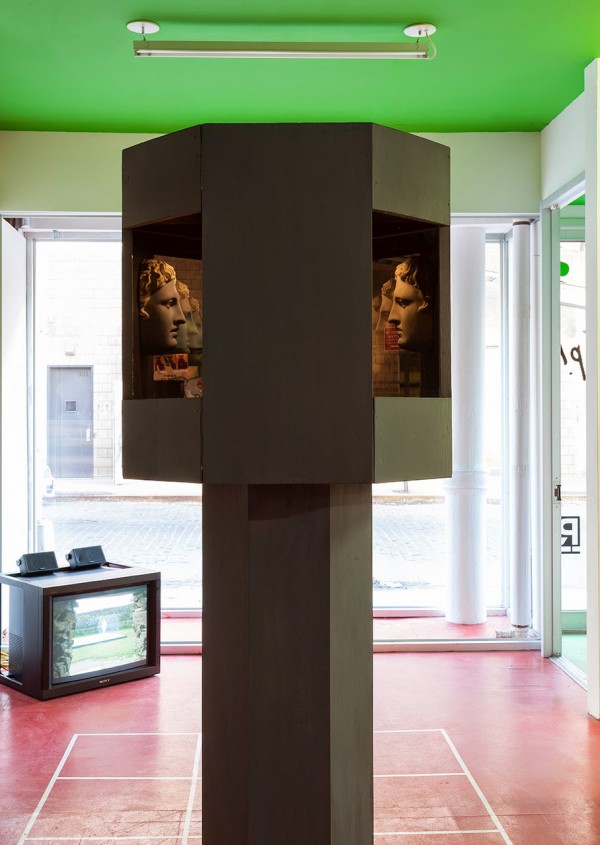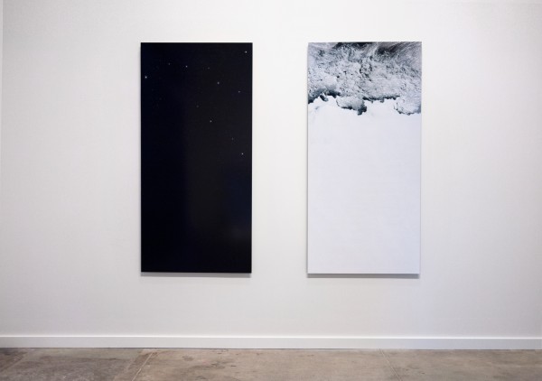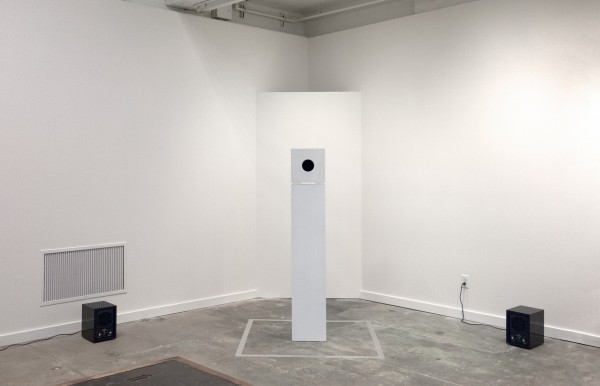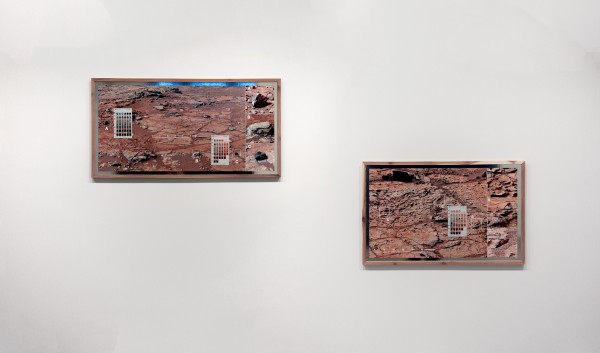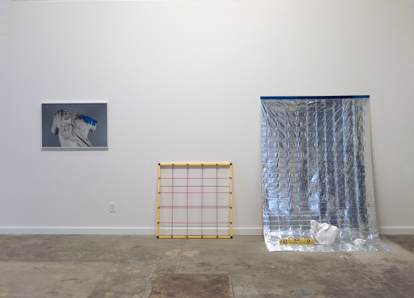

Work from “Depression” at Francois Ghebaly Gallery, Los Angeles.
Organized by Ramiken Crucible. Featuring work by Catharine Ahearn, Bjorn Amre, Lucas Blalock, Borden Capalino, Dan Finsel, Charlotte Hammer, Matt Heckert, Nolan Hendrickson, Gavin Kenyon, Andra Ursuta, and Margaret Weber.
“A scale model of a new building design will be exhibited simultaneously with Depression. Commissioned by Ramiken Crucible and funded with capital leveraged against the permanent collection to be amassed by the gallery over the coming century, this building embodies the ideal art space. Constructed in international waters, this free standing open ocean platform will function as an independent state. This island fortress will provide artists with a private kingdom free from any moral law, civil code, or financial regulation. The building will house the ultimate gallery, named Unamerican Fine Arts, and is scheduled to open for the fall season of 2100. The scale model was designed and built by the architecture firm known as We Will Replace All Of You With Cool Mexicans.
The first show at Ramiken Crucible was a solo exhibition by Gavin Kenyon in 2009. I was on unemployment and Gavin was living with his mom upstate. We overhung the show by an exponential margin. Someone took a shit in the gallery at the opening.
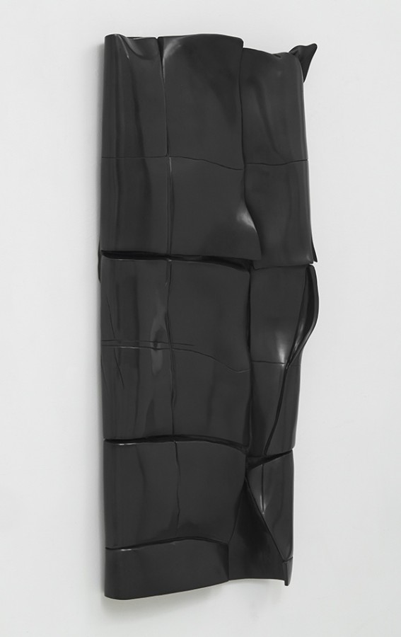
I wonder if Angela Merkel was depressed when Berlusconi called her an “unfuckable fatass.” No doubt she confidently dismissed the insults in public, and as Berlusconi’s shoddy, corrupt government fell to pieces, it was Merkel who had Berlusconi by the balls. But maybe she had a private moment, naked in front of the mirror, repeating his comment over and over in her mind, and she felt sad and lonely and unattractive. And then she might have stopped calling people back and started not leaving her house. She began to eat only pizza and ice cream, or whatever Germans eat when they are depressed. She took lots of xanax and codeine and when her prescriptions ran out, she drank high strength cough syrup and smoked menthol cigarettes. She stopped cleaning herself and her house. She stopped throwing anything away. All the trash from the pizza and ice cream and doner kebap or whatever built up around her house and in her teeth and in her gut like unfired clay. Her furniture, once beautiful and functional, began to resemble dirty wood scraps upholstered with used paper towels. It is from this paraphernalia of surrender that Borden Capalino works.
Mythologization inevitably takes over cultural production that seeks to sustain itself. In his text “Radical Gestures Cannot Be Maintained,” Bob Nickas outlines the career trajectories of Lee Lozano, Bill Bollinger, and Steven Parrino. Each artists reached a point of no return, accepted consequences, and continued to work. Without fail, artists who make this level of commitment pay a price, and these three artists were no exception. This commitment is beyond risk; risk implies the possibility of a positive outcome. When negative consequences become certain, radical work is possible. Ultimately, the consequence is death.
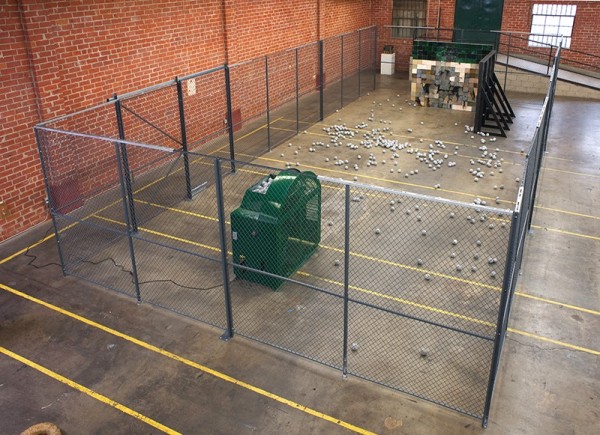
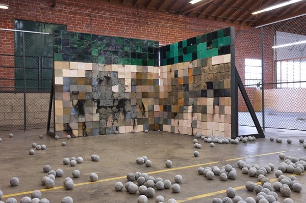
This exhibition includes Spiked Roller Machine, a machine made by Matt Heckert as part of SRL in 1984. Many of SRL’s machines explore mechanical athleticism, and borrow themes of strategic offense and defense from military industry. Spiked Roller Machine evinces the power of unstoppable death, a slowly rolling, unavoidable fate that has more in common with the slow walking terror of George Romero’s zombies than it does with gladiatorial combat. Spiked Roller Machine illustrates the onset of depression. Sufferers of depression feel the heavy weight that rolls over the psyche, the spikes that pierce every part of the mind, that penetrate every happy illusion. The spikes poke holes, depressions, voids in the corporeal body, shredding flesh and bone, blood pours out, the weight of the machine pressing the spikes all the way through the body, stopping only at the concrete below. This heavy weight, pressing down and through the body, is the certainty of death. Depression is a form of pragmatic realism. If everything humans can achieve means nothing in the moment of death, why live? Why move forward? If the end result is erasure, why participate in the unending march toward annihilation that constitutes daily existence? It is the confrontation with this fact that precipitates depression. No amount of ego, money, or fame can deliver a human from depression, because no amount of ego, money, or fame can prevent death. The most interesting artists, the most pragmatic artists, the artists who work on problems beyond their own self promotion and success, work in a state of constant, unending depression. To face the certainty of death, without the fantasies of success or progress, and still make artwork is a radical gesture. Radical gestures cannot be maintained. Death wins.
“I want my entire musical catalog to be deleted the second I die. What do I care? I’ll be dead. I don’t care about history. I don’t even want a tombstone, are you kidding? None of that stuff makes any sense to me.”
-King Buzzo of The Melvins, discussing his musical legacy, The Village Voice, October 2012
This is depression. To know the spectacular heights of feeling, and to see it ending, one work at a time. The struggle of every artist is not to be right, but rather to leave the deepest impression upon the physical world, to change the physical earth as if it were a lump of clay in your hand. Attitudes and strategies may differ, and the power of presence may give way to the overabundance of our times, but interior worlds are as real as exterior ones.
“All those moments will be lost, like tears in the rain. Time to die.”
-Roy Batty
The impression – the depression – upon you is what you fight against. Do you want to be impressed upon more than you impressed upon the world? For an artist, this means depression. An artist makes stuff. If you aren’t making as much as possible, or at all, and the world is filling you with amazing experiences, with great songs and movies and pictures and buildings and words and thoughts, if you’re an artist, this makes you depressed. Every artist is a furnace that wants to burn. Wood, cotton, coal, iron, plastic, foam, carpet, trash, paper, water – it will all burn and at different temperatures. Every artist furnace burns at a different temperature. Something is always consumed. Consumption hastens death. Every cell in a human body is set to oxidize. The only way to live longer is a low calorie, very restricted diet. To live a long time, you can’t eat too much, do too much, run too hot. A lot of people born to this world don’t get to live too long. Let death occur as it must, but get the work done. Getting the work done means death some day and no more work. Working is death. The point is to die. Face death. More depression. Depression is health. Depressed humans are honest. Failure is certain.
Andra Ursuta has made the following artworks, among many others:
1. Groups of three legged stools, the seat a solid cast of her upturned ass clad in thin underwear. These groups, called “waiting areas”, are sculptures that moon the audience. Because some of the asses are stacked, they resemble stacks of women’s asses waiting to get fucked in a porn video. 43 of these sculptures were shown by Ramiken Crucible in a cramped, dirty locked room, a temporary exhibition space at 3 Delancey street that resembled a room full of illegal of sex workers;
2. A life size, highly realistic cast of herself as an Iron Age bog mummy, naked except for a pair of Converse shoes. The sculpture, titled “Crush”, is flattened and covered in large amounts of fake semen;
3. A coffin shaped tent;
4. Flabby concrete models of a German war bunker from a beach;
5. A set of prostitution flyers advertising her as an “Ethnic Bimbo.” The cards show Ursuta naked and covered in cave woman mud markings. The mud markings spell out ‘ADIDASS’ on her leg;
6. A balloon with a noose tied to it;
7. Dozens of repeated drawings of a dead Chechen fighter;
8. Police batons with mushrooms growing out of the ends;
9. A giant medieval trebuchet hand built from trash designed to throw away her body. Next to the trebuchet is a flattened cast of her, damaged by impact with a nearby wall;
10. A concrete bloc-supported swing set for children with seats designed to allow them to shit on everything through the bottom, titled “Natural Born Artist”;
11. A ten-foot version of Brancusi’s “Endless Column” as a dildo impalement stake;
12. A fully functioning baseball-pitching machine made to stone human beings to death, with handmade rock ammunition and a backstop for the blood, guts, and hair, titled “Stoner”;
13. A horse-cart lunar rover with rubber tire wheels;
14. Three life size marble statues of a Roma woman expelled from France, wearing elaborate chokers made from windbreakers and small change;
15. Anthropomorphic pole sculptures of women, with coin slots for pussies;
16. A giant Aspic structure.
17. A scythe for death to ride like a bicycle.
In all this, Ursuta constructs a set of interlocking, contradictory narratives that provide a hierarchical context she can smash, bloodying herself in the process. The art is the expression of concepts and desires that are completely unreconcilable, and Ursuta’s self deprecation is the demolition that allows for the issue to be resurrected, over and over again.
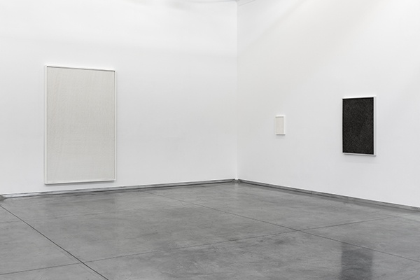
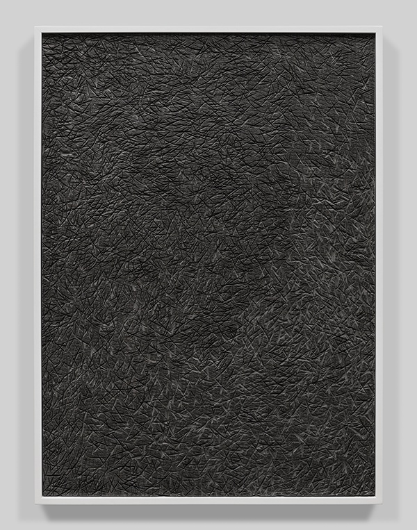
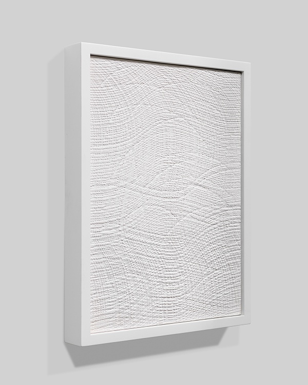
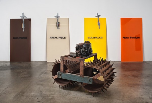
For Bjarne Melgaard, the process of making and living is also self-demolition. Melgaard’s use of the methodologies of therapy is a prybar to emphatically state that reality isn’t real. Melgaard relies on the premise, that our experience of reality is entirely self constructed, to indulge himself as much as possible in aberrant forms. His expansion of the role of the artist is intended to reach as far as possible beyond moral precepts. By making/curating/appropriating/buying very good art and very terrible art, Melgaard moves himself beyond taste. By abusing crystal meth and steroids, by using his wealth to appropriate entire cultural trends at once to exploit, and by going on violent, hate spewing text message rampages against his most ardent supporters, Melgaard frees himself from the expectation to act morally. This allows Melgaard to reposition the engines of mental illness that he indulges, creating a feedback loop that is shrill, violent, hurtful, and mesmerizing. When Melgaard points these engines of depression, narcissism, mania, jealousy, schizophrenia, and paranoia inward, he is paralyzed. When he turns these engines on the outside world, on other people and objects, he transforms his environment. In this way his art shares the same vector as therapy: to take what is inside the head and make it external, so that the patient may come to terms with the discrepancies, and move on towards a more optimal functionality. However, Melgaard has destroyed the optimal, leaving nowhere to go but down and deeper. Motor Paralysis, IDEAL POLE, PARAPRAXIS, and POST-EPIDEMIC, are vinyl plate works made under the pseudonym Bjorn Amre, whom Melgaard told me was his uncle. IDEAL POLE, PARAPRAXIS, and POST-EPIDEMIC each have a book duct taped to the face. One of the books is Naked by The Window, a thick, true crime tell-all about the death of Ana Mendieta and the subsequent trial of Carl Andre, the court records of which have since been sealed. Motor Paralysis is Melgaard’s engagement with his worst and most feared enemy: complete paralysis. If Melgaard ever met a problem he couldn’t own, it is complete paralysis. How can he appropriate or manipulate or create if he can’t even move? Motor Paralysis is an orange flavored cartoon villain, an optically perfect illusion of clarity and pure color mass that is to be feared. It is an imposition of digital perfection upon the physical world, an exaggeration of the forces of digital rendering and a sharp authoritarian geometric abstraction.
Melgaard also gives himself the freedom to walk away from any artwork, by burying it under a pseudonym or blaming it on a collaborator, or even claiming it isn’t a real work by him. These are Cady Noland moves; Noland denies the authenticity of her own artworks and feigns legal attacks on artists, curators, and collectors who attempt to curate, collect, or reference her work. By building in a way to deny authorship, Melgaard can avoid negative criticism, criminal charges, and market forces, all of which seek to pin him down and hold him responsible. Whether any of these powers are truly conspiring against him or even aware of his behavior is beside the point, because Melgaard’s mental state is defined most by his extreme drug induced paranoia, of which he is very proud. Paranoia is proof of the hermetic seal he maintains around his universe, and this in turn is proof that he has created a universe he has the power to seal up. Outside entities are irrelevant to Melgaard; as a quantum artist he is not concerned with position, but velocity. Melgaard paints and sculpts, but his physical diversions are simply props in his grander narratives of control and manipulation. He is a performance artist, and like Marina Abramovic, his medium is human beings. Unlike Abramovic, whose subject is herself and whose primary move is to put herself on a pedestal, Melgaard uses other people as sculptures. In “The Shape of Things”, Neil Labute creates an antagonist whose MFA thesis project is the manipulation of her unwitting lover, as if he were a sculpture, into bettering himself, as if she is sculpting him into an ideal form. Labute is commenting directly on the vanity of culture, using the genre of performance art as a symptomatic vehicle. Melgaard’s self loathing is so great that it surfaces in other people, controlling them, too. Abramovic’s facile constructions float on a new age pseudo science of self improvement through performance. Melgaard’s complete honesty and total self annihilation undermines the self obsessive vanity of contemporary performance art completely. His work cuts idealism off art like a knife through fat. There is no self improvement, and there is no perfect artwork. There is no progress. At the end of a video by Melgaard I saw at Maccarone, a brief text flashes on the screen: “Everything you do that is wrong is right.” Bjarne Melgaard’s work is liberation. He is one of the most generous artists I have ever met.
To quote Bjarne from an email, “Also making up some artist just for the show so its kind of obvious that some of it would be a doubt around if its real or made up artists,something i like a lot.If its to much boring art around I usually just make up some new artist!!!”
Andra Ursuta on Margaret Weber:
“For her debut at Ramiken Crucible, Margaret Weber shows large sculptural tapestries made from pieces of industrial carpeting stripped almost bare. Hung on walls or slumped onto the floor, these ghostly objects are suspended in a sort of afterlife; in their former glory, they furbished the offices, classrooms, sales floors, and waiting areas that make up the modern world, mapping dull gray expanses of corporate interstitial space. In their present, varying unraveled states, most of the soft matter has been picked clean with a relentlessness that feels both calculated and out of control. Weber’s reductivist touch is traditionally female work turned against itself. To fashion tapestries, she exacerbates generative manual labor (the kind that spins soft materials into concrete form, ectoplasm-like), its monotony and introversion, to the point it becomes malignant.”
“Weber’s upright works move once-horizontal floor covers to a vertical, contemplative plane, enacting a kind of resurrection. But these mastodons are wall-to-wall carbon copies of the places they once occupied, vaguely crooked rectangles with the odd missing corner. This ensures their perpetual awkward habitation of any other space. The work’s unyielding scale also challenges the wasteful monumentality of much successful contemporary art, favoring restrained, targeted stripping over a cumulative approach. Through methodical pulling and teasing, the soft surface layer, the one that would record the stains, spills and footprints of everyday use, has been reduced to discretely repeating specks of minimal noise that distantly echos larger organizational systems that comprise our lives.”
I wanted to use a photograph by Lucas Blalock as a tangent, a moment of human connection within the vast numbers of images, the vast numbers of people, and the utter worthlessness of a single human life, despite all, still, a human being, with feelings and fathomless consciousness, expressing herself with her eyes and a hand, not a trick of photography or a statement of functional content, but functionless emotion, grace, and the physical suspension of mortal love. The state in which we experience art is emotion. However he vetoed my pick for the show. Instead he gave me four new pictures.
From “xyz”, 2011: “Blalock enthusiastically deploys any method that can be used to construct a picture, provided it is contained within the procedural program of photography. Each picture begins on film, shot with a 4×5 camera by the artist; digital interventions follow. Blalock leaves his pictures unprotected from these overlapping strategies, which often contain overly elaborated procedures lifted from the technical production of commercial photography. Patterns merge and mutate, inflected by color corrections that do not correct and masks that do not fit. We see the machine working; the technology that was originally conceived of as invisible is put on stage to act among the intersecting possibilities of the mechanical, the procedural, the historical. Through this apparatus a play is produced that opens out onto uncanny and libidinal economies of physical objects. Blalock’s images could be seen to function in the same way that jokes do for a comedian: they are immediate, and perform themselves while at the same time conjuring the world (the picture and the pictured). In the spirit of a slapstick pratfall, Blalock’s work carries on the experiment with humor and absurdity.”
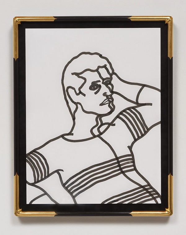
Nolan Hendrickson made a zine in 2009 titled “Faggot Carnival.” A friend showed it to me. I found out he made paintings, too. Now he also makes sumi ink drawings and aqua resin sculptures.
Catharine Ahearn makes furniture out of pretzel, woodshed lava lamps, air fresheners, black hole washed-out automatic writing sci-fi doodle paintings or recording studio sound baffles, monochromes in the dark, cosmic compost, soft furniture, soft sculpture, soap sludge laboratories, systems that undermine the credibility of daily life, exposures to absurd objecthoods inserted into the pyramid scheme, transformed into a pretzel scheme, twisting salted brains inside out. Ahearn’s Earth Daze movement is gaining steam; helping the environment is better than nothing and reusing soap slivers for art rather than throwing the slivers away has been calculated to potentially reduce the landfill deposits of soap in the United States alone by 337 million tons each year.
“In earlier times foretelling the future was the job of oracles or sibyls. These were often women, who would be put into a trance by some drug or by breathing the fumes from a volcanic vent. their ravings would then be interpreted by the surrounding priests.” Stephen Hawking
Charlotte Hammer was born in 1942 and currently lives in Phoenix, Arizona.
Is depression real? Doctors and scientists say yes. Does therapy work? Does art therapy work? Ask Dan Finsel. He has no idea, but he’s not afraid to find out. Finsel made a sculpture last year of a cage within a cage within a cage within a cage; he thought it was a self box, but now he doesn’t think so. Encased in a hall of mirrors constructed of distorted versions of himself, Finsel is working on creating more problems with the precision of a surgeon. When I look at Finsel’s work I am a rubber ball, bouncing and ricocheting off the surfaces of his mind, with no sense of gravity, like a scuba diver in a cave filled with silt.
Energy behaves in waves. The distance between the highs and the lows is the frequency. Highs and lows are symmetrical, and the higher the peak, the lower the proportional depression. To talk about the next aspect of this model requires a break from the common morality surrounding the use of mind altering substances. Getting high on drugs leads to an equally low depression, the come down. Successful drug users are able to manage the low, which requires some acceptance and moreover, restraint from immediately trying to mollify the depression. Depression is terrifying, but should be endured without resorting to irrational behavior. Substance abuse victims medicate their lows with the chemical event that produced the low in the first place. This cycle of addiction is an exponentially accelerating repetition that changes the problem of dependency into other, less manageable problems with physical health, sexual relationships, employers, law enforcement authorities, and dealers.
It is hard to say if depression is always a problem. Human beings who consistently endure depressions seem to be the most interesting people. Human beings who consistently endure depressions are a lot less boring than people who cannot deal with negative feelings honestly. Art is the manifestation of the most private and specific vision. Working against consensus is at least the right track. Where is the dignity in contemporary art?
Depression is often directly caused by, in the words of Carl Wilson from a recent review of a biography of Alex Chilton, “whatever drives a handful of artists to be great at the expense of being good, to gamble double or nothing on the long odds.” To these artists, working often means the same thing as failure, in direct opposition to the ones who produce to prevail, the game players and the posers, the networkers and the opaque black holes, the ones that master systems and moves, techniques and cliques, professional attitudes and academic jargon. Have fun being successful. Have less fun not being successful. Thus, depression. Someone has to lose, something. Despite all assurances, in whatever form, be it connections, friends, curators, awards, prestigious exhibitions, magazine articles, or money, there is no guarantee that an artist can or will make a great work. Many artists game the system, making things that will bring success fast and easy, or things that sit in judgement of fast and easy by ironically moving faster and easier. This is cynicism. These artists have already lost everything, and their work doesn’t matter. Being successful is nothing. Failure is the most important thing in the world, and it is the mistakes that cannot ever be replicated that are the most beautiful.
” …because of works of art like this. I believe in abstract art. If I have not been able to justify it, I can perhaps say with the pragmatist, with the literalist: There it is. I have shown it to you. It has been done. It is being done. And because it can be done, it will be done. And now, I am done.” Kirk Varnedoe, Pictures of Nothing, 2003
If reflected through the prism of desire, the spectrum of physical objects that can be described as contemporary art reveal wide rivers of desire: desire for power, desire for money, desire for influence, desire for security, desire for fame – these desires are the main courses to run, and yet they are corrupt. Art driven by these agendas is art in name only. Art forms, like a crystal, past the limits of desire, beyond which lies the unknown. One cannot desire what cannot be conceived, but what cannot be conceived can be created.” – Ramiken Crucible/Francois Ghebaly Gallery