Tuesday, 12 March 2013
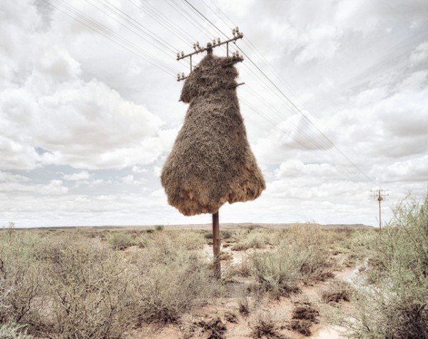
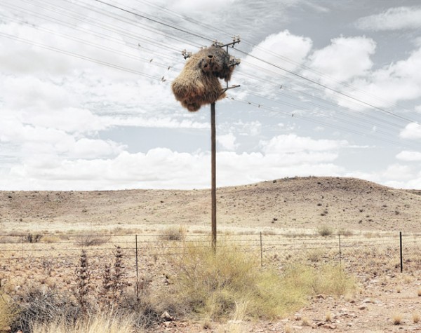
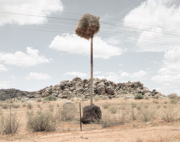
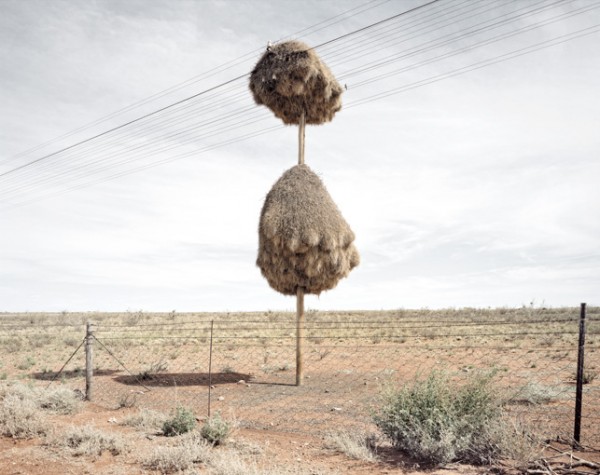
Dillon Marsh
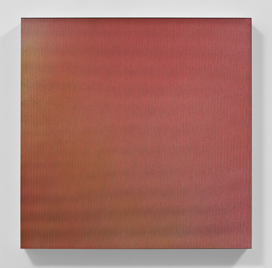
Work from Assimilation.
“In the vast barren landscapes of the southern Kalahari, Sociable Weaver Birds assume ownership of the telephone poles that cut across their habitat.Their burgeoning nests are at once inertly statuesque and teeming with life. The twigs and grass collected to build these nests combine to give strangely recognisable personalities to the otherwise inanimate poles.” – Dillon Marsh
via BLDGBLOG
Tags: birds, invasive, landscape, nature, nest, south africa
Posted in Uncategorized | Comments Off on Dillon Marsh
Monday, 11 March 2013
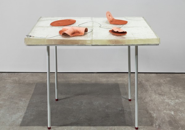
Alisa Baremboym
Work from her oeuvre.
“Her intimate and frank objects combine unglazed fired terra cotta with smooth cables and straps. The clay has a flesh-like quality that informs the manufactured binding in various ways. In one piece, doughy folds of clay are twisted like a rag and loosely bound with a grey USB cord, two materials at apparent but passive odds. In another, a sheet of clay softly impressed with the relief of basement plumbing evokes a human back and spine. This form interacts with woven nylon and plastic straps and buckles to evoke something at once sensual and utilitarian.” –Bmoreart
Tags: independent art fair, painting, russian, sculpture
Posted in Uncategorized | Comments Off on Alisa Baremboym
Sunday, 10 March 2013
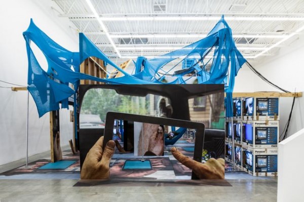
Jon Kessler
Work from his ouvre.
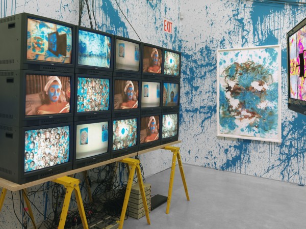
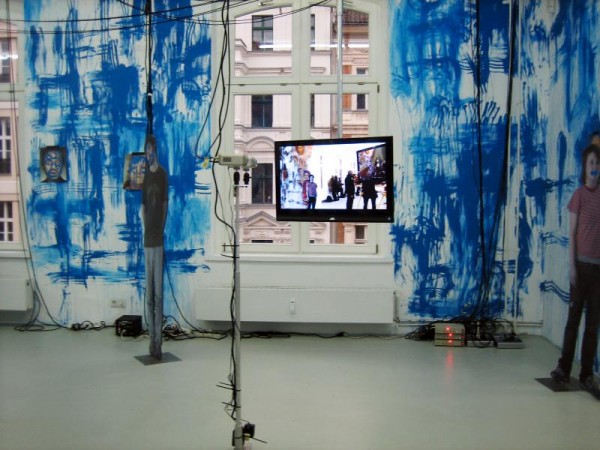
“The Web is an immersive installation that addresses the significance of the Internet and mobile devices in our lives while simultaneously examining the role of the viewer. The idea for the piece came to Jon Kessler on a New York subway ride when he realized that at least half of the riders were speaking on their cell phones, sending text messages, playing video games, or otherwise immersing themselves in their networked mobile devices.
The Web offers both an accessible and impermeable user experience, the title referencing a closed-circuit network accessed by viewers. Upon entering the exhibition, visitors are invited to download an iPhone app that feeds their images in real time onto surrounding monitors. Simultaneously pictured and reframed in Kessler’s sculpture Infinite Regress, spectators render themselves as nodes within a feedback network, the space a physical support for their virtual daydreams. Kessler’s creation broadcasts collected data, targeting viewers with images of themselves, their experience, and ultimately enticing input and generating output.
Much like the Internet itself, The Web acts as both a sentient organism and an environmental space: it facilitates the internal circuit between viewer, camera, and monitor, while simultaneously doubling as a sprawling architectural structure. While The Web conceptually foregrounds the role of networked technologies and our dependence on them, it is in many ways a tribute to direct experience. The viewer of The Web is repositioned among fellow viewers, with the feeling of sensory dislocation condensed into one geographic location—the exhibition space—and recast as a form of shared collective immersion.” – press release from Jon Kessler’s solo exhibition, The Web, at Swiss Institute, NY.
Tags: american, blue, installation, video
Posted in Uncategorized | Comments Off on Jon Kessler
Saturday, 9 March 2013

Pae White
Work from Here Today @ 1301PE.
“…Pae White creates a seamless world where she is constantly discovering innovative ways to transform materials and objects. She has explained, “For the last several years, my practice has focused on an exploration of the neglected, the forgotten, the spaces between things, even the things between things. I am equally drawn to the temporary, the fleeting, to the ephemera of everyday life. My work has attempted to subvert the viewer’s expected relationship to an everyday object, nudging them off balance, encouraging a deeper look.” By re-creating their purpose and meaning, White forces the viewer to see these usual objects in a different light.
“There is nothing visually raw or neutral about Pae White’s aesthetic: colors are dazzling, words are set in idiosyncratic typefaces, and the materials she favors are delicate and lush. Even when she is working minimally, the effect is ravishing and at times hallucinatory.” Alex Farquharson
Pae Whiteʼs unique ability to transform the generally unnoticed will only be magnified by this exhibition. Following her major exhibitions at the Power Plant in Toronto and SITE Santa Fe, White once again gives the viewer a heightened sense of site and context. Her new works ignore the traditional boundaries applied to fine art while also engaging the viewer to reexamine the familiar…” – 1301PE
Tags: color, digital, field, independent, screen, vision
Posted in Uncategorized | Comments Off on Pae White
Friday, 8 March 2013
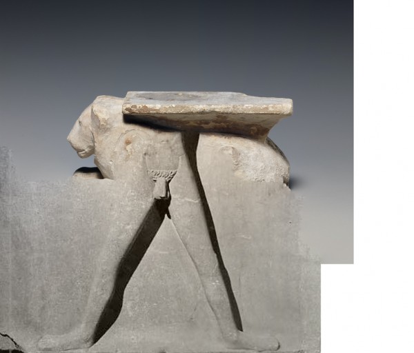
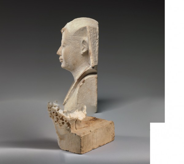
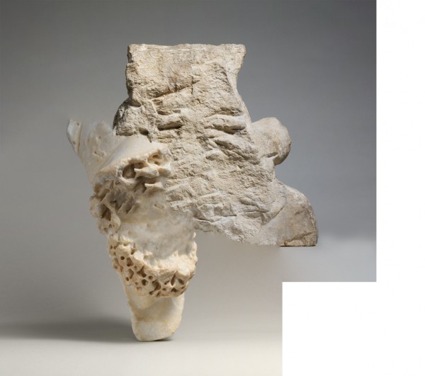
Erik Berglin and Clement Valla
Work from Iconoclashes.
“…The duo arrived at the project with no preconceived ideas and a desire to see how they would riff off the theme. ”Meanwhile, everyone in the hack was sending out emails listing an incredible range of skillsets, from programming to building GSM networks, to working with Kinect. I sent out an email saying I am really good at taking screenshots,” Valla says.
“And I figured that I am also pretty good at taking screenshots so we started talking about the different image tools we use,” Berglin elaborates. “I was interested in using Photoshop and its filters as the creator of imagery.”
The two programmers and artists enlisted the help of their friend, Jonathan Dahan, who wrote an API for getting images from the Metropolitan Museum’s online public archive. They searched for images tagged with ‘god’ or ‘religion,’ and then developed an automated process around Photoshop that would photo-merge two images, “creating a mashup of deities, talismans, stellae, gods, scribes and statues.”
The resulting hybrid forms are strangely appealing. “One thing that was quite strange was that even though Photoshop was blending the images perfectly – it always created a white square in the bottom, right corner. We don’t really know why but we like it!” Berglin says.
“Our mashups cause a moment of puzzlement making it hard to place the images. You have to pause and think where they belong — what time period, what culture, what religion — it’s disorienting,” the duo explains. “The images also seem like they’re actual objects, but the space, the colors and the physics don’t add up. So not only are they culturally disorienting, but on a sensory or phenomenological level they’re ambiguous as well. Photoshop makes them look so real. At first they seem like typical museum documentation, easy to parse and forget, but then you realize you have no idea what you’re really seeing, because it’s an algorithm and not a human that has created this new image of this virtual artifact.”
“It’s been three days since we first started thinking about this, so in a way, the whole thing is a surprise. We just met, we’ve never worked this fast, and we can’t really believe something came together so well, something that we both want to keep working on. We went on a speed date, and three days later we have this weird baby that people think is cute, and we have to take care of it together. Strange but exciting.”…” – Hrag Vartanian
Tags: 319, awesome, c, hack, mash-up, photoshop, religion
Posted in Uncategorized | Comments Off on Erik Berglin and Clement Valla
Thursday, 7 March 2013


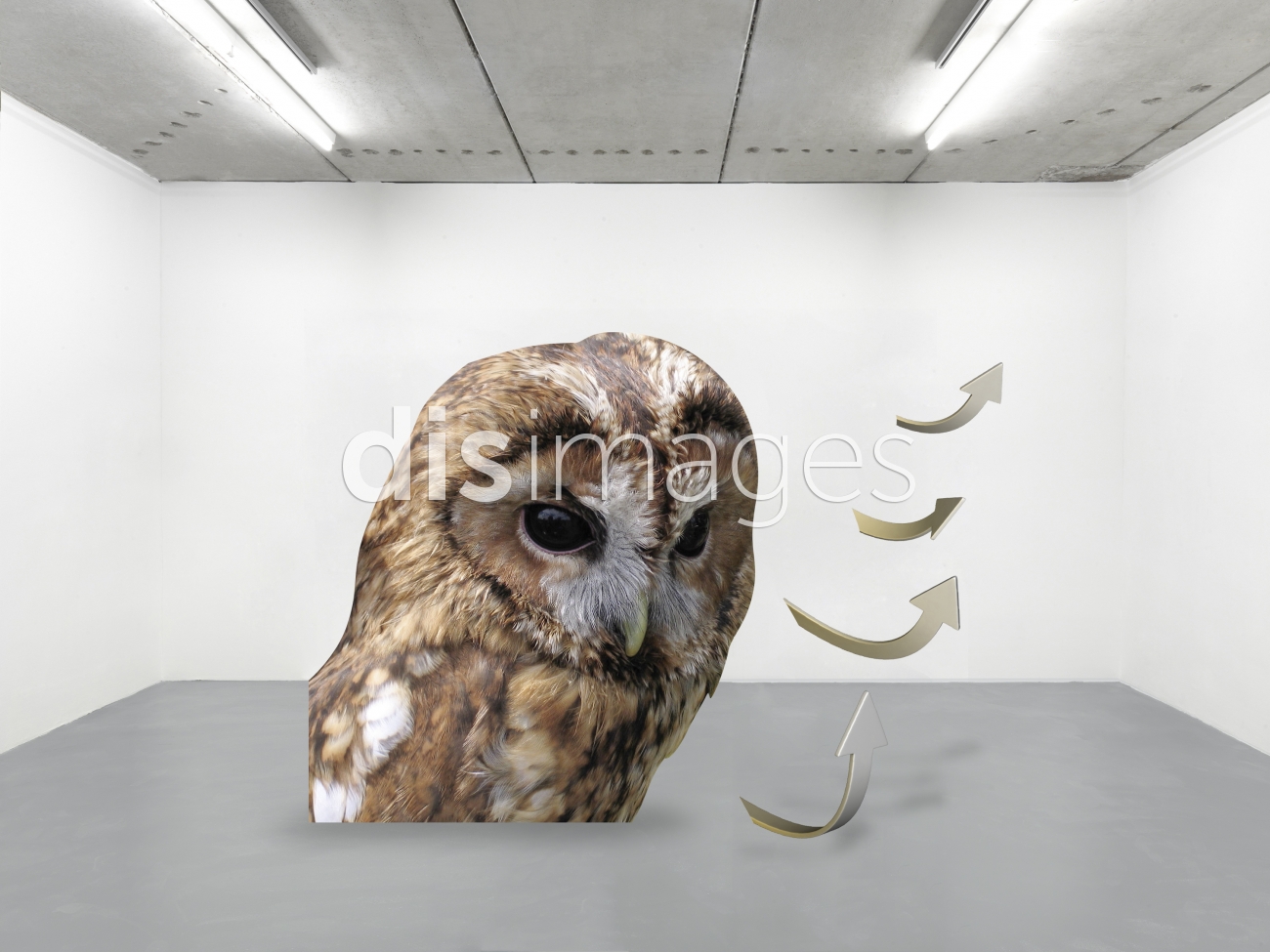
DIS Magazine
Work from DISimages
“DIS Images marks a significant shift in the way artists approach stock photography. Onlines image databases proliferated in the early part of the last decade, and artists searched them and plundered them. Their aggregated findings reflected the multiplicity of potential meanings in both the images and the keywords that index them; they exposed the gaps between the nature of language and the database logic, and the weird ways that stock agencies create images to cater to the latter. But the collection and reorganization of stock photography was harder to think of as a conceptual art method (if the surfers who did it ever even thought of it in those terms) when it hit the blog mainstream.
DIS takes the gap between semantics and database form as a given, and proceeds from there. Whoever tagged Maximo’s photos—“Art world, Outdoors, Hybrid, Confusing, Conceptual, Installation, Interior-Exterior, Utopia, Dystopia, Evolved, Lifestyles, Art Gallery, Solar Panels, Future, Clouds, Blue, White, Grey”—was clearly having fun with it. The keywords contradict each other, and they swing from literal specificity about colors and objects that appear in the image to the expansive subjectivity of “Confusing.” What interests DIS not how the database refracts meaning, but rather the stock photo’s readiness for a variety of potential uses.
DIS Images fits with DIS magazine’s circular treatment of art as a lifestyle brand and fashion photography as a form of conceptual art. The editors relish the possibility that their stock photos could end up in a commercial context—a product brochure, a magazine ad, or a Powerpoint presentation for a marketing agency’s client—but they think of DIS Images primarily as a way of distributing and licensing works of art. On my Sunday morning visit, Marco Roso, a founding editor of DIS, said that he and his colleagues imagine curators visiting disimages.com and searching for the keywords related to their exhibition concepts, and using the works they find to put together a show. I told him that sounded as if they were encouraging the worst kind of curating—operating with keywords and concepts instead of seriously engaging with the work. Roso shrugged. “We don’t care what people do with it after it’s online,” he said.
By commissioning and distributing artworks according to the model of a stock agency, DIS draws parallels between stock and art. They’re both open to multiple interpretations. They’re both made on faith, not for a particular purpose but for a broad context; in one case it’s commercial image use and all the potential destinations that involves, while in the other it’s the big wide art world, in hopes that it will find shelter in a collection, or a place in a critical study. Once it has moved from vague obscurity to visibility in a particular context, the ideal stock photo—like a great work of conceptual art—feels so right and so obvious that it’s hard to believe it wasn’t always around. For both stock and art, success means seeming light and ephemeral, as if it simply appeared in place. That was what made DIS Magazine’s gesture of transforming the gallery into a studio so important, however unexciting it might have been for the average viewer; it showcased the similarity of the labor that goes into the making of both art and stock.”
via Rhizome
Tags: Art Gallery, Art world, blue, clouds, conceptual, Confusing, Dystopia, Evolved, future, Grey, hybrid, installation, Interior-Exterior, Lifestyles, Outdoors, Rhizome Commissions, Solar Panels, stock photography, Utopia, white
Posted in Uncategorized | Comments Off on DIS Magazine
Thursday, 7 March 2013
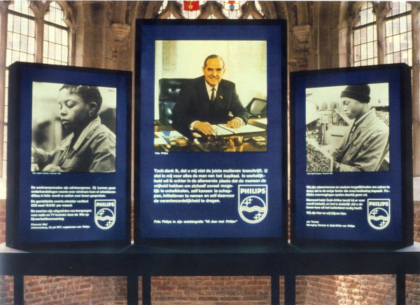
Hans Haacke
Work from his oeuvre.
“One of Haacke’s urgent concerns is the expanding relationship between corporations and museums. Another is the business ventures of major collectors and patrons in countries like South Africa. In the 1985 ”Buhrlesque,” his and hers shoes, each with a candle pointed upward out of the heel like an antiaircraft gun, sit on an altarlike table. Hanging on the wall behind the table, like a devotional image in a cheap motel, is a cover of Paratus, the periodical of the South African Defense Force. The person who inspired the work is Dietrich Buhrle, whom Haacke describes as a prominent Swiss art collector, a supporter of the Kunsthaus in Zurich and the chairman and chief executive officer of a company that makes shoes and arms that supply the South African Government. ” – New York Times (1986)
Tags: 1970s, conceptual, german, political
Posted in Uncategorized | Comments Off on Hans Haacke
Tuesday, 5 March 2013
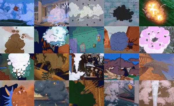
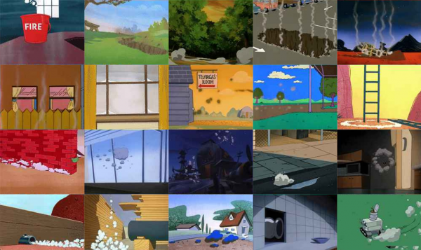

Dina Kelberman
Work from Smoke and Fire online @ The New Museum.
“Dina Kelberman’s new work Smoke & Fire (2013) reflects a reinvigorated impulse towards collecting on the part of contemporary artists.
Kelberman’s original website features an ever-growing grid of gifs (at the time of launch, there are seven hundred total)—each one an image of smoke or fire excerpted from an iconic cartoon (the list now includes The Smurfs, The Simpsons, Tom & Jerry, Darkwing Duck, Rocky & Bullwinkle, and many more). The project is hatched out of the artist’s obsessive online surfing—for this project, she located and sampled hundreds of cartoons out of the thousands that she chose—as well as out of a desire to order and rearrange the seemingly endless amount of information available to her. The gif images are linked not strictly by subject matter but also through more free-form visual associations, like form, color, and shape. The resulting work is a psychic tour of disasters as they are pictured to children (and/or other cartoon enthusiasts). Here, the successive images of smoke and fire pose no threat.
Much has been written about the withering aspects of the web’s surfeit of information. But for Kelberman, like so many other artists, this visual excess and the process of surfing through it is an inspiration. This tendency has been covered by the New Museum before: In 2007, the Museum copresented a show (also organized by Lauren Cornell) with Rhizome called “Professional Surfer” that explored this process of surfing the web as an emergent practice. More recently, curator Domenico Quaranta organized “Collect the WWWorld: The Artist as Archivist in the Internet Age,” which began at the Link Center in Brescia, Italy, before traveling to New York. On the exhibition, Quaranta has written: “Mass media has now been replaced by a mass of mediators. Art is not responding to what they [the mediators] do with a more professional and technically advanced use of the same tools, but is instead refining its own languages and codes.” His point is key to contextualizing Smoke & Fire in a history of appropriation and within contemporary practice. Where earlier artists unveiled the inherent politics or ideologies in TV or advertising, often artists today engage amateur (i.e., consumer) engagements with pop culture by amplifying the impulses to collect and re-represent aspects of it.
Smoke & Fire, and previous works by Kelberman, manifest the feeling of drifting or surfing online by compiling images along lines that reflect the way we wander through information online, which can either follow or work against the way images are indexed by search engines. For instance, I’m Google (2011–ongoing) is a tumblr blog in which Kelberman compiles batches of images and videos into a stream-of-consciousness grid that moves seamlessly from one subject to the next, from uniformed workers standing in formation, to sand castles, to craters, to mountains. For Blue Clouds (2012), Kelberman blurred screenshots of the Star Trek the Next Generation credits, turning each one into what looks like a blue-tinted, erased line in the sky. In Kelberman’s practice, surfing, searching, saving, and reordering merge into a broader artistic practice that distills shared preoccupations or ways of seeing the world. Smoke & Fire will evolve—growing in number of gifs featured—while it is featured on the New Museum website from February 14 to March 13, 2013.”
Tags: archive, cartoon, collection, gif, new museum, nostalgia
Posted in Uncategorized | Comments Off on Dina Kelberman
Monday, 4 March 2013
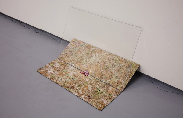
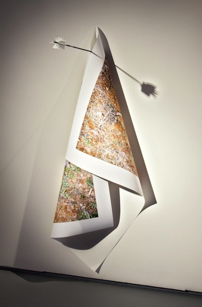
Brooks Dierdorff
Work from his oeuvre.
“Through the media of photography and video, I interpret the physical and psychological encounters between man and the natural world. Humans seek connection with nature and claim to be its guardians, while at the same time perpetuate its destruction. In my work I confront this contradiction in order to understand it. An interesting and complex relationship with nature exists between nature and hunting culture. Hunting can be the epitome of our oppositional relationship with nature, but it can also represent a communion with nature. For example, in order to get close enough to an animal to kill it, hunters often imitate the sounds and smells of that animal. The relationship of hunters to nature can range from killing only animals that they eat, to protecting land from encroachment so it is available for hunting purposes, to affirming their dominance by killing animals, and everything in between. Hunting can express both an opposition to and an integration with nature all at the same time.” – Brooks Dierdorff
Tags: america, guns, hunting, photography, shooting, the west
Posted in Uncategorized | Comments Off on Brooks Dierdorff
Sunday, 3 March 2013
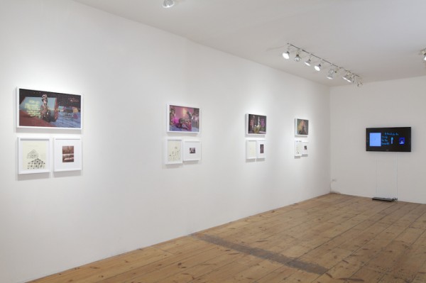

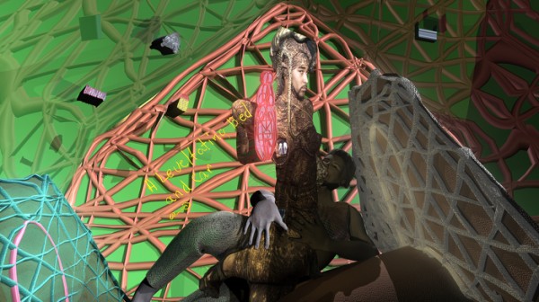
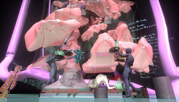
Jacolby Satterwhite
Work from The Matriarch’s Rhapsody at Monya Rowe Gallery, New York.
“Using these representations as launch pad, Satterwhite constructs his own animated universe, incorporating modern dance, voguing and ballroom culture to make sense of the drawings, and their attempts to fulfill notions of the modern ideal. While Satterwhite’s maximalist tastes appear unhinged, this is not due to a disinterest in academic formalism. Earning an MFA from UPenn, and a BFA from Maryland Institute College of Art, Jacolby worked eleven years as a painter before his interests turned to performance and modern dance, and eventually, CGI animation.
“I used to always work with my mother’s drawings as prompts for inspiration. If she made a drawing about football, then I got some football equipment from some weird place and did something with it. So, I started playing with after effects and I taught myself Rotoscoping and all these tricks — I figured out that in tracing the drawings I could eschew the lines and make them 3D. Once I figured out I could make her drawings 3D, I started working like crazy. Just stayed up all night, didn’t sleep, just read books and did tutorials. It happened organically… Voguing came into play because, I understood my mother’s drawings were design objects, and voguing houses often try to mimic a more Western, patriarchal American lifestyle, like wearing Louis Vuitton and Chanel. My mother’s trying to subscribe to an entrepreneurial lifestyle — I’m kind of functioning as an apprentice of her, carrying her vision into the world. So, voguing felt right, like a kind of tongue and cheek thing.”
As Sorcerer’s Apprentice, the artist viscerally unites his mother’s visions with his own body. Bedecked in a metallic bodysuit, the only human in his compositions, Jacolby’s “live” presence is incendiary. As he vogues, his jabs, angles, and rotations bring agency to the Reifying Desire videos, his movements literally bestowing life, aid, or complete destruction to its players. “When I do that in front of the green screen, I basically composite what I was envisioning in my hand and the space around me. I trace every limb from the computer, and so I can attach objects to them. When I put the characters all over the landscape, I can lineate the storyline from that. It starts out super loose, in my movement. The objects and the technology kind of synthesize the narrative on its own.”
While Satterwhite’s narrative may come off rather shadowy to his audience, the work is far from aimless. His Reifying Desire series is a suite of six videos, the fifth of which is on prominent display at Monya Rowe. When watched in succession, the videos make up six “chapters” of a loosely knit narrative, telling of the spastic creation, evolution, and obliteration of Jacolby’s amorphous world. Each video is an elastic rumination on a theme, their end a variation on the Alpha and Omega, the Christian tell-all symbol of the beginning and end of days. His settings too, are concerned with classic religious imagery.” – Idiom Magazine
Posted in Uncategorized | Comments Off on Jacolby Satterwhite