
Jeff Thompson
Work from Computers on Law & Order
“In the fall of 1990, a television program about crime, police investigation, and criminal trials named Law & Order aired for the first time. The show eventually ended in 2010, tied with Gunsmoke for the longest-running live-action television show at 20 seasons and 456 episodes.[1] With its unique (and consistent) style and trademark “dun-dun!” sound, Law & Order has generated several spin-offs and can likely be found playing at any hour of the day somewhere on cable.
Much has been written recently about how “binge-watching” an entire season or even an entire show is changing our interaction with—and in some cases the making of—television. This new TV-watching paradigm is due in large part to Netflix’s streaming service; around the same time it was launched, I started watching a lot of Law & Order. With so many episodes available in an easy-to-digest procedural format, I could just turn to the next episode in line and hit “play.”
I began to take screenshots of oddities: moments where the show broke from its usual format into first-person or split-screen views, or frames of unexpected abstraction as the camera panned across a scene. But somewhere in all those procedurally-formatted murders, quips, investigations, interrogations, and trials I began noticing computers. At first they were oddities too (characters using computers in funny ways, interesting-looking fake applications or websites), but as many obsessive projects start, the more screenshots I took, the more I noticed computers.
In the summer of 2012, I received a Rhizome commission to more systematically document computers across the entire original Law & Order series. I purchased the 120-disc box set and began to record (almost) every computer from all 456 episodes. Now, a little more than a year later, nearly 11,000 screenshots have been gathered along with some related (and some not-so-related) data about the show. The project is presented in the form of a blog (computersonlawandorder.tumblr.com) and in the more curated form of a book.
After watching all 319 hours of the show (or the equivalent of about two straight months watching 40-hours a week, though that is not how I consumed it), I think Law & Order is an even more interesting cultural artifact than I could have ever expected. The show forms a unique database of images and speech, and one that reflects the fascinations, fears, and biases of its time. Law & Order’s long run and its “ripped from the headlines” content makes it a useful lens through which to look at a period of great political and economic change in the United States. In particular, the show coincides with a major cultural shift: the rise and eventual ubiquity of computers and networked technologies over a crucial 20-year period in technological history.
Law & Order spans the emergence of the ever-present personal computer, the trajectory from specialized to mainstream internet use, the introduction of laptops and flatscreen monitors, and finally the mass adoption of internet-enabled smartphones. Alongside the actual technology appearing onscreen, the show’s content, ranging from casual conversations to crimes and crime-solving, reflects our fascination with and sometimes fears about technologies like BBS systems, email, online dating and social networking, webcams, privacy and hacking, facial recognition, and search engines.
While an investigation of the show could have taken many forms, as an artist interested in how technology shapes culture it made perfect sense to use Law & Order as a means to talk about how our relationship with computers has formed and changed over the last 20 years. The screenshots resulting from this project (along with other data, including web addresses used on the show, quotes about computers, and a list of “first appearances”—all included in this book) provide a rich data set through which there are many possible lines of investigation. One of the trajectories we can trace through the show is the transition of the computer from turned-off background prop, lending realism to scenes in the workplace, to its current position as a necessary, always-networked, and constantly used tool.
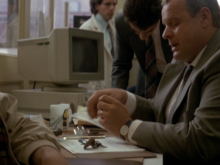
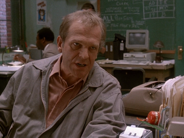
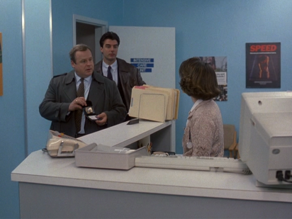
The first computer on Law & Order appears nine minutes into the first episode of the show. A rather small, dull-gray monitor sits on the also-dull-gray box of a computer. The keyboard rests on the desk in front and some kind of peripheral sits to the left. Exact details are difficult to identify. We see the computer as the camera quickly pans the room, obscured by motion blur and the graininess of the film stock. Alone, unused and tucked into the corner of the room, this is the state of computers for most of the first ten seasons of the show: a shared resource used only occasionally as needed, turned off more often than not, and dotted with Post-It notes left for other users. Often, these computers are shown on dedicated computer desks or tucked away in corners, below counters, or in other out-of-the-way places.
This reflection of banal details is something Law & Order excels at (whether intentionally or not) and stands in contrast with one of the show’s spinoffs, Law & Order: SVU, which often depicts police station computers in a manner bordering on the sci-fi. Unlike the smart-boards and touch-based interaction of SVU (which is intended to suggest high-tech interactivity while being decidedly not, sporting instead clunky and simplified user interfaces with the veneer of corporate design), the original series accepts the realistic limitations of blue screens and keyboard-only input, and as a result is a much better representation of the average computer user in the early 1990s.
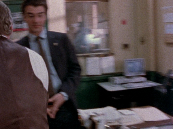
In fact, it isn’t until nine episodes and 39 computers later that a machine is even turned on, and it isn’t until season five that a computer appears on the front of someone’s desk. Over the course of the show as we might expect, computers become more and more common, shifting from bulky desktops to laptops and flatscreen monitors. City employees look up records for detectives and DAs, forensics and computer experts are seen using high-end software and even engaging in hacking, and computers dot the background with random programs open as if some important work had been interrupted. By the last two seasons, both detectives are regularly seen working on laptops across from each other and smartphones begin to make appearances.
This shift can be measured by counting the number of computers captured per season. The below chart shows the computer counts across all 20 seasons along with a line tracking the average trend: a steady incline in the number of computers onscreen that bumps up briefly in the middle and skyrockets towards the end of the show’s run.
An overall rise in the count is to be expected as computers become more common throughout 1990s and early 2000s (the spike in the first season is likely the result of my overzealous capturing of images at the start of the project). Computer use transitioned in the late 1990s from a shared office tool to one of near constant use at work, and often at home as well. By 2002, more than half of Americans were online.[10]Computers, the internet, and computer-related stories and crimes were on everyone’s mind; this was reflected in the show’s stories and as a bump in in the computer count.
The subsequent dip in the early-to-mid 2000s is perhaps the most interesting, and is likely the result of several factors. The first may be ubiquity: we all got used to having and using computers. Computers mediated many daily tasks and the internet matured, giving us a feeling of comfort with technologies like email and instant messaging. Another possible reason is a feeling of doubt about the role computers would play as the result of the dot-com bubble, when online retailers went under and technology stocks dropped. While not seen as clearly in the screenshots themselves, these sentiments are reflected in the show’s storylines. In episode 253 (2001), one character sums up this feeling: “Then her cousin Jeff convinced her to jump on the internet bandwagon. It was a disaster.”
But new technologies breed new fascinations and anxieties, and this is a likely cause for the sharp increase in the number of computers in the final seasons. With the rise of mobile computing, characters start using smartphones and laptops on a regular basis, and engage more with social networking sites (Law & Order’s fake Facebook is called Faceplace, one of few domains used on the show that NBC isn’t just sitting on).
There is a second possible reason for this spike: Apple became a sponsor of many NBC shows. No longer did we see nameless beige computers recycled from previous episodes or devices with their brand names covered. Instead, fancy new computers proliferated, clearly identifiable as Apple products. This consistent shift to a high-end brand is out of character for a gritty crime drama, but in the end perhaps says more about how television is made than it does about computers.
Now 18 months and hundreds of episodes later, I realize this isn’t a project about Law & Order at all—the show is one of many possible vehicles for exploring our culture’s relationship to technology. Detailed accounts have been written of mainframes and cloud computing, social media and online commerce, but there are few books about the more humble aspects of technological culture. Consider the computer desk: formerly ubiquitous, fake-wood melamine furniture with a keyboard tray and, depending on the vintage, a box of disks or a built-in CD rack, the computer desk is one of many objects mostly lost to the past that get a rich historical document through Law & Order. If we want to dig for this sort of anthropological detail, we are unlikely to find it anywhere but in the media of the period. It is difficult to pin down exactly what these and all the other images in this archive might mean, and that’s something I find satisfying. Embedded in the background of scenes, snippets of dialog, or fleetingly glimpsed fashion, I look forward to seeing more projects that use media to nibble at the profound or kitschy that lies waiting to be unearthed.”
text via Rhizome