Vettor Pisani
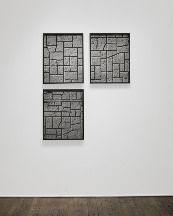
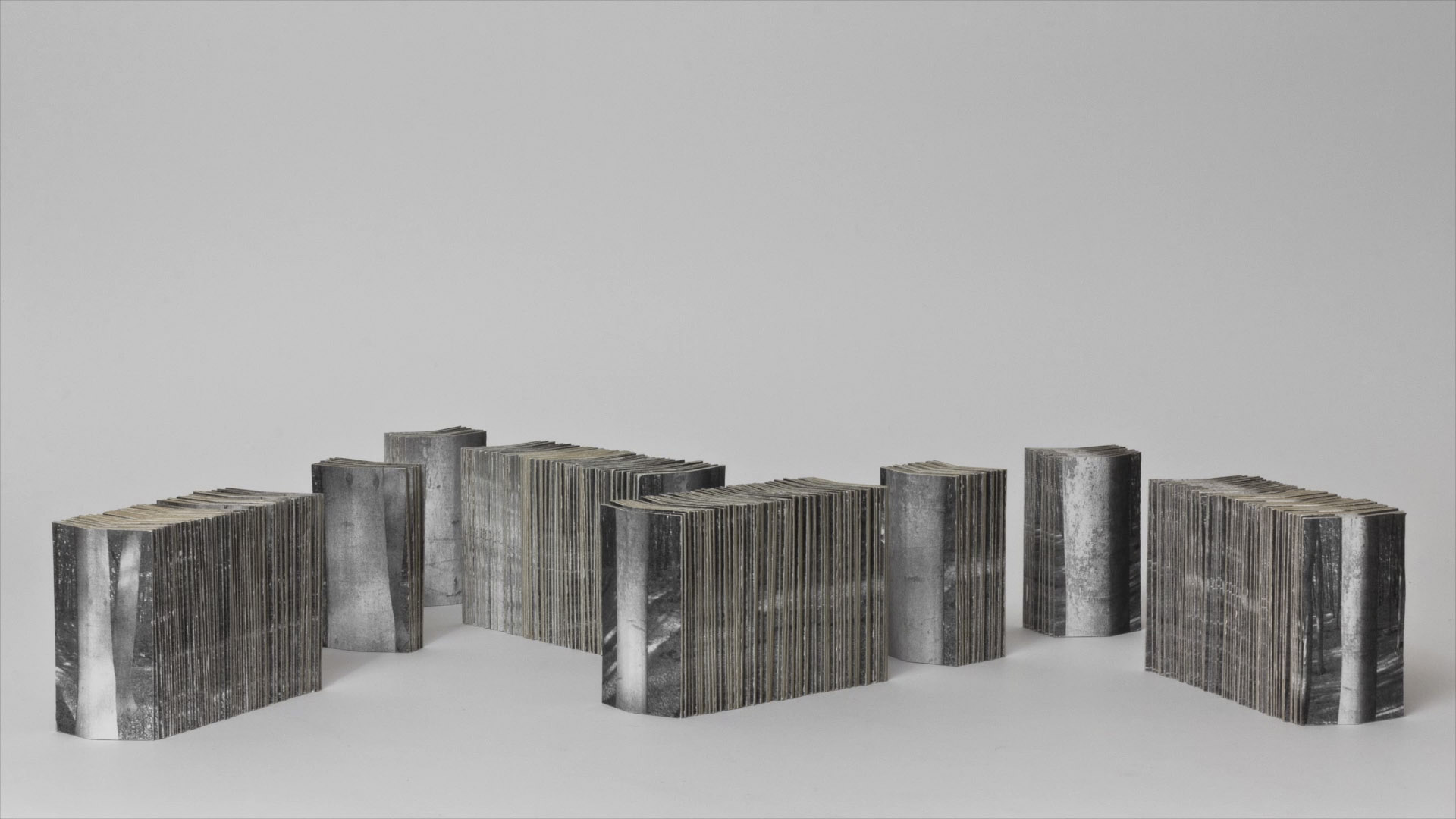
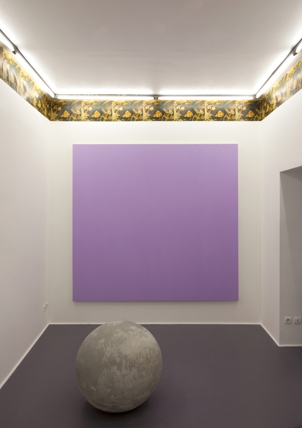
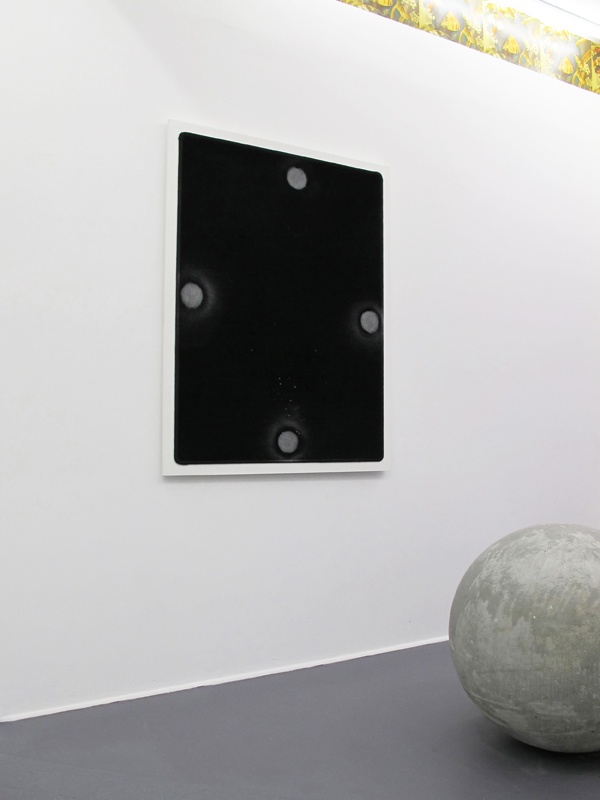
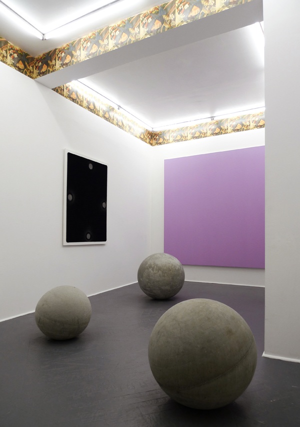
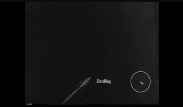
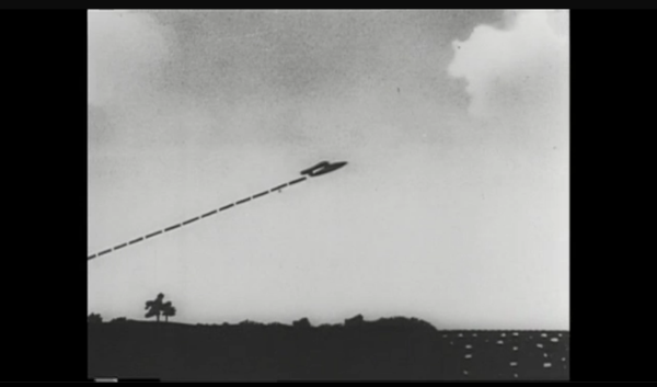
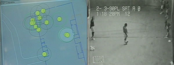
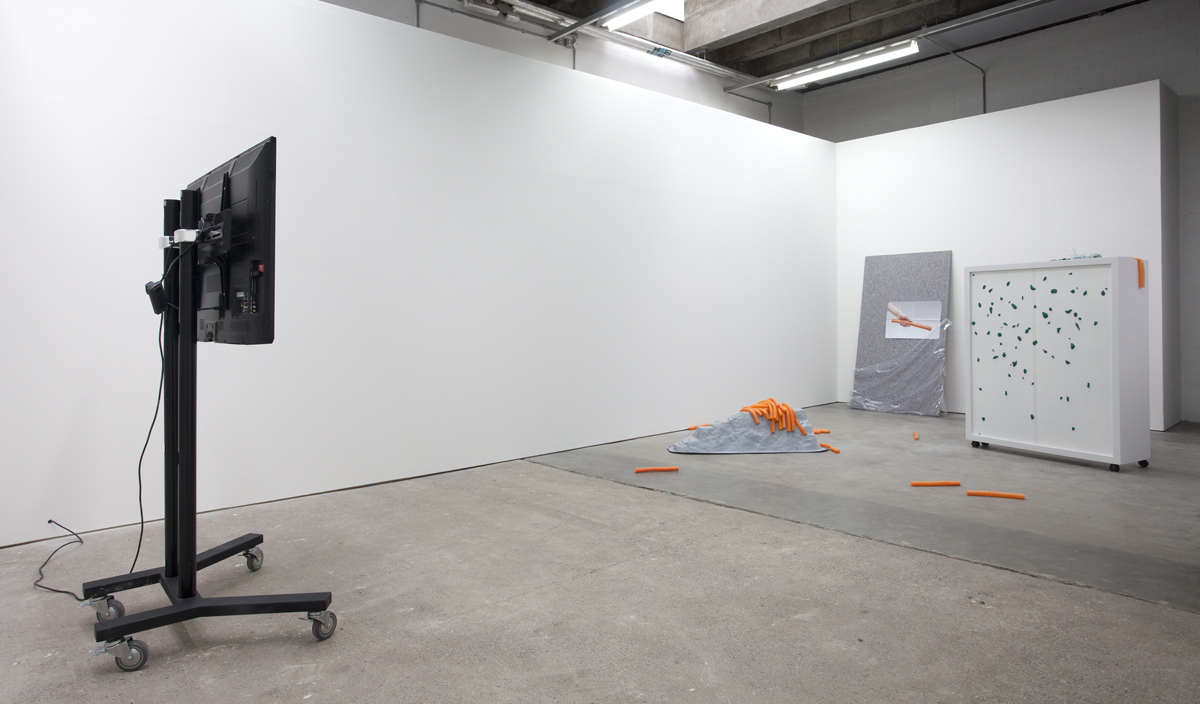
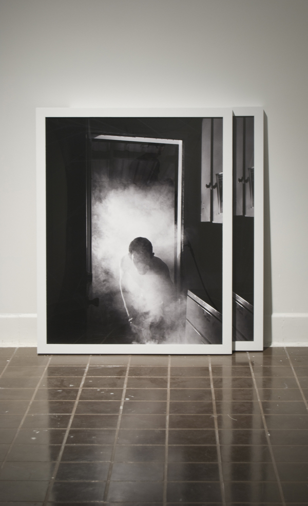
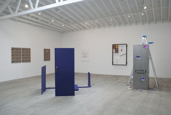
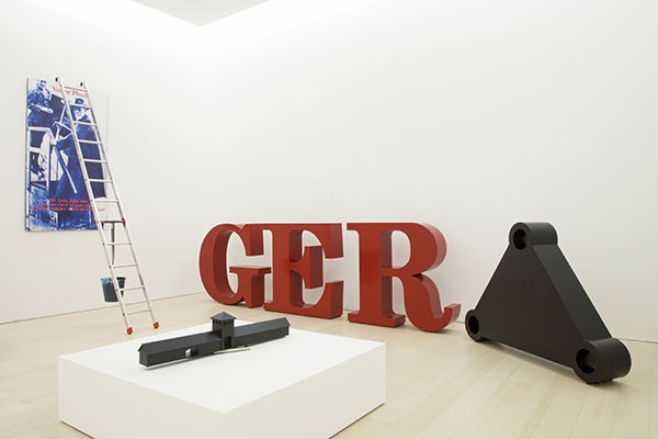
Work from “Eroica/Antieroica” at MADRE, Naples.
“Vettor Pisani figure appears to us today radically contemporary, that of a true precursor who successfully combined conceptual investigation with irony, the play of language with role playing, masking with the search for truth, major history with the chronicle of the trivial, the sacred with the profane, the art of the past with provocations of the present. From his solo exhibition in 1970 at the Galleria La Salita in Rome, and presence at Documenta V, through his many participations in several editions of the Venice Biennale, Vettor Pisani gradually revealed himself as one of the most important witnesses and exponents of artistic research in Italy from the ‘70s, as well as one of the most personal and visionary authors on the art scene of his generation.
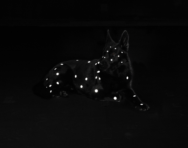
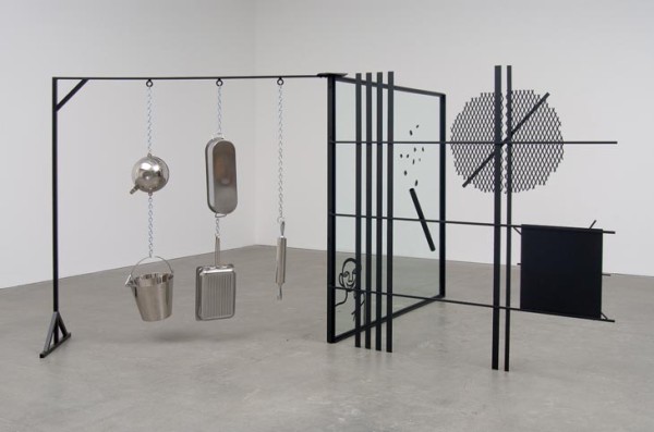
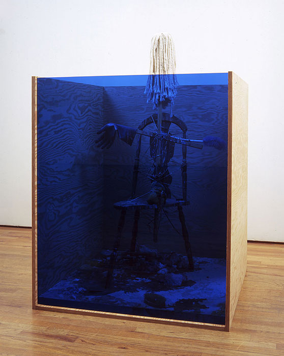
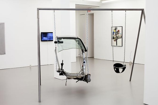
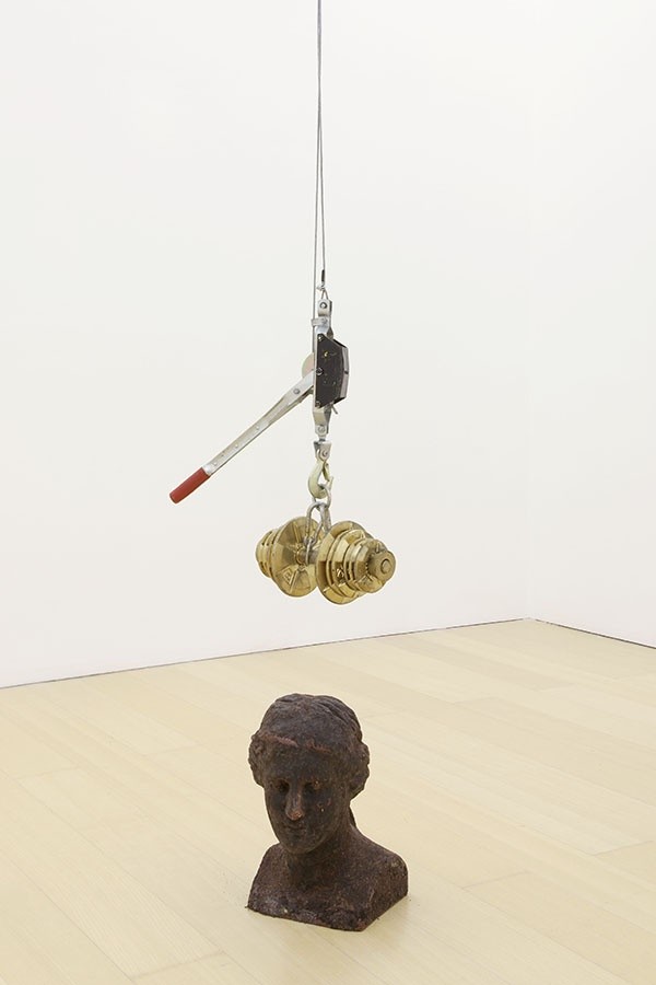
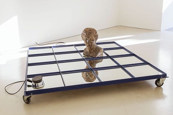
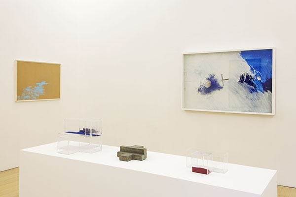
Studded with triangles, circles and semi-crosses, mirrors and tables, labyrinths and pyramids, pavilions and architectural models, alembics and hourglasses, pianos and violins juxtaposed with busts, mannequins, casts, fusions of religious figures like Christ, the Virgin, the angels, or pictures of Oedipus and the Sphinx or Arnold Böcklin’s Island of the Dead, and populated by a veritable personal bestiary (turtles, rabbits, chickens, monkeys, goldfish, snails, guinea pigs, cats, peacocks, eagles and pigeons), the works of Vettor Pisani are imaginary theaters of memory and knowledge, philosophical and cognitive representations “of the history of modern Europe” and its contradictions, ephemeral scenographies of moral issues and intellectual questions as unavoidable as they are insoluble, forms of introduction to the complexity of speculation expressed through the ordinariness of everyday life, spacetime thresholds between different eras, codes of communication between opposing states or entities (hero and antihero; human and divine; human and animal; man and woman; life and death) and, finally, provisional museums of the inevitable destruction and constant reconstruction of art, in which the kaleidoscopic variety of the artist’s artifacts and references, the dimensions of history and myth, gender, the different cultural traditions and identities of the artist all come together in a unicum, indefinable in its critical status and aesthetic consistency.
Pisani’s output has some of its most significant achievements in the many versions of RC Theatrum (a veritable Rosicrucian Theatre presented for the first time at the 1976 Venice Biennale and then resubmitted and extended over the years in various versions, including The Theatre of Oedipus, The Theatre of the Virgin, The Azure Island, The Theatre of the Sphinx, The Theatre of Artists and Animals, The Crystal Theatre, Virginia with the Goldfish), in cycles devoted to the islands of Capri and Ischia and “Napoli Borderline,” in political works that have as their focus the themes of Judaism, Nazism, the compromised European identity (dealing also with the issue of migrants), and in the design of the Virginia Art Theatrum / Museum of Catastrophe, a work produced from 1995 to 2006 in a disused travertine quarry at Serre di Rapolano, Siena, configured as the culmination of all his research: dwelling, philosopher’s stone, opus which condenses his idea of art itself. These are projects and works that will all be reconstructed, reordered and documented in the exhibition. In all these works and projects, art history, politics, psychoanalysis, popular culture, everyday news, hermetic philosophies, Masonic symbols, alchemical rituals and Rosicrucian doctrine inextricably overlap, often in ways that are oddly dissonant or even ironic and often self-deprecating, yet paradoxically always coherent in creating a sense and a world of his own.
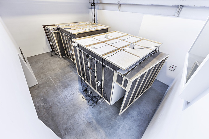
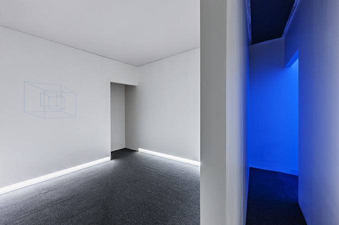
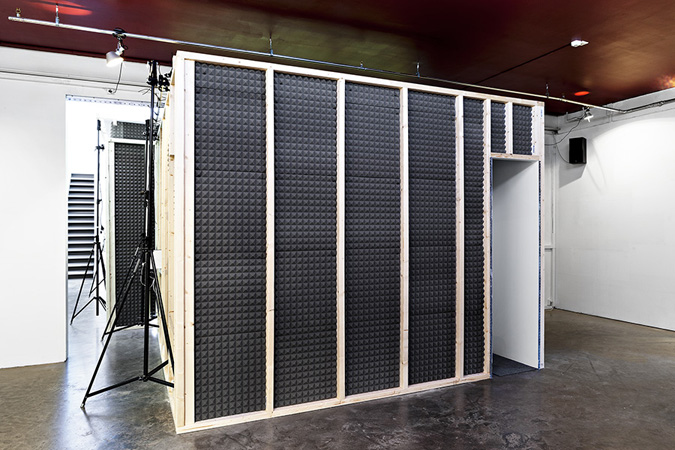
Offering an in-depth vision of the principal aspects of this research, at the same time broad and deeply complex, stratified in time and articulated in expressive media adopted, the exhibition – curated by Andrea Viliani and Eugenio Viola and under the scholarly supervision of Laura Cherubini – is the most comprehensive to date to deal with the artist. It brings together the most substantial group of works, both historical and recent, ever united in a single exhibition on the artist, enabling visitors to trace his whole output, from site-specific installations to drawings and collages, from paintings on canvas and PVC to performative actions, from photographic and filmic images to works in mixed media, with an essential endowment of documentary materials. At the conclusion of the exhibition, in 2014, the Madre will produce a major monographic bilingual publication (Italian/ English), to be issued by Electa. A second exhibition will be presented, in the early months of 2014, at the Teatro Margherita in Bari (the artist’s birthplace). Designed specifically for the spaces of the Teatro Margherita and organized in collaboration between the Fondazione Donnaregina Naples and the City of Bari, the exhibition will bring together works and documents from the 1970s down to his most recent production.” – MADRE, Naples