Sunday, 1 September 2013
Since May 1, ilikethisart has been operating with an experimental format, and many of you have noticed monthly aesthetic/topical shifts in the works posted. I want to take this opportunity to thank the previously anonymous (or at least unannounced) contributors that have kept the site running since May.
First and foremost, I would like to thank Wyatt Niehaus (May) and Jacob Riddle (July) – both of whom are longstanding editors/contributors. Jacob and Wyatt have been helping with ilikethisart since 2010, and have yet to be acknowledged for their continued efforts.
Additionally, I would like to extend my sincere thanks to Justine Ludwig (June) and Nicholas O’Brien (August) for their contributions in their respective months, and for sharing work that likely would have been otherwise overlooked.
As of today, we will return to the original format with posts from myself, Jacob, and Wyatt. Again, I want to thank everyone for their involvement and support.
Tags: back in the saddle, business, Dread Pirate Roberts
Posted in Uncategorized | Comments Off on Dread Pirate Roberts
Friday, 30 August 2013

Noam Rappaport
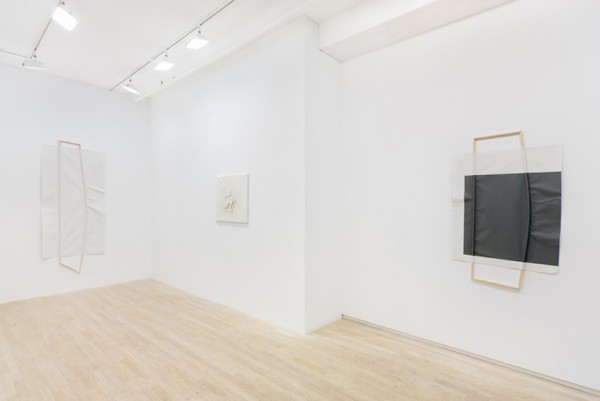
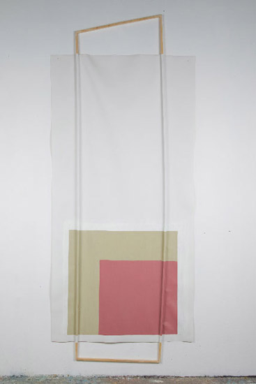
From top to bottom: Installation View at ATM Gallery, NYC (2008), 2×6 and Yellow and Blue (2010), Right Face (2009), Installation View at Ratio 3 San Fransisco (2013)
“Each detail in the eight works on view here—all part of Noam Rappaport’s debut show at James Fuentes—is remarkably self-possessed. By detail, I mean a dash or dab of paint; a single, slender line; a shred of gauzy fabric; or a spare, perfectly formed geometric shape, often cut a half an inch or so into the canvas. Rappaport is economical with such elements—in all the pieces here except one, there are never more than one or two, three at most—an artistic decision that keeps his works subtle and soft. In Greens (all works 2012), a reed painted hot purple swoops over thick swipes of pine and seaweed hues, cuts across a recessed ecru circle, and catapults the piece into an interim space somewhere between sculpture and painting. Likewise, the fulcrum of Untitled is a most lissome line of electric green, dividing fields of mint and cream-colored paint, both neatly tucked into orderly rectilinear forms.
Collection #8 (Victory Cap) is the anomaly, possessing not one but a plethora of details, all tiny objects stodgily tacked to a panel in neat rows—each a speck, a scrap, an abbreviation of some greater whole, a piece of linen, a block of wood, a sheet of paper, a fishing line—that, as abbreviations, teem with a certain confidence: Elision is enough. After all, the dynamism (and beauty) of art like Rappaport’s—and that of the rtistic giants he’s so frequently linked to, such as Richard Tuttle and B. Wurtz—hinge on the smallest of details: that line of bright lime which ever so subtly creeps along those vast plains of cream and mint. All of which makes Collection #8 (Victory Cap) especially revealing among this suspiciously post-Minimalist array of works—and Rappaport’s artistic practice as a whole—as it acts like a sort of treasure chest of suggestions, an archive of potential endings, each particle dangled like precious stock in a market, as if to say “I can complete you.” Whether or not Rappaport is an artist’s artist (and the question is well worth considering), his works gently insist that confidence requires no more than a whisper.”
-Allese Thomson Baker for Art Forum
Tags: abstraction, aesthetic, color, expanded painting, minimal, organic shapes, pastel, wall sculpture
Posted in Uncategorized | Comments Off on Noam Rappaport
Thursday, 29 August 2013

Christopher Meerdo
From top to bottom: Hveragerði (2013), Cipher (2011), Dark Data (2013), Sine Qua Non (2012)
“Interested in the evasive nature of photography, Christopher Meerdo utilizes photography, video, and installation to act as a mediator between memory and constructed reality. Through addressing political issues as well as confronting his own personal narratives, Meerdo creates visual representations of seemingly inaccessible information that examine perception, permanence, and entropy.
For Sine qua non (2012), Meerdo takes an opposite approach. Rather than restoring damaged photographs, he instead uses destruction as the process to create new images. Realizing the ephemeral disposition of digital technology, he spent the summer of 2011 using a camera manufactured in the 1990’s to photograph the sun thousands of times over. Through the process, the camera’s sensor eroded, leaving it incapable of photographing representational images and instead only able to record its own deterioration. Meerdo then printed these images in the order in which he took them, so that the viewer can see how the images change as the sensor erodes.
Continuing to explore how photography can aesthetically contextualize abstract information, Meerdo sources an encrypted 1.5 gigabyte file released for a short time on WikiLeaks, an anonymous activist website. Created by the site’s founder, Julian Assange, the file is intended to act as insurance in the event that Assange or WikiLeaks is ever jeopardized. Until Assange releases the encryption key, what is truly contained in the file, titled insurance.aes256, is ultimately unknown. Through data processing, Meerdo transforms the amorphous and essentially non-existent raw binary data of the file into a black and white image. He then prints the image in its entirety on an uninterrupted 100” x 350” piece of paper to show the scale of information included in the file, as well as inside handmade envelopes that recall patterns of security envelopes. Similarly, Chinga La Migra (Fuck the Border Patrol) (2011) sources 700 classified documents from the Arizona Border Patrol through teenage ‘hacktivist’ groups, whose intents include generating disorder on the Internet. Using the documents’ binary data, Meerdo converted the 1’s and 0’s into the RGB color spectrum–thereby exposing the documents through visual interpretation. Through creating corporeal visualizations through aesthetic interpretation, these two series both examine the idea of hidden data and the artist’s obsession with the unseen.”
-Excerpted from The Museum of Contemporary Photography
Tags: contemporary, data, decay, digital, entropy, obsolescence, photography, public access
Posted in Uncategorized | Comments Off on Christopher Meerdo
Wednesday, 28 August 2013
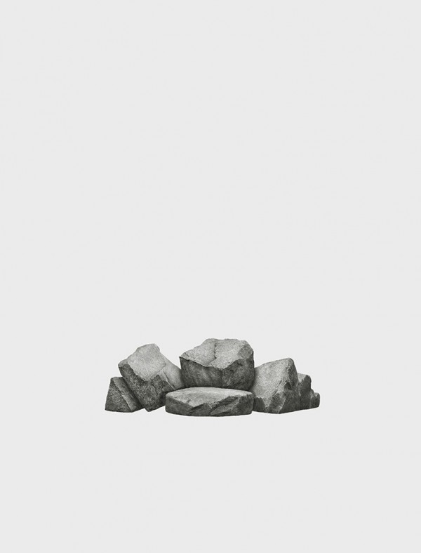
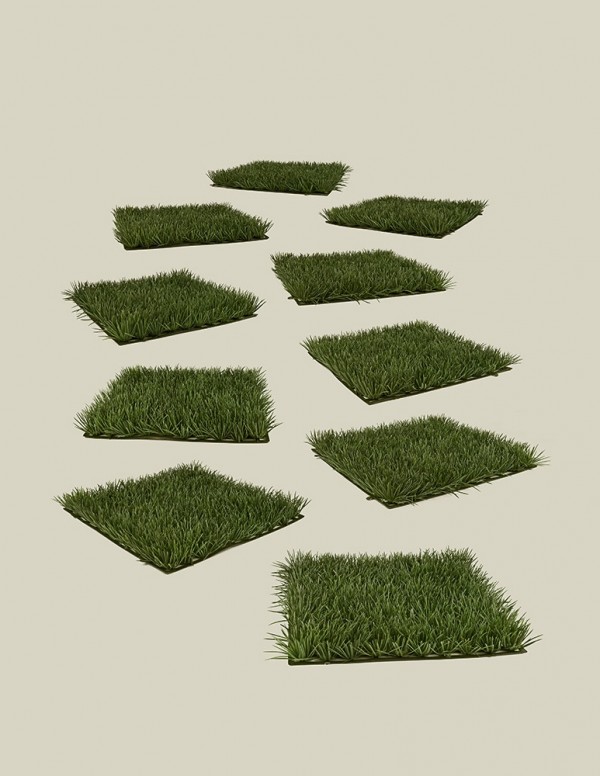
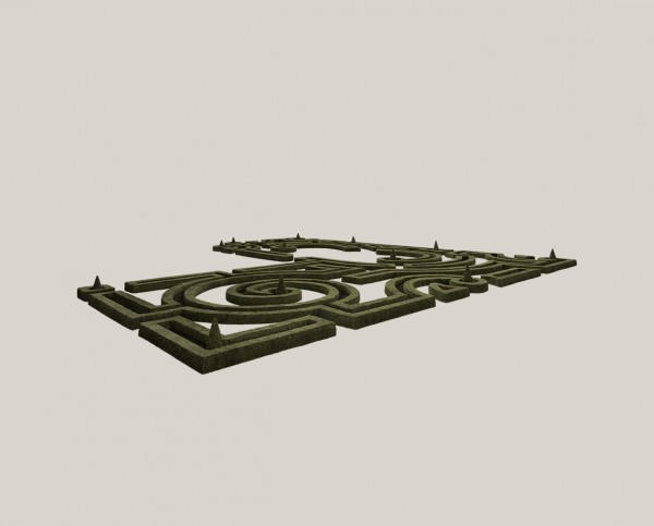
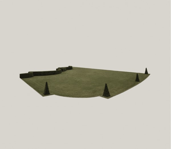
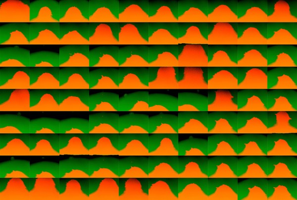
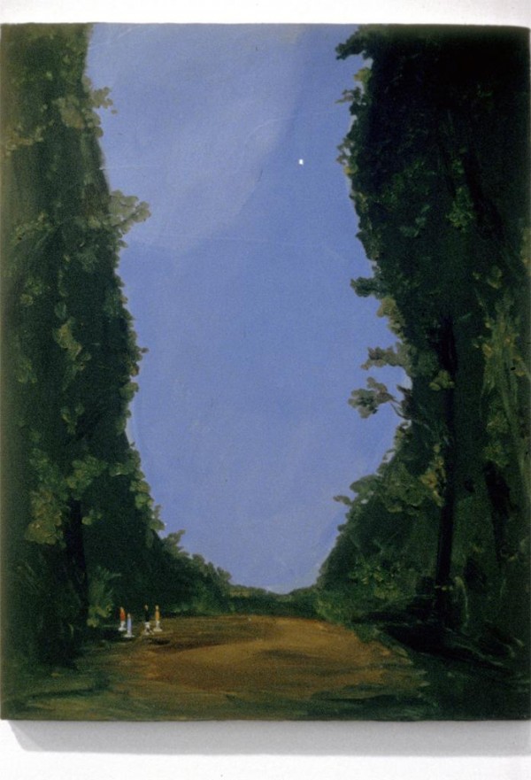
Jürgen Bergbauer
From top to bottom: Artificial Lawn in Ten Views (2011), Untitled no.3 (studies) (2008), Untitled (Parterre de Pieces Coupees I) (2004), Untitled (Parterre de Gazon I) (2004)
“Stephen Jay Gould once wrote that ‘the human mind delights in finding pattern – so much so that we often mistake coincidence or forced analogy for profound meaning. No other habit lies so deeply within the soul of a small creature trying to make sense of a complex world.’ This is the spirit that influences the work of Juergen Bergbauer, a German-born, RISD-educated photographer whose images highlight the tense harmonies that exist between man and his natural surroundings. ‘That’s my understanding of photography,’ Bergbauer says. ‘It’s about registering the visual world and endowing it with order and meaning. I’s a strong human desire.’
Bergbauer draws attention to the stark, irregular beauty of organic forms by photographing them in crisp monochrome, and altering the image, divorcing figure from ground. The artist’s technique is to juxtapose arrangements of objects that demand a natural context against a sterile, even, white blankness, the most antiseptic modernist tool. The resulting composition presents what might be considering mundane components (an assemblage of mildly chamfered stones, for instance, pocked and textured by time) in a new light, with all intent and arch-modernist jouissance of a Barbara Hepworth sculpture.
Earlier works by Bergbauer focused on the lushly-manicured gardens of the eighteenth- and nineteenth century Europe, with their strict axialities and topiary labyrinths. Channeling the adversarial relationship between Western man and his wild natural surroundings, the artist succeeded in abstracting the pure formalism and orthogonal willfulness of pre-modern landscape architecture, to mesmerizing effect.”
-Excerpt from text written by Kevin Greenberg for The Last Magazine Issue 10 (Full Text)
Tags: artificial, film history, garden, isloation, landscape, minimal, parks, simulation, void
Posted in Uncategorized | Comments Off on Jürgen Bergbauer
Tuesday, 27 August 2013

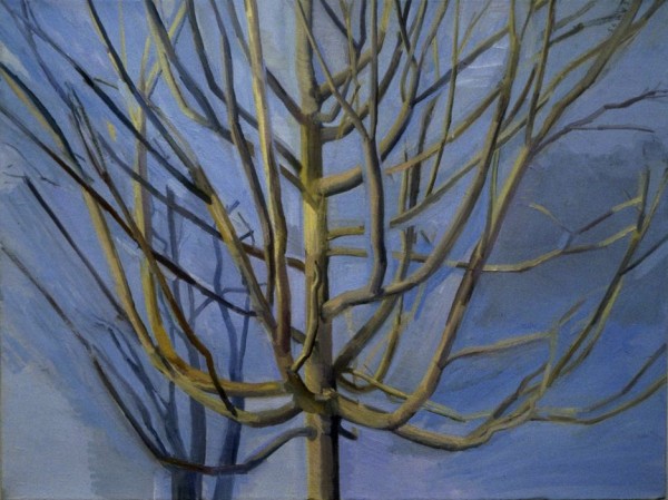

Sylvia Pilmack Mangold
From top to bottom: Untitled (View of Schunnemunk Mountain) (1980), The Maple Tree (1992-93), Trees at Pond (1983), The Maple Tres (Summer) (2006)
“Sylvia Plimack Mangold is the sort of admirable artist who discusses cobalt violet oil paint as if it were as tasty as crème fraîche. This is only partly a matter of visual delectation. She has been drawing and painting the trees on her property for over three decades, and this simple yet consuming project has caused her to develop a masterful sensitivity to the materials she uses.
Plimack Mangold’s work in the 1970s was laden with self-referential impulses that pushed her otherwise straight-forward realist paintings into conceptual territory. Landscape 1977, the earliest painting in this 30-year survey of the artist’s landscapes and trees, is a snowy view painted on paper that is held by masking tape to a canvas; rulers are adhered along its left and bottom edges. But what appears first as an assemblage is in fact trompe l’oeil: the tape and rulers are painted. While paying homage to artists of illusionistic tableaux like William Harnett, Plimack Mangold’s own artifice forces the viewer into a philosophical mode. Are the rulers illusions, strictly speaking, if they are marking off literal inches of height and width? Does the tape refer to the artist’s process or is it a fiction through and through?
…
This testing against visual experience brings Cézanne and Morandi to mind, but another important influence was Lovis Corinth, whose works Plimack Mangold began to acquire in the mid-’80s. Corinth devoted a suite of etchings and drawings to a single tree, and Plimack Mangold followed suit with her own drypoints and aquatints that presage The Elm Tree ( Winter). The probity and atmosphere in these are gripping. The same is true of her work in watercolor, which shares a similar precision, ensuring that her broader treatment in the oils has some discipline behind it. After years of emphasizing branches and the spaces between them, Plimack Mangold produced an image of a tree thick with foliage. Summer Maple 2009 is a delightful tangle of verdure, put down with lusciousness and aplomb on a wide rectangle. Winter Maple (2012) contrasts the tree’s limbs, bare again, against an evergreen pine behind it. A visual mode has supplanted the philosophical one, leaving the artist to work unimpeded with shape, color and the integrity of careful looking.”
-Franklin Einspruch for Art in America
Tags: brush-work, contemporary, edges, landscape, painting, periphery, representation, trees
Posted in Uncategorized | Comments Off on Sylvia Pilmack Mangold
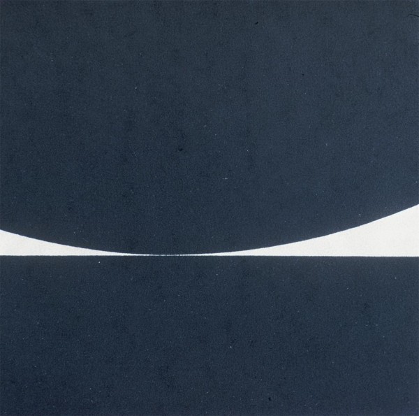
Monday, 26 August 2013
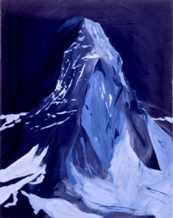

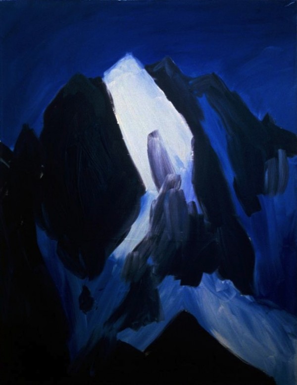
Karen Kilimnik
From top to bottom: The Matterhorn at Night, Dreamland, 9pm, 3am, Zermatt (2007), The Perch (2003), Candle Burning (1996), The North Face (2005)
“Kilimnik was first acclaimed for her so-called scatter-art installations of various bits of pop cultural detritus strewn about a gallery space to create a sensibility somewhere between the postminimalism of Robert Morris and Barry Le Va and the backstage of a fashion preview. She has recently become recognized for paintings that combine art historical tradition, modish topicality, and an awkward intimacy and fragility.
Kilimnik’s work cultivates an unabashed sense of romanticism yet retains a knowing criticality and awareness of the personal desire that we invest in both vaunted works of visual art and the more fleeting intrigue of celebrities and superstars. It also draws on the literary traditions of gothic mystery and fairy tales, presenting narratives that unfold over the course of a series of related paintings. Her expansive approach to cultural forms and the convincing inventiveness of her installations has had a profound effect on many young artists working today”
-Excerpt from Exhibition Text at MCA Chicago
Tags: color, contemporary, historical, landscape, long title, painting
Posted in Uncategorized | Comments Off on Karen Kilimnik
Sunday, 25 August 2013
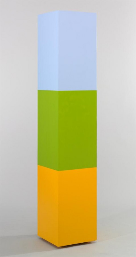
Anne Truitt
From top to bottom: A Wall of Apricots (1968), Catawba (1962), Morning Choice (1968), Parva XXXIII (1993)
“Born in 1921 in Baltimore and raised on Maryland’s Eastern Shore, Truitt was inspired by the natural and architectural environment of her childhood. After a stint in clinical psychology and fiction writing, Anne Truitt began her art career in the late 1940s, sculpting figurative objects with clay, cast cement and stone. It wasn’t until she was exposed to the paintings of Ad Reinhardt and Barnett Newman in a 1961 Guggenheim exhibition that her concentration on abstract, minimalist sculptures took form.
It was “an epiphany…that led her to feel that art should be oriented toward concept rather than material,” Kristen Hileman explained. Later, Truitt’s abstract figures of the 1950s shifted to wood sculptures painted with acrylic paint, a stylistic continuity that persisted from 1961 to her death in 2004.
Yet finding a fit for Truitt within any 20th century movement isn’t an easy task. Hileman points out the individuality of Truitt’s work, taking elements from both minimalism and abstract art, while maintaining an artistic uniqueness. Also a factor was her reluctance to promote her own work.
“She developed an independent art that has elements that resonate with…larger movements in American art,” Hileman said. “And I think that’s one of the reasons she’s so important, because she demonstrates an alternative kind of minimal abstraction.”
It wasn’t merely Truitt’s artistic discipline that inspired students, colleagues and friends, [Tim] Gunn and [Jem] Cohen insisted, but it was also her integrity and spirit, which make the retrospective even more compelling, rich and overdue.”
-Excerpt from PBS’s Art Beat by Meaghan Wilson and Talea Miller
Tags: abstract, color, freestanding, material, minimal, monolith, sculpture
Posted in Uncategorized | Comments Off on Anne Truitt
Thursday, 22 August 2013
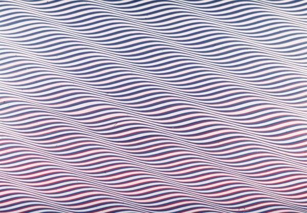
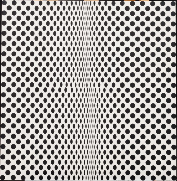
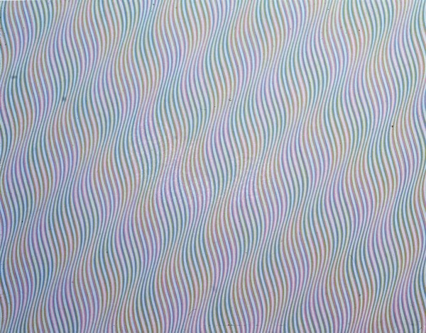
Bridget Riley
From top to bottom: Cataract IV (1967), Fission (1964), Molecey (1976), Kiss (1961)
“Riley was born at Norwood, London, the daughter of a businessman. Her childhood was spent in Cornwall and Lincolnshire. She studied at Goldsmiths’ College from 1949 to 1952, and at the Royal College of Art from 1952 to 1955. She began painting figure subjects in a semi-impressionist manner, then changed to pointillism around 1958, mainly producing landscapes. In 1960 she evolved a style in which she explored the dynamic potentialities of optical phenomena. These so-called ‘Op-art’ pieces, such asFall, 1963, produce a disorienting physical effect on the eye.
Riley was awarded the AICA Critics Prize in 1963 and also that year a John Moores’, Liverpool Open Section prize. In 1964 she was awarded a Peter Stuyvesant Foundation Travel bursary to the USA. In 1968 she won an International Painting Prize at the Venice Biennale.
Her first solo exhibition was held at Gallery One in 1962 with a second solo show the following year. Other solo shows were held at Nottingham University, 1963; Richard Feigen Gallery, New York and Feigen Palmer Gallery, Los Angeles, 1965; Museum of Modern Art, New York, with US tour, 1966; Venice Biennale, British Pavilion (with Phillip King), 1968; Hayward Gallery, London, 1971; National Gallery, Prague, 1971; Hayward Gallery and Kunsthalle Nuremberg, 1992; Kettle’s Yard, Cambridge, 1995; and Waddington Galleries, London, 1996.”
-Terry Riggs for the Tate Museum
Tags: abstraction, geometry, minimal, op-art, optics, painting, pattern, pioneer, uk
Posted in Uncategorized | Comments Off on Bridget Riley
Wednesday, 21 August 2013
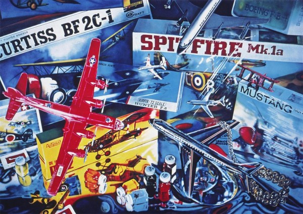
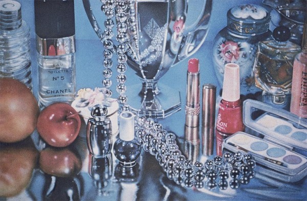


Audrey Flack
From top to bottom: Spitfire (1973), Chanel (1964), Wheel of Fortune (1977), Marilyn (Vanitas) (1977)
Long considered one of the innovators of photorealism, Audrey Flack emerged on the scene in the late 1960s with paintings that embraced magazine reproductions of movie stars along with Matza cracker boxes and other mundane objects, that referred ironically to Pop Art. As one of the first of these artists to enter the collections of The Museum of Modern Art, Flack later came to excel in vanitas paintings that combined painted renderings of black and white photographs along with detailed arrangements of elegant objects including fruits, cakes, chocolates, strings of pearls, lipsticks, tubes of paint, and glass wine goblets. In works such as Wheel of Fortune (1977-78), she would represent decks of playing cards and other ephemera related to gambling, adding a mirror and human skull, for good measure. Her recent exhibition of Cibachrome prints, curated by Garth Greenan for Gary Snyder Project Space, is titled “Audrey Flack Paints A Picture” and is accompanied by five actual paintings. This show reveals the painstaking process employed in making these fresh and original paintings from the late 1970s through the early 1980s during a highly significant and intensely productive period of her career.
-Robert C. Morgan for Art Critical
Tags: painting, photorealism, pop, still life, vanitas
Posted in Uncategorized | Comments Off on Audrey Flack
Tuesday, 20 August 2013
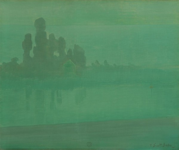
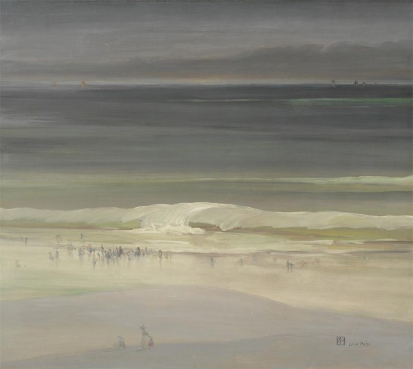
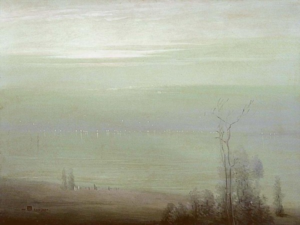
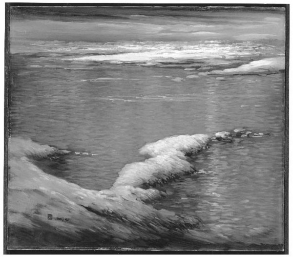
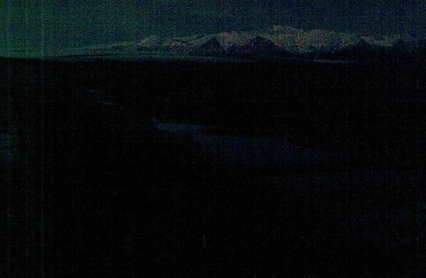
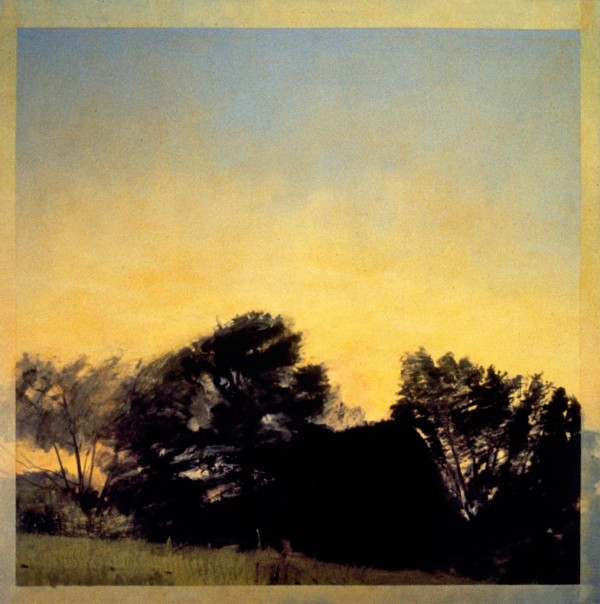
Leon Dabo
From top to bottom: The River Seine (c. 1900), The Seashore (c. 1900), Evening on the Hudson (1909), The Hudson in Winter (1910)
“Leon Dabo’s own descendants have heard little about him. Dabo, a French-born painter, died in 1960, at 96, after a restless career living in and around New York and in Europe and exhibiting in hundreds of group and solo shows. His early subjects were saints, and later he favored twilit riverbanks, battlefields, bouquets and eerie pastures striped with dead trees.
Dabo ended up estranged from his family, and he has largely fallen off the radar of art historians. Albert Douglas, 91, Dabo’s only grandson, told art dealers during a recent filmed interview that he hardly knew his grandfather. He does remember a debonair gentleman fond of expensive liqueurs and chronically short of cash who could “paint like a stream.”
In Dabo’s seven-decade career he hobnobbed with celebrities like Marc Chagall and George Bernard Shaw. At the 1913 Armory show in New York, Theodore Roosevelt admired Dabo’s scene of a Canadian snowfall. Helen Hay Whitney wrote a poem about the canvas’s “old lost stars to rise and gleam” and “secret, haunting theme.”
Major institutions including the Metropolitan Museum of Art, the Newark Museum and the Brooklyn Museum acquired his work. But he has had few shows since his death, partly because so many of his significant works and archival material were hidden away. Stephanie Ofental Dabo did donate some of his papers to institutions like the Smithsonian and the New York Public Library. But her collection of hundreds of paintings by her husband ended up bequeathed to a sister and then a succession of family friends, inaccessible to scholars.”
-excerpted NYT Article by Eve M. Kahn
Tags: b&w, foggy, hudson, landscape, nature, picturesque, seascape, tonalist
Posted in Uncategorized | Comments Off on Leon Dabo