Monday, 19 August 2013

Andre Kertesz
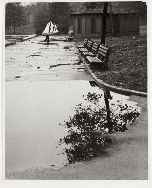
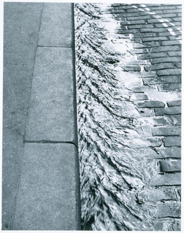
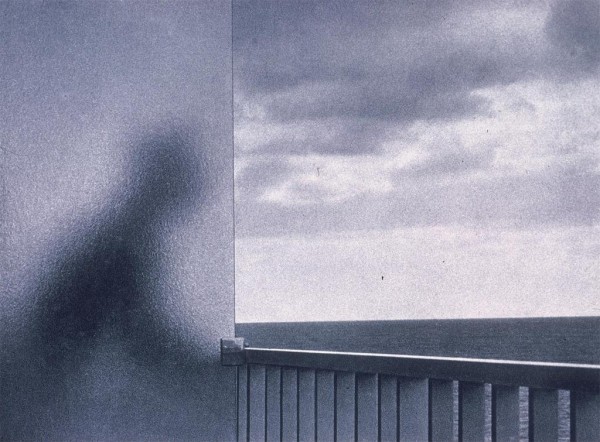
From top to bottom: Mondrian’s Glasses and Pipe, Paris (1926), New York. Central Park Boat Basin (1944), Paris (1929), January 1, Martinique (1972)
“Known for his extended study of Washington Square Park and his distorted nudes of the 1930s, Andre Kertesz was a quiet but important influence on the coming of age of photojournalism and the art of photography. For more than seventy years, his subtle and penetrating vision helped to define a medium in its infancy. Though he spent most of his life in the United States, his European modernist sensibility is what made him great, and that is what he is remembered for today…
… By 1927 Kertesz’s scenes of the streets of Paris were beginning to attract a great deal of attention, and he had his first show at an avant-garde gallery. His humor and subtle humanity seemed to personify even the stone walls of Paris. Throughout the 1930s he remained in Paris studying the people and their inhabitation of the streets, and the play of light and shadow that so dramatically filled the urban landscape. In 1936, after the death of his mother and his marriage to Elizabeth Saly, he moved to New York, where he had been engaged by the Keyston Agency. Though he canceled the contract only a year later, the progress of the war made his return to Paris impossible. Unable to leave and treated like an enemy by the government (which prevented him from publishing for several years), Kertesz was caught in tragic uncompromising circumstances. When the war ended Kertesz had lost the momentum of a supportive artistic community, but continued to live in the States due to health and familial considerations.
For nearly twenty years his gifts remained relatively unrecognized in New York. It was not until 1964, when John Sarkowski, curator at the Museum of Modern Art, organized a one man show that Kertesz’s career was reawakened. Over the preceding years, art photography in the United States made serious leaps and began to recognize the advances of earlier European artists. It was this renewed interest that eventually brought an otherwise forgotten genius back into the public eye. Throughout the 1970s and 1980s, Kertesz was shown regularly at the major international museums — having one-man shows in Paris, Tokyo, London, Stockholm, Budapest and Helsinki. In 1983 the French government awarded him the Legion of Honor, and the following year he passed away in his New York home. Very few artists are able to witness the formation of their own artistic medium. Kertesz was not only able to witness much of the beginnings of hand-held photography, but had a profound effect on it. With subtle and whimsical artistry, he took full advantage of a medium not yet sure of its own potential, and for that, contemporary photography remains in his debt.”
-Excerpted from PBS: American Masters
Tags: b&w, bohemian, NYC, paris, photo journalism, photography, still life, street-scene
Posted in Uncategorized | Comments Off on André Kertész
Sunday, 18 August 2013
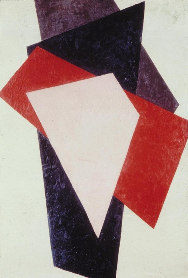
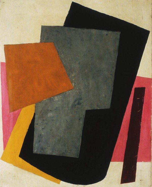

Liubov’ Popova
“In 1912 and 1913 Lyubov Popova studied in Paris. So she was very familiar with the developments of Cubism. She also made trips to Italy where she saw Futurist work firsthand. But unlike either Cubism or Futurism she really takes a jump and severs this connection with the visual world to try to make truly abstract pictures.
This picture was made in 1917, the very year of the Russian Revolution, which shook the established order of things at its foundation. And Popova, like many of the other artists of the Russian avant-garde, ended up allying herself with the new Bolshevik government.
If you were going to have a revolution you’d have to start over from the beginning. So there’s this idea that painting could serve as a special kind of laboratory or incubator space for developing ideas about what the visual forms of this new world might look like. And in this she finds the metaphor of architecture very helpful. And the series of work she made in 1916 and 1917, Painterly Architectonic, she develops her own style of painting where she layers these skewed geometric forms on top of each other to create these very dynamic, brightly colored compositions.”
–Leah Dickerman for MoMA
Tags: abstraction, avant-garde, color, composition, geometry, pre-mininal, russian, supermatism
Posted in Uncategorized | Comments Off on Liubov’ Popova
Saturday, 17 August 2013
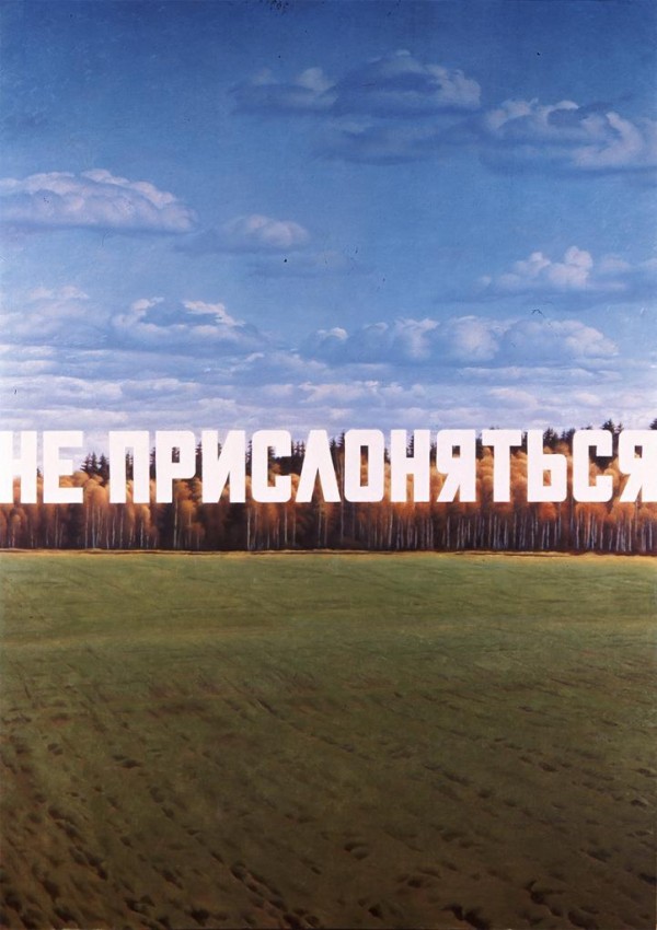
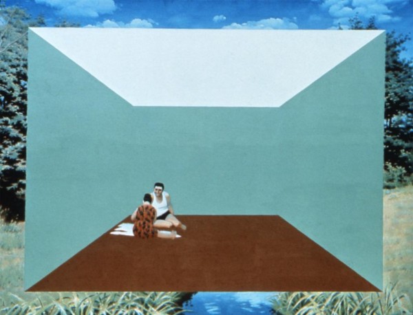
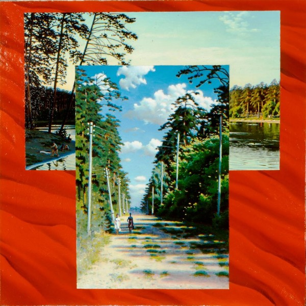
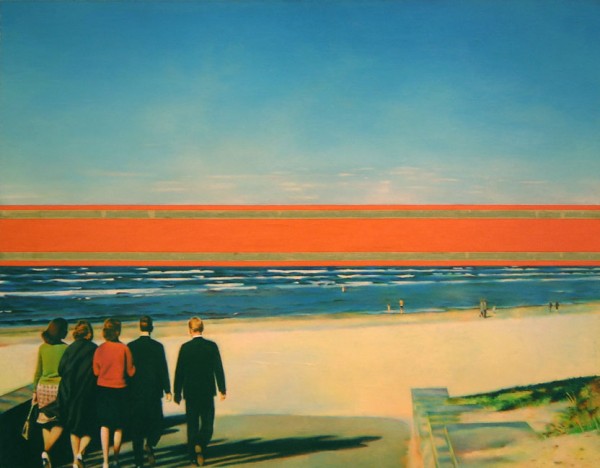
Erik Bulatov
From top to bottom: Not to be Leaned On (1987), People in a Landscape (1976), Two Landscapes on a Red Background (1972-74), Horizon (1971-72)
“Eric Bulatov was born in Sverdlovsk in 1933 and was raised in Moscow. He began his studies at the Moscow School of Art and finished at the Surikov Institute in 1958. After working several years as a children’s book illustrator for the State, Bulatov’s disillusionment with the creative and political restrictions of his position inspired him to begin making unofficial works of art. This exhibition, the first comprehensive showing of a major contemporary Soviet artist in Chicago, consists of twenty-three large-scale works painted between 1967 and 1988, all executed ‘unofficially’ within the context of Soviet society and it’s government.
Bulatov’s paintings are large, colorful, realistic images of landscapes, skies, urban settings, and people, many of which are painted over and partially obscured by wry words or phrases. Metaphorically rich and poetic blue skies are overlaid with Russian texts that translate: Glory to the U.S.S.R. or Trademark. Lush, green landscapes toil under the labels Not To Be Leaned On or Caution.
Bulatov’s subject matter is broad. Equally broad is his perception of the government’s role in the classification and control of everything. Bulatov symbolizes the government through his use of language as a system of order and control, the foundation of written law and constraint which he then plasters on every tree and rock. It is in this sense that Bulatov’s paintings may take on a more universal accuracy and a more populist appeal. His emphasis on only the public and external aspects of life–the street, the land, the State television broadcast–reinforces the notion that one’s thoughts and feelings are (still) one’s own. the psychological and emotional are beyond the confines of words, language and law.
This literal irony and contradiction is symbolically enriched and layered through Bulatov’s deft use of Social Realism, the government’s traditional mechanism for pictorial communication. His wordless images of Brezhnev have all the trappings of officialdom: a crisp pose, a heroic gaze, the flags of the communist States. However, the calculated flatness and lack of flourish in Bulatov’s style tends to rub off on his subjects, making them seem the victims of their own constraints. Bulatov’s paintings are unflattering without being overtly critical; his sly matter-of factness is too accurate to be false.”
-Joe Scanlan for the Renaissance Society
Tags: absurd, collage, hyper-realism, landscape, postmodern, semiotics, soviet, surreal, text
Posted in Uncategorized | Comments Off on Erik Bulatov
Friday, 16 August 2013
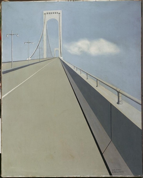

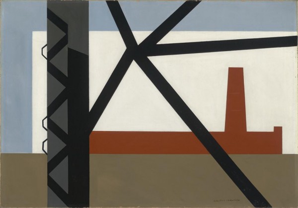
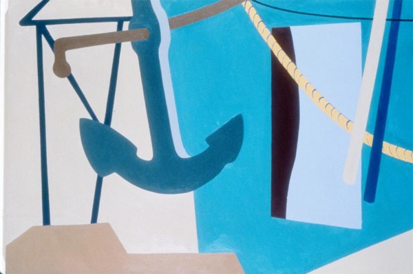
Ralston Crawford
From top to bottom: Whitestone Bridge (1939), Boat and Grain Elevators No. 2 (1942), From the Bridge (1942), Nassau #5 (1963-1967)
“Painter, printmaker, and photographer Ralston Crawford created both abstract compositions and representational images characterized by precision, clarity, and rational geometry. Crawford spent his youth in Buffalo, New York and often accompanied his father, a ship’s captain, on travels on the Great Lakes. He studied art at the Otis Art Institute in Los Angeles and worked at the Walt Disney Studio before enrolling at the Pennsylvania Academy of the Fine Arts in Philadelphia. In 1932-33, he attended two academy schools in Paris. Thereafter, he was based in New York City, but traveled frequently to teach at institutions throughout the United States.
In the 1930s, Crawford perfected a stripped-down, ascetic style associated with the movement known as precisionism for its hard-edged linear emphasis, invisible brushwork and smooth surfaces, and dispassionate approach. Drawn to the subject of the sea, he also focused on industrial structures, which he rendered in terms of their pure geometry, as worthy aesthetic objects. Toward the end of the decade, Crawford began to discard the semblance of representation, using objective form as the basis for abstract arrangements of shapes, lines, and colors. The increasingly geometric approach he took in the late 1940s seemed at odds with the then-rising movement known as abstract expressionism, which privileged tactile evidence of the artist’s emotional response and rapid process. However, Crawford regarded his own seemingly controlled, rational work as deeply reflective of emotional experience.
In the mid-1930s Crawford took up photography. He made his first lithograph in 1940 but did not begin printmaking seriously until 1949, when he embarked on a decade of creative experimentation in the medium of lithography. Profoundly affected by the devastation of World War II and his experience as a witness of the atomic bomb test at Bikini Atoll in the Pacific in 1946, Crawford turned to expressively jagged lines and strong color contrasts in works that continued to bear the impress of precisionism’s clean edges and self-effacing smooth surfaces. Following the first of many visits to New Orleans, he used the inspiration of its jazz music to create vivid images of the life of its ordinary inhabitants. Crawford often used photographs and earlier paintings as the basis for prints. His first solo show, in 1934, was followed by many more, including a retrospective exhibition at New York’s Whitney Museum of American Art in 1985. Largely neglected by critics in his day, Crawford increasingly is recognized as an inspired practitioner of mid-twentieth-century modernism.”
-The Terra Foundation for American Art
Tags: abstraction, geometry, modernism, painting, post-war, Precisionist, roaming, streetscene, urban portrait
Posted in Uncategorized | Comments Off on Ralston Crawford
Friday, 16 August 2013

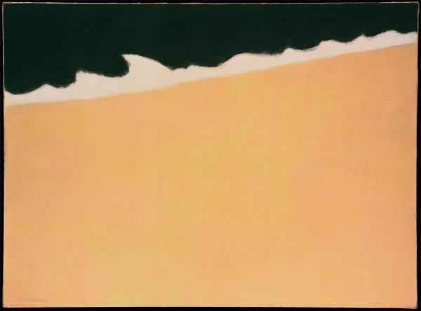

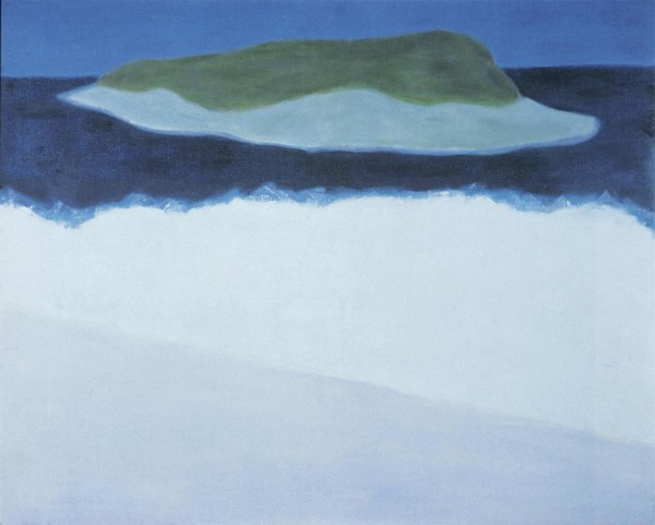
Milton Avery
From top to bottom: Interlude (1960), Black Sea (1959), White Sea (1947), Offshore Island (1958)
“Milton Avery’s landscapes, still lifes, and figure compositions derive their expressive power from their abstracted, flat shapes and luminous yet subtle color. His subjects seem unremarkable, but the manner in which he treats them is exceptional, for through his strong, simple designs, his intimate scenes take on monumental presence.
Avery was born in New York, in 1885 and in 1898 moved with his family to Wilson Station, Conn. From 1901 to 1911 he held many mechanical and construction jobs, but he became interested in art while taking a lettering course (some time between 1905 and 1911) at the Connecticut League of Art Students in Hartford. Avery continued classes there until 1918, when he entered Hartford’s School of the Art Society. He moved to New York in 1925 and in 1926 married Sally Michel, a fellow artist who was often the subject of his work. Avery attended evening classes at the Art Students League and in 1927 started exhibiting regularly in group shows. The following year Avery and artist Mark Rothko became friends, and Rothko, in turn, introduced him to Adolph Gottlieb and Barnett Newman, all leading Abstract Expressionist artists. His friendship with them did not lead him to share their commitment to total abstraction, however.
Although rooted in the American Scene tradition, Avery’s work was too abstract to assign him a place in that group; and though he was a friend of the foremost Abstract Expressionists, his work was too representational to belong to the non-objective movements of the 1940s and 1950s. Avery’s colorful, simplified forms, and explicit yet subtly toned contours, defy classification. Yet the freshness and uncomplicated nature of his images linked him with other independent American modernists, such as Arthur Dove, John Marin, and Lee Gatch, all, like Avery, artists whose work was greatly admired and collected in depth by Duncan Phillips.”
-From The Phillips Collection
Tags: abstract, color, color field, figure, landscape, mid-century, muted, painting, seascape
Posted in Uncategorized | Comments Off on Milton Avery
Wednesday, 14 August 2013
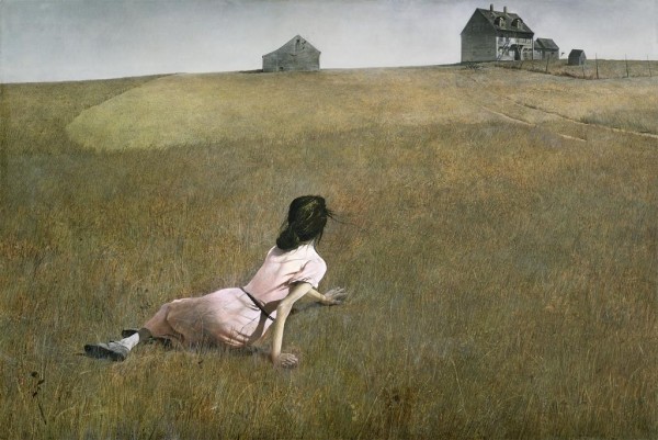
Andrew Wyeth
From top to bottom: Christina’s World (1948), Snow Flurries (1953), Brown Swiss (1957), Her Room (1963)
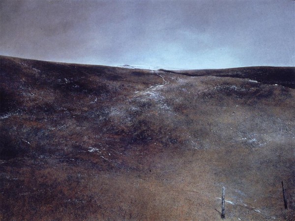
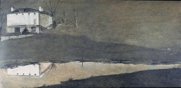
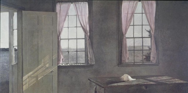
“Wyeth gave America a prim and flinty view of Puritan rectitude, starchily sentimental, through parched gray and brown pictures of spooky frame houses, desiccated fields, deserted beaches, circling buzzards and craggy-faced New Englanders. A virtual Rorschach test for American culture during the better part of the last century, Wyeth split public opinion as vigorously as, and probably even more so than, any other American painter including the other modern Andy, Warhol, whose milieu was as urban as Wyeth’s was rural.
Because of his popularity, a bad sign to many art world insiders, Wyeth came to represent middle-class values and ideals that modernism claimed to reject, so that arguments about his work extended beyond painting to societal splits along class, geographical and educational lines. One art historian, in response to a 1977 survey in Art News magazine about the most underrated and overrated artists of the century, nominated Wyeth for both categories.
Art critics mostly heaped abuse on his work, saying he gave realism a bad name. Supporters said he spoke to the silent majority who jammed his exhibitions. ‘In today’s scrambled-egg school of art, Wyeth stands out as a wild-eyed radical,’ one journalist wrote in 1963, speaking for the masses. ‘For the people he paints wear their noses in the usual place, and the weathered barns and bare-limbed trees in his starkly simple landscapes are more real than reality.'”
-Excerpt from NYT Obituary by Michael Kimmelman
Tags: american gothic, desolate, landscape, painting, plains, tempora
Posted in Uncategorized | Comments Off on Andrew Wyeth
Tuesday, 13 August 2013
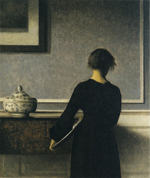


Vilhelm Hammershøi
From top to bottom: Interior (1899), Interior (ca. 1903-1904), Sunbeams; Dust Motes Dancing in the Sunbeams (1900), Interior with Potted Plant on Card Table (1910-1911)
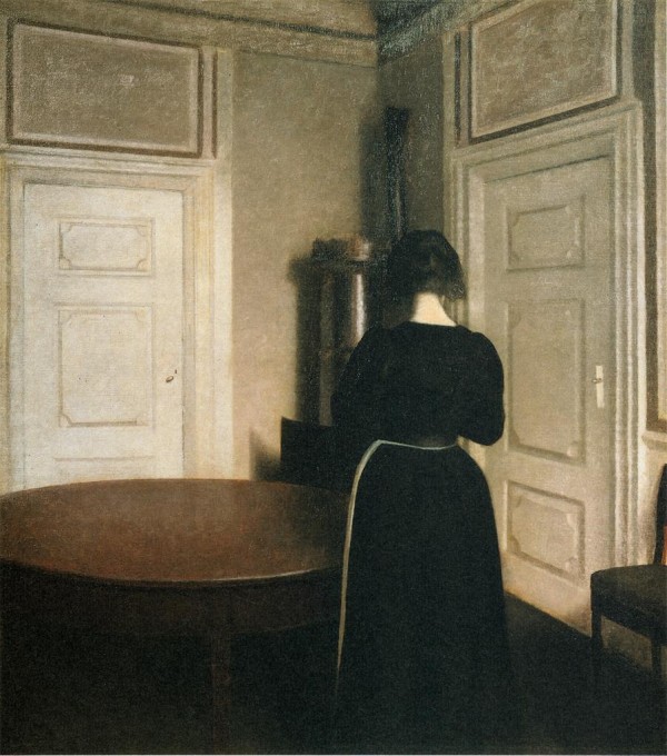
Ida, facing away.
The artists’ wife turned into the walls, turned onto herself, floating in the intimate foyers of the home she shared with her husband. The Danish winter painted into the walls, breathing a chilling fog over the cherry wood dining table. At times looking out windows, at times facing the covered brick and plaster of the house bought through inheritance, we wish we could comfort her, to touch her shoulder, hold her hand. But mostly all we get is distance, as if we were seeing her from some great distance. It is in that void between us that all of the fallen leaves of autumn could live.
Occasionally light will shine in through the large French windows, but more often then not a soft glow appears from a indiscernible source, as if the artist himself radiated a light for evenly flooding the room. This unknown luminosity gets caught most in the fabric of Ida’s modest dress, trapped into the deep woven black of floor-length robes that seem more fitting for the maid than for the mistress. Where the harsh black-carbon consumes the light of the room, Ida’s porcelain skin radiates tenderness and delicacy. It is as if the fabric has been draped on her not for warmth or decorum, but to contain an incandescence that would truly set the world alight. If only the walls that encased her – the very ones that she seems so preoccupied by –would crumble or fade, then the dimness of the northern winter sun that hovers low above gray horizon wouldn’t be as unbearable.
And yet, as an undeniable yearning coats the canvas of these melancholic vignettes, calling out to Ida, reaching into the gap that keeps us at bay, she won’t turn around. We’re denied her full grace; the artist refuses us what must be an angelic visage. For why would any man want to hide the face of his beloved if not to keep it only for himself.
Tags: danish, figure, interior, melancholic, nicholas o'brien, painting, portraiture, romantic
Posted in Uncategorized | Comments Off on Vilhelm Hammershøi
Monday, 12 August 2013
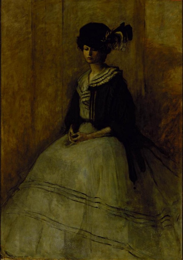


Romaine Brooks
From top to bottom: La Veste en Soie Verte (1907), Renata Borgatti au Piano (or) Musical Inspiration (ca. 1920), White Azaleas (1910), Maggie (1904)
“Amazons in the Drawing Room presents Brooks’s work in relation to early twentieth-century European society, and contemporary ideas about personal identity, class, and sexuality. The exhibition comprises four main sections: Portraits; Self-Portraits; Images of Ida Rubinstein; and Drawings. Brooks’s painting was influenced by three main elements: her place in elite European social circles; her involvement in the homosexual literary and artistic culture of Paris; and her childhood experiences. Brooks’s works are also a visual record of the changing status of women in society, and of Brooks own refusal to conform to the social order of the day. Her rebellious nature can be seen in her paintings of nudes—not traditionally the subject of women artists at that time—and in the androgynous appearance of some of her portraits.
Brooks produced many portraits of Russian dancer and actress Ida Rubinstein during their relationship, which lasted between 1911 and 1914. Among these paintings are La France Croisée (The Cross of France, 1914), in which patriotic heroism is portrayed by a figure cloaked in black bearing the insignia of the Red Cross, and Le Trajet (The Crossing, 1911), which presents an image of female sexuality and morbidity. Also included is Ida Rubinstein (1917), in which Ida’s windswept figure, again wrapped in a black cloak, is the very image of Brooks’s romantic ideal.
Brooks’s predominant subject was portraiture, and at the center of the exhibition are stark, gray-and-black-toned depictions of herself and her circle, which included the artist/filmmaker Jean Cocteau, poet and pro-fascist Gabriele d’Annunzio, pianist Renata Borgatti, and Duchess Elisabeth de Gramont, among others. Brooks’s so-called “amazon” portraits of the 1920s, stylistically influenced by another expatriate artist, James McNeill Whistler, can be seen as the artist’s bold attempt to fashion a lesbian identity for her sitters.”
-Excerpt from Press Release of retrospective of the artist’s work curated by Joe Lucchesi
Tags: ex-pat, female form, lgbt, nude, painting, portrait, void
Posted in Uncategorized | Comments Off on Romaine Brooks
Sunday, 11 August 2013
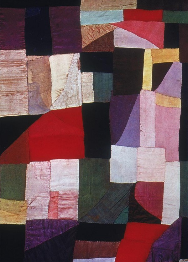
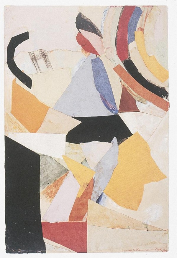

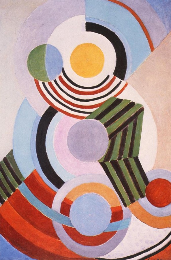
Sonia Delaunay
From top to bottom: Blanket (1911), Solar Prism (1914), Electric Prisms (1914), Rhythm (1945)
“A world of color would be ideal, where one could create emotions accordingly. We could live by impressions the way a blind man lives by touch. We could vivify or seduce, transmute or emote, the possibilities are endless. A world of color so fine and pure, from the deepest innermost part of the human body to the pale washed evasiveness of the white of the human eye. We could live in a constant state of aura where every feeling manifested itself by color thus removing the lie from mankind.
Sonia Delaunay took an early, perhaps the earliest jump into non-objectivity where color elicited form. Her work serves swift proof of a tenacious intensity with which she threw herself into her art, her life. She lived a philosophy of emotion; delving, gouging, tasting, creating. Through a direct communication with the gut, she relied on intuition rather than intelligence, as did men of stature such as Geothe. She strived to emulate such greatness.
Her work is the embodiment of myth and legend, of the God-like strength granted to man. In that sense it is a proud rival to the majesty of ancient cultures in which there was no separation between art and life. Sonia Delaunay is the modern earth goddess. The ancient was Gaea. She sang the music of the sea and the wind. Primitive sensibility and the communication with the baseness of the earth began there. And the personification of rivers took place in pediments, plant life grew from the tops of columns. One simply entered the inner-self and emerged fresh with the proportion, stylization, and technique fitting.”
-Excerpt from longer interview with the artist conducted by David Seidner (republished in BOMB)
Tags: abstraction, collage, color, fabric, mixed media, non-objectivity, painting
Posted in Uncategorized | Comments Off on Sonia Delaunay
Saturday, 10 August 2013
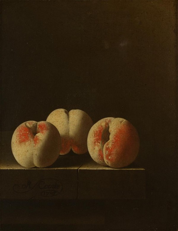
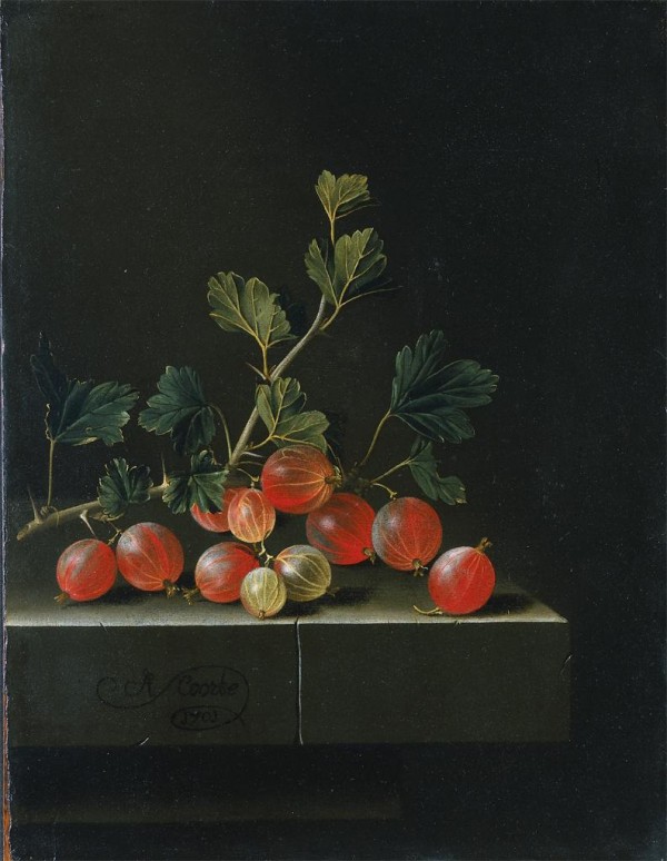
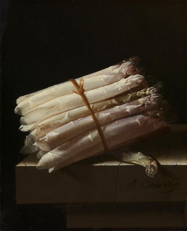
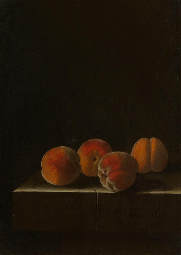
Adriaen Coorte
From top to bottom: Three Peaches on a Stone Ledge (ca. 1705), Gooseberries on a Table (1701), Still Life with Asparagus (1697), Four Apricots on a Stone Ledge (ca 1698)
“The very modesty of Coorte’s pictures has led them to be overlooked. His reputation has not been helped by the fact that no information has turned up about his career; his period of activity has been reconstructed from the dates on his pictures. All his surviving work is of still life, which is limited to the depiction of shells, gooseberries, red currants, medlars, peaches and asparagus. Occasionally and unexpectedly he paints a butterfly hovering over the isolated elements in his pictures. It is possible that these butterflies-usually of the prosaic Cabbage White variety may have some allegorical significance. Transience and the mutability of all things are the usual interpretations given to their presence. His works are always small and carefully painted. The Middleburg of his time was relatively isolated and his personal way of seeing cannot have been popular elsewhere. He has been forgotten for three centuries.”
-Christopher Wright, The Dutch Painters: 100 Seventeenth Century Masters,
Tags: arrangements, composition, darkness, dutch, fruit, history, painting, pantry-painting, still life, void
Posted in Uncategorized | Comments Off on Adriaen Coorte