Michael Dean

Installation-view_g1 HS9-MDN3994S HS9-MDN3990S HS9-MDN3987F_a

Michael Dean

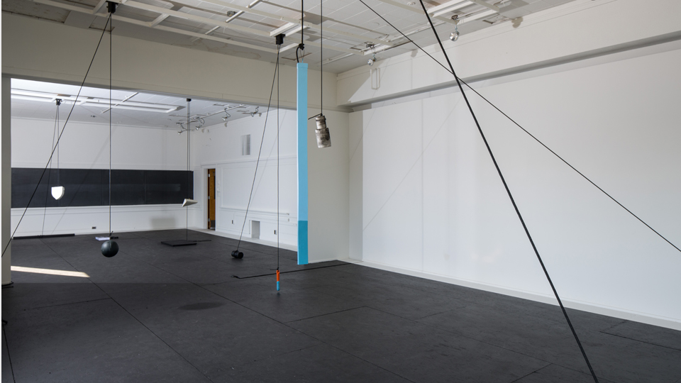
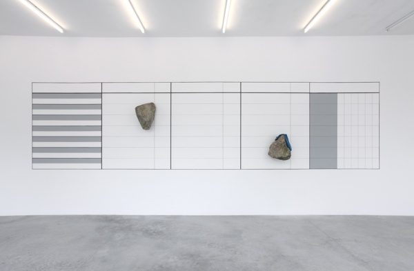
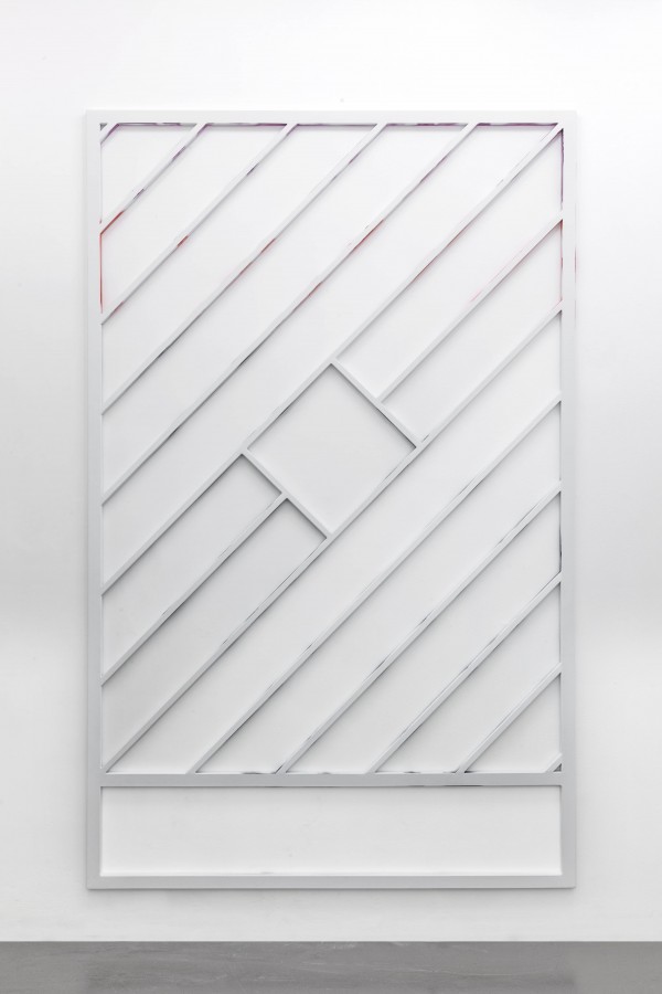
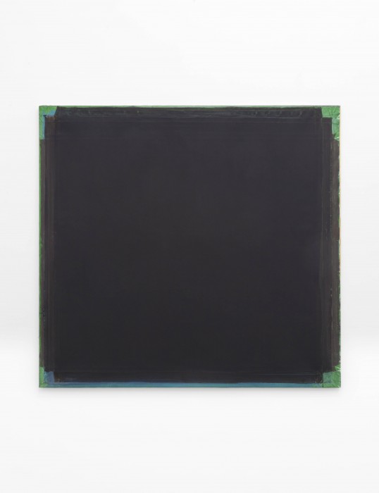
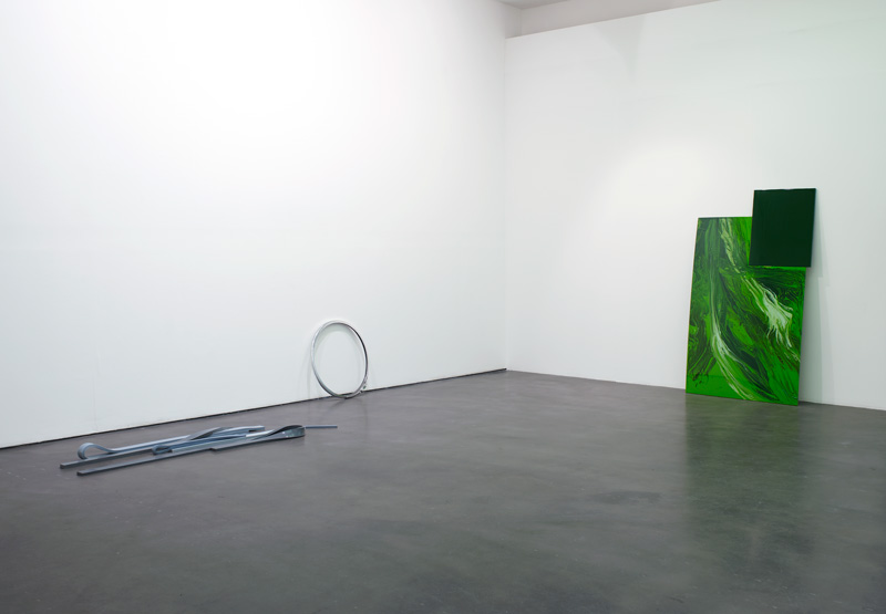
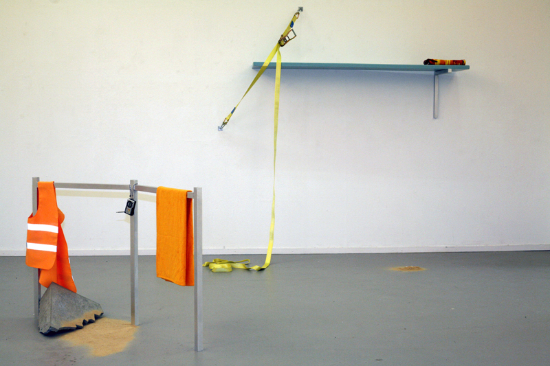
Work from his exhibition at Herald St, London.

“If you say “haha,” aloud, you are not, under any circumstances, laughing. In fact it is something like the opposite of a laugh, the onomatopoeia of a dead laugh. You are laughing at laughing, or at best describing it (‘funny haha’). That is why, in transcriptions of interviews for example, laughter often becomes instead a stage direction, a non-verbal cue in parentheses: “(laughs)… (laughter)…”

If you write “haha,” on the other hand – rather, for example, than “lol” – you are begging the question. You are choosing, deliberately, to inhabit the ambiguity of writing, its indecision between saying and doing, its fundamental indirection. It is, just, possible for “haha” on the page to be a sympathetic form of laughter rather than its mockery; but it is impossible that it evades the possibility of mockery – which is to say, the possibility of irony – entirely.

“The white of the word” – the space within and between individual letters – is, according to Gerrit Noordzij in his theory of writing, what makes any script legible. Comparing forms of writing by examining the “black of the letter,” he says, means attending only to the “superficial differences,” because the various ways that a letter can be composed – from a quill pen to a typewriter (to a concrete cast) – are so incommensurable. The only aspect which absolutely every form of writing, of every epoch, has in common, and by which they can be accurately compared, are the “manifest relationships” of spacing, the ways in which the page becomes a ground for the letter’s figure. Noordzij is alive to the peculiarities of the functioning of this spacing – for example, he notes that ‘n’ and ‘u’ are really the same letter, the same stroke, and their meaning is dependent on our orientation – but one thing he does not seem to consider is what happens behind letters.

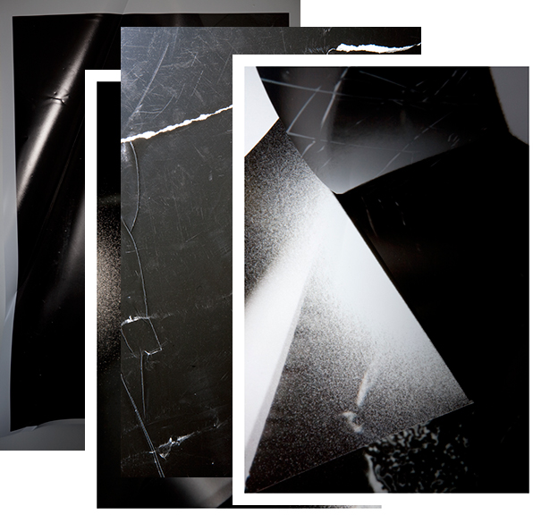
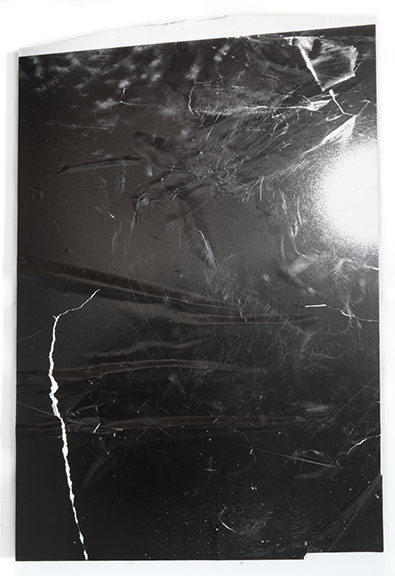
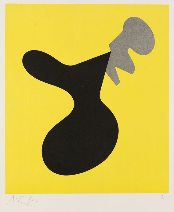
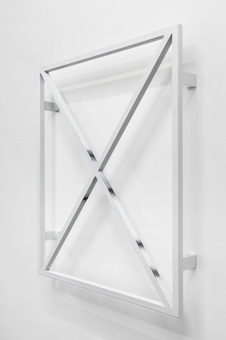
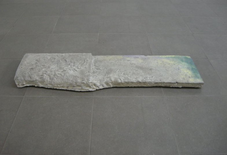
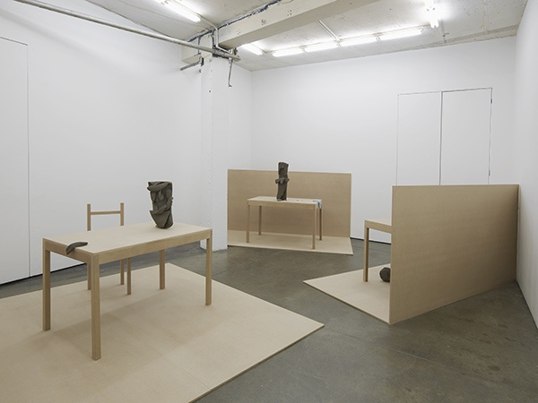
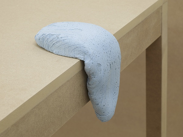
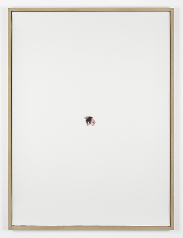
One way of approaching Michael Dean’s art is to think of it as a form of writing in which none of the relationships are manifest. The fact that his objects are, apparently, based on words composed from a typographic alphabet of his own design and which he has not shared seems to make of them something esoteric, as if we were pith-helmeted scholars confronted by the language of some ancient priestly caste. Nothing is self-evident: we can’t even be sure of distinguishing letter from spacing, so that we may begin to feel that the work resembles the ultimate private language, an illegible cryptogram. And in this show, when the reverse of Dean’s recalcitrant letter forms are inhabited by casts of lock mechanisms, we seem at risk of being doubly excluded.

What can it mean to cast a series of tumbler locks? Is this a mocking gesture, a “HAHA” (delivered in the style of Nelson from The Simpsons)? If we read the sculptures in this way then it would seem Dean is making an ironic gesture, revealing what lies ‘behind’ his letters as only the mechanism by which their secret remains locked away. Are these works, then, a carnival mirror of our desire to unpick them, a pantomime of their own reticence? There is no getting away from it: this is a collection of locks without keys. What more taunting form of secrecy could there be?

At the same time, these lock forms are outsize and exposed. These are not closed doors, or keyholes: they are naked mechanisms, diagrams after the fashion of a how-to book, enlarged for clarity. They are a promise, of sorts, a kind of open secret. And they are repeated, with variation, which perhaps becomes, after all… somewhat funny haha. Unlike many of Dean’s previous sculptures, the works in this show also stand away from the wall and turn their faces away from us. They even seem, on occasion, to blush. This reading would leave us with a new question: what does it mean to be embarrassed about being reticent, but to refuse to give it up and instead to insist on it, blushingly?” – Herald St, London

via Mousse Magazine

A.K. Burns

TP_2012


A.K. Burns

Work from “Touch Parade”.

“Burns brings intelligence and humor to her subjects. In a 2011 interview with Rhizome director Lauren Cornell, she asks pithy questions like, “Why are things, shaped the way they are, continually inserted in to our vaginal consumerist reality?” and asserts that “the personal is not only political, but sexual.”

The show combined six wall-hung mixed-medium sculptures (all works 2012) with as many floor sculptures; the two groups engaged in a subtle dialogue. The wall works feature found images (most of them from the New York Public Library Picture Collection) printed on roughly 14-by-11-inch pieces of canvas. Each was attached to the wall by a penny stuck partway into a groove that had been dug into the drywall surface.

The canvas hangs limply around the penny, forming unmistakably labial shapes that obscure some of the images; visitors were permitted to lift the folds for better viewing. In combination with the usual prohibition against touching art, it was all likely to make a viewer blush.

But not the imagery, which is (usually) pretty civilized. The punningly titled In Labor shows placard-bearing workers on strike. On Our Knees visually rhymes a photo of female workers kneeling in the dirt at an archeological dig and one of a woman in bondage gear on hands and knees, a pane of glass placed on her back to create a table. Extending the rough play is Figuratively, which, if you lift the canvas, reveals an image of a bondage chair designed to look like a woman’s legs.” – Art in America

Andrea Longacre-White

Stadium1 4_IMG_8113 bifua_6 ALWblackoutRip

Andrea Longacre-White

Work from her oeuvre.

Many of your works seem interested in the tension between analog and digital in the creation and reception of a work, like physical xerox scans of the screen of an iPad.  To what degree do you connect a piece to the technological platform on which it was made?

The Pad Scans are scans of an iPad. The iPad is confused by the light from the scanner that produces heat making it think it’s being touched. So the scans are capturing the iPad rolling over to another web page, making visible these digital or web in between spaces.

Error feels a sign of humanness. For me it’s important to insert that into an image or work dealing with mediation and technology. In this constant looping between the physical and digital worlds images are unstable in that they are left always open to reuse.

I also recently learned the term ‘retronym’, which feels a linguistic insight into my working process. (A paralleling of technological advances and in the face of them a return to the past to update/qualify/recontextualize.)

Your naming conventions vacillate between identifying their originating platform (iPhone Videos, Pad Scans) and describing their final form (Prints of Plays). In terms of these degrees of mediation from an initial image, how important to you is the ultimate format of the work versus its role in destabilizing that image’s objecthood?

Everything is important in different degrees at different times in different works in different ways. There is so much process, yet when pieces are ‘finished’ as in hanging on a gallery wall there is no separation between image and form or object and picture. Though this unification is so fleeting, as it lasts for the course of a show and only if you are standing in front of it. The reality is that’s not how the majority of viewers experience a work. So instantly there is another mediation through online jpegs of the show as install shots or as specific individual works. So then the reality becomes that maybe there is no ultimate format. No singular state of importance heirarchy.

A recent show at Foxy Production (NY) wrote that through the physical manipulation of photographic prints [by tearing, cutting and folding], “any trace of the original context evaporates.” Critic Sharon Mizata suggested, however, that similar works of yours retained traces of portraiture.  Would you place these works in the tradition of artists like Lucas Samaras who have used new media to consider or distort personal identity?

Neither of these statements are totally accurate. Though much becomes abstracted over the course of generations of shooting and reshooting, there is a vital tension between the recognizable and the unrecognizable, the obvious repeated shape of a pixel, a mouse’s arrow, a staple or paper tear. I was curious to read the comment of works retaining traces of portraiture as I never shoot people directly, though there are endless traces of fingerprints, marks, dents as remnants of presence.” – excerpt from an interview with Rhizome

Jean Arp

CRI_116473 arp-5 six-white-forms-and-one-gray-make-a-constellation-on-a-blue-ground-1953-jean-arp 3707_m_hasard

Jean Arp

Work from his oeuvre.

“In 1931, Arp was associated with the Paris-based group Abstraction-Création and the periodical Transition. Throughout the 1930s and until the end of his life, he continued to write and publish poetry and essays. In 1942, he fled Meudon for Zurich; he was to make Meudon his primary residence again in 1946. The artist visited New York in 1949 on the occasion of his solo show at Curt Valentin’s Buchholz Gallery. In 1950, he was invited to execute a relief for the Harvard Graduate Center in Cambridge, Massachusetts. In 1954, Arp received the Grand Prize for Sculpture at the Venice Biennale. A retrospective of his work was held at the Museum of Modern Art, New York, in 1958, followed by another at the Musée National d’Art Moderne, Paris, in 1962. Arp died June 7, 1966, in Basel.” – Guggenheim

Erika Vogt

TBA12_ErikaVogt_960 EV-green-music-small-660x990 Photo Credit: Barb Choit Photo Credit: Barb Choit

Erika Vogt

Work from her oeuvre.

“Vogt arranges groups of sculptures throughout the space, reiterating the vocabulary present in the videos and drawings. These sculptures invite tactile engagement, and derive their form both from found objects as well as invented ones. There are, for example, knobs, a jig, a window sash, wood scraps, a guide, and some musical instruments. The gestures implied by the handling of these objects—the turning of the knobs, the measuring with the jig—become important component of the works. TheGuide, for instance, a roughly 100 inches by 1 inch structure with handles on each end, is meant to be handled by two people.  One person “leads” the other, as they carve a line through The Engraved Plane.  Viewers are allowed to handle the sculptures when looking at the show.

Vogt conceived the works in The Engraved Plane in close relation to the groupingGrounds and Airs that will be featured in the first Los Angeles biennial, Made in LA, at the Hammer Museum from June 2, 2012 – September 2, 2012.”- Simone Subal Gallery

Gabriel Kuri

IMG_8652-copia1 IMG_8641-copia IMG_8875-copia2 IMG_8714-copia

Gabriel Kuri

Work from “punto y línea en el altiplano“.

“Galleria Franco Noero announce the opening of its new exhibition space in Turin, with “punto y línea en el altiplano,” an exhibition of new works by Gabriel Kuri. This is the third solo show of the Mexican artist for the gallery.

Shown in the former factory building converted to a design by Flavio Albanese, the series of works illustrates the ongoing development of Kuri’s most characteristic themes: an analysis of the nature of sculpture and of its potential in terms of form, together with the possibilities opened up by combining different elements, whether found or made, in a way that augments their intrinsic material and tactile qualities.

Beneath the large skylight in the central space of the Gallery, the notions of monumentalism, balance, weight and gravity are simultaneously expressed in a sculpture consisting of elements that interact with each other as mirror images: a skip for rubble is surprisingly tipped up at 45°, counteracting a thick sheet of steel gently curved into an L-shape and painted in a neutral colour. As the result of an industrial process, the metal contrasts withnature, in the form of two large stones thatanchor them to the ground,establishing a balance of composition and tension between horizontal and vertical.

The twists and turns of a segmented line of solid colour nearby wind through space, unfurling a continuous series of painted metal tubes joined together by curved linkages. In these “broken lines”, as Kuri calls them, the smooth, coaxing quality of the curves contrasts with the sharp, pointed starkness of the anti-pigeon spikes that cover them like a thorny mantle. Like drops of rain or an imaginary celestial constellation, copper-coloured coins are scattered on the floor beneath them.

Opposite the large strip windows on Via Mottalciata, a long unbroken wall defines a space that reveals other characteristic aspects of Kuri’s work. These are the parallels between the abstraction of economic systems and abstraction in art, the link between the immanence of everyday life and the horizon formed by universality, to the habits of social life and to human presence, and the desire for the work of art to come alive through them.

The entire wall is covered with hand-drawn coordinates from a calculation book, a system that is interrupted by two quarry-rough stones that mysteriously appear to lose their weight – a double phrasing like notes on a musical score. On one of the stones a sweater that seems abandoned quotes the physical presence through the absence in the form of the discarded clothing.

Further on a progression of metal trestles painted grey, designed by Kuri, become the sloping horizon on which a soft, undulating “tongue” of linoleum unfolds: blown-up microchips emerge on the surface, where natural stones are also resting. The irregularly wavy shapes of the linoleum recall a section of a landscape, the crest of a downward slope, but our attention is also shifted to the deviation in size of the microchips, which are at variance with what they are, thus becoming a succinct graphic sign.

Perpendicular to this is what Kuri calls an “alignment”. This is a neatly arranged series of different objects that are placed in an empathetic relationship, as though run through by a flow of energy and ideas. This plays on the concept of line, of breakage and juxtaposition, of heights, planes and volumes, making every object capable of presenting all its characteristics individually but also within a global “system”, endowing each one with the same level of aesthetic dignity.” – Galleria Franco Noero, Turin

Good Luck & Safe Journey

T293_FEMA_02-600x900 T293_GLSJ_06-800x533 T293_SAFA_02-2 T293_FEMA_01-1-466x700 T293_JURO_03-538x700

Sam Falls, Federico Maddalozzo, Julia Rommel

Work from “Good Luck & Safe Journey” at T293, Naples.

“The exhibition examines the procedures and repeated gestures used to structure works in a certain way and open them up to random luck and chance, be it natural or employed. In their final forms, the works by Sam Falls, Federico Maddalozzo and Julia Rommel present a record of the processes while outlining new directions in pictorial and sculptural abstraction. Control and supervision have to surrender to or only attempt to remedy the action of time, chance and nature, which will always be unpredictable and ungovernable.

In much of his work, Sam Falls investigates the capacity for representation involved in the processes of deterioration, such as the long-term effects of sunlight, rain and time on materials like paper, steel and cloth. Throughout the past few years he has been creating sculptures, paintings and photographs whose interest comes from the work’s potential in both its unfinished and finished state.

Julia Rommel will present a series of new paintings that provide evidence of the processes through which they pass. Surfaces coated with thick textured and multi-layers of paint on linen show signs of being cut, unstretched and restretched more than once. The resulting monochromes are indeed deeply intimate and emotional.

In ‘Refreshing chromophobia’, Federico Maddalozzo goes through an inverse process by which he reproduces urban structures – such as casings of windows and doors – and the action of clearing them from spray paint. The structures become fetishist objects that absorb and reflect the process showing the remains of colors and their visual impact.” – T293

Esther Kläs

7334807402_c302376b5a_b Screen Shot 2013-05-15 at 12.04.39 AM EstherK

Esther Kläs

Work from her oeuvre.

“Despite the idea of stillness often associated with sculpture, Kläs’ works contain the energy of movement while integrating joint body parts in monolithic structures counterbalanced and held up by frames and ephemeral supports. In “All In”, 2011 a varied and multiform set of figures dialogue together in the main space, as in a family picture of humankind, keeping a precarious and yet controlled equilibrium. Through the cast, the artist is able to frieze a movement at the highest point of tension and the sculptures keep echoing that vibrating instant, like adjectives with a spirit.

The direct impact and physicality of the sculptures challenge the viewer to read through the forms, discerning the movements and searching deeper in an effort to elaborate a reference.” – Peter Blum

Standard Escape Routes

Screen Shot 2013-05-14 at 12.07.41 AM 1ca28ae85ac1ad9f3bd2b9dd441dc304 Screen Shot 2013-05-14 at 12.08.50 AM Screen Shot 2013-05-14 at 12.09.02 AM

Jonathan Binet, Walker Evans, Aaron Garber-Maikovska, Guyton/Walker, Alex Hubbard, Ann Cathrin November Høibo, Adriana Lara, Klara Liden, Anders Nordby, Sigmar Polke, Chadwick Rantanen, Nick Relph, Hannah Ryggen, Torbjørn Rødland, Oscar Tuazon, Franz West

Work from Standard Escape Routes

Consequential damage (Law)

(a) Damage so remote as not to be actionable
(b) Damage which although remote is actionable.
(c) Actionable damage, but not following as an immediate result of an act.

Webster’s Revised Unabridged Dictionary, 1913

The exhibition will be inaugurating the gallery´s new exhibition space in Waldemar Thranes gate 86 B, which will be running parallel to a solo exhibition by Michaela Meise in the adjacent, current exhibition space of Waldemar Thranes gate 86 C. The preview will also see the launch of the publication Hegdehaugsveien 3, documenting the exhibitions that took place in the gallery´s initial exhibition space during the years 2005-2012 and including texts by Matias Faldbakken, Eivind Furnesvik and Knut Knutsen.”Standard (Oslo)

Magali Reus

BackgroundInstallationViewIbid200910 CoolCondition2008web Spill2009web ArtiInstallationView2008web

Magali Reus

Work from her oeuvre.

“Through the way the works are presented, by the appropriation of objects, and thanks to the use of colour, two identifiable thematic series thus gradually come to the fore: on the one hand, sporting imagery, with training sessions and gym equipment (rings, wall-bars and wallbrackets, and various training mats), and, on the other, the signs of mass exoticism. Thus described, it becomes increasingly obvious that she is proposing something akin to an abstract version of the visual leisure world, mainly sport and tourism, along with the many di!erent ways they are depicted by the media. So Magali Reus’s work does not seem to have the autonomy which it at first appears to lay claim to.

Heteronomy—being subject to something else—defines many abstract, conceptual and minimal works produced since the 1960s. So it is in relation to something external that certain abstract paintings may nowadays be described as realist.¹ These “found abstractions”² are to be found all around us, in reality; they have invaded everyday life. Minimalism, similarly, which, at the outset, saw itself stripped of all symbolic and structurally autonomous content, has become gradually loaded with many di!erent meanings. In particular, it started making reference to luxury furniture, and the graphic quality of the brands and logos of the large corporations of the 1960s.” – Jill Gasparina