Lee Ufan
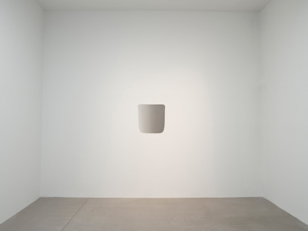
Work from his oeuvre.
“Marking Infinity presents the work of artist-philosopher Lee Ufan, charting his creation of a visual, conceptual, and theoretical terrain that has radically expanded the possibilities for painting and sculpture since the 1960s. Lee is acclaimed for an innovative body of work that revolves around the notion of encounter—seeing the bare existence of what is actually before us and focusing on “the world as it is.”
Lee was born in southern Korea in 1936 and witnessed the political convulsions that beset the Korean peninsula from the Japanese occupation to the Korean War, which left the country divided in 1953. He studied painting at the College of Fine Arts at Seoul National University and soon moved to Japan, where he earned a degree in philosophy. Over the last 40 years, he has lived and worked in Korea, Japan, and France, becoming a transnational artist in a postmodern world before those terms were current. “The dynamics of distance have made me what I am,” he remarks.
In the late 1960s, in an artistic environment emphasizing ideas of system, structure, and process, Lee emerged as the theoretical leader of Mono-ha (literally, “School of Things”), a Japanese movement that arose amid the collapse of colonial world orders, antiauthoritarian protests, and the rise of critiques of modernity. Lee’s sculptures, presenting dispersed arrangements of stones together with industrial materials like steel plates, rubber sheets, and glass panes, recast the object as a network of relations based on parity among the viewer, materials, and site. Lee was a pivotal figure in the Korean tansaekhwa (monochrome painting) school, which offered a fresh approach to minimalist abstraction by presenting repetitive gestural marks as bodily records of time’s perpetual passage. Deeply versed in modern philosophy and Asian metaphysics, Lee has coupled his artistic practice with a prodigious body of critical and philosophical writings, which provide the quotations that appear throughout this exhibition.
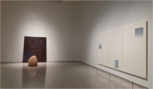
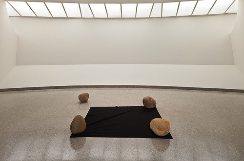
Marking Infinity is organized to reflect Lee’s method of working in iterative series and spans the 1960s to the present. Whether brush marks on canvas or stones placed just so on the ground, his markings in space elicit momentary, open-ended situations that engage the viewer viscerally. His distilled gestures, manifesting an extraordinary ethics of restraint, create an emptiness that is paradoxically generative and vivid. Relatum (formerly Phenomena and Perception A, 1969) presents three rocks laid on a latex band marked as a measuring tape. The weight of the rocks causes the band to stretch and buckle, disrupting the system of measurement it codes and reminding us of the capriciousness of rational truth: what you see is a result of where you stand.
Lee’s early painting series, From Point and From Line (1972–84) present a minimal, gestural act that induces in the viewer a lived experience of passing time and physical (rather than depicted) space. In these works, Lee combines ground mineral pigment with animal-skin glue, traditional to East Asian painting on silk. Restricting his palette to a single color on a white ground—cobalt blue or burnt orange, evoking sky or earth, respectively—Lee loads his brush with this powdery, crystalline emulsion and, in From Point, marks the canvas with regular dabs from left to right until there is no more color left. He then repeats this act until rows of gradually fading marks fill the entire canvas. The From Line series pursues a similar systematic approach, moving vertically with single gestural strokes. Lee uses the means of abstract minimalism—seriality, the grid, and monochrome—to alternative ends, emphasizing the gestural mark, the edge, and surface as physical affirmations of existence.
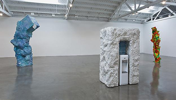
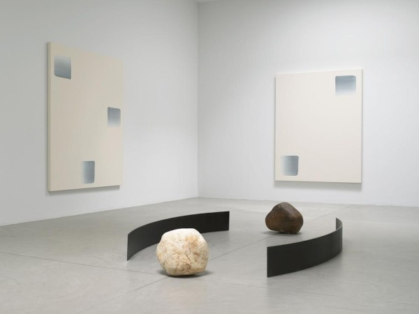
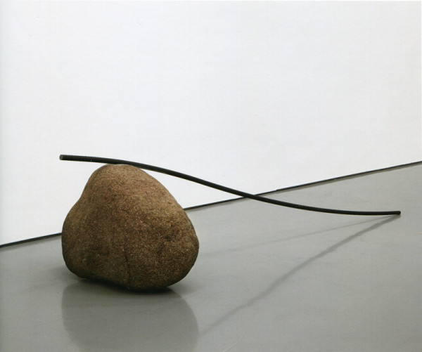
Since his early Mono-ha period, Lee has restricted his choice of sculptural materials to steel plates and stones, focusing on their precise conceptual and spatial juxtaposition. The steel plate—hard, heavy, solid—is made to build things in the modern world; the stone, in its natural as-is state, “belongs to an unknown world” beyond the self and outside modernity, evoking “the other” or “externality.”” – text via the Guggenheim.