Friday, 31 May 2013

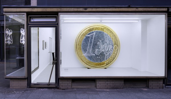
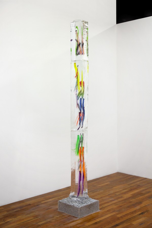
Nicolas Ceccaldi, Than Hussein Clark, Vernon Price, Ken Okiishi, Megan Francis Sullivan
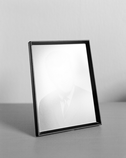
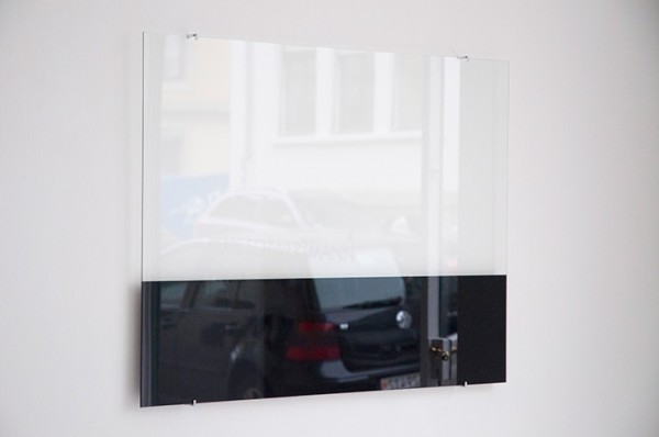
Work from “Love is Still Colder Than Capital” at Matthew, Berlin
“Love is colder than capital said René six years ago.
Love is colder than death said Rainer a few decades earlier.
And Kai sang in the last century: “Ich möchte mich so gerne versöhnen, mit allem, was es gibt. Möchte einmal alles sein und rühre so mit am Werke.”
I can feel quite well what Kai means, still to write a press release for Mathew is not possible from my position. And this in spite of all my admiration for Mathew.
Nicolas, Than, David, Nick, Clay, Megan, Vernon, Pete, and Ken, they are so wonderful that I could fall in love with each of them right away. Concerning the possibility of writing a press release for Mathew though, capital is whispering in my ears: NO.” – Yilmaz
via Contemporary Art Daily
Tags: 2d, berlin, europe, group show, sculpture
Posted in Uncategorized | Comments Off on Love is Still Colder Than Capital
Thursday, 30 May 2013


Robert Morris
Work from his oeuvre.
“Morris’s early sculpture tended to emphasize a banal repertoire of form and subject-matter, while attempting to investigate the role of language in artistic representation. Metered Bulb (1963; Jasper Johns priv. col., see 1971 exh. cat., p. 57), in which a working lightbulb is displayed with an electric company meter monotonously recording its energy expenditure, is typical of his early work’s use of unconventional expressive means. At the same time, however, Morris continued his involvement with performance art, for which he reunited with former collaborators Walter De Maria, Yvonne Rainer (b 1934) and La Monte Young (b1935), who had also moved to New York. Through an influential series of articles that began to appear, irregularly, in the New York art press c. 1966, Morris assumed a highly visible position in determining both the objectives and the tenor of Minimalism in America, then in its early stages. Yet, while his impersonal and often doctrinaire manifestos were received favourably by a large number of young artists, he himself was frequently regarded as provocative and even flamboyant. This apparent schism posed some difficulties for critics who found his enigmatic behaviour hard to reconcile with the comparative reserve of other leading sculptors drawn to the movement. It led a number of critics to associate Morris’s irreverence with the highly controversial activities of the Fluxus group, despite the fact that his first New York gallery exhibitions consisted of large conceptually inspired pieces, such as Untitled (0.7 m cubes of plexiglass mirror on wood, 1965; see 1971 exh. cat., p. 22), whose scale and geometric simplicity had much in common with Minimalism. Indeed, this type of sculpture maintained a privileged place within his output during the 1970s, although his practice increasingly moved beyond the constraints of conventional media.
For the next ten years Morris’s work was characterized by the use of ephemeral materials. He experimented with heavy felt, mirrors, textile waste products, steam and dirt in an effort to dematerialize the object, creating works that could be appreciated only briefly before they disappeared or were removed by the artist, for example Untitled (steam, 1968–9; see 1971 exh. cat., p. 122). The photographic documentation of these works was often the only material trace of these attempts to negate the very physicality of the artistic gesture.
In the light of this ambition, it is even more startling to consider Morris’s work of the 1980s, for example Untitled (1983; New York, Robert and Nancy Kaye priv. col., see 1986 exh. cat., p. 49), part of the Firestorm series. Morris returned to drawing and painting at this time, producing works of a heroic scale. Through an integration of sculpture and two- dimensional images, he evoked an apocalyptic vision of the modern world. Using ‘Hydrocal’ and welded steel to create dark framing elements that bear skulls and other body parts in their relief panels, he set into these frames canvases whose lush landscapes are evocations of the apocalypse or holocausts. In abandoning issues of the phenomenology of the work of art, which had so deeply and consistently affected the first 20 years of his activity, Morris may have ultimately adopted a bleaker vision of the questions that surrounded artistic practice towards the end of the 20th century.” – Derrick R. Cartwright, MoMA
Tags: 20th century, american, canon, sculpture
Posted in Uncategorized | Comments Off on Robert Morris
Wednesday, 29 May 2013
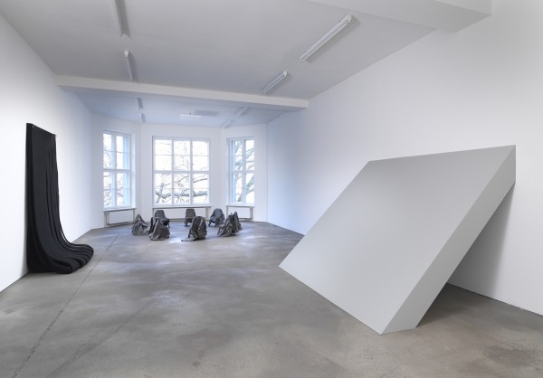
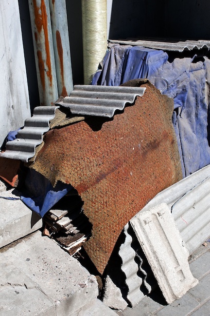
The Jogging
Work from “Soon” at Still House, New York.
“For most, the trip to the Still House is a lengthy one, poetically punctuated at the end of Brooklyn’s Van Brunt Street by a view of the Statue of Liberty standing in the Hudson River. Upon congratulating yourself for completing an hour-long MTA commute, one wonders how exponentially more relieved America’s immigrants were upon seeing that 19th century landmark after boating across an infinite expanse of water for weeks on end. Could our great-great-great-grandparents have imagined the industrialized country they’d build and the habits of consumption and production they’d pioneer would become so powerful, so globally ubiquitous that future residents would be returned to that same infinite aquatic expanse? We are potentially the first generation of people to begin making down payments on a hellacious environmental check that has long been deferred. Historically we owe the situation we are in to a false sense of permanence about our economies, lifestyles, and even our species itself. There is a pervasive sense of temporality in our present moment, though. We comment “you only live once” on videos of viral celebrities that disappear as quickly as they emerge, using cell phones that are obsolete within the year we purchase them. Through one lens, our digital lives are training us to care less about permanence, to focus our attention on the fleeting beauty of connectivity. But it’s hard to live in the moment, and the devices that could teach us how to do just that more often than not separate us from the reality we seek through them. There is a togetherness in the approaching catastrophe, one that threatens to level all political and religious difference as surely as it threatens to nullify the entirety of land space and the national distinctions that geography provides. It is perhaps more difficult to acknowledge the uniformity of the fate we march towards than the imminent catastrophe itself; to change is to admit defeat. Still today, when it rains, the waves crash freely into rocks feet away from Fairway Marketplace, tickling organic paninis on the unprotected patio eating area with a reminder the destruction they recently wrought. We imagine a time (perhaps now?) when Jogging will no longer need to labor over combining food items in irreverent ways to make sculptures, a time when the Atlantic Ocean will carry goods from Fairway up to the fourth floor, into the Still House, and create our work for us. Until then, we anticipate that impermanence in the art we create. Today’s lifeguards will be tomorrow’s installation photographers.” – The Jogging
Tags: consumer materials, new york, sculpture
Posted in Uncategorized | Comments Off on The Jogging
Tuesday, 28 May 2013


Chris Wiley
Work from his oeuvre.
“When looking at Chris Wiley’s photographs, two main things come to mind. One is you feel like you’re walking along at a particularly quite time of day in a suburban/urban area, noticing all the odd, mundane, but strangely beautiful detritus around the streets. Second is the Japanese concept of Wabi Sabi that heralds asymmetry, honesty, simplicity, economy, modesty, and many other humble characteristics of that sort. Exactly the kind of aesthetic that would allow one to appreciate odd strange things in the street. That’s what we see.” – Juxtapoz Magazine
Tags: building materials, construction, materials, photography
Posted in Uncategorized | Comments Off on Chris Wiley
Monday, 27 May 2013
Fleming Ove Bech
Work from his oeuvre.
“Danish photographer Flemming Ove Bech’s images are satisfyingly simple. Taking a straightforward, sculptural approach to image making, Bech’s work combines unremarkable everyday components in a playful manner. Shapes and tones are flattened by the photographic plane and rendered in an oscillating palate of delicately muted pastel hues, and stark, angular black and white images. The images are ambiguous and aloof, but always visually pleasing.
Likewise, Bech offers negligible contextual guidance along with his pictures (the series on his website have no descriptions and are titled only with numerals), leaving the viewer to consider his aesthetic combinations freely – a refreshing approach in a field often saturated with carefully constructed narratives and theory-driven artist statements. This approach is extended in Bech’s curating and publishing project Lodret Vandret, co-run with friend Johan Rosenmunthe – whose recent publications Pretty Young Things and Sonic Booms To Consider display a similarly open-ended approach to image curation; affording the reader a welcome opportunity to explore the work before them through the lens of their own personal experience.” – HotShoe Magazine
Tags: black and white, denmark, object based, photography
Posted in Uncategorized | Comments Off on Fleming Ove Bech
Sunday, 26 May 2013
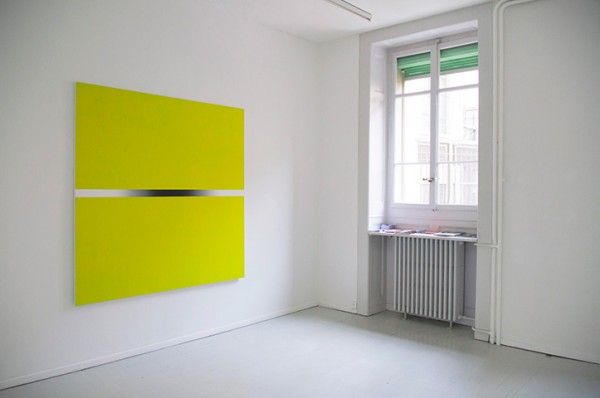
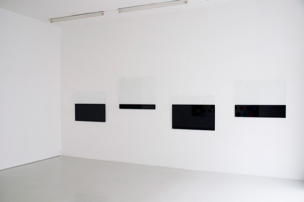
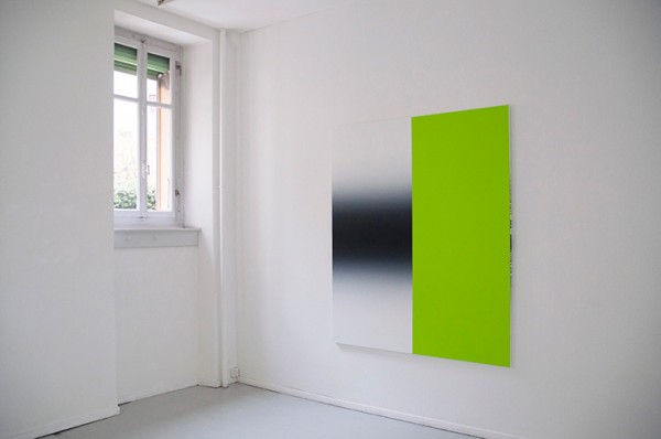
Pierre Schwerzmann
Work from “Two” at Skopia, Geneva.
“At first glance, then, the eye is attracted by the vibrations of the light well at the centre of the painting. The immediate effect of these vibrations is to prevent the gaze from settling and to incite the body itself to start moving in order to adjust. It is not a matter of the image as something that creates a distance […] but of a destabilising, repelling effect. The body/objectiveʼs attempt to adapt and grasp the image and thus fix it proves vain, and instability turns into a growing feeling of irritation. Do we end up seeing nothing at all? After all is said and done, does the picture have nothing more to offer than a splendid void? This willed irritation is already present in Schwerzmannʼs earlier works, but in this new series its radicalism goes beyond purely optical phenomena to insinuate itself into the body and then into the emotions — understood here in the etymological sense as that which moves out and agitates, and therefore makes us react. In this specific relational situation, these are like so many defence mechanisms before a moving image. It is as if there is a non-concordance between the perceiving subject and the perceived object, both temporally and spatially (or locally), taking the form not of an emptiness, but of an absence.” – Slash Paris
Tags: 2d, colorfield, minimal, switzerland, vibrant
Posted in Uncategorized | Comments Off on Pierre Schwerzmann
Saturday, 25 May 2013
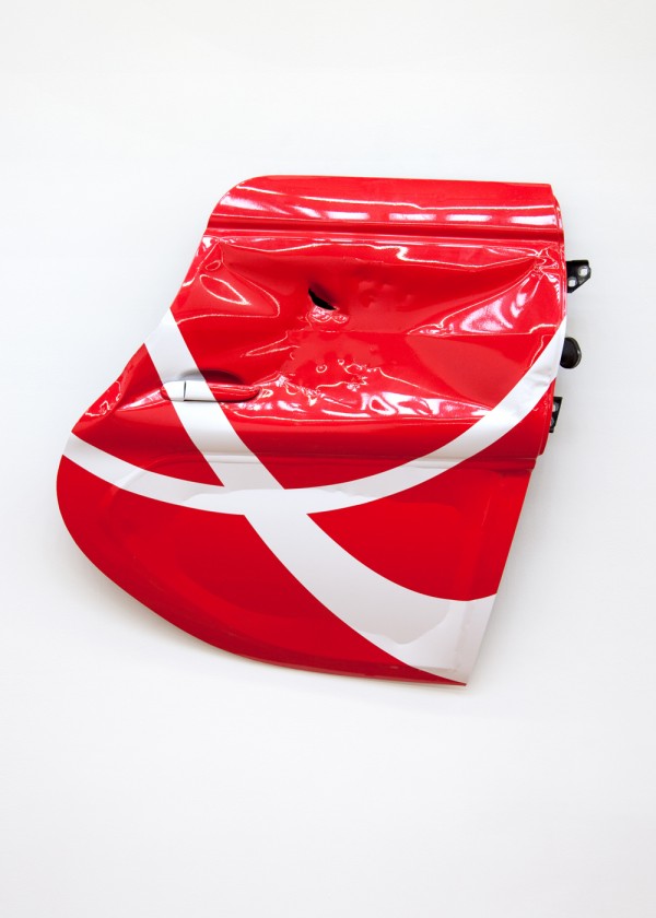
Eloise Hawser
Work from her oeuvre.
“The level of sophistication in security and anti-theft devices forms the image of a socio-economic bracket, and there exist disparities between these devices from inner city East to West. As such, a great number of metal roller doors exist along the high streets of London’s East End. At first glance, these metallic objects may appear to possess little intrinsic value, but their banality is a cover for a complex and intimate set of relations.
Intrigue to learn how roller doors are constructed reveal that each unit is composed of interlocking slats with scroll-like details that appear to be crafted and articulated by hand in an otherwise industrial process of production, lending them personal character that complicates their universality, and evokes physical and cultural intimacies between maker and object.
As to the qualities of their construction: roller doors generally exist as a boundary that divides the inside from what exists outside it, but when placed inside shops, as they sometimes are, they enclose the vague area of an interstitial space. This may be the Haus der Braut. Or the Haus der Braut may be the name of a shop far along a road in London’s East End. Either way, some have perforated surfaces that create odd, almost pointillist compositions of partially-visible products inside the shops they protect. These semi-transparent images possess a romantic quality that reveal and conceal in equal measure.
The relations suggested by roller doors, between industrial forms with handmade touches, and an economy form of protection, are the crux of several new works by Hawser that consider skins, industrial seduction and display, as well as legal and domestic terms of intimacy, physical constitutions, and the antiquated term ‘husband,’ in relation to sculpture.
The rosette helix that Hawser has isolated and extracted from the profile of roller door slats (Haus der Braut, 2012) is re-articulated in several works, including silkscreen prints and a textile created on an industrial loom.
In the transitional space of the gallery, this problematizes a more easy resolution of the ‘roles’ of objects in everyday relations—and considers the material composition of objects that are intended to be anodyne and ‘forgettable.‘” – Eloise Hawser, Haus der Braut
Tags: blue, industrial materials, london, sculpture
Posted in Uncategorized | Comments Off on Eloise Hawser
Friday, 24 May 2013


Morten Andenæs
Work from his oeuvre.
“Galleri Riis is pleased to present enclosed circuit, Morten Andenæs¹ second show with the gallery. It consists of 35 new photographic works from his ongoing project Regarding the Middle Class and can be viewed in opposition to his exhibition observance in 2011. Up til now, the works in this project have been marked by a consistent yet undetermined point of view. The reproductions of scenes from everyday life, people and objects have been sober and apparently neutral. The images have mirrored a gaze, an attitude and a stance which tries to domesticate the world without admitting to this motive. Thematically the project has dealt with the constraints, both in the sense of responsibilities and “liberties” imposed on the individual by the family and society, as well as the ensuing violent impulses such restrictions and straightjackets might cause. The viewer enters a seamless illusion of reality, analogous to the way the situation or thing was perceived originally. This sense of presence creates both a closed circuit and a kind of recognition; we see the image, and in turn we ourselves are seen.
Although the overarching theme is the same, the exhibition marks a shift in his project¹s direction. Rather than mirroring a specific gaze or stance, a main concern of this exhibition are those things which do not easily lend themselves to photographic representation – such as pain, sound, or the lack thereof. Referenced here is the role photography played in the late 19th and early 20th century with regards to classification, the creation and fixing of identity and the drive towards making the invisible visible. The latter becomes evident in an oversized image of a female subject undergoing a clinical trial about pain at the National Institute of Occupational Health.
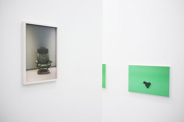
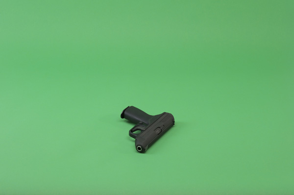
At the centre of this exhibition is an extract from a series of handguns against a chroma-green background, a “greenscreen”. Here, violence and fantasy are no longer just implicit as destructive potential or unfulfilled desire, but become an injunction and public spectacle. At the same time the systematic approach, especially visible in the serial works on display, point towards another kind of violence: In order to avoid the chaotic and potentially shattering ambivalence at the heart of language and images, things are forced into categories; not based on intrinsic properties but on the grounds of superficial markers. Nina, as a recurring title in differing works, becomes such an instance. Without any explicit connection between them, a short circuit may occur.” – Galleri Riis
Tags: chromakey, oslo, photography
Posted in Uncategorized | Comments Off on Morten Andenæs
Thursday, 23 May 2013
Adam McEwen
Work from his oeuvre.
“Adam McEwen wrote actual obituaries for The Daily Telegraph in London before he ever turned the genre into artwork, writing obituaries for still living and breathing celebrities like Kate Moss and Jeff Koons (he’s done nine in total and has three more on the way). Seeing news in an art gallery of someone dead who is still so obviously alive is like creating a black hole on the wall-which seems to be an effect that McEwen, age 43, now living and working in New York, is particularly good at making. His monochromatic paintings with blobs of dirty, chewed gum stuck on the canvases (some named after German cities bombed in World War II) work like meditation pieces on expectations.” – Interview Magazine
Tags: black and white, gagosian, new york, newspaper, pop-culture
Posted in Uncategorized | Comments Off on Adam McEwen
Wednesday, 22 May 2013

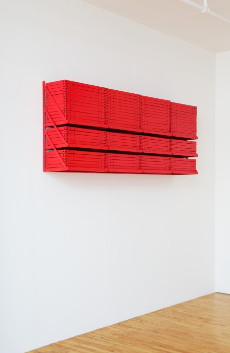
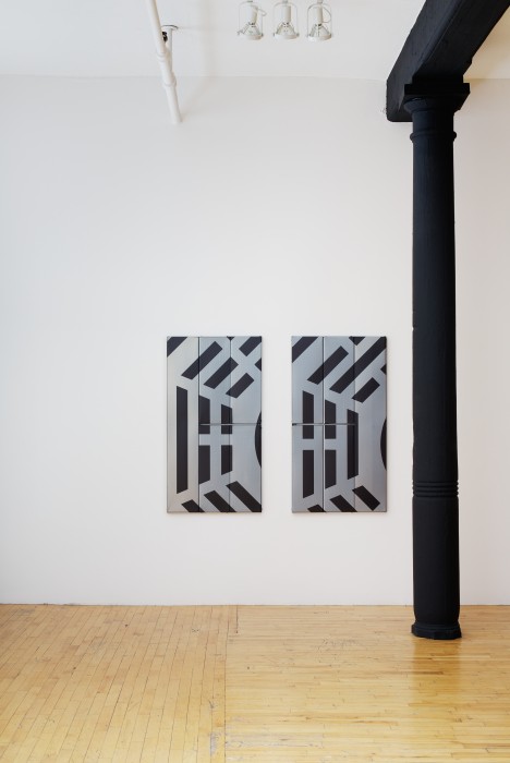
Zak Kitnick
Work from his exhibition at Clifton Benevento, New York
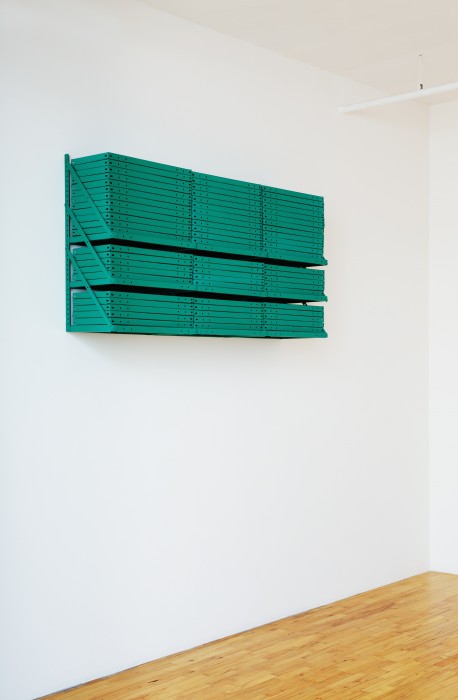
“Once he started using store-bought industrial shelving to create highly ordered Neo-Minimalist sculptures, Zak Kitnick came into his own as an artist. In his latest show, he takes these materials and his compulsion to organize to ingenious new levels, by basing his works on the bagua color chart used in feng shui.
According to the bagua, deploying certain colors along various points of the compass ensures good fortune for a building’s occupants. A group of reliefs here—units of stacked metal shelves, each painted a different hue—are hung accordingly, with a white piece installed on the east side of the gallery, a black one on the south, a green one on the west and a red one on the north. Several vertically oriented panels made of industrial shelves that have been laid flat on the wall are placed lower down. Each of these objects is powder-coated in gray, and printed with black lines representing the eight divisions of the bagua known as trigrams.
This is all revealed in a gallery handout, but the titles of the works explain everything—and judging from them, feng shui devotees are very career-oriented. One work is called Self, Career, Work, Change, Job, Switch Career Fields, Meet New Work Goals, Water, Blue, Black; another, Fame, Future, Reputation, Increase Recognition, Establish Reputation, Become Well Known, Fire, Red, Orange.
Kitnick’s efforts are striking, both as individual pieces and as a coherent, resonating whole. And like sushi or a set of dishes, the wall sculptures are available à la carte in each bagua color.” – Nana Asfour
Tags: colors, minimalist, new york, sculpture, shelving, structure
Posted in Uncategorized | Comments Off on Zak Kitnick