

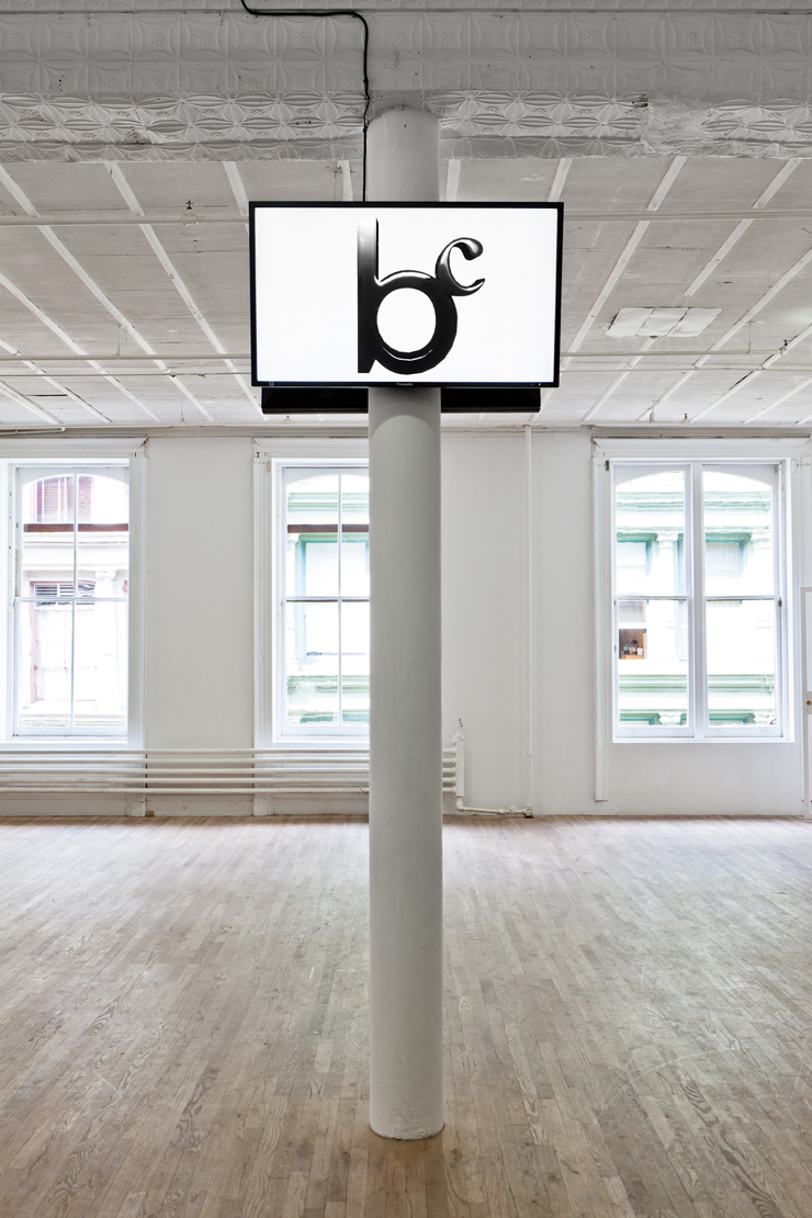
Bernadette Corporation
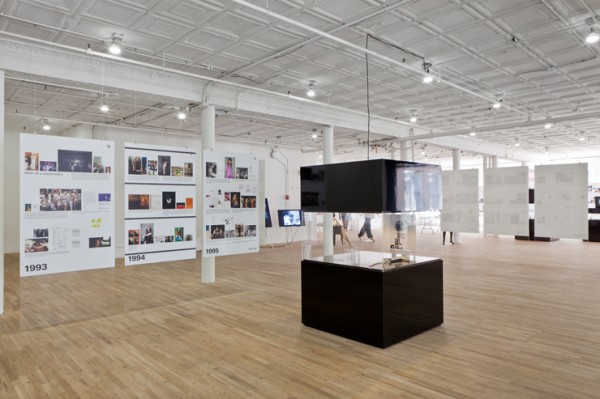
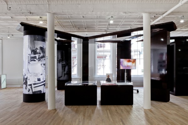
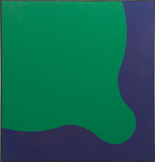
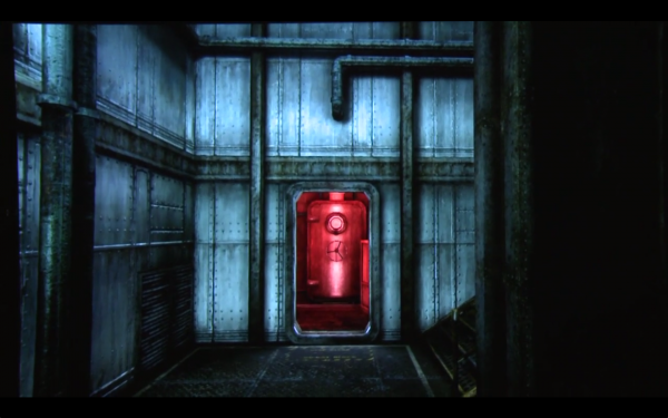
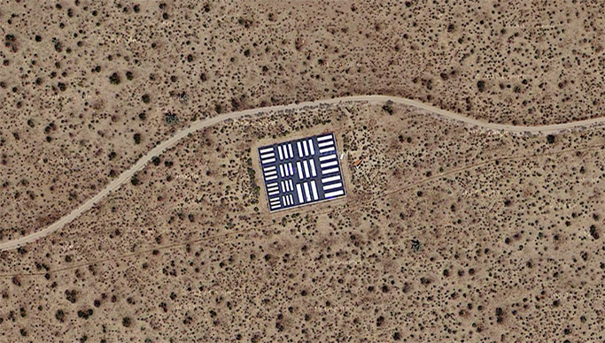
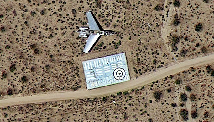
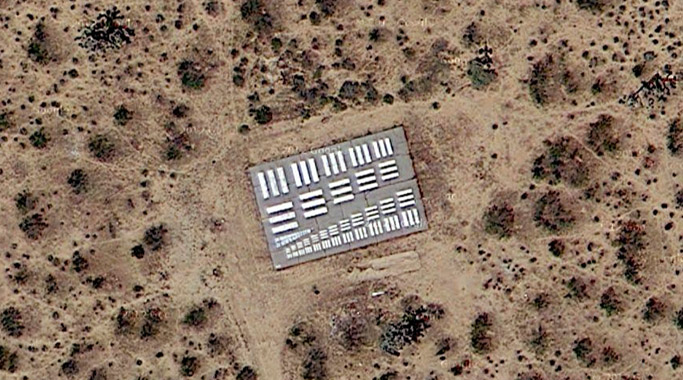
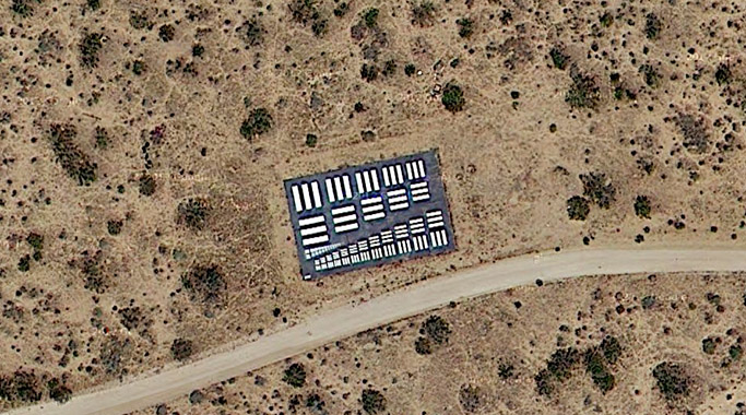
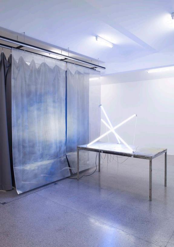
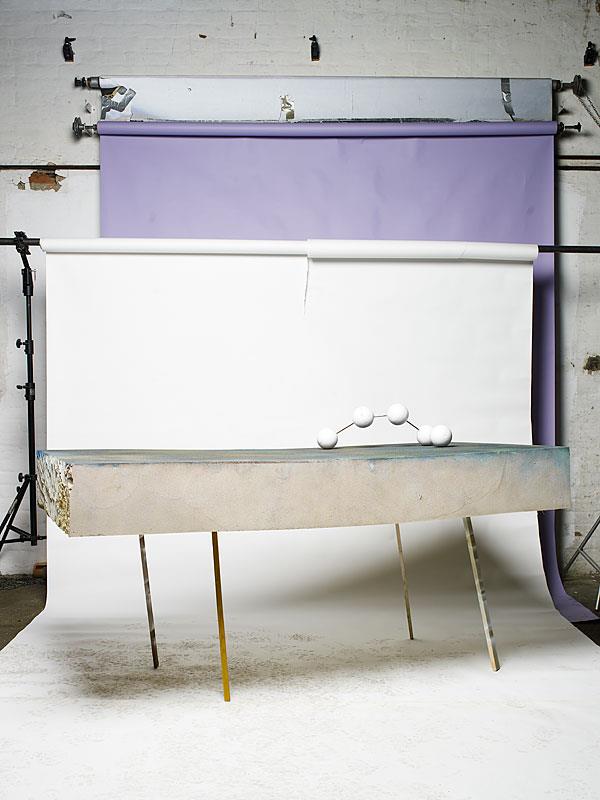
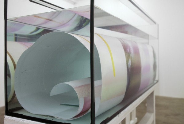
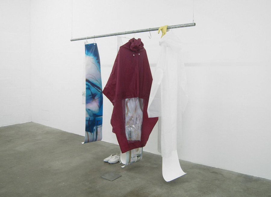
Work from 2000 Wasted Years at Artists Space, New York.
“2000 Wasted Years is the first retrospective by Bernadette Corporation. The exhibition recasts the works authored by the group since their inception in the early ‘90s.
The origins of Bernadette Corporation lie in the organization of parties in downtown New York, their mock incorporation and ambiguous branding strategies suggesting a slipperiness of intent that developed between 1995 and 1997 into a women’s fashion line. In keeping with the original premise that a corporation was “the perfect way to alienate alternative politically-correct types,” the image grammar of BC’s clothing and styling focused on the mass-produced sportswear styles of ethnic minorities ghettoized in the urban territories. At a time when the fashion industry was confronted with a DIY rebelliousness, BC took its cues from the political-literary wing of the historical avant-garde. They engaged in quotation, concepts, fictions, appropriation, provocation, hoaxes, and anti-artistic postures of crass commercialism.
Between 1999 and 2001 Bernadette Corporation turned to publishing, releasing three issues of the magazine Made in USA. In the same way that the poet Stéphane Mallarmé oddly inhabited the contemporary fashion journal of the 19th century with his self-published La Dernière Mode, BC spread itself across the pages of a magazine in a polyvalent mode, with funny mute images and writing that went from poetic sincerity to buffoonery to references to French theory and a fetish for cinema critique.
Since the early days of Bernadette Corporation there was always the desire to make films, and the group began to use the context of contemporary art for production assistance and screening opportunities, culminating in one of BC’s most widely seen videos: Get Rid of Yourself (2003). The film revolves around the rioting in Genoa during the 2001 G8 summit and the militant-intellectual mood of radical Black Bloc anarchists, in opposition to peacenik anti-globalization protest organizations and the police. The video opted for seductive contagion by circulating modes of protest along with scripted passages featuring downtown actress and fashion icon Chloë Sevigny.
Within Get Rid of Yourself there runs a thread of anonymity and opacity, the rejection of normative social forms and appellations, such as being an artist, or a political activist. This “whatever” subjectivity reached its apogee with the 2004 Bernadette Corporation novel Reena Spaulings, in which the blurring, gaps, and self-unworkings were distributed in practice and product by fusing up to 50 unnamed authors’ subjectivities and linguistic styles. The narrative is imbued with an attention-deficit driven taste for chaos centered on the eponymous character – a twenty-something museum guard turned model/muse in her post-9/11 New York life. As a “novelization” of this period, the book glorifies a version of the 21st century metropolis that appeared and disappeared in the time it took to clear away the ruins of the Twin Towers.
Till that point Bernadette Corporation had little desire towards putting objects in galleries, but it was with the failure of BC’s Pedestrian Cinema project in 2006 – a proposed underground film factory in Berlin – that a proper exhibition practice commenced. BC discovered that cinema was dead, and then went about trying to hide the corpse through a rush of promotional flyers, screenplays, hours of DV footage, tweaked after-effect filters, t-shirts, and film stills that made their way into galleries in lieu of actually showing films to an audience.
This fascination with the deceptive flexibility of the gallery space continued with the reunion of Bernadette Corporation in New York in 2008. The Complete Poem, with its repurposed collective writing and auxiliary support by photos of lithe models in jeans, was tailored for the rigors of poetic form at Greene Naftali Gallery. A Haven for the Soul at Galerie Neu in Berlin concentrated its conceptual play on information flows, leaks, and PR disasters, while Stone Soup at Galerie Meyer Kainer distilled the communicative capacity of images to a murmur, with its straight-faced promotional campaign of nudity, jewelry and potatoes.
These exhibitions demonstrate the lyrically and conceptually complex relay of the quotidian that continues to engage the collective today and resonates throughout their Artists Space retrospective, all the while underscored by the “reality” of BC both as a group of relationships, and as brand.” – Bernadette Corporation/Artists Space


