Sunday, 28 August 2011


Shirana Shahbazi
Work from her oeuvre.
“How real or abstract is photography? Shirana Shabazi’s work has circled around this theme for over ten years. Often she arranges her images in startling combinations. For instance, abstract color gradations are placed alongside a double portrait, followed by a black and white steppe-like landscape, then a still life with berries and fruits, and finally two carpets, stitched together from photographs of a young man and a sun-soaked landscape. This sequence demonstrates how much she repeatedly wrestles with the question of representation in photography, and how she plays with it in front of vividly colored, monochromatic backgrounds.
More recently the play and wrestling with representational traps of photography have given way to an obvious delight in the visually abstract image. An unrestrained construction of colored surfaces emerges, producing a fascinating as well as confusing game between surface and depth. Freely but precisely arranged color planed, constructed in the studio by combining geometric expanses of color, are placed alongside images of rocks, mountains, and landscapes. Structural similarities between outside and inside, between observed landscape and constructed landscape are arranged in a relationship to one another. Everything is construction, everything is abstract: both the documentary and the still life; the unrestrained forms open up new pictorial and conceptual spaces.” – Fotomuseum Winterhur
via Mrs. Deane
Tags: abstract, color, iran, meta, process, superdutch
Posted in Uncategorized | Comments Off on Shirana Shahbazi
Saturday, 27 August 2011


J. Parker Valentine
Work from her oeuvre.
“‘Could a photograph be something that you have scanned; is that a type of photograph?’ J. Parker Valentine posed this question to me upon my invitation to contribute to this project, and I realized the complexities of answering yes or no. I once taught an experimental drawing class to high school students, and told them that anything really could be a drawing except a photograph. This distinction was so clear to me before, and now as I said in my introduction, I believe these photographs are fragments, drawings, sketches, or evidence. Valentine’s practice embodies these ideas of traces, fragmentation, and how an object or work could be a constellation of inspiration more than a singular idea. Objects lean or curl in Valentine’s arrangements, and the paper becomes as much of a three-dimensional object as the support structure it happens to be placed on. Valentine’s surfaces are filled with abstract and organic graphite marks where the ghosts of heads or profiles always turn up in her drawn surfaces. However, in the photographs here she is able to use the properties of light, as an abstract mark-making tool in the same way the black charcoal would be in one of her drawn surfaces. But for Valentine, it is not just the gestural and abstract marks that are significant, it is also the connection between the sign and the signified, an interaction that photography and the photograph know all too well. The image can both represent an individual thing as well as be a symbol for the idea of the thing, an ambiguous relationship that creates this paradoxical bond between the photograph and the object.” – i heart photograph
Tags: inquiry, meta-photography, photography, semiotics, sign, signified
Posted in Uncategorized | Comments Off on J. Parker Valentine
Friday, 26 August 2011


Sam Falls
Work from Color Dying Light.
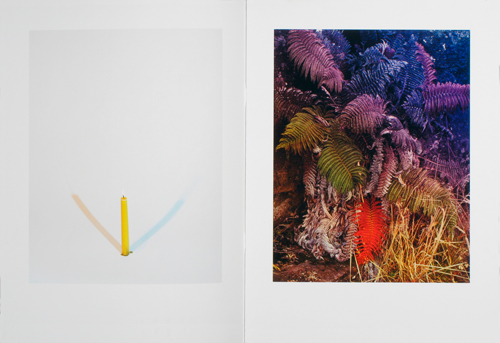
“‘When I was asking for help titling the book friends would ask ‘well, what’s it about?’ and I’d say, ‘It’s about color, it’s about dying, and it’s about light’. So that’s it, Color Dying Light. There are pictures where I added and subtracted color from flowers, one where I inverted images and re-photographed them so the negatives were positive (because I wanted to cast a positive light on the death of admired artists), as well as recorded reflections of projections of light in my studio'” – Sam Falls
Tags: artists book, book, color, meta, photo
Posted in Uncategorized | Comments Off on Sam Falls
Thursday, 25 August 2011


Asger Carlsen
Work from Wrong.
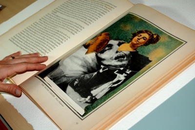
“There’s something about a good sci-fi movie that really sticks in your head — especially if you see it during your formative years. I saw Paul Verhoeven’s Total Recall in the theaters, so I must have been about 15 at the time. There were certain visuals in that film, ie. the three-boobed prostitute, that I can imagine at will all these years later. It just seemed so real, as far as futuristic visions go. Sometimes, an artist just gets it right on a conscious and subconscious level. And having spent some time with Wrong, by Asger Carlsen, I’m willing to ascribe such imaginative success in this case. It’s a terrific book on multiple levels, and I’m glad I get to keep this copy.
Carlsen has taken the “of his time” wizardry of Jerry Uelsmann and brought it into the digi-verse, black and white and kooky as ever. I know it’s not crazy original to make the comparison, as everyone who creates bizarre, surreal composites must resent the immediacy of the thought. But as a child of the computer age, I’ve never been able to grasp the sense of wonder people must have had when they first saw a good version of Uelsmann’s work. That “I know it’s not real, but it looks like it” feeling is hard to come by these days.
But Carlsen has nailed it. This book contains a series of black and white images of somewhat-normal looking scenes that have insane sub-themes grafted on, masterfully. Wooden leg frames, double faces, faces replicated on the back of heads, flesh mounds, bug eyes, there are a handful of tropes that Carlsen brings back again and again, each time with pleasure.
I’ve always thought, and occasionally written, that black and white photography has tremendous potential to manipulate temporal expectations in viewers. And here, it’s just the perfect choice. The series of images reads like a quasi-almost normal series of pictures from 2150, once genetic engineering has had some time to settle in. They look like historical photographs of a history not yet lived. Genius. (Especially as the book’s post-script reads “Based on a true story.”)
I suppose some might find these images creepy or disturbing. I’d understand if they did, but I practically giggled. They’re funny in an absurd way, and yet the craftsmanship leaves not doubt as to the artist’s seriousness. Just a great piece of work. Well worth the investment.” —Jonathan Blaustein
Tags: body issues, danish, documentary, fake, freak, manipulation, photoshop
Posted in Uncategorized | Comments Off on Asger Carlsen
Wednesday, 24 August 2011

Sterling Crispin
Work from his oeuvre
“I am interested in the turbulent event horizon between consciousness and objective reality, and the ways in which subjectivities can be manipulated through ritual, mindfulness and magic systems. my current area of interest lies in the relationship between these issues and our exponentially accelerating networked global culture that will result in a technological singularity; a theoretical event in the future when machine intelligence surpasses humanity and births the posthuman era.
a reoccurring influence in my work is the buddhist concept of sunyata. emptiness. the void. sunyata is the infinite and absolute, all things coexisting in one fluid field , an infinite expanse empty of independent entities and forces. sunyata has been called “the great void” , “zero” , “emptiness” and “the ultimate truth”.
one way to understand sunyata is to try to understand written and spoken explanation of it. the other way to understand sunyata is through observation. sunyata is somewhat intangible and an indefinable concept.
this is because there is no worldly knowledge, be it general studies, science or philosophy, that can lead to the attainment of the state of sunyata. the only path to its realization is via an passionate and discriminating mind. It is beyond the common worldly understanding.
with that being said, this brief definition from wikipedia does a good job at outlining the surface level concept
sunyata signifies that everything one encounters in life is empty of absolute identity, permanence, or an in-dwelling ‘self’. this is because everything is inter-related and mutually dependent – never wholly self-sufficient or independent. all things are in a state of constant flux where energy and information are forever flowing throughout the natural world giving rise to and themselves undergoing major transformations with the passage of time.” – Sterling Crispin
Tags: consciousness, objective reality, posthuman, sunyata
Posted in Uncategorized | Comments Off on Sterling Crispin
Tuesday, 23 August 2011


Santiago Calatrava and Frank Stella
Work from The Michael Kohlhaas Curtain @ The Neue Nationalgalerie with text by Nicholas O’Brien.
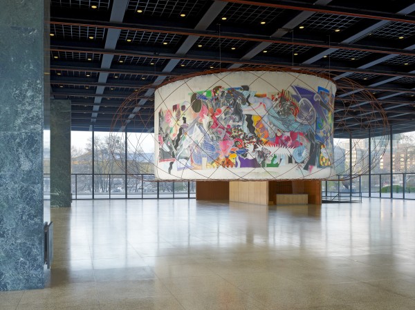
“Upon approaching the renown last building by Mies van der Rohe, a distinct glass pavilion supported by the German architect’s signature grid of steel beams, one immediately is captivated by the massive caged painting that hangs roughly seven feet from the floor. The structure, a collaboration between Santiago Calatrava and Frank Stella, is at once imposing and sublime. The neon colors of the 98 foot mural immediately jump out and clash against the surrounding stoic tones, while the gridded donut enclosure acts as an update the stagnant flat grid of Late Modern architecture. The collaboration between these two acclaimed figures manifests as an attempt to create a visual narrative within the space that traces a route from the Modern to the Contemporary. The Curtain certainly takes cues from early 20th century murals, but instead of opting for a figurative approach, this collaboration tells an abundantly abstract story of the reciprocating influence that painting and architecture have had upon one another, as well as point toward a vivid future where both disciplines can merge into one grand gesture.
Although Stella’s work appears flat from a distance, closer examination of the structure reveals a vibrating surface that contains multiple layers and shapes that could be mistaken for onomatopoeia bubbles found in comic books or default software paint brushes – a gesture that speaks as much to PaintFX as it does to the legacy of Roy Liechtenstein. Amidst all of the organic forms, and their inorganic color schemes, glimpses of a comment on the bravado of architecture peak out intermittently. Warped gridded lines move along the mural in strokes that begin to resemble columns. The shapes that undulate beneath the top surface reference mechanical floor plan drawings, or else borrow from a palette familiar to anyone who has worked with a CAD process. But as quickly as these nods appear to the viewer, they recede just as rapidly behind gradients pulled from the look of an 80s air-brushed billboard.
As one walks around Calatrava’s encasing web, one begins to see how his contribution acts as a counter swing in the pendulum that is this monumental work. The visual simplicity – but technical complexity – of the apparatus that holds together Stella’s mural exemplifies the desire that Yoshio Taniguchi stipulates for contemporary architecture to not just envelope, but to eventually “disappear.” The criss-crossing array certainly adds a sculptural component to the Curtain, but it also serves a purpose akin to the bridges that gave Calatrava his name. The frame in this collaboration creates a similar surface/space in which to transport and traffic mobility, but instead of cars being the primary vehicle of movement, Calatrava instead directs our eyes. The uniformity of his ornamentation creates a even distribution of attention along the chaotic scramble of Stella’s scribbles and loops.
The impact of the Curtain is undeniable, given its presence in the space, its resonating colors, its complex construction and installation, its ambition, and its balance between the baroque and the minimal. The collaboration between Calatrava and Stella is perhaps most successful due to the surprising reflexivity that emerges from the work as one navigates its density and observes the elegant meditative spaces resting between surface and structure.” – Nicholas O’Brien
Tags: berlin, digital referencemuseum, germany, installation, nicholas o'brien
Posted in Uncategorized | Comments Off on Santiago Calatrava and Frank Stella
Monday, 22 August 2011


Walid Raad / The Atlas Group
Work from The Sweet talk File.
“The Atlas Group is a fictional collective, the work of which is produced by Walid Raad. His works to date include video, photography and literary essays. All, in one way or another, deal with the contemporary history of Lebanon with particular emphasis on the wars in Lebanon between 1975 to 1991. The work is also often concerned with the representation of traumatic events of collective historical dimensions; and the ways film, video, and photography function as documents of physical and psychological violence.[1] He is also a member of the Arab Image Foundation.” – Wikipedia
Tags: archive, fact, fiction, huxter, performance, photography, truth
Posted in Uncategorized | Comments Off on Walid Raad
Sunday, 21 August 2011


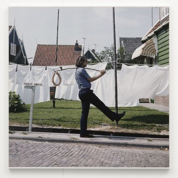
Ger Van Elk
Work from The Co-Founder of the Work O.K.
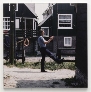
“Ger van Elk, an artist whose fascination with man’s role in modern landscape once led him to travel a canal via a small rubber dinghy and, later, navigate the Atlantic, has contributed a series of three color photographs, collectively titled The Co-Founder of the Word O.K.-Hollywood (1971). Each image has that vintage, William-Eggleston-worthy orange-heavy coloring, and each shows van Elk posed in profile to the right of a framed bubble letter “O.” He has propped up against a pole, column or building facade, and raised his own arm and leg to turn his body into the letter “K”–so he is “O.K.” on a residential street, outside a convenience store and a block from the Hollywood Colonial. Though cars line the streets and colorful signs interrupt the skyline, few other bodies appear in the shots. It’s as if van Elk is a pioneering tourist in a man-made but barely occupied amusement park.” – via The Daily Serving.
Tags: conceptual, dutch, ok, photography
Posted in Uncategorized | Comments Off on Ger Van Elk
Saturday, 20 August 2011


Steve Bishop
Work from “The Myth of Fingerprints“.
Steve Bishop‘s preferred working materials are found, ready-made objects and substances which already carry specific or unalterable characteristics, such as the mouthwash “Cool Mint” by the brand Listerine. Its luminous azure blue lends the appearance of a monochrome painting to his work “Φ”. However, in its immediate presence, the entire space is filled with the acrid and unavoidable smell of the mouthwash, countering the appearance of a painting with the realisation of what it is in the first place, namely mouthwash.
The work “Difference Between Mating Parts” also emphasises, by repositioning and de-contextualising, the idiosyncratic nature of its objects: two stool frames – machine-made things which should, theoretically, match each other perfectly – are synthesised into a new form. Their mutual confrontation is clearly intended by the artist to render visible the fact that they are, after all, not identical.
The title of the ongoing series “My Work Here is Done” formulates Bishop‘s approach in a kind of self-assessment that is amounting to an artistic programme. Thus the works have the last word when Bishop accommodates effects that emerge out of the works themselves and are not of his making: in the early textile works of the series, consisting of distorted tights stretched over objects, Bishop plays on the tension created by references to the human body. By contrast, the more recent works of the series address the dynamics of optical phenomena arising from materials such as glass and colour filter foil on account of their properties of transparency and reflection.” Galerie koal
Tags: clean, color, german, listerine, modern, sculpture
Posted in Uncategorized | Comments Off on Steve Bishop
Friday, 19 August 2011


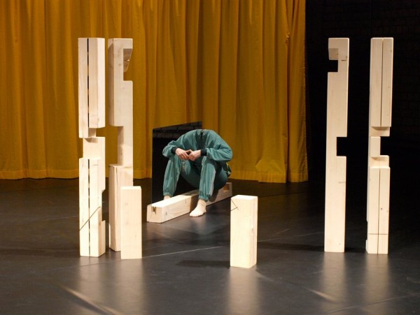
Elín Hansdóttir
Work from On Misunderstanding.
“When understanding collapses, confusion follows, and in the mess new discoveries can be made. On Misunderstanding looks into the nature of misunderstandings, into how communication can break down, into behavioral malfunctions, into illusions, distortions and parallel realities. Is it all a question of perspective? A bad translation? Or is reality the most basic misunderstanding of all?” – Elín Hansdóttir
Tags: dance, illusion, optics, performance
Posted in Uncategorized | Comments Off on Elín Hansdóttir


