Heimo Zobernig


Heimo Zobernig

Work form his oeuvre.

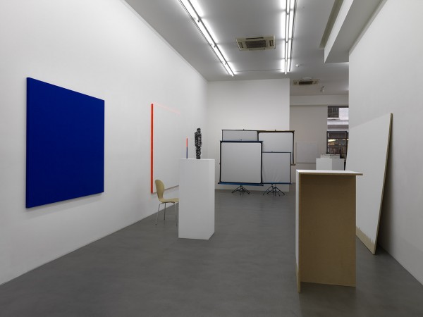
“Zobernig’s main interest often seems to be attempting to find out what the bare minimum requirements for a work of art or art space might be. His installation O. T. (Untitled, 1999-2000), for example, is a press conference, podium discussion and video presentation space with rows of white designer chairs, a long Last Supper-type table and audio-visual hardware between two floating panels in black and white. Three monitors showed some of his rather bland low-tech videos. The room is something of a reprise of similar earlier works, including his conference room design for Documenta 10, with Franz West chairs. But it could conceivably be customized for the reception or promulgation of international art in any institution anywhere. Sitting in the room is like being at an absurd discussion that has no participants or invited guests but is taking place anyway.

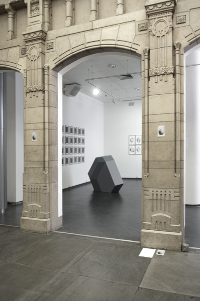
Zobernig’s most dramatic commentary on architecture for art was in the cavernous gap that divides the interior of the new museum into two lopsided grey basalt-clad lobes. Here he installed his White Cube (2002), a permanent intervention that acts a passage or connection between the exhibition rooms on one of its levels. It is a kind of gesture equivalent to a reverse lobotomy. Like Blinky Palermo’s site-specific paintings in art institutions, it is easy to miss if you haven’t been in the place before, although in a typical piece of showmanship Zobernig organized a spotlight projection of his name and the work’s title. Also on show were displaced reconstructions of similar works, such as Kunstmesse Chicago, 1990, Stand Galerie Peter Pakesch (Chicago Art Fair, Peter Pakesch Stand, 1990), (1990) a gallery booth for the Chicago art fair, and a chipboard reception area and a doorway for the Neue Galerie, Graz – O. T. (Untitled, 1993). Although many artists have explored the boundaries between sculpture and architecture, display techniques and furniture, Zobernig does it with considerable finesse.

The hallmarks of his work is his use of standard materials and sizes, an inside-out appearance and the embracing of a no-frills craftsmanship that acts something like the equivalent of brushmarks and rough edges in some of his paintings and sculptures. This is evident in his great gloss-painted cardboard objects such as O. T. (Untitled, 1986), a tarred and feathered column or pedestal. Included in ‘Mid-Career Survey’, were four untitled groups of geometric abstract paintings from the mid-1980s, one of which was hung on a black wall – a reconstruction of an exhibition at Galerie Peter Pakesch, Vienna (Nachbau der Ausstellung in der Galerie Peter Pakesch, Wien, 27.1. – 23.2.1985, 2003). Also included were his works from the mid-1990s, which proclaim the word ‘real’ in the manner of Robert Indiana’s Love; somehow these look better reflected in the untitled mirror works he has made over the years – wall-mounted panels cracked by the blow of a hammer.” – Frieze Magazine
Lili Reynaud-Dewar


Lili Reynaud-Dewar

Work from her oeuvre.

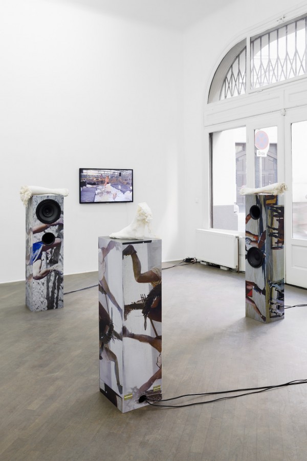
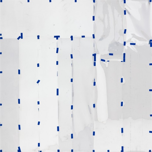
“Though based on historical research, Reynaud Dewar’s works often evoke the feeling that one has landed on a riotous new planet where time and space are anything but linear. Fittingly, the centrepiece of ‘Interpretation’ evoked a Suprematist-shaded spaceship (Interpretation Structure, 2010). Against the wooden structure’s mirrored interior, a video projection showed Rias, a striking woman in a carnivalesque dress, seated on a throne-like chair whose jarring geometry referenced Ettore Sottsass’s Memphis Group furniture. After she theatrically described attending a Sun Ra concert in France in 1970, Rias began dancing slowly around the throne – placed in the same gallery that the viewer stood in now – to the fractured, frenetic sounds of the original concert itself.

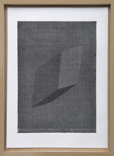
This moving, séance-like scene was accompanied by the pencil-on-cardboard series, ‘Interpretation Drawings’ (2010), which featured stencilled simulacrums of Sun Ra’s 1950s-era pamphlets such as A Spook Sho Is a Dragg Man, He’s a Dragg. The throne was there too, its geometric forms deftly dressed in African fabrics from Paris markets. Taken together, the exhibition explored notions of identity, performance, design and origins: Sun Ra famously insisted he was from Saturn (slyly undercutting those who would associate him with the lineage of slavery); Rias, in turn, is the artist’s originator, though here she took on an otherworldly identity. Nevertheless, the equilibrium Reynaud Dewar achieved with these disparate histories was discomfiting. That the show’s very power came from this disquiet, however, has long held true of the artist’s work.” – Frieze Magazine

Guillermo R. Gudiño

Guillermo R. Gudiño

Work from his oeuvre.

“Your mind is attempting to escape from this text and it takes some effort to stay here, present.

This happens to us all, several times in a day, but most of the time we don’t notice how it is affecting our behavior. It is useful to be able to escape, but many times this keeps us from living in the present and relating with the everyday. My work is an ongoing investigation that focuses in this human condition.

The temporary situations I produce open the possibility of increasing awareness of our sense of place. I suggest alternative ways of inserting one context into another, shifting functions, activities, objects and locations. I am interested in how the two frames meet, making visible how both are constructed and equally admissible. The work becomes a platform where human interactions can occur in two places at the same time. To achieve the desired suspension of disbelief, I use practices like photography, sculpture, performance and relational art, integrating them with common activities such as conversation, bargaining, chopping wood or camping.

Contemporary societies are so saturated with alternative ways of making sense of reality that understanding the vulnerability of frames is a priority in my research. We need to question the way ‘reality’ is being framed in order to make sense of what is going on and what we are escaping from. My task is to provide situations that allow for a re-evaluation of the way we construct and accept specific structures in which we are asked to believe.” – Guillermo R. Gudiño

via Field Notes.

Nøne Futbol Club

Nøne Futbol Club

Work from From Outer Space.

“In our networked society, images are no longer only visual surfaces that represent a reality. The image being digital, exists of data and is described by metadata. The digital networked image is a data repository but what does it look like? Can its data be involved in its design? Consisting of data, the digital image is readable and manageable by the network. It facilitates connections to be made between people, camera’s, files, keywords and more. People have become aware of the image as a tool, of its multiple uses and benefits, besides its singular aesthetic richness. Also the tool itself has evaluated from being a supporting and constructive context to becoming an organizational method. Think about web applications such as Flickr, YouTube or Vimeo. In these contexts, images are not created by the application but are organized and managed by it. In Flickr for example, groups of people are connected to each other through images, they are the glue of the network. Even the camera is involved in this image management since it is part of the networked chain of events within Flickr and YouTube. Although the camera literally creates images, it is inextricably linked to the agenda of the organizational method of the tool. An example is the digital camera that comes with a YouTube capturing mode. ‘Shoot, easy upload and share!’ is the advertising slogan. No more DIY digitizing, resizing or encoding in separate software, the camera does it all for you. Camera and application merge; they exist as one tool. Another example of a networked image-to-tool situation is one of mobile phones that support direct uploading to the web. In that case, the image taken is not just a nice photograph, it is a tool that organizes a person’s online presence. It answers popular questions such as; where are you? and what are you doing? (the most prominent questions Twitter users try to answer daily) The image performs the functions of a tool. A camera phone image of her dog’s poop in the metro configures the future of a Korean girl at the moment the image is being recorded and instantly uploaded to the web. Very soon after this image moment the girl’s personal information is published on the web and results in an online hate-campaign. It makes the girl leave her university. Networked images allow for the management of power relations inscribed to it by software. The image as tool is a result of the social productivity stimulated by web-applications as well as by the easy access to recording devices such as mobile phones. The fact that both tool and image are digital and networked levels the borders between them. Within digital networked images you will not only find traces of the tool but a tool in itself. Striking is that the process of images becoming data and a tool, is almost completely invisible and mainly an indexical back-end process. At this point it is the designer that can and should question the tool from a visual point of view. What do digital tools allow us to see? How can the tool be made visible? How to integrate the aesthetics of the tool in images, in design? How can digital tools be challenged and help to expand the concept of visuality? It seems that VLF/Nøne FC, a collective of designers from Paris, has decided to give it a go!
TOOL IMAGE

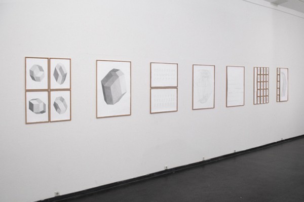
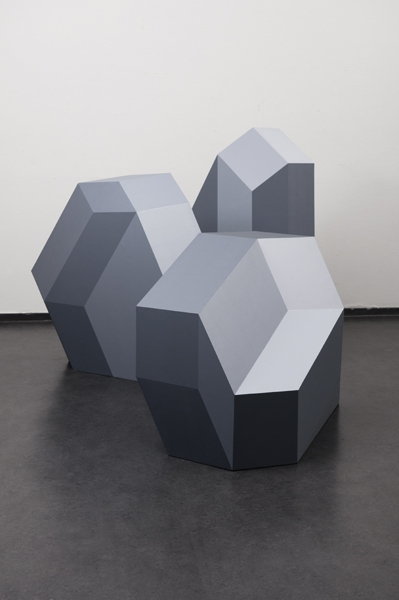
In the work of VLF/Nøne FC a virtual world of data and tools meets the visual and especially perspective. Being inspired by cubism they try to further develop the concept of (multi) dimensionality by using software, a digital tool. Four to five dimensional objects or hypercubes, linedrawings and images of virtual perspectives in the form of paint are the result. All start from one concept; materializing a virtual perspective, that of the tool. What you are looking at in VLF/Nøne FC’s work is the tool. The tool at work but also designers challenging a tool and finally designing tool images. A tool image is an image that integrates a tool’s characteristics and potentials as well as the aesthetic of the tool. It shows how it is being produced. The question is, can the drawings be re-produced, can the hypercubes and its virtual dimensions that are produced by the software, really exist as an object? VLF/Nøne FC manages to do this by painting ‘impossible perspective’ on top of the existing faces of a possible cube. In that way the virtuality of the tool and of an impossible shape is actualized through its materialization in paint. The line drawings of the hybercubes, that are created with an Adobe Illustrator filter, show how much the cubes include the tool and its impossible perspectives. The drawings and cubes are informational, enabling the viewer to read and understand them. To understand them is a challenge since the drawings and cubes do not refer to any kind of reality outside of them. It is a reality that has its starting points in the virtuality of the tool and is a reality in itself. A reality in which all images and objects refer to each other and are a multiplication of one and the same concept. My reading is that first of all, the drawings are a tool for constructing a cube with impossible dimensions and finally a material version of a hybercube. At the same time the drawings are a tool for understanding how the hypercube is a visualization of perspective, a point of view in itself. It shows how the cubes are not an object but ‘a way to look at it’, a materialized or almost freezed moment of virtual sight. Finally, without the material hybercube it is impossible to perceive the perspective that is constructed by the tool since it is flat, it simply doesn’t allow certain views.

THE SURFACE OF DESIGN

What is intriguing about VLF/Nøne FC is their curiosity for simulating perspective and multi-dimensionality from the point of view of a flat or 2D profession: graphic design. Working parallel to the conceptual construction of cubism VLF/Nøne FC soon hits the surface of design. A surface that can be explained in two ways. One is the literal and material surface of the image as a flat plane. Second is the hybrid surface of design, the interface, which is inextricably linked to an engine, an entry point into the back-end of the machine and into data. Seemingly a place where data and tools meet the visual. Two images are emblematic for the way VLF/Nøne FC deals with these two kinds of surfaces. One image is a photograph of the raw hypercube, the object ‘under construction’, standing in the wood workplace of the Willem de Kooning academy. The second is the same image but transformed in Photoshop. Grey tones are added to some of the faces of the object. In that condition it simulates dimensions the hypercube does not materially possess but virtually. It simulates the paint as ‘perspective’ on top of the faces of the cube. The first image is an image of a reality, that of a multi-dimensional object in space. The second is an image of virtual perspectives and dimensions. Moving back and forth between these two images I realize that it will be just touch that will help people to understand what exactly they are looking at. When touching a flat surface that implies a certain perspective, you have to conclude it is just an image you’re seeing, an image of perspective, one of the many images that are displayed in the drawings on the walls. The layer of grey paint interfaces the object’s construction, it is a reference to the tool in the object. On a visual level any kind of reference to the object being a figurative representation is taken out by the grey color. The hypercube is a representation of its construction, it shows how it has been produced within the context of the tool. The grey tones represent the dimensions the tool allows the cube to possess, virtually. What is interesting is that the virtual dimensions are being materialized by a layer of paint; the physical hypercube is annotated with virtual but visual information. The work of VLF/Nøne FC is based on conceptual images, dealing with the potential of materializing virtual perspective by imaging it. How flat is software? What perception is possible within a software and can this be materialized? It is at the exchange level of the tool and the visual that designers should take on these challenging questions. The challenge to find out where and how the tool enters the visual and rearranges the relations between virtuality, visuality and materiality. It is through the tool that allows the designer to find new potentials of the visual. The software turned out too flat to walk around the objects or show all parts of it and according to VLF/Nøne FC you have to be able to move around an object to really know it. Only by moving the objects themselves its multiple dimensions can be shown within the context of the tool. By building the hypercubes and exporting an image of perspective as a layer of grey paint into the material world, allows the viewer to both experience its material and virtual dimensions at the same time. Bringing together the grey paint as the ‘image of perspective’ and as the interface to the tool, I start to wonder, is this a multi-dimensional object I’m admiring or am I actually walking around an image?” – Kim de Groot

Brian Jungen


Brian Jungen

Work from his oeuvre.

“Within the past few years, Jungen has focused his practice on modernist concerns and contexts, redefining his object making through the use of new materials and processes that reflect this shift, a more intimate relationship to the body, and his family’s traditions and history.

Since 2006, Jungen has lived and worked between Vancouver, British Columbia, and the Doig River Indian reserve in northern BC, where the First Nations Dane-zaa (pronounced “dan-ney-za”) side of his family is located. Reconnecting with friends, family, and the landscape of the Peace River Valley, has increasingly personalized the vocabulary of his practice. Previously, Jungen was most well known for deconstructing Westernized, mass-produced commodities such as leather goods, sports paraphernalia, plastic lawn chairs, and reforming them into sculpture. For this exhibition, Jungen presents two series of works that combine objects of natural and manufactured form, drawn from a range of influences and references, including: modern furniture, Marcel Duchamp’s readymades, Andy Warhol’s silk screen prints, and traditional Dane-zaa drum making.” – Casey Kaplan

Matthew Jarvis Wall

Matthew Jarvis Wall

Work from his oeuvre

“The increasing prevalence of computers and information networks in daily life has produced a transformative shift in the way in which individuals participate in the production of art and design. The cornerstones of classical aesthetics in art — autonomy of form, singularity of vision, and totality of message — become less relevant as artists turn towards the “systemic” as aesthetic. Generative design refers to any art practice where the artist uses a system, such as a set of natural language rules, a computer program, a machine, or other procedural invention, which is set into motion with some degree of autonomy contributing to or resulting in a completed work of art. Generative art is, in this sense, self-automating by nature. Self-automation is a seemingly contradictory notion, an intrinsically mechanical process that also speaks to the complex forms and behaviors observed in nature.

These sculptural works from Matthew Jarvis Wall constitute an exploration of emergence in simulated organic systems. Emergence may be understood as the process by which novel and coherent structures, patterns and properties arise during the process of self-organization in complex systems. The particle systems employed in the generation of these sculptures were designed with a focus on plant root and tuber growth, simulations that serve as a means by which the basic systemic processes present in these organic systems may be observed and experimented with. In a wonderfully tridimensional universe, Matthew’s work could be seen as overtly tactile, generating a certain sense perfectionism between the physical and digital realms.”

via O Fluxo


Josef Albers

Josef Albers

Work from his oeuvre.

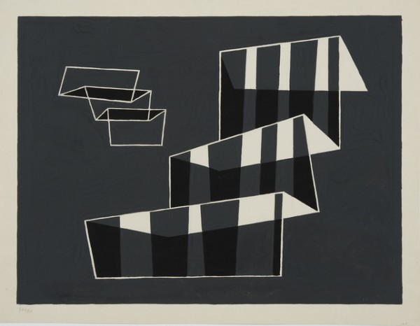
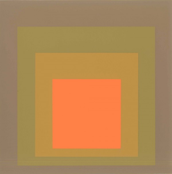
“Albers’s overall aim was to create an impression of effortless, inevitable harmony, which, of course, demands hard work. And labor is the subject of “Josef Albers in America: Painting on Paper” at the Morgan Library & Museum, a show not about finished products but about the constant hands-on research and experimentation, the hitting, missing and learning-as-you-go correcting that went into them.

But the big change is the emphasis on color over geometry as a source of dynamism, and with this shift the buildup to “Homage to the Square” has begun. In the show it advances in stages. The large rectangles start to look somewhat less houselike and a little more like what they are: stacks of superimposed colored planes. And as if the memory of stained-glass has returned, Albers turns his attention to luminosity in color, paint as light.

Keenly alert to subtleties of hue and value, he bought the same color paints made by different manufacturers and compared them side by side, noting the names of colors and brands in pencil in the margins of the oil-on-paper studies, a habit that persisted into the “Homage” series.” – Holland Cotter

Peter Alexander

Peter Aexander

Work from his oeuvre.

“…I look out from a Cycladic perch on the isle of Syros at a hillside sparsely populated by whitewashed rectilinear geometries, made more austere by the undulating topography. The same perch from which the quintessential maximalist, Martin Kippenberger, once gazed. But that’s another story…The Greeks are consummate minimalists, their white palette chosen to reflect Mediterranean light. Our story is about a group of artists who strove not to reflect light but to “personify” it.

Now quickly moving to a different coastline: that of Southern California circa 1965, where a group of artists waged a quiet revolution of luminosity, using every conceivable method to capture the light veiled in the stunning haze of toxins that created Los Angeles’s radioactive glow. Unlike their brethren on the East Coast—Judd, Andre, Flavin—they were not waging an art-historical battle or burning the flags of Abstract Expressionism or Pop art. They abandoned the vocabulary of representation, removing all but the most elemental forms. Pioneers of Minimalism, they took “sculpture,” already a means of expression that forsook illusionistic space by occupying three-dimensions, to extremes, creating works that removed all but the most indispensable elements of our visual world; light, space, and form, the latter being a residual byproduct of the former two, and itself an element that certain members of this group strove to expunge. In this abyss, the viewer’s optical sense becomes hyper-acute, emptiness now vast fissures of details, the slightest change a traumatic tectonic shift.

These Southern California artists ultimately employed two artistic strategies: according to Robert Irwin, one of their generals, there were “those that were creating within the picture-frame and those creating outside of it.” The group that became known as Light and Space attempted to harness the gases of light and space without traces of a frame. Its key members include Irwin, James Turrell, Doug Wheeler, and Mary Corse. The other group, known as the Finish Fetishists, captured and exploited the phenomenological effects of these elements within the confines of their fetishistic objects (frames). They did not fetishize the object, regarding the vehicle as just the vessel harnessing the magic. The group’s members include Peter Alexander, Larry Bell, John McCracken, DeWain Valentine, and Craig Kauffman. They were unified by their ambitious experiments with industrial materials that had never been used in the practice of making art. The aesthetic dialogue that both camps engaged in resulted in work of uncanny beauty and originality.

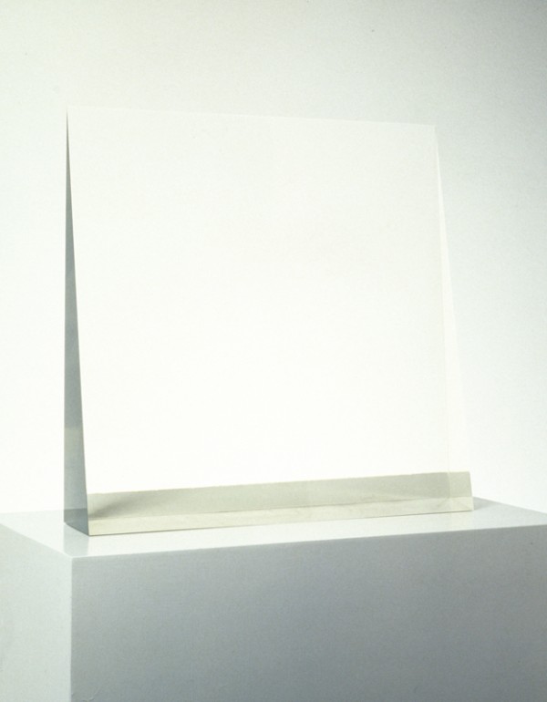
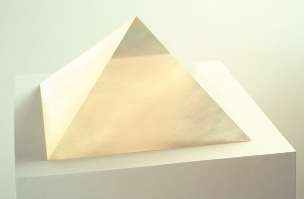
As a young man, Peter Alexander worked for the architect Richard Neutra. Alexander’s architectural foundation, especially the unadorned intersection of planes of glass, is a seminal visual reference in his work. As legend has it, though, his eureka moment came from the observation of the translucence of a Dixie cup when a circular disk of the dried resin used in surfboards was placed at its bottom. Between 1965 and 1972, he forged works by pouring polyester resin into handmade wooden molds. The works appear to hover above their pedestals, like painting in space, or vibrating on the wall. The “frame,” as Irwin calls it, was a barely perceptible structure, a humble artifact from the wooden mold used to create the form.

Alexander’s cubes, wedges, freestanding structures, and the final group of works from this period—bars mounted on the wall—freeze and refract light tantamount to the visual experience of swimming underwater. The process involved injecting pigment in layers as the resin dried, sometimes creating the effect of cubes within cubes (rooms within rooms) or subdivisions of the sculptures (as in Pink-Blue Cube, 1967). At other times, particularly with the more monumental freestanding works, observation from one particular angle, for example the narrow fin of Blue Wedge, 1970 (fig.1) paints a “zip” in space; the background wall “becomes the field of Barnett Newman’s canvas (fig.3). It is the depth of the side view, the experience of looking through eighteen inches of pigment-infused resin, that massages the viewer’s retina, playing tricks on the quixotic brain. Meanwhile, a front view offers a totally different optical encounter, conjuring up the spatial infinitude of Brancusi’s bronze Bird in Space, 1923 (fig.2) the space around the sculpture sharing equal weight with the sculpture itself. The casting was an experimental process that achieved results that were wholly unique from piece to piece and differed from any art making that had preceded it. While the literal gesture was removed from the object, the subtle expression that was achieved from “happy accidents” injected the works with soul that a perfected, machinated process would have slaughtered.” – via artnet.

Leo Villareal

Leo Villareal

Work from Conner Contemporary.

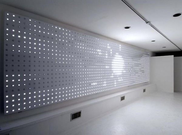
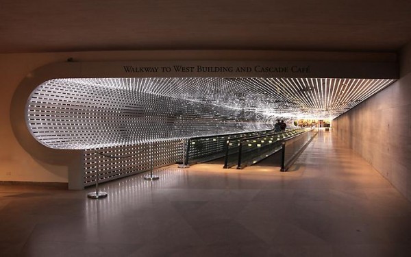
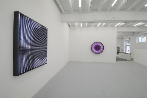
“…Leo Villareal’s sumptuous and transporting light sculptures are firmly rooted in the artist’s interest in underlying structures and rules, particularly the systems-based theories of mathematician John Conway. For more than a decade, the Yale-trained sculptor has been developing a rich visual vocabulary based on the use of multicolored incandescent, strobe, neon, and LED bulbs. His preferred format is a light-studded circular, square, or rectangular wall-mounted structure fronted with translucent Plexiglas that diffuses the changing patterns of the illumination beneath. The effect is part ’60s psychedelia, part ’70s disco.

Origin, 2006, the sole work in Villareal’s latest show, represents a significant step forward for the artist. A rich, visually complex work of densely sequenced overlapping patterns, it resembles an old theater marquee, with 1,600 equally spaced LEDs on a large base. Inspired by the theories of Isaac Newton as well as those of Conway, Villareal developed a pair of computer codes that cause the lights to flash, fade, or glow. The matrix is programmed to create nonrepeating patterns that suggest stars in the heavens, microscopic cellular activity, the heaving of the ocean, and dense urban grids.

The genesis of Origin, and of the artist’s work with light in general, dates back to the 1997 Burning Man festival in Nevada’s Black Rock Desert (he returns to the event annually). The artist needed a way for himself and other members of his Disorient Tribe to locate their base camp amid the thousands of revelers on the featureless expanse of desert. The result was a work fashioned from sixteen strobe lights visible from up to two miles away. The random patterns generated by the device ultimately sparked Villareal’s exploration of rule-based cellular automata programs, particularly Conway’s Game of Life (the artist has said that his works are portraits of Conway’s rules).

Villareal has used LEDs before, but the scale of Origin makes it feel more visually aggressive than viewers who know his work might expect. Additionally, he has succeeded in using his medium to define space (recalling the oeuvres of Dan Flavin and Fred Sandback), but the kinetic narrative patterning of this work goes further and actually invades space. When a single light appears to course up and down the darkened work before stopping in the center and exploding (think of using an ultrasophisticated version of Lite-Brite to illustrate the Big Bang), for example, it floods the adjacent walls.

Villareal likes to play with our urge to find patterns in randomness and synthesize fragments of information into a manageable whole. At one moment, the work appears to be a black-and-white version of Piet Mondrian’s Broadway Boogie Woogie, 1942-43; then the lights scatter, only to regroup and swarm like insects or swim like sperm. At other times, the artist conjures images of blinking lights on nuclear power plant control panels and early computers, manipulating density by programming the lights to fade gradually in and out. Villareal is adept at seducing eye and mind with works that have a beauty underpinned by intellectual exploration. By stripping away color and amplifying scale and complexity, Origin introduces a welcome tension, a visual sparring with the viewer that is by turns soothing and jarring, hypnotic and disorienting…” –

Lutz Bacher

Lutz Bacher

From her recent exhibition at Ratio 3.

“…Her newer work is more polished, but equally weird: hundreds of light, bouncy, black rubber balls roll around the concrete floor; framed prints of nebulae are spaced widely apart on the walls; a very dark and shiny image of waiting-until-marriage abstinence vampire Robert Pattinson hangs drearily in a corner; a heavily accented voice talks about dreams from a small speaker on the ground.

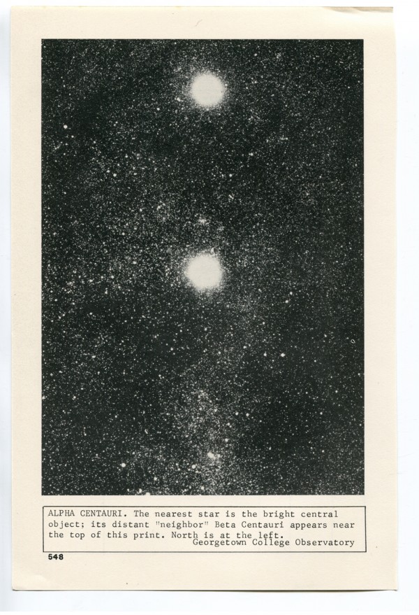
The exhibit is, in part, an iteration of her “The Celestial Handbook” (2011), and “Baseball II,” two of her three contributions to the Whitney’s Biennial in May of this year. Bacher’s “The Celestial Handbook” takes its pages and name from amateur astronomer Robert Burnham Jr.’s 1966 book. Each print was captioned by Bernham with commentary, such as “…a picture of such strangeness and splendor that is scarcely seems natural…” (Huffington Post). Bacher exhibited 85 of the plates throughout the galleries of the Whitney Biennial, which the museum described in an audio tour:

Sometimes these are poetic, sometimes they’re minimally factual. Either way, they rarely seem to describe their subjects adequately. In Bacher’s staging of the original book, that failure becomes a point of interest. It suggests that the work’s real subject may be the cosmic chaos that exceeds the reach of language.

The black balls at Ratio 3, laid on the ground like “Baseball II”, help the viewer resolve the limitations of language—and our ability to relate to something so large—when conceptualizing outer space. When walking through the gallery, the viewer is a solar system; your mass changes the structure of stars around you, and the clumps of balls and people chatting form galaxies.

Robert Pattinson’s presence is best explained by Bacher’s previous works using appropriated images of celebrities, including the exhibits “ODO”, 1987-88’s “Jokes”, and 2009’s “My Secret Life” (because celebrity=star=yikes). The glass over his iconic smirking face that you just want to slap is smoky and dark; maybe the image’s obfuscation is comparable to “My Secret Life’s” celebrities in disguise. ArtPulse’s Ernesto Menéndez-Conde wrote the presence of celebrities in “My Secret Life”, “suggests that critical art is another mass-media construction. The critique of the status quo is unmasked as spectacle.” I guess I’m comfortable with applying Menéndez-Conde’s interpretation, given the context of Ratio 3’s exhibit. It’s more interesting than thinking about Robert Pattinson in the vacuum of space.” – Kendall Goerge