Mayumi Lake


Mayumi Lake

Work from Poo-Chi.

Poo-Chi is a deceptive and hilarious body of work that seemed like the perfect Sunday post. Enjoy.

“The images in this book are not what they at first appear to be. Look again, and closely. Mayumi Lake’s series of color photographs focuses on the wakinoshita, presenting this often neglected part of the body in a discomforting new light. Know what the true subject is, and while some unease might remain, any revulsion turns to curiosity, admiration and perhaps even delight. The wakinoshita Lake portrays with such intimacy and originality are shown in a wide array of “poses”; dressed with crochet, lace, embroidery, fake fur, these obviously adult bits of body take on a diverting, playful look. But underneath the soft and feminine drapes nestle the dark hairs and folds of flesh that give Lake’s work a decidedly unsettling edge. As with all illusion, there is more here than meets the eye: the viewer is drawn time and again to take another, deeper look. ” – From Nazraeli Press

You can buy the book here, I might buy it today.

Arthur Hash


Arthur Hash

Work from no particularly named body of work, but a sampling of Hash’s oeuvre all conceptually related to ideas of material, design, and adornment. Much of his work involves humor, process (including DIY pieces), and the recontextualization of materials through their presentation as jewelry. Hash also maintains a blog with regular updates which offers a great peek into his process.

Work descriptions, in order:

“Different materials that evoke certain feelings in connection with the body bring into question the definition of what jewelry was in the past and is today. Metal and precious stones have historical significance and value. Jewelry throughout time defined status and wealth, emphasized important dates and marked royalty. I treat unconventional materials such as toilet paper, cigarette butts, glue, spices, cough drops, plastics and animal parts as precious as their traditional counterparts: gold, diamonds and silver. By twisting the value of materials and using them to create body adornment, I want to re-present what jewelry can become and change the stereotype of what jewelry is.”

Michelle Forsyth


Michelle Forsyth

Work from Text Work.

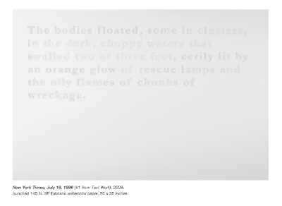
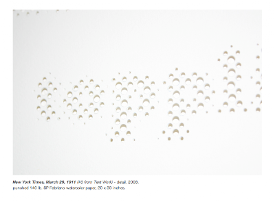
These pieces are made by punching out small circles of paper in a way that replicates the print pattern of a newspaper press. Forsythe’s other work has a conceptually similar approach, using tedium and repitition to force reconsideration of contemporary imagery.

“For the past several years my work has addressed historical events as seen through the lens of news media. Through first-hand visits to, and subsequent renderings of, my visual experiences at 100 historical disaster sites pictured in news photographs, I have worked to address a sense of grief. While researching each site for this project, I have scoured many old newspapers for written information. Along the way I have noted many poetic passages that conjure graphic images of their own. In Text Work, I have punched several quotes, including eyewitness testimonies and first-hand accounts, into single sheets of white paper. What is left is a lacey absence.”

____________________

“Favoring the formal elegance of pattern, and the visceral qualities of the handmade over the efficiency of digital production, I consider my work to be a reflection on, and a reaction to, the onslaught of images of suffering in our contemporary world.

All of my work is made in response to an extensive collection of images of trauma culled from television, newspapers, and the Internet. From horrific scenes of disaster captured by our contemporary news media to the smaller scale depictions of personal tragedy, images of peril and demise have permeated nearly every aspect of contemporary life. Even without the recent documentations of the aftermath of Hurricane Katrina, the US invasion of Iraq, or the Israeli bombing of Lebanon, it is easy to see that the mass media pushes daily reminders of the aesthetics of horror. Viewing these kinds of images from afar creates ways of looking that are, at once, both voyeuristic and apathetic. As I find myself confronted by this onslaught, I mourn our tolerance of violence in our media and our inability to express a sense of grief. “To grieve,” according to Judith Butler, “and to make grief itself into a resource for politics, is not to be resigned to inaction, but it may be understood as the slow process by which we develop a point of identification with suffering itself.” (See Judith Butler, Precarious Life: The Powers of Mourning and Violence (New York, Verso, 2004), p.30).

As a humanistic response to these kinds of tendencies, I transform images of abjection and spectacle into glittering surfaces that shroud the images of pain with layers of beauty. Quiet and contemplative, my work bears traces of its making. From thousands of tiny, sinuous brush strokes or cut-out paper flowers, to diluted layers of watercolor, the value of my time spent becomes just as important as the final product. Color functions to conceal and hide the images in a protective coating, which creates a distance that I hope will empower viewers with a greater ability to bear witness to the complexities of our mediated experience.

I am certainly not the first painter to respond to these kinds of horrors, nor am I the first to work from journalistic photographs as source material. From as far back as Francisco Goya’s Disasters of War series (1810 – 20), which document the horrors of the Napoleonic invasion of Spain in 1808; and Edouard Manet’s The Execution of the Emperor Maximillian (ca. 1867) depicting Mexican republicans executing the French appointed emperor; through Gerhard Richter’s suite of 15 black and white paintings of the imagery associated with the Baader-Meinhof gang, who all committed suicide in their prison cells early on the morning of 18 October 1977; and Leon Golub’s paintings documenting the atrocities of the War in Vietnam; to the more recent work by Joy Garnett and Adam Hurwitz, the physicality that painting holds has long provided us with means to reflect on the persistence of these kinds of atrocities. According to Susan Sontag, “Torment, a canonical subject in art, is often represented in painting as a spectacle, something being watched (or ignored) by other people. The implication is: no, it cannot be stopped – and the mingling of inattentive with attentive onlookers underscores this.” (See Susan Sontag, Regarding the Pain of Others (New York: Farrar, Straus and Giroux, 2003) p. 42.) Although I consider my work, as a whole, to fall within this tradition of painting, it does not rely on the aesthetic spectacle to give it its power, instead I hope it will be a lasting counterpoint to the typical manner in which we view traumatic historical events.”

Spencer Finch


Spencer Finch

Work from Prussian Blue and others. Finch’s work is a great conceptual examination of light and color, and I have only posted a small sampling of it here.

Descriptions (in order):

Sky (Over Coney Island, November 26th, 2004, 12:47pm. Southwest view over the Cyclone.) | 2004, balloons, helium and string. Installation at Miami Beach. Violet balloons inflated inside cobalt balloons to precisely match the color of the sky over Coney Island.

Two Examples of Molecular Orbital Theory (Prussian Blue) | 2005, Fluorescent lights, filters, acrylic paint. This installation presents two physical theories of color. The left room creates Prussian blue with filtered light and white walls, the right room creates Prussian blue with white light and painted walls.

West (Sunset in My Motel Room, Monument Valley, January 26, 2007, 5:36-6:06 PM)) | 2007, 9 channel synchronized video installation with 9 TV monitors. Total running time: 31 minutes 5 seconds

Grand Canyon from Valhalla Point with My Eyes Closed (morning, late morning, noon, evening) | 1995, 21″ x 99″, ink on mutsu paper.

_________________________________

“…Prussian blue, the pigment that was the first artificial pigment, and invented in this very city by Heinrich Diesbach some 300 years ago. Suddenly blue was for the first time available as an affordable colour, both commercially and artistically. Its use quickly spread to textiles and it was notably used to dye the uniforms of the Prussian army. In the 19th century it showed itself useful for the early photographical pioneers and was used for cyanotypes or blueprints.

Prussian Blue, 2005 is a three-dimensional model of the molecular structure of said pigment, executed using standard light bulbs in different sizes. As all Finch’s works, the chandelier is representational. This is in fact what the pigment looks like on the molecular level.

The main work that Finch has made especially for the exhibition is an installation called Two Examples of Molecular Orbital Theory (Prussian Blue) 2005. Blue light is seen coming from two large door openings leading in to large light-filled rooms. Both appear blue, but the colour is achieved by different means. Again the artist questions what we see but also shows faith in representing the unattainable – be it the colour of Jackie’s pillbox hat or the elusive position of electrons in a molecule. Similar ideas come back in a series of water-colours, Study for a Transparent Language, Index of Prussian Blue (35 watercolour drawings), 2005, that catalogues alphabetically 35 different names for the pigment, ranging from American Blue to Williamson’s Blue. But again, does anyone know what blue is?” – Press release from Galerie Nordenhake

Finch has a collection of short reviews here.

Chiharu Shiota


Chiharu Shiota

Work from Inside/OutsideLebensspuren (Traces of Life) and Trauma / Alltag.

Reviews of all sorts can be found here. Goff + Rosenthal has a great collection of her work as well. Spend some time on her site, there is tons of great work there. I saw the Lebensspuren installation last fall in Berlin, and the photo does not do justice to the scale or experience of the work (as can be expected).

“Enveloping items of clothing within a cocoon of wool threads in the front room, Shiota weaves an unsettling allegory of the absent body with a compelling tension of sublime intimacy and haunting imprisonment. The black web traces the artist’s performative movements, as though she were drawing in space with yarn, demarcating the spatial modalities of the building in relationship to the clothing and defining an impenetrable private space within the public exhibition.

Her second, room-encompassing installation consists of a towering structure of windows, which stands like the remnant of a construction that has been left behind. Associating herself with the city in which she lives, the work goes far beyond a mere sense of personal mourning:

“When I look at disregarded windows at a construction site, I imagine the life of those people who looked from East Berlin over to the life of the people in West Berlin…. Everyday, I am looking for windows until I am exhausted… They are like the boundaries of myself that I cannot cross.”
Questions relating to the futility of human effort, the meaninglessness of individual existence and the inevitability of human fate arise from this work, which is at once powerful yet at the same time communicating a feeling of empathetic powerlessness. Chiharu Shiota juxtaposes the relationship between the internal and the external, shifting our emotional experiences as well as our subconscious memories.” – press release from Goff + Rosenthal 

Hyungkoo Lee


Hyungkoo Lee

Work from Animatus.

____________________

WHAT’S UP DOC?:
LEE HYUNGKOO AND THE ORIGIN OF THE SPECIES 
Howard Rutkowski
 
 
The Punch Line
 
A black room frames the installation, which is dramatically spot-lit. A presentation of two skeletons, not unlike what one might see in a museum of natural history; a predator chasing its prey. Then the dawning – it’s Wile E. Coyote and The Roadrunner! Reduced to a science exhibit! Brilliant, clever and very, very funny.
 
Once the laughter subsides, something very interesting begins to emerge. The work is not merely clever or amusing in the way that Cattelan’s taxidermy animals are. There’s a whole new bit of forensic activity at work and the viewer is drawn into an exploration of the process behind this reductio ad absurdum. First of all, cartoon characters are not real; they are two-dimensional exaggerations of human behaviour. Yet, over time, they have entered the pantheon of global popular culture and are more recognisable than the real personalities that shape our world (Just consider the multi-national empire that is Disney). Our own predisposition to anthropomorphise furry (and feathered) creatures allows us to endow them with personalities that reflect our own and to place them in situations that mirror the trials and tribulations of our daily lives. So, if these cartoon figures can represent us in a simplified, yet extreme form, it follows that this form can be deconstructed and analysed.
 
Lee Hyungkoo’s approach eschews the pop psychological approach to deconstruction. What he is doing is actually physical deconstruction – more pop palaeontology – and it is detailed, thorough and completely worked through.
 
 
‘Familiar Tree’
 
This was Lee’s original idea for the title of the exhibition. As a play on ‘family tree,’ he was looking to describe the evolution of his creations and to evoke the empathy we all have with these animated characters. This new body of work began with Homo Animatus of 2002–2004. This was an homunculus – Latin for ‘little man’ – a cartoon exaggeration of human form (think of Elmer Fudd as a skeleton). The original homunculus was a creature with magic powers that medieval alchemists claimed to have created. Considering that Lee’s studio looks more like a laboratory than a typical artist’s atelier, the connection is even more easily drawn. Plus cartoon characters do possess incredible strength, resilience and resourcefulness: how many times has the Coyote fell off a cliff, only to rebound fully-intact in the next frame?
 
Homo Animatus was an extension of a series of earlier pieces where the artist physically sought to alter – to reduce to cartoon simplicity – his own anatomy. Using plastic forms, enlarging and reducing lenses, Lee created a variety of body costumes that altered both one’s appearance and one’s vision of the real world at the same time. Homo Animatus is, for Lee, the ‘Origin of the Species;’ in a peculiar and devolutionary way, of course, and in keeping with how animated creatures serve as stand-ins for their human counterparts. Canis Latrans Animatus (Wile E. Coyote) and Geococcyx Animatus (Roadrunner) followed and are now joined by Lepus Animatus (Bugs Bunny), Felis Catus Animatus (Tom), Mus Animatus (Jerry), Anas Animatus (Donald Duck) and his three nephews, Animatus H, D and L (Huey, Dewey and Louie).
 
‘Familiar Tree’ remains an appropriate description for this body of work. These are the ‘skeletons’ of characters/personalities that are as close to us and as instantly recognisable as our own inner frames.
 
 
The Process
 
Stories of any kind usually require a build-up before offering the denouement. The joke involves a narrative before providing the punch line. Lee Hyungkoo works backwards. Merely seeing the work gives no clues to the complexity of its creation. Visually, the work can strike a chord and delight, amuse or bewilder, but examining its origins and development frames it properly.
 
Lee’s studio is a laboratory and could not be further removed from a scruffy artist’s garret. With a white-coated, masked team of technicians working in ‘clean rooms,’ the space is unlike any other. Bones of real animals sit on shelves alongside those of the works in progress. Clay constructions of skulls of imaginary characters provide a reference to those reconstructions of our fossilised ancestors. The walls are adorned with drawings of the anatomies of both real animals and their animated renditions. The tools and working methods are more akin to the procedures seen on the Nature Channel than the usual brush and paint-pot strewn environments one usually associates with the creation of contemporary works of art.
 
The adoption of Latin names to describe the individual creations underscores the faux-scientific approach, utilising the classifications associated with ‘kingdom, phylum, genus, species’ that categorise every living thing on the planet. Fans of the Roadrunner cartoons will recall that schoolboy Latin was often used to describe the characters, e.g. ‘Coyotus imbicilus.’
 
 
The Sources
 
The work itself, while sublime, delightful and amusing, requires an in-depth understanding of how all of this came to be in order to be fully appreciated. Observing the creation of this various works does provide the modus operandi behind Lee’s work, but where does the origin of the Origin of the Species lie?
 
Lee has cited Rodin and Giacometti as sculptural artists to whom he has responded within the development of his own work. Rodin was a breakthrough artist who sought to imbue the natural human form – warts and all – with a heroic sense of space, rejecting along the way the idealisation of the body that was previously the hallmark of Western sculpture. Rodin changed the way one could look at the human figure much in the same way that Lee’s optical helmets and body-distorting devices create alternative physical realities.
 
Giacometti’s own work passed through a number of critical stages – representational, cubist and surrealist – until he reached his apogee in Post-War Europe and sought to render the human form in all its existential angst. Giacometti found the inner reality of man.
 
Lee has spoken about the ability of these two artists to create a new sense of sculptural space. ‘Space’ is a concept that all artists working in three-dimensions must come to terms with. With this new body of work Lee has gone from the virtual space defined by his Objectuals series and has made the virtual a reality.

Chad Gerth


Chad Gerth

Work from the series Empty Lots.

“Chicago’s great physical feature is not the height of its skyscrapers, but the flatness of its terrain. To take advantage of the endless Midwestern plains, it is laid out in a persistent grid that lays waste to the land, ignoring all geographic features. Aside from a splendid lake front, there is no conformity to markers such as rivers, valleys, or hills, as in cities like Toronto or Boston. Chicago is the city’s city. “The Machine” is a friendly, hard-working political, economic, and architectural hydra. Yet within this tight urban apparatus, there areas where the city ends. These pockets take shape as empty lots squeezed in between buildings, houses, parking lots. Representing lacunae in the city’s fabric, these empty spaces are like grass in the cracks of a sidewalk, a rhizomic void in the skyline. They are gaps of nothingness, like so many missing teeth in an overfull mouth.
Empty lots such as these are within every city’s territory, yet they exist outside of their identity. They are ungoverned Lesothos or Vatican Cities. Alternately called urban prairies (geographic), unproductive land (economic), and terrain vague (philosophical), they serve purposes beyond the city’s control: they are a social space; they are a dumping ground for waste and litter; they are a place for crime and play; they are both a visual resting place amidst Chicago’s dense architectural fabric and an eyesore; and they are also nothing at all. The photographs that make up this series are as flat and square as the land they depict. They are
taken from above, 40-80’ high. From this perspective we see traces of past purposes and patterns of use that are not visible from the ground. This reveals not only the human past, but nature’s strategies for reclaiming the land. While every major city has these areas, Chicago’s particular flatness, rectilinearity, and fabled skyline lend a revelatory aspect to this process. They are a shortcut to both the pre-urban past and a post-human future.”

Mandy Corrado


Mandy Corrado

Work from the series Reflections of the Muse.

“From Venus of Willendorf to Olympia, the nude has been a consistent subject in art throughout the ages. Yet how often do we see the models’ perspectives? Where are their voices in this ongoing discussion? These questions came to mind often during my years as a figure model.

I began posing in my senior year at the School of the Art Institute of Chicago. Modeling allowed me an insider’s view of countless art studios and schools. I enjoyed interacting with hundreds of artists, collaborating with them for the sake of their work. Upon graduating, I took up posing full time. Besides the occasional ache and pain associated with holding perfectly still for upwards of nine hours a day, I loved my job. Yet, over time, I grew frustrated. Despite the innumerable drawings, paintings, photographs and sculptures of me in studios, portfolios and on gallery walls all over Chicagoland, I felt unseen. Despite the fact that I was spending six to seven days a week in the studio, I was not making art.

One day I began fantasizing about photographing myself on the model stand and set out to make the Reflections of the Muse series. I bought a gold framed mirror and brought it to jobs with me. All of the artists were more than happy to be a part of the project. I would set up my mirror so that I could see myself while posing while not distracting the artists, and then go to work as usual. My camera would be somewhere nearby and when a break was called, I would nonchalantly grab it and click a few frames before moving. The resulting images are the interiors of studios with artists actively working. I am somewhere in the frame, reflected back at myself. My gaze is on the viewer, inviting them to look at me and the world in which I live. The tables have turned and the nude figure is now the artist.

From my experiences of knowing dozens of my colleagues, most artists’ models are also artists themselves. They are actors, dancers, painters, writers, and so on. Most of them pose not only as a means to make a living, but also because they feel a deep commitment to the artwork and a respect for artists they collaborate with. Yet their views of themselves as models remain largely mysterious. Through this work, I invite you to consider the point of view of the many nudes you have encountered in art. Perhaps you will gain a new understanding of this timeless artistic tradition.”

Mona Kuhn


Mona Kuhn

Work from the series Evidence.

I wanted to post some more out of focus work, as I am struggling with the cohesiveness of content with my own blurry work. I couldn’t find a statement for this work, so here is the inside book jacket statement of sorts. Poss should be fairly regular again now.

“Critics have observed that Mona Kuhn’s subjects seem ‘nude but not naked . Completely relaxed before the camera, they give the impression that nothing could clothe them better than their own skin.’ Kuhn, who photographs in the naturist or nudist community, often in domestic interiors, weaves together gestures from the traditional iconography of nude studies with the comfortable body language of her subjects, creating a visual patois at once classical and contemporary. And beneath the mellow surfaces of her photographs lies an explosive energy: the artist’s controlled play with the power of sensuality. Tension and uneasiness coexist with all that sunlight and soft flesh. The subjects and their gestures are suggestive but ultimately ambiguous. Tenuously held planes of focus provoke the imagination. Kuhn works very close to her subjects, often with a depth of field of only a few inches. Real world and image world seem to blend together as her figures unite the reality of human complexity with the blissful essence of nature. With only sparse reference to physical surroundings, they appear to float in an idyllic picture space, part of a dreamlike narrative just beyond the viewer’s comprehension. These exceptional photographs exist in a space created by the artist and subject alone-the viewer is given a single fascinating glimpse, suspended in time, and then an enduring sense of the resilience and vulnerability of the human body.”

Limited Access to Internet

until Sunday, no posts from me.