Constant Dullaart
Work from Jennifer in Paradise. The letter below was posted on Rhizome.
Dear Jennifer,
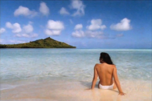
Sometime in 1987, you were sitting on a beach in Bora Bora, looking at To’opua island, enjoying a holiday with a very serious boyfriend. The serious boyfriend, John, took a photograph of you sitting on the beach, not wearing your bikini top. John later became your husband and father to your children Sarah, Lisa, Alex and Jane.
This photograph of a beautiful moment in your personal history has also become a part of my history, and that of many other people; it has even shaped our outlooks on the world at large. John’s image of you became the first image to be publicly altered by the most influential image manipulation program ever. Of course, this is why I know the names of your children, and this is also why I know about the cool things you do trying to get a .green top level domain name to promote environmental sustainability. (Although, personally, I believe that the importance of the domain name has been reduced to a nostalgic, poetic value).
I still wonder if you felt the world change there on that beach. The fact that reality would be more moldable, that normal people could change their history, brighten up their past, and put twirl effects on their faces? That holiday image was distributed with the first demo editions of Photoshop, and your intimate beach moment became the reality for many people to play with. Two Jennifers, no Jennifer, less clouds, etc. In essence, it was the very first photoshop meme—but now the image is nowhere to be found online.
Did John ask you if he could use the image? Did you enjoy seeing yourself on the screen as much as he did? Did you think you would be the muse that would inspire so much contemporary image making? Did you ever print out the image? Would you be willing to share it with me, and so, the other people for whom it took on such an unexpected significance? Shouldn’t the Smithsonian have the negative of that image, not to mention digital backups of its endless variations?
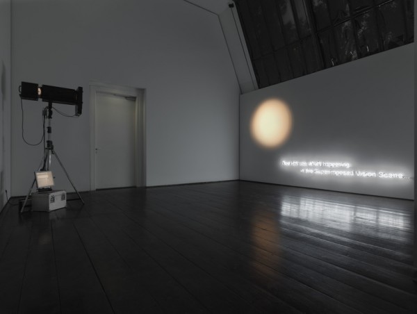
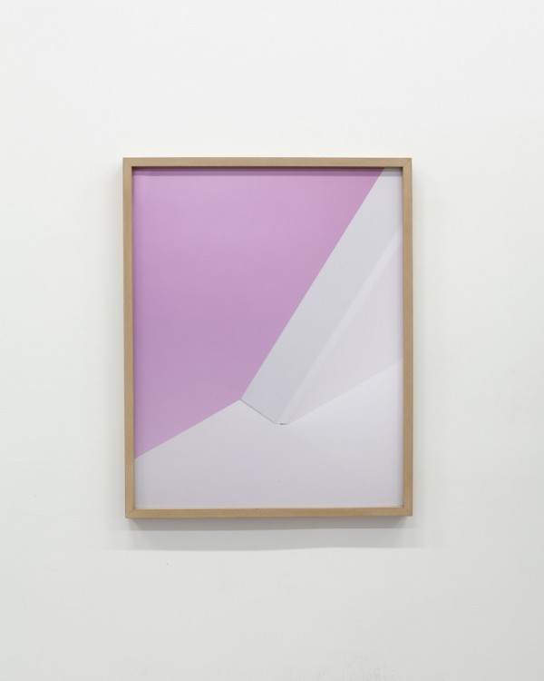
All these questions have made me decide to redistribute the image ‘jennifer in paradise’ as well as I can, somewhat as an artist, somewhat as a digital archeologist, restoring what few traces of it I could find. It was sad to realize this blurry screen grab was the closest I could get to the image, but beautiful at the same time. How often do you find an important image that is not online in several different sizes already?
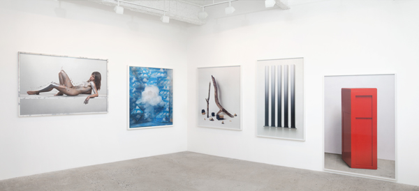
I have two exhibitions opening this coming Saturday in Berlin, Germany. Both of them are called Jennifer in Paradise. And you, or at least your depiction, play a central part in these exhibitions. A faint, blurry, pixelated focal point. To celebrate the time that you were young, and the world was young, as it still naïvely believed in the authenticity of the photograph.
Sometimes, when I am anxious about the future of our surveilled, computer-mediated world, when I worry about cultural imperialism and the politics behind software design, I imagine myself traveling back in time. just like the Terminator, to that important moment in technological world history, there on the beach in Bora Bora. And just sit there with you, watching the tide roll away.
Sincerely,
Constant Dullaart
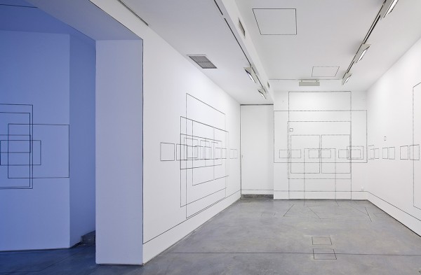
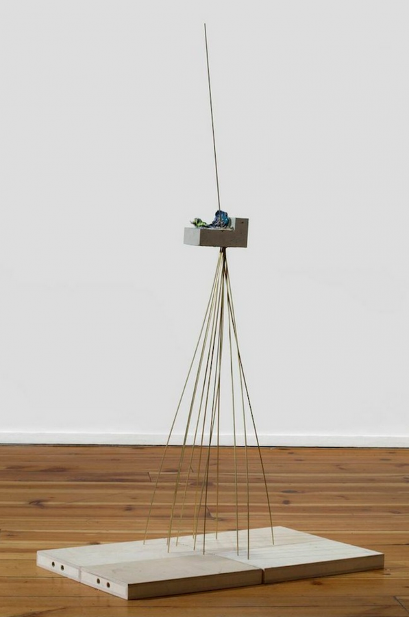
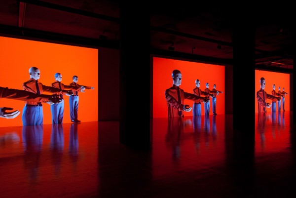
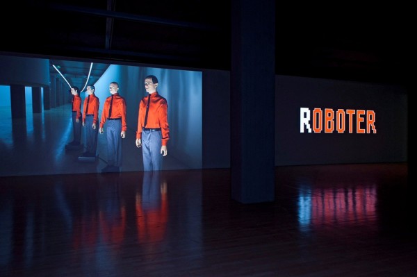
“Jennifer in Paradise is a multiplatform exhibition that will take place simultaneously across physical and online environments. Material venues include Future Gallery and Import Projects. Constant Dullaart’s work explores contemporary modes of access, visibility and (mis)representation associated with global spread of information technologies. The title of this show by the Dutch artist references the first ever photoshopped image, Jennifer in Paradise [1]. Along with online transparency, hidden information and the multi-tiered infrastructure of the web, it is a catalyst for Dullaart’s meditations upon the act of translating between human and machine, image and code, part and whole.
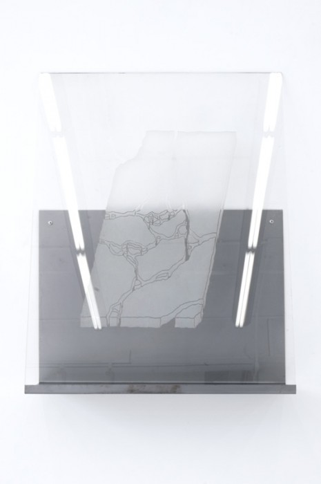
Most commonly used window glass, also known as float glass, has a light green shimmer in it due to the iron in the sand used in its production. Window glass produced prior to the 1950’s, before Alastair Pilkington developed the first industrially produced float glass, will slightly deform reality due to its irregular thickness. In our computer mediated reality, the perception of life through algorithms and filters does not only offer a distinctly expanded experience of life, enhancing our daily agency as if it was on steroids, but also carries various kinds of cultural deformations.
The deformation or distortion of information caused by its mode of communication, which is commonly accepted as medialization, could easily be compared to the deformation of reality whilst looking through glass. Perhaps this is why the analogy of ‘windows’ is commonplace within the computer environment. Everyday we look through different windows online. We have windows looking into our machine, and windows looking outwards, to the Internet. Google’s algorithms give us a different view on reality, or its representation, then for example Baidu (Chinese search engine). Keeping with the analogy, both are windows, with perhaps different types of ‘algorithmic’ glass. Each with a different way of structuring information, with political and commercial motives, shaping the way we look at information on the web. Selecting information for us by way of secret formulas, therefore tinting and shading our online social contacts, or research.
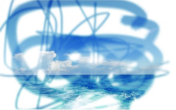
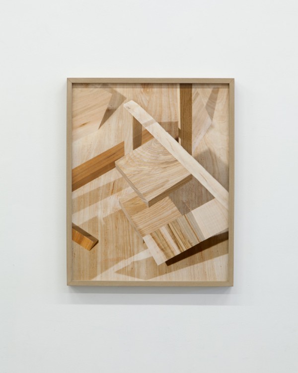
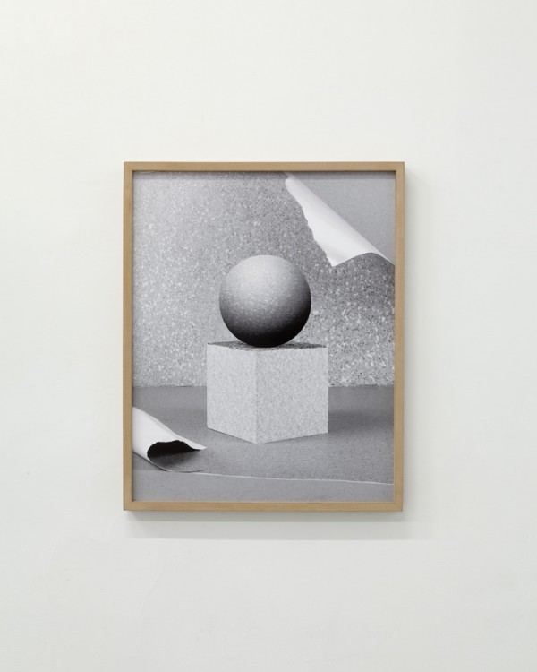
For this exhibition Dullaart presents a new body of glass works, which derive from the 2012 piece http://untitledinternet.com/. When clicking on the website one is taken directly to the Google search page, only there is an distinct brush stroke or sketch like overlay that masks certain parts of the visible information. These randomized filters, created and imposed by the artist, dramatically change the visual landscape of surf experience. The website can be seen as a comment on the way Google displays information, by obscuring the search giant’s web page, while simultaneously turning the entire web into a painted collage. In these new pieces Dullaart abstracts compositions of the filtered images via screenshots. In essence, photographing the web as seen through a dynamic overlaid filter. These images are then UV printed directly onto glass. The white aspects of the image remain unprinted and transparent. Dullaart has also taken the inverse approach by having similar brush stroke like gestures sandblasted or carved directly into sheets of glass. Here we have artifacts of digitally imposed filters made manifest through their visual blockages in transparency.” – Future Gallery
–
[1] Jennifer in Paradise is the name of the first picture ever to be photoshopped. Taken by John Knoll, co-creator – along with his brother Thomas – of the now ubiquitous software, it depicts his girlfriend on a tropical beach. The image was digitized by Kodak in 1987 and supplied with early versions of the program. Though initially ubiquitous, it has since become harder to track down. For the online component of this exhibition Dullaart is redistributing a version that contains a steganographically encrypted payload.


![8_timetilings[stuk]_pablovalbuena_19_web](http://ilikethisart.net/wp-content/uploads/8_timetilingsstuk_pablovalbuena_19_web-600x431.jpg)