Wednesday, 9 January 2013
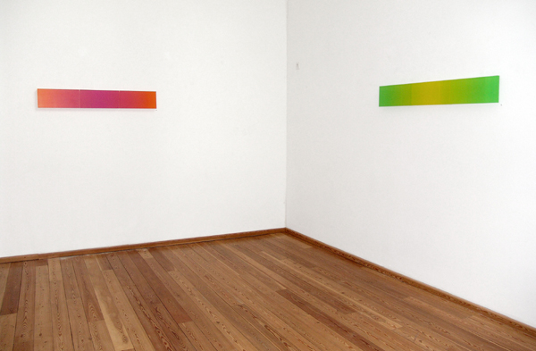
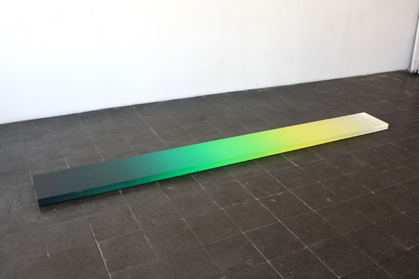
Color Shift.
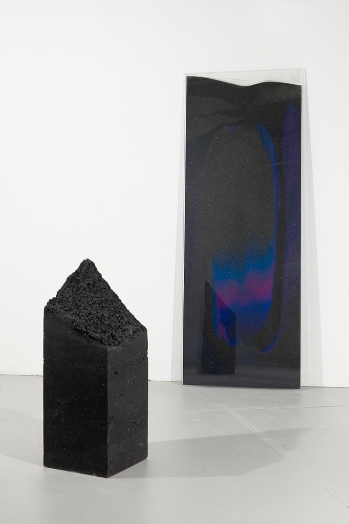
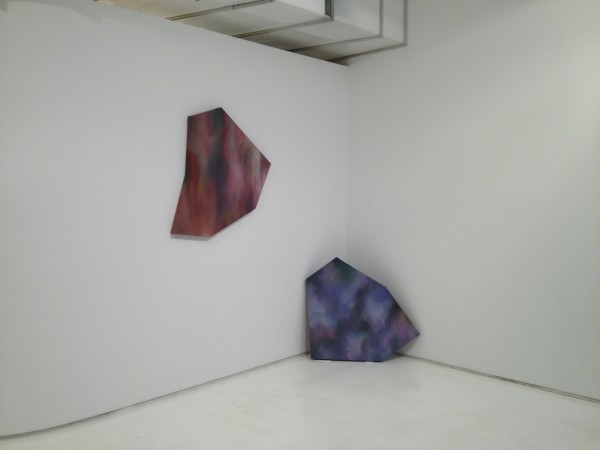
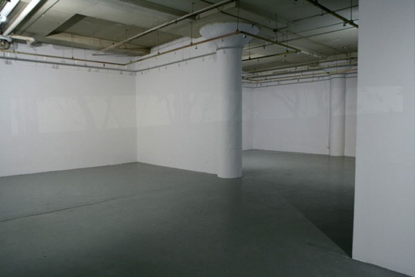
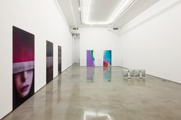
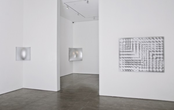
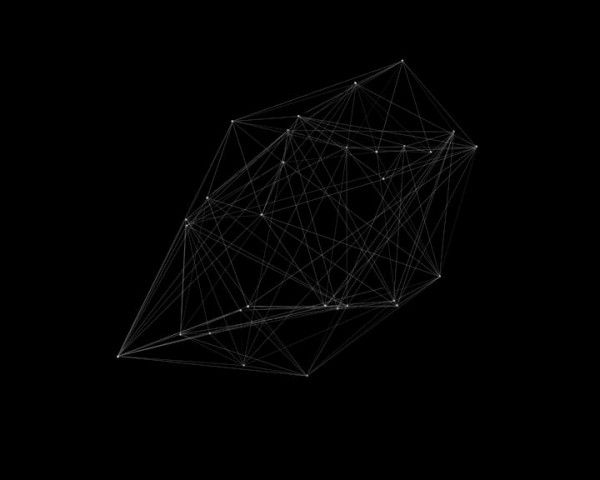
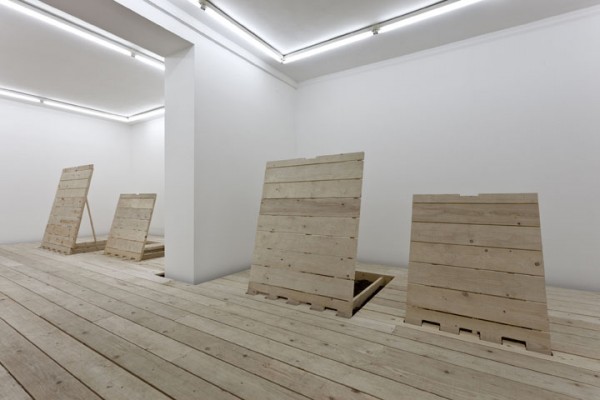
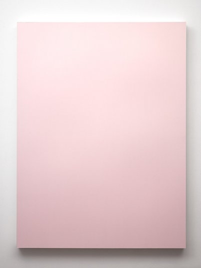
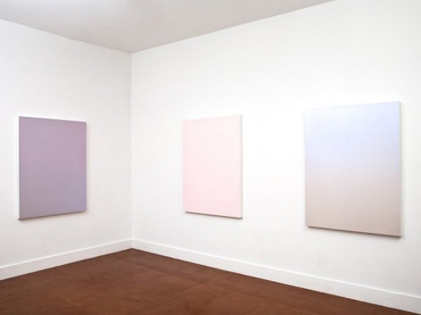
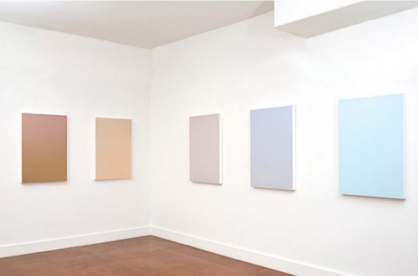
Work from Color Shift at Mixed Greens. Featuring Arabella Campbell, Wyatt Niehaus, Zachary Dean Norman, Rick Silva, Kate Steciw, Sherwin Rivera Tibayan and Alex Walp.
Color Shift opens tomorrow night at Mixed Greens.
“This exciting group exhibition revisits the reductive aspects of modernism and explores its impact on contemporary artists. Through commissioned investigations into the resurgence of modernist/minimalist aesthetics, Color Shift is a refresh (v2.0) of the modernist approach to medium, material, and color. The seven participating artists address the resurgence of this inquiry and intentionally bring it to the foreground, while critically investigating its lineage, context, aesthetic, and contemporary function.
Color Shift acknowledges reframed investigations of color as a fundamental component to art making, as well as the transience of color as it moves across platforms and devices. This dialogue is particularly relevant given the migratory nature of our image consumption and aims to acknowledge both a fundamental difference in our understanding of color, and our persistent/historical relationship to it.
Each artist has been asked to address, in some fashion, these ideas of a (reductive) new Modernist inquiry as it relates to his or her practice, and more broadly how the influence of canonical artists (Ellsworth Kelley, Yves Klein, Robert Irwin, Ay-O, Barnett Newman) is manifest in the expanded field of contemporary work. The exhibiting artists have chosen to approach this work through a variety of media ranging from installation-based works and paintings to video games and photographs.
In many ways, this exhibition aims to address the increasingly complex visual field by following a multitude of strategies laid out by the doyens of modernism. The apparent simplicity of these works echoes the rich capability inherent in a sincere and pointed investigation of new materials, aesthetics, history, and the contemporary milieu.” – Mixed Greens
Posted in Uncategorized | Comments Off on Color Shift
Tuesday, 8 January 2013
Mary Temple
Work from her oeuvre.
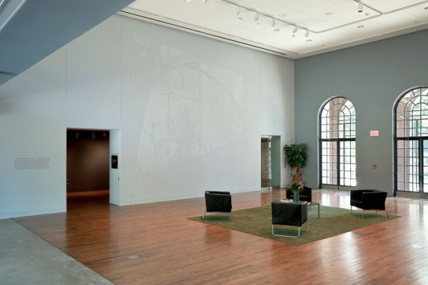
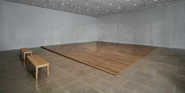
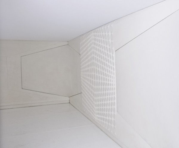
“Mary Temple’s new installation Northwest Corner, Southeast Light, 2011, creates an empty space for contemplation behind the glass front wall of the Rice University Art Gallery. Inside, the cool white walls are empty; they surround a white oak floor, or rather, a platform that takes up all but the front and left margins of the gallery, slightly sloped upward toward the rear. Visitors may walk on it only after removing their shoes. The crucial element here is the subtle, almost invisible arrangement of light and shadows—silhouettes of trees seen through windowpanes—that fall across the walls and floor: a trace of nature within the quiet of the gallery. Soon, however, one recognizes that these forms have no relationship to the actual trees outside the front of the gallery: They seem out of scale, and remain motionless despite the breeze outdoors. Also, viewers’ shadows do not match up to those of the foliage as one would expect. The ostensible shadows turn out to be a trompe l’oeil painting. Working in Brooklyn, Temple made a digital composite of images from her slide archive (trees from Central Park, magnolias from Houston) that were then painstakingly applied on site with the aid of a slide projector. The shadowed areas were filled in first, the lighted regions then painted over them. A feeling of tranquility emerges from the environment’s apparent simplicity.
That these facts are not obvious reveals how much of the eye’s work in processing input from the environment normally escapes conscious notice. The initial sense of equilibrium gives way to one of fascination. This comes partly from the work’s grounding in photography and in the transcription of irregular plant forms, which distinguishes it from the frequent treatment of light and shadow as a geometrically regular phenomenon (as in James Turrell and Robert Irwin). The work’s gradual opening up rewards a viewer’s patience.” – Benjamin Lima for ArtForum.
Tags: color, mixed greens, monochrome, space, trompe l'oeil, white on white
Posted in Uncategorized | Comments Off on Mary Temple
Monday, 7 January 2013

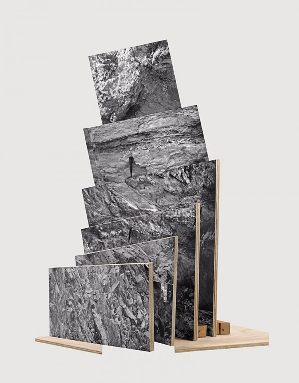
Jason Gowans
Work from Five Landscape Modes.
“This show was created from physical objects. I built maquettes using found negatives, my own photographs, and images from the Internet. I photographed them to create several angles, exposures, shadows
I took many cues from Robert Smithson’s Non-Sites, Michael Snow’s La Région Centrale, and western movie sets” – Jason Gowans
Tags: 23/3d, Canadian, construction, landscape, object, photography, sculpture
Posted in Uncategorized | Comments Off on Jason Gowans
Sunday, 6 January 2013


Massimo Grimaldi
Work from his oeuvre.
“Mariem Before The Image ‘Rubine’ and Daba Before The Image ‘Magnesia’ are two hyperdecorative images in front of which two children, Mariem and Daba, are standing, looking back at the viewers watching them. Once absent, their names remain bound to those of the images, recalling their presence and representing their absence.
Bill Kaulitz Surface and Bill Kaulitz Surface consist of the rough hybridization of the face of Bill Kaulitz, singer of Tokio Hotel, with that of one of his young fans.
They Were Mostly Women And Children, They Were Defencelessand They Were Unprotected, They Died Without Knowing Why Or How make up a gratuitously iconic graphical form. The phrases of the title are drawn from a blog that describes the recent massacre in Jos Plateau, Nigeria.
Ryszard Kapuściński Lights consists of the dull and perpetual vertical sliding and semi-rotation of two lights mounted on linear guides driven by a cog mechanism.
February 1990 Playlist is the reproduction of a playlist composed of 20 musical tracks, with 10 minute intervals of silence, in such a way that the previous piece may be forgotten and the beginning of the next one may seem a surprise. This playlist is an apocryphal and sweetened representation of one month in reality lived tragically.
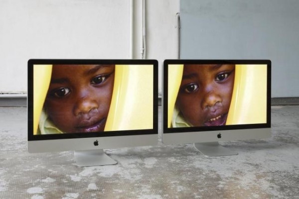
Emergency’s Bangui And Mayo Paediatric Centres Photos Shown On Two Apple iMac Core 2 Duos has come about as the result of the awarding of the Adolfo Pini Prize for Contemporary Art then donated to Emergency as a contribution in support of its paediatric centres in Bangui, in the Central African Republic, and in Mayo, in Sudan. As a result of this donation, the two Centres have become the affective subject of the photographic reportage that documents their activities. Emergency is an independent and neutral Italian organization founded in order to provide free, high quality medical and surgical treatment to the civilian victims of war, landmines and poverty.” – Artnews
Tags: apple, children, italian, nigeria, polemic, political, team gallery
Posted in Uncategorized | Comments Off on Massimo Grimaldi
Saturday, 5 January 2013
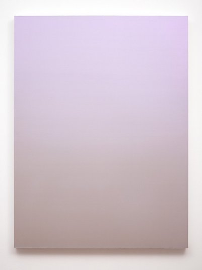
Thomas Deyle
Work from his oeuvre.
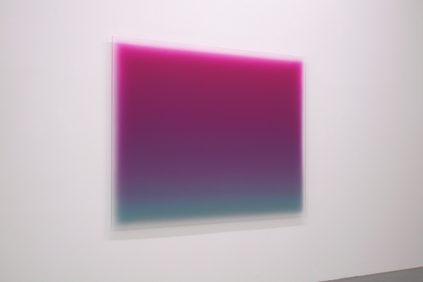
“This theory is the basis of my interest in my work since 1989, when my first painting was on a glass plate. In the figures presented here are only seeing paintings on Plexiglas panels. On frosted Plexiglas panels in thin glazes is color coated to color light areas and compacted to the highest light intensity. The paint application is using commercially available foam rollers for a previously devised mathematical structure of the composition, which to me sets the surface structure of the painting. This compositional structure allows the flexibility to participate in the “color space” to work for artistic pleasure / painting (see drawing “score”). Painting remains until the end translucent and is thus intimately linked with the respective light conditions, so that any change of light, the painting changed dramatically in their color characteristics. the surface of my paintings is completely dull and without any trace of a painting process, so that the viewer a placement of the color field before the wall can not make. He sinks his eyes in a boundless, vibrant color light space. An emotional field that the viewer can analyze in its individual elements, but will be when looking at the painting again enthralled by the inexplicability of to seeing. Due to the close links with the light and the frosted transparent plastic backing plate of my painting, which over a short distance before wall is hung appear to the viewer a floating before the wall color field, seemingly without support, very light colored, with enormous luminosity and a steadily pulsating color energy. In reality, prior to such a painting you are an observer of a process, namely the action of light upon my painting and its constant change. Attempting a photographic reproduction of any such painting finished but the described process of the direct action of light on my image and captures her, so to speak the “soul”. These characteristics make a picture of my work as hard as the observer of the photographic reproduction only remains a blurred color field that eludes an optical explanation completely. Given these characteristics of my work, I have decided not reflect the work front and photocopying perfectly illuminate, because the work never the same and seem to be different every second. All work has been photographed in the studio under the prevailing daylight conditions.” – Thomas Deyle translated via Google.
Tags: color, faust, gradient, light, minimal, painting, rad
Posted in Uncategorized | Comments Off on Thomas Deyle
Friday, 4 January 2013
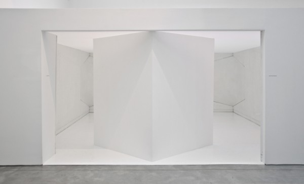
Enrico Castellani
Work from Castellani e Castellani @ Haunch of Venison.
“…his critically acclaimed Spazio Ambiente, a roomlike environment from 1970 that has rarely been exhibited publicly, and which is graciously on loan from the Fendi collection. Although created decades apart, the works exemplify Castellani’s signature style and merge art, space and architecture to transcend the confines of painting.
The Angolare (“Angular”) series consists of 12 painted works from 1960-1965 for which Castellani fabricated corner-shaped armatures that impose concave and convex curvatures on the canvas, yielding subtly disorienting perceptual and spatial effects. In this exhibition, Castellani reconsiders the Angolare works for the first time since 1965, expanding the series – monochromes painted black, red, or white – with five that display a silvery surface. The metallic, reflective pigment activates and thickens the surfaces of the works, enhancing their sculptural, even kinetic, quality while creating an ethereal presence.
Moving beyond the spatially suggestive quality of his Angolare series, Castellani produced his first environment in 1967. Called the Ambiente Bianco (“White Environment”), the work was a spatially enclosing structure formed by interlocking canvases of geometric and angled shapes. The work was destroyed following its exhibition. In 1970 Castellani reconstructed the environment, adding a floor and ceiling, and reintroduced it as Spazio Ambiente (“Environment Space”) in the landmark exhibition “Vitality of the Negative in Italian Art 1960/70” at Rome’s Palazzo delle Esposizioni. Spazio Ambiente is a 360-degree painting executed in a translucent white acrylic that produces a luminescent and transcendental optical effect. Castellani demonstrates the power of abstract painting to transform space and encompass the viewer. Together the Angolare works and Spazio Ambiente articulate Castellani’s determination to produce unprecedented and dynamic spatial experiences while using the traditional canvas.
Formally trained as an architect, Castellani focuses on manipulating the surface configurations of his canvases to alter perceptions of space. In a recent interview with the artist, Hans Ulrich Obrist described Castellani’s break from traditionally conceived paintings as “an epiphany.” Drawing inspiration from Lucio Fontana and Piet Mondrian, Castellani developed his breakthrough signature style in 1959. With Piero Manzoni he founded the Milan gallery Azimut and the affiliated journal “Azimuth,” organizing international exhibitions and publishing essays that opposed the dominant art movements in Europe at the time. Revered as one of the forerunners of Minimalism and Conceptualism, Castellani continues to produce new works that sensitize and liberate the surface of the painted canvas.” – Haunch of Venison
Tags: architecture, awesome, grid, installation, minimal, monoshrome, perception, shape, space, white
Posted in Uncategorized | Comments Off on Enrico Castellani
Thursday, 3 January 2013

Lisha Bai
Work from her oeuvre.
Lisha Bai is featured in an upcoming group exhibition entitled “The Order of Things” at NURTUREart, Brooklyn.
“NURTUREart is pleased to present The Order of Things, featuring artists Lisha Bai, Leah Beeferman, Ethan Greenbaum, Elisa Lendvay, Demetrius Oliver, Allyson Vieira, and Joe Winter. The Order of Things considers the shift in our relationship to the universe in light of recent apocalyptic predictions. An acute awareness of time engenders a special attentiveness to space, materiality, and objecthood, with smaller details emerging and becoming foregrounded.
Either through their own experimental studio practice, or in how they visualize and aestheticize the passage of time, the artists in this exhibition address cosmological hierarchy from the bottom up, reiterating the impulse of subjects to understand their existence and the world through objects. The interplay of works, some of which use a scientific vernacular, underscores the phenomenological relationship between subjectivity, and perception, examining banality and the existential in equal parts.”
“The Order of Things” is curated by Jamillah James.
Tags: new york, plexi, sand, sculpture, space, yale
Posted in Uncategorized | Comments Off on Lisha Bai
Wednesday, 2 January 2013
Hassan Khan
Work from his oeuvre.
“Is it possible to isolate, extract and hold up for inspection the essence of a culture? In a city like Cairo, teeming with endlessly competing stories and voices, any attempt to tease out the core threads of its cultural identity is almost certainly doomed to sloppy generalization or scattergun biographical anecdotalism. Egyptian artist Hassan Khan is all too aware of this dilemma, as he journeys in his work back and forth between the individual and the communal, and the revealed and the hidden.
As the largest city in Africa and the centre of the Arab world, Cairo’s population is estimated at somewhere between 16 and 25 million, depending on whether you include the city’s millions of homeless and undocumented citizens. This overcrowding forces people onto the streets, where daily life is led with a necessarily casual regard for the distinction between public and private. The loudness, theatricality and energy that such an existence demands are reflected in Shaabi, a popular form of street music that is as impassioned as it is generic. In his 2005 work DOM-TAK-TAK-DOM-TAK Khan found six recordings of Shaabi standards, analysed and re-recorded their rhythms with a Shaabi percussion section and then employed virtuoso street musicians to improvise separately, withouthearing one another, over the recorded beats. He then mixed the independently performed tracks together, producing six hybrid instrumental masters that, while built from subjective interpretations, actually sketched out a reductive schema of the genre that set the clichés of spontaneous personal expression and predetermined cultural momentum against one another.” – Frieze
Tags: cinema, culture, diagrams, egypt, film, sculpture
Posted in Uncategorized | Comments Off on Hassan Khan
Tuesday, 1 January 2013
Davide Belula
Work from his oeuvre.
“…Addressing the painterly representation of landscape, he has also begun another series in two dimensions: images of riverbeds, including those of the East River and the Seine, made by throwing a large piece of canvas, filled with pebbles and tied with a rope, into the waterways. After leaving the canvas submerged for about two hours, he pulls it back to shore, creating a visual record in water stains, algae and mud. Expanses of untreated canvas, the final works, East River Painting (2009), La Seine Painting (2010), and Douro Painting (2010), feature green or black smudges (depending on the health of the river), accumulations of silt and the occasional leaf of an underwater plant—poetic compositions shaped by Balula’s plunge into the natural environment…” – Lillian Davies for Art in America.
Tags: color, faust, french, material, minimal, painting, wood
Posted in Uncategorized | Comments Off on Davide Belula
Monday, 31 December 2012
Franck Salzwedel
Work from THE STAR WEPT ROSE at Blackston Gallery.
“…Salzwedel utilizes both precision and intuition in applying layers of pigment to reveal luminescent, entirely smooth panels of singular yet gradated colors, which progress both laterally and radially across the surface. With little overt contrast across the plane, the focus is on nuance and the barely discernable variation across the individual panel of color. The additional overlay of a virtually imperceptible iridescence changes entirely in overall effect according to the perspective from where a painting is viewed.
The texture of the pieces is perceived in the subtle transition of colors on both the panels and in reference to their counterparts. The smooth perfection of the surfaces, the repetitive vibration of color, the interplay of the pieces and the scope of pigments employed all assume vital roles in creating a precise environment based on a limited spectrum of color — and offer a direct connection to the transformative experience of color in general.
The ultimate depth of the surface is virtually negligible to the viewer, a perception that is enhanced by the sight of the edge of the boards, which are painted white. The works take on a transcendent lightness, similar to paper.” – Blackston Gallery
Tags: color, color field, french, monochrome, painting
Posted in Uncategorized | Comments Off on Franck Salzwedel