Molly Springfield


Molly Springfield

Work from Translation.

“I can’t remember the first time I read Proust—a fact that’s ironic on a number of levels. I’m pretty sure it was sometime during the summer of 2004, the summer after my first year of grad school. A friend who is something of a Proust evangelist forwarded me a Word document full of his favorite quotes from In Search of Lost Time after learning that I was interested in the relationship between objects and memory. Many of the quotes were from passages about art: “Through art alone are we able to emerge from ourselves, to know what another person sees of a universe which is not the same as our own and of which, without art, the landscapes would remain as unknown to us as those that may exist on the moon.” My reaction to Proust was of the kind that every artist wants a reader or viewer to have. I thought: this is how I feel. 

In delving into Proust, I became interested not only in his writings but in Proust’s own idiosyncratic, reclusive life and the history of In Search of Lost Time’s translation into English. The first English translation of the novel’s first volume, Swann’s Way, was by C.K. Scott Moncrieff and published in 1922. Like Proust, whose sole endeavor during the last years of his life was finishing his seven-volume novel, Moncrieff’s spent the last eight of his translating it. He died before finishing the seventh volume. Although Moncrieff took some creative license with his translation, adding superfluous embellishments to the text, his flowery, baroque interpretation was the standard for about 60 years. Excepting the revisions to Moncrieff by two different translators, there are only two other original English translations of Swann’s Way, one in 1982 by James Grieve and one in 2002 by Lydia Davis.

Each translator’s approach is different. Some adhere as closely as possible to the French; others imagine what Proust might have written had his native language been English. Moncrieff’s translation of the novel’s first sentence reads: “For a long time I used to go to bed early.” Grieve’s: “Time was when I always went to bed early.” And Davis’: “For a long time, I went to bed early.” In either case, the translator is a mediator between reader and author. Unless one is able to read French, meaning is inevitably lost. 

I am currently producing my own “translation,” entirely in the form of drawings, of the first chapter of Swann’s Way, pieced together using every English translation of the text. It will consist of 28 individual drawings of photocopies of open books, each drawing consisting of two sequential pages from the first chapter of the book. This patchwork of texts will produce overlapping gaps from page to page, resolving into an incomplete and not-fully-readable rendition of the original. The drawings will be installed side by side so that viewers can read my translation, with all of its breaks and intersections, from beginning to end.

There are parallels, I think, between the occasionally flawed process of translation and the novel’s central theme of memory and, also, the holes, static, and misperceptions that incomplete or lost memories can leave behind. For Proust’s narrator, memories have an intrinsic and sometimes transformative relationship with objects and places. But the narrator also values the examination of the minutest details of sensory experiences and dependence on habit and ritual, without which, “our mind, reduced to no more than its own resources, would be powerless.”  – NY Arts Magazine

Nicholas Knight


Nicholas Knight

Work from the Sentence Diagrams, Frame & Photo, and Taking Pictures.

Interview with Nicholas Night:

Jordan:

In much of your work, there are underlying (and sometimes blatant) references to the production, deconstruction and obfuscation of the original (sentence, work of art, floor, frame, etc). Quite possibly, it is this method of working/thinking (which is perfectly distilled in Sentence Diagrams) that makes your work so engaging. Do you see this post-structuralist mentality as a conscious part of your work and process? [I normally don’t invoke movements so readily, but Derrida and Barthes (among other philosophers / artists) comprise your Sentence Diagrams source material.]

Nicholas:

I’m usually conscious of this approach to my subjects, but I’ve also found it creeps in even when I’m trying to do something different! But it is not my intention to bolster any received Post-structuralist position. My techniques are more interrogatory, so generally I want to push back on the subject to see if its claims hold up. I pull things apart and put them back together again. And like any tinkerer, when I put them back together, there are usually parts left over.

Jordan:

Taking Pictures is a little bit of an outlier when viewed with your other work, but can be viewed with the same lens of deconstruction. Aside from the irony and photo-specific commentary, what was your motivation for choosing various masterworks to be the off-frame subject of this work?

Nicholas:

At first there seems to be a visual break, yes, but most of my favorite themes are as present here as elsewhere. I’m very interested in how the gestalt meaning of a thing changes when a new form is grafted on top of it. So the Sentence Diagrams are not merely grammatical analysis; they are a picture of the fact of being diagrammed. That is, the diagram exists as a method out there in the world, and there’s nothing the author can do to withhold her sentence once I choose to analyze it. Then, if the results modify its claims, some new thing is created.

And really, I think the same thing is happening in Taking Pictures. This mode of interaction by museum-goers (not just photographing an artwork, but doing so with the particular at-arm’s-length mode that these devices require) is creating a new thing. I’m documenting the phenomenon, but it’s very important which photos I choose to let into the world. There is always some multivalent situation in the successful images: the photographers’ postures, or the details of their appearances, align in some revelatory way with the duplicated histories accompanying the artworks they’re photographing.

Jordan:

I am intrigued by the austerity of Open Source, and Double-Empty Frame. While viewing the work one is denied access to context and image through a challenging of expectations. Traditionally picture frames are objects meant to contain works, not exist as an integral part of the work. How do you view this dialogue progressing with the viewer?

Nicholas:

You’re right that the works are quite austere, and they can be challenging to engage with, since they seem to withhold so much. But I don’t think they deny access to context or image. I was really trying to find some limit condition of the photographic experience. Since photography is so flexible and adaptable, I wanted to use the conventions of it to make something that might not actually count as a photograph. Pushing through the frame and into the real space seemed to be a way to achieve this. So the resulting photo-sculptures are always depict the space they’re made in, and thus are bound to it. They’re “tethered”, if you will. My hope is that the viewer will overcome a moment of dis-orientation by enlarging his own “frame” of awareness about the context that lends meaning to photographic images.

__________________________________

“Nicholas Knight has covered the walls of the project room at Steven Wolf with something of a relic of an older educational system: the sentence diagram. Each wall is consumed by a single, spidery, large scale diagram done in vinyl lettering with the remnants of pencil guidelines lingering beneath. But the point of the piece (because this space should really be thought of as a whole), is not the almost forgotten model of sentence diagramming, but how this form allows the carefully selected quotes to be broken down, dissected. Here, on two facing walls, sit the combined diagrams of a quote by Jacques Derrida, alongside one by Henry James. On each one is in French (grey) and one in English (black). They read, “To read between the lines is easier than to follow the text” / “Il est plus facile de livre entre les lignes que de suivre le texte” (Henry James) and “Il n’y a pas de hors-texte” / “There is nothing outside the text” (Jacques Derrida). One can already see, just from the combination of these two quotes, not only the pun inherent in their visual form, but the theoretical dialogue. I feel that the James quote speaks more to our tendency towards quick interpretation based on our own pool of knowledge, while Derrida warns against the potential pitfalls of such actions. I.e., the two quotes are not necessarily at odds, as they first might appear (or are they?). The real object here is to get the viewer to think – to analyze. Somehow, I feel that having the quotes diagrammed out (and therefore made more of a struggle to read) further enforces this.

The third wall is adorned with a quote by John Lehmann, “To talk about translation is rather like talking about the glass in front of a picture.” This, of course, adds an additional layer to the Derrida/James conversation, wherein one pairing features each quote in its original language and the other in translation. I can only hope that the Lehmann quote is presented as a point to be contested, as there are debates among scholars even with the translation Knight uses for “Il n’y a pas de hors-texte” (not to mention what is “lost in translation”). (see here for a discussion).

Here, like in many conceptual works, the aesthetic element is almost incidental – the stylization serves only as a springboard for discussion – however, it is integral to the piece, as much so as the evidence of the process involved in its design. All of Knight’s work seems to follow a Goethe quote he used in a previous piece – “Thinking is more interesting than knowing but less interesting than looking.” – Percolator Magazine

Andrew Bush


Andrew Bush

Work from Vector Portraits.

I can’t recall where or when I first encountered this work, but today is a good day for it. You can buy the book here.

“A century ago, the first affordable, mass-produced automobile rolled off assembly lines: the Model T. Sensing it would spark a social revolution, its creator, Henry Ford, proclaimed, “We shall solve the city problem by leaving the city.” By “problem” he meant not just urban congestion, but the increasingly intrusive presence of Eastern European Jews (Ford was a notorious anti-Semite), and more alarmingly, blacks escaping the Jim Crow South. By “leaving” he meant fleeing for the suburbs and their promise of an ideal—which is to say white and Christian—America.

The resulting car culture befouled our environment and poisoned our politics; Rush Limbaugh’s popularity wouldn’t have been possible without legions of angry listeners stuck in traffic. But if this unsustainable mode of living may finally be going the way of the dodo, it still deserves an iconic visual representation. For that honor, I’d nominate Andrew Bush’s “Vector Portraits.”

Bush created the series between 1989 and 1994, using his own car, with a medium-format camera pointed out the passenger side, as a rolling studio. Cruising around California and the Southwest, he’d pull up alongside another vehicle, matching its speed before remotely tripping the shutter.

Usually, Bush caught his subjects unawares, or, if facing the lens, looking peevish or puzzled or mildly amused. They seem to be heading everywhere and nowhere, caught between the point A of autonomy and the point B of alienation. Occasionally, Bush’s flash can be seen reflected in the driver’s door, glinting like sunlight off armor. Together, these images from the cusp of the ’90s create a portrait of a country focused on the road—and oblivious to where it was going.” —Howard Halle

Reynold Reynolds


Reynold Reynolds

Work from Six Apartments.

“Two screen video projection loop transferred from 16mm with a duration of 12min. 

Six Apartments is a poetic document of decline and deterioration—both physical and ideal, hypnotic and melancholic. Six isolated occupants of six different apartments live their lives unaware of each other. Without drama they eat food, wander between rooms, bathe, watch television, and sleep. For them, this is life.

Yet whilst it may appear that nothing is happening here, the apartment building and its inhabitants’ bodies are aging, giving way to bacteria, larva, and finally transformation. Televisions and radios tell them about the destruction of the whole planet but it does not effect their lives. Everything is in a state of resolute conversion. Immense drama does exist: chaos overcomes order; rot supersedes life; small destroys large. The occupants’ lives are sinking slowly towards death according to the deliberate, methodical rhythms of their uniform days. This insistent erosion of bodies, building, and planet however, also reveals the ever active potential of death and its material processes.

An old woman is playing cards; she is dying. A man is listening to the radio; discomposed interiors of activity relentlessly eat away at him. All of the tenants are victims of the realities of physical deterioration as well as of their own psychological attempts to accept the attendant struggle with death. In their passivity and isolation, the inhabitants emerge as the true form of death, while the rooms they inhabit maintain the ongoing transformation of life. The potential of life, then, exists only in the process of death. Eventually all forms of life are consumed by new life. The implacability of decay results in an explosion of life.

Reynolds’ Six Apartments sustains a mood of hopelessness, or perhaps more optimistically, one of melancholia, and even if the occupants remain unaware, the viewer sees: in death lies a great activity of life. One wonders if this might be a positive sign for the planet.” – Reynold Reynolds

Claudia Angelmaier


Claudia Angelmaier

Work from Works on Paper.

I encountered Angelmaier’s work the other day at Galerie Alexandra Saheb, this work is (as I am sure has been said) strongly remiscent of Robert Heinecken’s Recto / Verso. Now, this is a very basic and aesthetic observation, as I think the conceptual concerns are different, albeit with several fundamental similarities. In an examination of advertising and context, one is compelled to consider the implications of canonized masterpieces of art, their existence as a museum card, and how the transparency of context, both literal and figurative, challenge and obsurce the actual work.

Galeria Kleindienst also has a good selection of her work.

“Claudia Angelmaier’s works quote the great masterpieces of art and their history. She approaches pictures in the form of reproductions that she finds in books, postcards or slides. These then become the material of her works. Hence, the motif is no longer the “original”, but the photographic reproduction that also leads to the work’s familiarity. Angelmaier’s photographs address the question of our viewing habits in a world flooded with visual media.

In the series “Works on Paper”, Angelmaier works with various art postcards that share the themes of the Rückenfigur (a figure seen from the back) and the Romantic landscape. She photographs the postcards in such a way that, although they are seen from the back, the viewer is also confronted with the front – the picture side. The art postcard acts as a souvenir, a memory of the artwork; its mass circulation contributes to the work’s popularisation. Angelmaier’s works elevate the art postcard to the status of a tableau. The just visible image on the front – the reproduction of the artwork – is given back its original dimensions. Nevertheless, the contemplative viewing of the picture is disturbed by the way in which it has been photographed. The viewer is confronted with the normal details of postcards such as the barcode or fine dividing lines and the printed text of the card. The latter provides the meta-level of the picture: the work’s title, author, size, location, medium etc. By showing and making us conscious of what is “behind” the picture – the classification as object within the art market or the art historical system – the postcard is implicitly changed from being a collectors’ item back into an object of communication. 

The artist carries out a double game. By giving the work back its “original” dimensions, she brings us closer to this work; however, the further reproduction – now reversed and partially overlapped – of the work becomes a shadow of itself. This results in a constant oscillation between visibility and disappearance, illusion and pictorial reality – something is revealed and simultaneously hidden.” – Galeria Alexandra Saheb

Mårtin Lange


Mårtin Lange

Work from Anomalies.

Interview in ahorn magazine, which if you haven’t read, you should.

“Lange’s photographs also seem to reference photographic modes from the document and the archival oddity. They are reminiscent of the book, Evidence, by Larry Sultan and Mike Mandel, where the dislocation and seeming randomness of the objects and scenes photographed imbue the work with an atmosphere of intrigue. The harsh flash and ultra-high contrast also lend Lange’s images a forensic feel, as if they had been made to prove or disprove some criminal allegation. They are, I am sure, made for no such reasons, but it is hard to disengage yourself from the history of practical uses of photography when faced by such enigmatic work. It would also be easy to view Lange’s images conversely, as sitting outside reality because of the technique that he employs, as untrue representations of the ‘real’ object or as caricatures…” – Gordon MacDonald from Photoworks Magazine, found via The Exposure Project.

Giles Revell


Giles Revell

Work from Photo Fit.

The PDF of the project, complete with interviews and an introduction is here. Read it.

“Photofit: In providing each sitter with the same tools – a 1970s police Photofit kit, the process by which they created their self-portrait was democratized; the immediate, tactile qualities of the kit enabling them to tell their own story as a likeness falls into place, piece by piece. An ongoing collaboration with Matt Willey of Studio8 Design, Photofit has been widely published.”

Ian Aleksander Adams


Ian Aleksander Adams

Work from Gray Days.

The following is an email dialouge that Ian and I had yesterday that discusses his work. It really was a treat to have an intelligent Trans-Atlantic back and forth about art.

Ian: Gray Days is my most recent book project, with the final touches still being put on it. Being Inside was the first attempt to pull something together from my personal work, and ended up being much more conceptually specific. Israel By Land was also shot during the Gray Days period, and there is some crossover.

So I don’t have a final statement that I’d want to send just yet, but I’m more than happy to talk a little bit about it. 

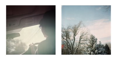
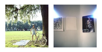
The book, which is small and personal (7 inches, the blurb square, is perfect for it, I think), is either a culmination or a significant step in about 4 years of shooting. The creative process for this book centers on the editing and discovery of visual sensibility, instead of being founded on a specific subject based project mentality. Basically, I wanted to look at what I’d been taking pictures of and let myself make connections in a more organic matter in order to learn more about what I took with myself when I was shooting. So it’s a book about New England, with many of the pictures taken very far from the area I was raised. It’s a book about Gray Days, but not about gray days. It’s a book about fuzziness and poetic sequence, about in betweens instead of solid blacks or pristine whites. 

It’s very mundane, but it’s not, I hope. 

I hope some of that helps. It’s a body of work that I think speaks for itself in many ways – on most levels, it is what it is. But I don’t want it to sound simple. It took many months of just editing and moving pictures around till I felt it was perfect, as well as the creative input of many minds. From the get-go, though, I was hoping to make a project that resisted the quick and dirty artist statement approach to creating work, and that makes it more difficult to describe verbally. 

Jordan: There were a few things that specifically drew me to the work, and I was wondering if maybe I could ask some vague questions that could get us somewhere productive. One of the aspects that drew me into the work was the film-specific aesthetic, not in the use of grain or color palate or any sort of preferential film v. digital usage, but in the inherent acknowledgement of photographic process evident in processing marks, chemical stains, and light leaks. Quite possibly, I am sensitive to this sort of treatment because of a strong conceptual interest in medium-specific contexts and self-reflexive works, but regardless, it brought me in.

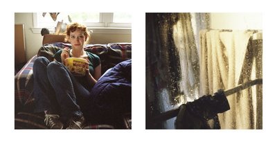
In some ways this is what interests me about contemporary Dutch photography, but their aesthetic sometimes balks at formal composition or thematic cohesion in a way that I find less appealing than your work. It was also the use of diptych that I found interesting, with some images paired and some left alone, yet still organized in book form. Were the pairings mostly formal, organic, trail and error type of diptychs (I view them this way rather than recto-verso) until something felt right, or was there any sort of conceptual narrative to how the book is structured?

Ian: I’ve been very interested in the physical manifestations of photographic process – though perhaps more in a metaphorical or purely aesthetic sense, instead of a technical one. They tend to represent a shift in how I felt about photographing in general – embracing of fear, acceptance of failure, perhaps – and I’ve written a fair amount along those lines. Maybe you saw the article published in ahorn magazine? Here’s the link: (On Fear And Photography)

While an art student, I had many debates with my teachers about the “right” and “wrong” of creating images. Phrases like “underexposed” irked me, because of their inference of a “proper” exposure. To me, the “correct” exposure would always be the version of the image that had the emotional impact that reached me the most. Often times that would be the image at the end of the roll, or the one with the light leaks, or the one four stops underexposed. When I showed these to teachers out of context, they were almost always under appreciated, but I think after several months editing, they were allowed to be what they were.

It’s like the crooked skylines of that one landscape photographer – one crooked skyline was a mistake, but in context, they were a vision, a way of looking at the world. Learning to let these things be as they should, instead of “correcting” them in some manner is just as hard as learning the “rules” for successfully pleasing an advertising director, haha. It takes willpower to just let them sit until they become comfortable – often the impulse to change them is only within myself, not something wrong with the picture. 

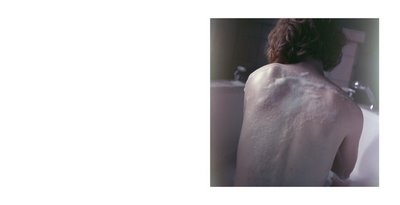
 And since I was learning to embrace a more risky style of shooting (vintage camera, expired film, neglected light meter), I would often be reacting to the final images themselves, not trying to create what I thought might be the best way to capture something – if that makes any sense. Many of these images were taken, scanned, and then left alone for several years before becoming part of the editing process for the book. When I saw them again, it was as if I was discovering them for the first time, and their existence was purely as photographic object, as image, and not as representational of something that had happened. Obviously that’s only one layer of their existence, but that was the most important one to me for much of the editing process. I wanted to see what they did as images. 

Of course, at the same time, it’s almost impossible to think of a picture of something as just the picture – the “something” matters very much. I think that for much of the small books, though, I was photographing feelings, mindsets… moods, not objects. Perhaps you can see that? It tends to come across more in book and series form, it’s an aspect to the work often lost in individual prints, one of the reasons I don’t often focus on selling prints as the primary art object.

So the pairings and sequence, they might be the real crux of the art here. I think a lot of the individual images are beautiful, some may even be excellent pictures, but real poignancy doesn’t seep into the work until it is appreciated together. I spent a long time making sure each page turn worked in some fashion, each image was working on the page with others. I wasn’t satisfied with what an image did to the viewer, I wanted to see what the images would do to other images. 

I also spent a lot of time making decisions about the overall sequence. Subject matter, and even exact subjects, are revisited throughout the book. Time is played with. I didn’t want it to be direct and easy, it had to stay gray in all aspects, so time flows in strange ways. Also, as a direct reaction to seeing people flip through my other books, the book ends and begins with the same subject. Many industry professionals will flip through a book from end to beginning, and I wanted that to still be a moving experience.

People know that a lot of editing goes into books, but they often focus on selecting the “best” or “strongest” images. That was not my intention. You don’t make a song by only including the loudest sounds, you don’t make a poem by only including the harshest words. In order for something to flow, it needs to have rhythm, it needs to have waves. So I included images where they felt right, without worrying too much about their individual strength. It makes sense for the viewer to spend less time on some pages than others. If every image is an explosion, the viewer feels worn out, tired. I know there are not many explosions, in this book, it’s not that kind of work, but I think you understand what I mean. 

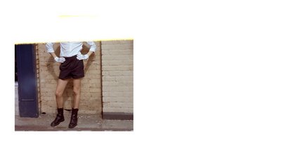
In the same way, not every spread is a diptych. There are no rules for this kind of work, and getting stuck in a pattern is often detrimental. I included that half frame image of the young man in the mickey mouse costume, and I included it on the left hand side for this very reason. It’s designed to let the viewer know that this book is not just a set of pictures, it’s a poem that is in an order, and may catch you off guard or pass you by if you are not paying attention.

Jan Dibbets


Jan Dibbets

Work from Perspective Correction, Land and Sea Horizons, and Windows.

New York Times article here.

“The camera records something quite different from what we see. There are no rectangular formats in nature, only in art (paintings, sheets of music or poems, windows, ravioli), and only if we choose to look at it that way. For Perspective Correction, My Studio I, 1: Square on Floor, 1969, the earliest work in the show, Jan Dibbets drew an upside-down trapezoid (in relation to the camera) on his studio floor and took a photograph (the work) so that the trapezoid, distorted by perspective, appears to be a square. It’s difficult not to think of it as a square, and no reason not to, despite the inward-slanting walls. In a way it is a joke about the preeminence of the picture plane in contemporary art, whereas, of course, the perception of Renaissance perspective still prevails, or at least still resides, or better yet is still the place where we and the artist reside. Despite the square, our eyes take us into depth to the windows and their light. There are windows within a window presaged by another window. Without really destroying our illusions, the artist has interrupted reality, or intervened to almost imperceptibly create another reality, something in the back of the mind that forces us to accept both realities. The artist introduces himself (takes control?) by making a square out of a trapezoid in his own studio. The trick is an elementary one, a wan display of the human imagination. But it suggests something more elemental, in itself and in works to come.” – Donald Goddard

“Jan Dibbets’ series “Land And Sea Horizons” juxtaposes photographs of dunes and ocean, each mounted in different shapes and formats. The viewer sees simultaneously what would be in front of and what would be behind him in a real landscape. This experience is further stimulated by the fact that although the panels are pieced together in different ways, the horizon line always remains level and constant.

Also Dibbets’ “Windows” question the angle of vision from which we perceive reality through images today: a reality presumably existing in the objective sense, and another reality that we are able to create as a pure fiction in our minds. If some of Dibbets earlier works have already juxtaposed the indexical and the iconic dimensions of photography, this strategy is fully realized in the “Windows” series. Photographs of windows are isolated through a process of cut-outs and then enlarged. These images then are mounted on paper and surrounded by a monochrome field of paint. The light eminating through the windows is contrasted by the actual light that is reflected by the painted surface. Icon and Index are playing off each other and finally seem to become the flipside of the same coin.” – Konrad Fischer Galerie

Tim Simmons


Tim Simmons

Work from Quarry (Intervention).

“His works expound the spirit of the place, from the mundane to the magnificent. Landscapes from the back yard to the snowfield are the sets of his eerie, haunting, enigmatic photographs. Created as seamless, modest yet elaborately orchestrated tableau. Meticulous in their poise, composition and lighting — Simmons is a master technician, an illusionist. By using a technique refined over the last 25 years, he reconfirms that the camera can do much more than capture a moment in time. Interventions are animations of frozen time worked to elevate landscape, (imagined as an indefinite subject between dream and reality), above history and legend. His pictures suggest the bizarre yet beautiful surrealities behind deceptively familiar locations, empty and lonely territories become simultaneously poetic and seductive. Dissonantly lit in their isolation at once recognisable they draw us into exploring a transformation of the urban landscape after dark, and take on altogether new and classical meanings in this estranged context.

Nocturne is a natural subject for artists who exploit the metaphysical dynamic that manifests during the dark hours of day. In their work they manipulate emblematic representation to amplify the emotional impact, this is employed in Simmons revelation of the world, instilled with a heavy silence and an anxious glow. Conjured during the diminishing hours of day and deep into the night when the uncanny and otherworldly manifest, rendered with concentration and subtleness these fleeting moments endure. In each image the enchanting narrative unfolds suggesting a yet unrealised transformative potential. Within eerie states of stillness they possess a silent and extraordinary magical beauty.

Shot at night or at the time just bridging twilight, a mythical zone when the veil separating this world and the next is at its thinnest. They bask in the loss of light which accents the glow that persists, emanating from an unknown source. The most significant sense from the works is an overriding feeling that evokes the notion of interlude and aftermath.

Fascinated with the mythology of space and potential traces of life in absence, Simmons’ imagery does not attempt to offer a single answer to a complexity of questions but acts toward contributing to the mystery of life and in reconfirming the elusivity of a tangible didactic.”- 
Louise Clements – Senior Curator of QUAD and FORMAT Photography Festival