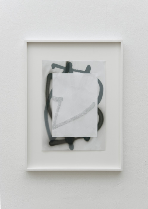
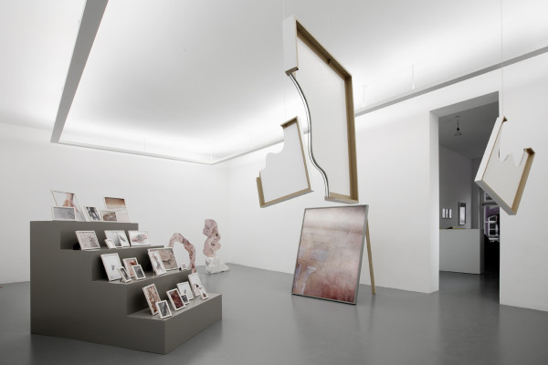
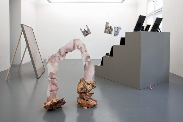
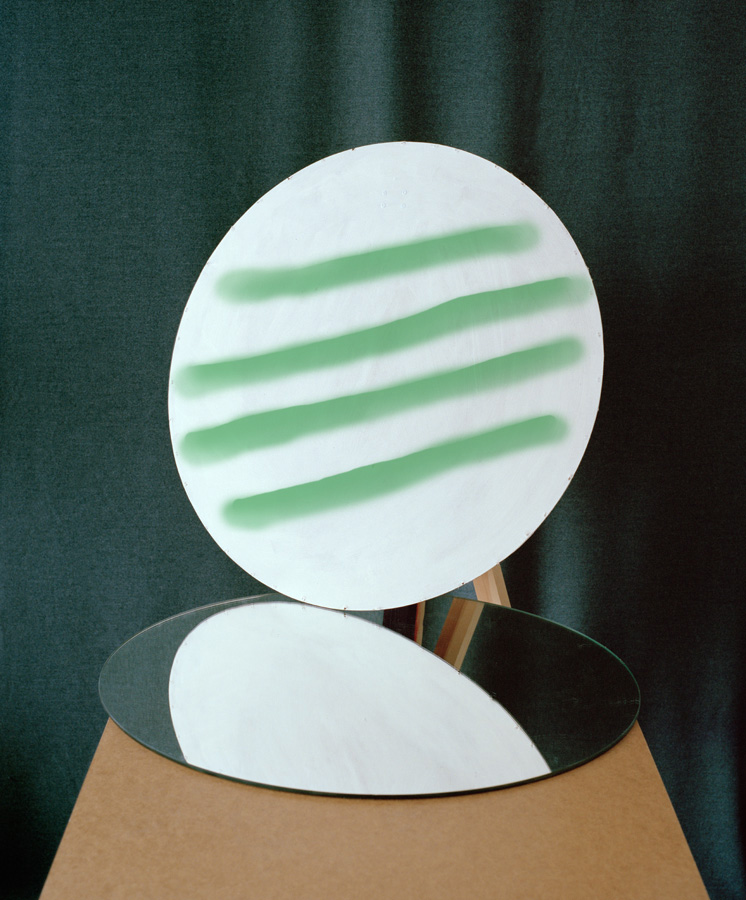
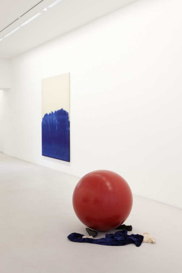
Ute Müller

4-EXHIBITION
10-EXHIBITION
129
57
96

Ute Müller

Work from her oeuvre.

“…This body of works – paintings, architectural structures, sculptural references – defines a space where the viewer is immediately captured by the beauty of a painting that has its origins in the history of twentieth century abstraction.

Yet this is only a transitory emphasis, an instant of burning passion later exposed to the artist‘s scrupulous critique, revealing her own tendency to question such tradition.

Catalysts and kingpins of the whole exhibition, the paintings are monochromes at first glance – toning from grey to blue – but slowly unveil different and deeper levels of paint. The sculptural elements purposefully arranged in close proximity to the paintings, suggest the audience different points of view and contribute to define portions of space in which a close relationship between the work and the eye is established – initially estranged, then, intrigued.

The audience  is thus confronted with fragmentary processes and discern several „views“ which direct the eye inside an apparently indecipherable pictorial space, like constructivist scaffolds made of guiding lines for the eye.

Müller knows what it means to be inside a tradition. She is perfectly aware of the forms devised by her forerunners, from the Russian Constructivism, one of the first movement to investigate the connection between painting and real life, to the minimal art experiences; but she also knows how to redefine and reconstruct her poetics through a series of slight variations which answer originally the tortuous questions sorrounding the status of painting as art.
Her paintings fluctuate between solidity and instability. Different levels of interpretation can be applied, side by side, independent of one another; they all influence the journey of the audience through the pictorial space. The result is a multi-perspective game in which the imaginary and the real are entwined, in which poetry and narrative are balanced by more physical, pragmatic needs, and where man is still the core of the matter, oscillating between illusion and reality….” – Galeria Collicaligreggi.

vis DUST Magazine.

Rachel de Joode

IMG_9833_de_Joode_Molten_Inner_Core
IMG_9830_de_Joode_Molten_Inner_Core-1
_MG_5708
IMG_9790_de_Joode_Molten_Inner_Core
IMG_9803_de_Joode_Molten_Inner_Core

Rachel de Joode

Work from The Molten Inner Core at Neumeister Bar-Am.

“Puddles, Meteorites, A Surface of a Dinosaur Bone, Bronze, Grey Goo, Fat, Stone and Human Skin all have an aesthetic calling to de Joode. These things are explored for their material agency, not only their communication with us but with each other and their context.
Skin plays a central role in ‘The Molten Inner Core’. The average human adult carries roughly 2kg of dead skin, the surface of which is shedding every two weeks. This perceptual layer is therefore useful to de Joode when understanding a physical interaction between things, and investigating when a thing changes form.

Works ‘White Pedestal Thing’ and ‘Sculpted Human Skin In Rock’ explore the co- dependance and understanding of pedestal and sculpture. Visibly handmade clay miniatures act as pedestal and sculpture, while abstract forms in human-scale are flat. These two-dimensional shapes are covered in ‘sculpted’ photographs of skin and stand in solid rock. ‘Achilles’ depicts the artists heel and is printed the height of the artist. Although photography is used as representation, each object is acting in a non-hierarchical grouping. A print, the ink, the frame, the floor, a pedestal, a sculpture and even the artist herself retains a potential to become (melt into) another thing.” – Neumeister Bar-Am

Thomas Albdorf

14_albdorf_stilllife 01_albdorf_formerwriter_900 17_albdorf_stilllife 02_albdorf_actualities 15_albdorf_stilllife Screen-Shot-2014-01-20-at-22.29.51

Thomas Albdorf

Work from his oeuvre

“Thomas Albdorf’s still lifes are never quite what they seem – the more the perspectives, shapes and colours shift, reflecting the Austrian photographer’s interest in manufacturing beauty and uncertainty out of seemingly mundane. “What fascinates me when I look at art created by other people is how they engage with simple objects within their immediate reach,” he says. “I feel drawn to people who manage to create something very beautiful and charming out of almost nothing.”

Albdolf’s immediate surroundings are the outskirts of Vienna, an area he wandered in search of raw material for his Former Writer series. Seizing on wood, wire, tyres and fridges, he created a kind of ‘edgelands’ trash art, sometimes adding paint to enhance the sense of uncertainty. “I used to do graffiti writing but I stopped at an early age because it’s quite superficial,” he says. “But as I was wandering the peripheries of Vienna, I saw tags and I wanted to use a spray can again.

“I like the idea because one of the easiest tools to use in Photoshop is the simple brush, so I thought I would use a mixture of real and fake paint. So the paint in the first picture in Former Writer is Photoshopped in – you can’t see it in the reflection in the mirror. But the paint in the second one was sprayed on with a can, and you can see the drips. When I use paint in the series, I create basic, thick lines because that’s what works best with spray cans. So it’s very rough and naïve, and it links digital painting to analogue painting.”

Albdolf also mixed up where he worked, sometimes shooting on location and sometimes setting up shots indoors. “The studio as a place became a topic of interest for me; the idea that if something is inside it’s staged and if it’s outside it’s authentic,” he says. “I wanted to see how these two types of images work together.”

“I did a presentation on Allan Sekula’s Fish Story when I was studying; it’s a story shot on container ships about how goods are shipped around the world. During the process, I wasn’t sure if Sekula really went on the trips with the container ships. Was it real or not? I didn’t know either. But it doesn’t matter, authenticity doesn’t matter. It’s hard to draw a line between the two, and thats’s what my work is about.”

Albdorf is fascinated by the way the internet decontextualises images. Pictures that would once have been given meaning by being shown in a newspaper, magazine or a family album are stripped bare, he says, rendering them all part of the same ‘digital soup’.’I’m interested in creating images that stage this uncertainty,” he says. “i’m trying to show images that don’t have too much logic in them, where the subject and object aren’t functioning as they are supposes to. Decontextulisation is present in how we see images, and as long as the internet works the way it does, that uncertainty needs to be examined.”

via BJP

Harun Farocki

HARUN-FAROCKI-PARALLELE-13_300dpi-800x533 homothetic (2)homothetic homothetic (4) homothetic (3)   homothetic (1)


Harun Farocki

Work from Parallele

“In 2007, Harun Farocki, whose work has had a decisive influence on the history of the political film since the late 1960s, was the first artist and filmmaker featured at Galerie Thaddaeus Ropac. Besides over 100 productions made for television and cinema, Farocki – curator, long-time author and editor of the magazine Filmkritik, and visiting professor at Berkeley, Harvard and Vienna – has set out his reflections on the relation between society, politics and the moving picture. His importance in the visual arts is reflected in retrospectives of his films in institutions such as Tate Modern/London, and solo exhibitions in the MUMOK [Museum of Modern Art]/Vienna, Jeu de Paume/Paris, Museum Ludwig/Cologne and more recently in the Kunsthaus/Bregenz. The significance of his films and installations is demonstrated not least through his participation in the documenta in 1997 and 2007, as well as in the Venice Biennale this year.

For the first time, the Paris exhibition features Farocki’s new four-part Parallele I-IV (2012-14), which the artist has been working on for the past two years. It coincides with a solo exhibition at the National Gallery in Berlin (Hamburger Bahnhof), which will be held from 5 February to the end of July.

The question of how technologically produced images influence and define our social and political spheres, our consciousness and our habits, has been a leitmotiv in Farocki’s work for many years. In his new cycle, Farocki describes the 30-year-long developmental history of computer graphics, with a special focus on the aspect of animation. The work is based on the assumption that we live in technologically produced image worlds, which Farocki characterises as ideal-typical. It seems that soon reality will no longer be the criterion for the imperfect image, but rather the virtual image will be the criterion for imperfect reality.

The four-part cycle Parallele deals with the image genre of computer animation. Computer animations are currently becoming a general model, surpassing film. In films, there is the wind that blows and the wind that is produced by a wind machine. Computer images do not have two kinds of wind.

Parallele I opens up a history of styles in computer graphics. The first games of the 1980s consisted of only horizontal and vertical lines. This abstraction was seen as a failing, and today representations are oriented towards photo-realism.

Parallele II and III seek out the boundaries of the game worlds and the nature of the objects. It emerges that many game worlds take the form of discs floating in the universe – reminiscent of pre-Hellenistic conceptions of the world. The worlds have an apron and a backdrop, like theatre stages, and the things in these games have no real existence. Each of their properties must be separately constructed and assigned to them.

Parallele IV explores the heroes of the games, the protagonists whom the respective players follow through 1940s L.A., a post-apocalyptic, a Western or other genre worlds. The heroes have no parents or teachers; they must find the rules to follow of their own accord. They hardly have more than one facial expression and only very few character traits which they express in a number of different if almost interchangeable short sentences. They are homunculi, anthropomorphous beings, created by humans. Whoever plays with them has a share in the creator’s pride.” (Harun Farocki)

To mark Harun Farocki’s 70th birthday this year, as well as the monographic exhibition in Paris and Berlin, Walter Koenig is publishing the book Harun Farocki – Diagrams, which for the first time approaches Farocki’s work through the specific disposition of images – stills from a total of 15 films and installations.”

via Contemporary Art Daily

Helen Marten

Screen Shot 2014-02-23 at 7.53.15 PM
Screen Shot 2014-02-23 at 7.54.31 PM Screen Shot 2014-02-23 at 7.53.44 PM
Screen Shot 2014-02-23 at 7.54.06 PM

Helen Marten

Work from her oeuvre.

“Marten treats physical stuff the digital way: she drags and drops, compresses and unpacks, crashes and reboots. She’s obviously not the only one doing this, but she does it in a way that is as comfortable with sculpture as hammering or welding (although she actually does occasionally hammer and weld). Entering the London-based artist’s exhibition, ‘Take a Stick and Make it Sharp’, earlier this year at Johann König in Berlin felt like being dropped into Tron after a troll cluttered the movie with previously deleted data. You wandered around risking knocking into a gold-coloured American mailbox, which sprouted daisies and a little black cross, and was log-jammed with rolled-up envelopes (Home Grown, 2011). Sport socks were suspended from a wall-mounted pick-up-sticks of custom-welded steel tubes in shades of green and beige, like laundry hung out to dry by builders on bamboo scaffolding (Riggers, 2011).

You could go on elucidating the details and wordplay in the show but that would mean becoming entangled in convoluted descriptions, as experiencing Marten’s work is equivalent to finding folders full of stuff nestled into folders nestled into folders in your memory bank. Thisfeeling of being unable to retrieve and read data in a manageable way was expressed in tangible form on the gallery wall in the form of digitally printed wallpaper, the central element of which was a ‘wait’ cursor from an obsolete generationof Apple software – a black wristwatch – surrounded by blurry, vector-drawn steam-trainsand a Greek temple: the out-of-date ridiculed by the seriously antique (Some Civic Shades, 2011). The wristwatch symbol speaks to any viewer who, like me, always wonders if the time will come when they’ll get stuck and freeze – mouth open and saliva dripping like Patrick when SpongeBob asks him a question – on earlier cultural references and ways of inhabiting them. But then, this kind of recently outdated material is hot stuff for anyone wanting to understand how ideas and styles succeed one another – the genealogy of progress. Rustic’s Ransom (Peach, Pearl Grey, Clay) (2011) is a multi-punch-lined joke about this: three panels are mounted onto steel bars like a family crest of crossed swords, yet immersed neatly into each of their laser-cut surfaces of Corian (a synthetic material used for kitchen worktops) are Nokia mobile phones from earlier this century; they’re accompanied by a brick-sized piece of wood sprouting a delicate antenna-like twig. It’s like a Neanderthal ancestor of wireless communication.” – Frieze

Everything Is Collective

do226
do25
do236

Everything Is Collective

Work from Deliberate Operations 1 [2].

“‘DELIBERATE OPERATIONS reflects the EIC’s view of how it conducts considered and sustained operations in space and sets the foundation for developing other fundamentals, tactics, techniques, and procedures. These operations are designed and/or spontaneously realized to reveal or conceal certain features of the environment. This volume serves as a record of those interactions and a guide to other practitioners…” – Everything Is Collective

Latifa Echakhch

g
i-8---latifa-echakhch---photo.-fabrice-seixas-z16
i-4--latifa-echakhch---photo.-fabrice-seixas-z23
i-5---latifa-echakhch---photo.-fabrice-seixas-z79

Latifa Echakhch

Work from her current exhibition at galerie kamel mennour.

“On the occasion of her third solo show at galerie kamel mennour, Latifa Echakhch will exhibit in the new space on the rue du Pont de Lodi. In line with the works presented at the Kunsthaus Zürich in 2012 and for the Marcel Duchamp Prize at the FIAC in 2013, the artist once more mobilizes the idea of a ghost show, deserted by both audience and performers after some uncertain disaster. The sky has fallen into the large downstairs room, as though having wormed its way in through the high glass roof: it is a theater backdrop painted azure blue and dotted with clouds that has slipped to the floor like a dress left at the foot of the bed. Standing before this crumpled, unfinished canvas that is too large for the space, one’s thoughts turn to the skies of 17th century paintings, to Nicolas Poussin, and to the golden age of theater. A melancholic sense of non finito hangs over the abandoned scene. The walls are hung with paintings. Blue ink has seeped capillaries into the white canvas like some kind of vibrant sap, creating coralloid arborescences or a tight network of branches. As in most of her ink works, Latifa Echakhch initiates a minimal procedure, then lets time and the materials do their work—in this instance, the “phthalo” ink, developed in the 1930s from the chemical compound phthalocyanine, whose deep blue recalls the artist’s stencils. Due to this part of the process that is given over to chance, these images might almost be called “acheiropoietic” (or “not made by human hand”), a category in which we also find the Veil of Veronica and Chinese scholar’s rocks. All Around Fades to a Heavy Sound… is the title of one of these spectral works. The collation of all the titles creates a story—a story about a walk, about the narrator’s wandering in a forest that is reminiscent of the first verses of The Divine Comedy, though the text also evokes “the latest landscape”. Perhaps a decomposing sky glimpsed through the foliage of a strange blue forest. ” – galerie kamel mennour

Aiden Morse

aiden-morse-puberty-blues tumblr_mrm1aesYYd1qc0rpjo1_r4_1280 Untitled-1_30 tumblr_mzbn5dNrka1qc0rpjo1_1280 cheetohs-aiden-morse tumblr_n0njhy7aoE1qc0rpjo1_1280

Aiden Morse

Work from his oeuvre

“It takes talent to make an articulate and humorous spectacle of the absurd. Aiden Morse, experimental artist from Tasmania, has deliberately juxtaposed the characters of his photographic dramas as objects of accident and compositions of intent. Morse confronts us with the paraphernalia of brand addictions, emulating the focus on material objects of desire, but stirring discomfort with, as he calls it, “an innate sense of wrongness”.

It might be a kind of plastic grotesque that best describes the experiments of Aiden Morse. Bizarre and hypnotizing, his disembodied limbs, suspended gestures and perpetually glistening skin leave the barely sensed note of revulsion. His projects are child’s play feigning sobriety. Though his work exists primarily in the digital realm, Aiden Morse is beginning to find expression in Melbourne’s art community, using his insatiable taste for saturated color and garish consumer artifacts as his medium”

text via WBM

Cultivated Variety

marten-esko-epp-õlekõrs-konstanet-cultivated-variety_01-1200x800@2x marten-esko-epp-õlekõrs-konstanet-cultivated-variety_02-1200x800@2x marten-esko-epp-õlekõrs-konstanet-cultivated-variety_04-1200x800@2x

Cultivated Variety

At Konstanet by Marten Esko and Epp Õlekõrs

“With the recent furor over art writing, namely the coinage of the term ‘International Art English’ and the ongoing crisis in art criticism, a focus has been put on how to evaluate, judge or examine art through and with the means of text. But another piece of textual output, which often accompanies the notorious press-release, and which, in some circles, carries out a stronger judgment than any form of criticism has somehow, in most cases, been left aside. This previous sentence is, of course, referring to the artist’s curriculum vitae – the sum of everything an artist has accomplished, an international art world passport, or more accurately a breed certificate, according to what, art world or art market professionals make the judgment of value.

But this form of text is not in any way connected with art criticism as a discipline, yet, in a peculiar way, does it actually originate from what could be called the ‘field of art’. Supposedly, the first person to create a professional CV was Leonardo Da Vinci in 1482, when he outlined his experience in rock flinging and creating lightweight bridges. In comparison to criticism evolving as a textual means of expression of the ideas concerning art in the broadest sense, the CV has its history in the field of employment, as could also be seen with Da Vinci. Simply put, it is a bureaucratic means for evaluating one’s accomplishments and qualifications in a compressed textual format, which leads to a possibility to attain seemingly objective, yet still judgment-based results.

Here the main question is, ‘to whom are these seemingly objective results meant?’, or more directly, ‘for whom does the artist’s CV exist?’. It seems unnecessary for the ‘common’ audiences contemplating the works in the exhibition context, for it adds nothing, in the artistic perspective, to the presented work. Yet it is always present, mainly because it provides information about the primary (external) context of an artwork – the artist. But still, this information is not meant for the average visitor; it is not a short biography but a CV. Therefore, the answer to this previously stated question about its aim is, with some generalization – the market.

Would this mean that the art market is the employer for the artists, who tirelessly try to push their CVs through the gates of the art world and the art market? Looking at the market–artist relationship through the employer–employee relations of power, casts doubt on the independence of an artist and raises the question about future growth of the amplitude of market influence. The change is taking place already, as a certain segment of professional art has its primary output aimed towards fairs or the auction houses, thus, making the exhibitions seem as side-effects or formalities that have to be dealt with in order to gain future validation.

This skeptical position, however, correlates with the institutional theory of art, which, simply put, suggests that the ‘final decision’, if something is a work of art or not, is made by the art world’s institutions, however when we look at the way CVs function, institutions, in a wider sense (e.g. museums, galleries, biennials, professional journals, art magazines, fairs) are also the ones who comprise ‘objective’ criteria for the judgment. By being associated with certain institutions – via an exhibition, a nomination or an article written about – develops this background, by which, firstly the artist and then his or her work is evaluated. The problem lies in this previously stated sequence, which has initiated a shift from evaluating an artist by what he or she produces to assessing the production according to its author.

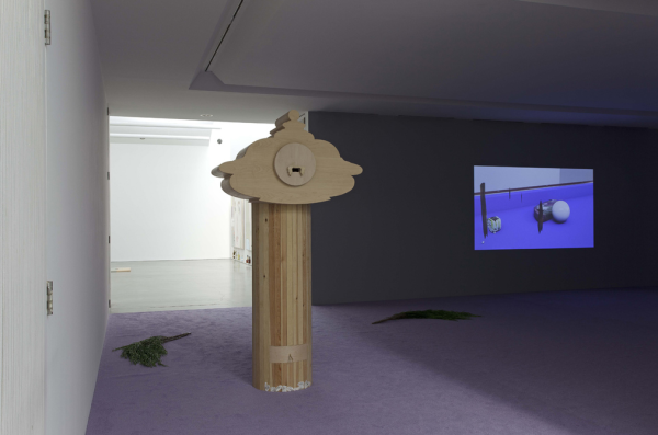
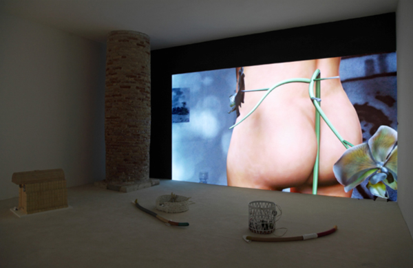
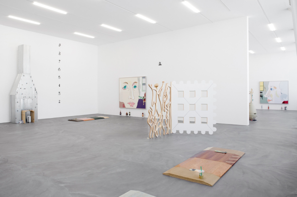
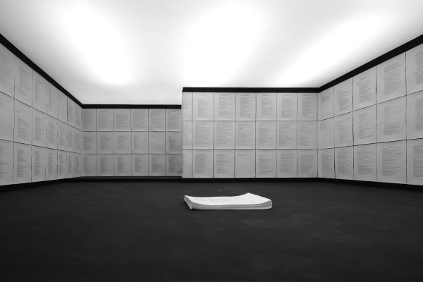
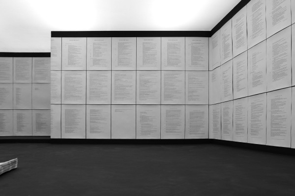
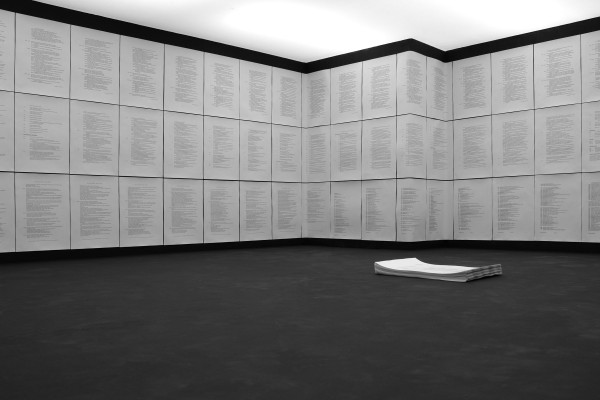
Finally we come to the question of the title of this exhibition. There is more to it than matching initials, for ‘cultivated variety’ refers, in the sense that something, for example land, is altered to suit the needs of the owners, to an artist who has been cultivated to suit the needs of the art world and of the art market. The 23 artists, whose CVs are included in this exhibition, are the only ones listed in the ArtReview’s 2013 Power 100 index. These artists comprise the crème de la crème of today’s contemporary art world, but the fact that, from the ‘ranked list of the contemporary art world’s most powerful figures’ less than a quarter are actually artists, speaks for itself.

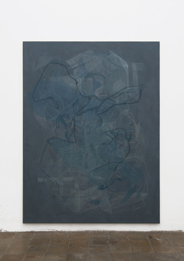
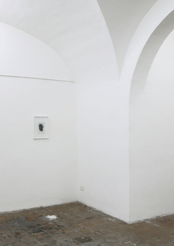
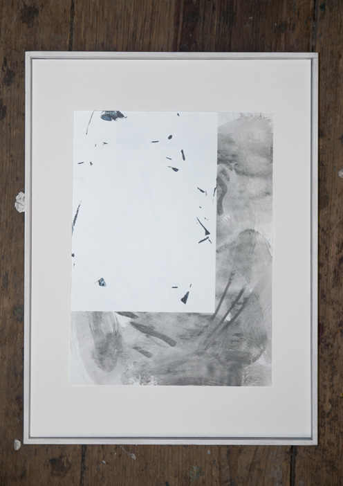
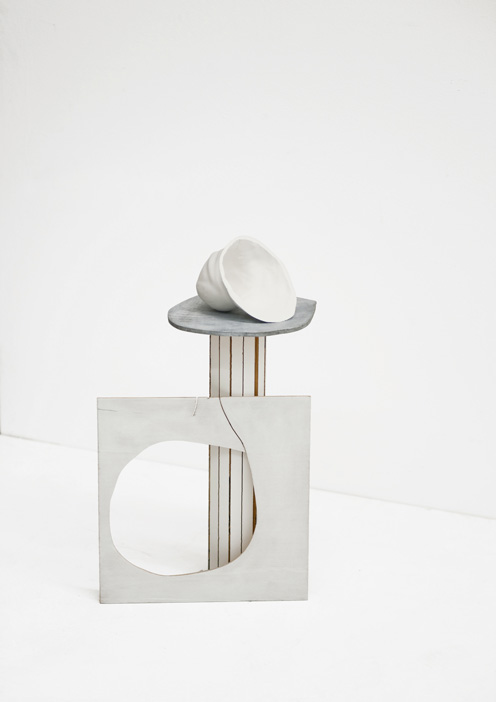
This exhibition is not an ironic commentary on the already established personae, as it is not suggested that these artists themselves are the cultivated varieties, on the contrary, they are the parent plants from which many can be produced. One could imagine the gallery space as a repository of rare and valuable sources (e.g. plants or artists) which satisfy the current market demand while, at the same time, making an influence on the future generations and leaving their marks on history. For this exhibition, CVs also take on the role of artworks, as they are meticulously crafted compositions – masterpieces in the art world’s commercial landscape.

Therefore the exhibition works rather as a skeptical hypothesis on the growing influence of the art market and on its relation to the future of the art world. The dominance and predominance of the market and its further influence on the actual production of art, is that what is in question here. How far reaching will the influence be and what precisely will follow, is yet to be witnessed, but these developments should not in any case be overlooked, for they might turn out to be the actual course alterers.”

Beatrice Marchi

20140121_H_001920140121_N_069 20140121_H_0016

Beatrice Marchi

Work from “Che cattiva Katie Fox” at Gasconade, Milan.

““Che cattiva Katie Fox” [How mean Katie Fox is!] is the first solo exhibition by Beatrice Marchi; and is the first exhibition hosted within these walls to be worthy of the sequence of hashtags: #dance #sex #art #pop #tech.

Ça va sans dire, Beatrice is a woman of choice; and the determination and inventiveness entailed in her creative process prove this—a process manoeuvring through and across several media (from photography, to installation, to music production), but never embracing any of them a priori. Beatrice’s artworks in fact display a pronouncedly camp attitude: if this stems from a sheer celebration of ambiguity as a value, or from a more programmatic attempt at bypassing medium specificity are questions which the works make of the viewer… By the way, in order to prevent that the artworks’ nature remains a taboo and so facilitate their ‘communication’, we would invite the viewer to agree that those in the show, for example, are: an RnB song (Never Be My Friend, 2014), pillowcases (Occhi tristi, 2014), puppy dresses (SquirryFoxy, 2014), and frames for daydream images (B.B. Blue, Mandy & Sandy at the Beach, 2014).

The exhibition’s protagonist is Katie Fox: an avatar, a Basset Hound dog, a younger sister, a fantasy character, a samaritan girl, a pop star, a jeune fille, a mistress, and so on. Her different incarnations furnish a set of case studies, to be exploited for testing logics and dynamics behind the exercise of moral judgment and its affecting the perception of the social context we belong to. Why for example are the behavior and the sensitivity of certain characters, such as children and animals, free from moral judgement? And why in others, such as teenagers, do they take on excessively moralistic attitudes? As with children and animals, nature ignores culture, for teenagers love can only be followed by hate— and in between there remains only opportunism, the role playing which leads one to pretend to love or hate..The artworks in the show distil aesthetic languages which mass culture has apparently digested, but have nevertheless conserved an intrinsically radical feature which allows for any of their ‘formalizations’ which lack a true communicative need to instead assume grotesque tones. For example, cinema, comics and video games have liberated fantasy fiction in the adults world; young women dressed up like mermaids inhabit the limbo between a carnival mask, typical of a child’s imagination, and an alluring outfit, which betrays an awareness of the seductive power of a mature body. To continue the argument: today the sound of RnB is universally recognized within the vocabulary of pop music; an RnB song, in which male voices mimic female voices, themselves replicating an overblown chat conversation between hot-tempered teenagers, suggests that mishmash of a cravingbfor social redemption and schmaltzy emotivity which RnB embodies—that’s how we ball out. And we won’t carry on into discussing the sexual deviations of BDSM practices, and the blend of pleasure and pain.

Beatrice Marchi’s artworks seem to imply a vision in which art is trapped in its own commenting strategies and ‘cynical’ interpretation of social phenomena; art itself dishes out a plethora of judgements, which do not restrict themselves to aesthetic categories—its area of jurisdiction, one could say—but overflow into the reign of morality. Artistic language betrays indeed a tendency toward affectation: it is often mischievously cryptic, self referential, boastful, and again moralistic; it tends to repress any vision of art as a scenario of sharing and collaboration, and celebration of the wide emotional spectrum encompassed by human heart… Even this text isn’t free from this criticism: it pursues assertiveness, in order to legitimize itself and the subject it depicts—unfortunately, it won’t ever be strong enough to present these artworks as the creations of a woman in the prime of her life, a failed lap dancer, and probably our BFF.” – Gasconade, Milan