Yves Klein

Yves Klein

Work from his oeuvre.

“Due to the fact that I have painted monochromes for fifteen years,

Due to the fact that I have created pictorial immaterial states,

Due to the fact that I have manipulated the forces of the void,

Due to the fact that I have sculpted with fire and with water and have painted with fire and with water,

Due to the fact that I have painted with living brushes — in other words, the nude body of live models covered with paint: these living brushes were under the constant direction of my commands, such as “a little to the right; over to the left now; to the right again, etc.” By maintaining myself at a specific and obligatory distance from the surface to be painted, I am able to resolve the problem of detachment.

Due to the fact that I have invented the architecture and the urbanism of air — of course, this new conception transcends the traditional meaning of the terms “architecture and urbanism” — my goal from the beginning was to reunite with the legend of Paradise Lost. This project was directed toward the habitable surface of the Earth by the climatization of the great geographical expanses through an absolute control over the thermal and atmospheric situation in their relation to our morphological and psychical conditions.

Due to the fact that I have proposed a new conception of music with my “monotone-silence-symphony,”

Due to the fact that I have presented a theater of the void, among countless other adventures…

I would never have believed, fifteen years ago at the time of my earliest efforts, that I would suddenly feel the need to explain myself — to satisfy the desire to know the reason of all that has occurred and the even still more dangerous effect, in other words — the influence my art has had on the young generation of artists throughout the world today.

It dismays me to hear that a certain number of them think that I represent a danger to the future of art — that I am one of those disastrous and noxious results of our time that must be crushed and destroyed before the propagation of my evil completely takes over.

I regret to reveal that this was not my intention; and to happily proclaim to those who evince faith in the multiplicity of new possibilities in the path that I prescribe — Take care! Nothing has crystallized as yet; nor can I say what will happen after this. I can only say that today I am no longer as afraid as I was yesterday in the face of the souvenir of the future.

An artist always feels uneasy when called upon to speak of this own work. It should speak for itself, particularly when it is valid.

What can I do? Stop now?

No, what I call “the indefinable pictorial sensibility” absolutely escapes this very personal solution.

So…

I think of those words I was once inspired to write. “Would not the future artist be he who expressed through an eternal silence an immense painting possessing no dimension?”

Gallery-goers, like any other public, would carry this immense painting in their memory (a remembrance which does not derive at all from the past, but is solely cognizant of the indefinable sensibility of man).

It is necessary to create and recreate a constant physical fluidity in order to receive the grace which allows a positive creativity of the void.

Just as I created a “monotone-silence-symphony” in 1947, composed in two parts, — one broad continuous sound followed by an equally broad and extended silence, endowed with a limitless dimension — in the same way, I attempt to set before you a written painting of the short history of my art, followed naturally by a pure and affective silence.

My account will close with the creation of a compelling a posteriori silence whose existence in our communal space, after all — the space of a single being — is immune to the destructive qualities of physical noise.

Much depends upon the success of my written painting in its initial technical and audible phase. Only then will the extraordinary a posteriori silence, in the midst of noise as well as in the cell of physical silence, operate in a new and unique zone of pictorial immaterial sensibility.

Having reached today this point in space and knowledge, I propose to gird my loins, then to draw back in retrospection on the diving board of my evolution. In the manner of an Olympic diver, in the most classic technique of the sport, I must prepare for my leap into the future of today by prudently moving backward, without ever losing sight of the edge, today consciously attained — the immaterialization of art.

What is the purpose of this retrospective journey in time?

Simply, I wish to avoid that you or I fall under the power of that phenomenon of dreams, which describes the feelings and landscapes provoked by our brusque landing in the past. This psychological past is precisely the anti-space that I put behind me during the adventures of these past fifteen years.

At present, I am particularly excited by “bad taste.” I have the deep feeling that there exists in the very essence of bad taste a power capable of creating those things situated far beyond what is traditionally termed “The Work of Art.” I wish to play with human feeling, with its “morbidity” in a cold and ferocious manner. Only very recently I have become a sort of gravedigger of art (oddly enough, I am using the very terms of my enemies). Some of my latest works have been coffins and tombs. During the same time I succeeded in painting with fire, using particularly powerful and searing gas flames, some of them measuring three to four meters high. I use these to bathe the surface of the painting in such a way that it registered the spontaneous trace of fire.

In sum, my goal is twofold: first of all, to register the trace of human sentimentality in present-day civilization; and then, to register the trace of fire, which has engendered this very same civilization — that of the fire itself. And all of this because the void has always been my constant preoccupation; and I believe that fires burn in the heart of the void as well as in the heart of man.

All facts that are contradictory are authentic principles of an explanation of the universe. Truly, fire is one of these principles, essentially contradictory, one from the other, since it is both the sweetness and torture that lies at the heart and origin of our civilization. But what stirs this search for feeling in me through the making of super-graves and super-coffins? What stirs this search in me for the imprint of fire? Why search for the Trace itself?

Because every work of creation, regardless of its cosmic place, is the representation of a pure phenomenology — all that is phenomena manifests itself. This manifestation is always distinct from form and it is the essence of the Immediate, the Trace of the Immediate.

A few months ago, for example, I felt the urge to register the signs of atmospheric behavior by recording the instantaneous traces of spring showers on a canvas, of south winds, and of lightning (needless to say, the last-mentioned ended in a catastrophe). For instance, a trip from Paris to Nice might have been a waste of time had I not spent it profitably by recording the wind. I placed a canvas, freshly coated with paint, on the roof of my white Citroën. As I drove down Route Nationale 7 at 100 kilometers an hour, the heat, the cold, the light, the wind, and the rain all combined to age my canvas prematurely; At least thirty to forty years were condensed into a single day. The only annoying thing about this project is that for the entire trip I was unable to separate myself from my painting.

My atmospheric imprints of a few months ago were preceded by vegetal imprints. After all, my aim is to extract and obtain the trace of the immediate from all natural objects, whatever their origin — be the circumstance human, animal, vegetable, or atmospheric.

I would like now, with your permission and close attention, to divulge to you possibly the most important and certainly the most secret phase of my art. I do not know if you are going to believe me — it is cannibalism. After all, is it not preferable to be eaten than to be bombed to death? I can hardly develop this idea that has tormented me for years. I leave it up to you to draw your own conclusions with regard to the future of art.

If we step back again, following the lines of my evolution, we arrive at the moment when I conceived of painting with the aid of living brushes. That was two years ago. The purpose of this was to be able to attain a defined and constant distance between myself and the painting during the time of creation.

Many critics claimed that by this method of painting I was doing nothing more than recreating the method that has been called “action painting.” But now, I would like to make it clear that this endeavor is distinct from “action painting” in so far as I am completely detached from all physical work during the time of creation.

Just to cite one example of the anthropometric errors found within the deformed ideas spread by the international press — I speak of that group of Japanese painters who with great refinement used my method in a strange way. In fact, these painters actually transformed themselves into living brushes. By diving themselves in color and then rolling on their canvases, they became representative of ultra-action-painters! Personally, I would never attempt to smear paint over my body and thus to become a living brush; to the contrary, I would rather put on my tuxedo and don white gloves.

It would never cross my mind to soil my hands with paint. Detached and distant, the work of art must be completed under my eyes and under my command. As the work begins its completion, I stand there — present at the ceremony, immaculate, calm, relaxed, perfectly aware of what is taking place and ready to receive the art being born into the tangible world.

What directed me towards anthropometry? The answer can be found in the work that I made during the years 1956 to 1957 while I took part in that giant adventure, the creation of pictorial immaterial sensibility.

I had just removed from my studio all earlier works. The result — an empty studio. All that I could physically do was to remain in my empty studio and the pictorial immaterial states of creation marvelously unfolded. However, little by little, I became mistrustful of myself, but never of the immaterial. From that moment, following the example of all painters, I hired models. But unlike the others, I merely wanted to work in their company rather than have them pose for me. I had been spending too much time alone in the empty studio; I no longer wanted to remain alone with the marvelous blue void which was in the process of opening.

Though seemingly strange, remember that I was perfectly aware of the fact that I experienced none of that vertigo, felt by all my predecessors, when they found themselves face to face with the absolute void that is, quite naturally, true pictorial space.

But how long could my security in this awareness endure?

Years ago, the artist went directly to his subject, worked outdoors in the country, had his feet firmly planted on the ground — it was healthy.

Today, easel-painters have become academics and have reached the point of shutting themselves in their studios in order to confront the terrifying mirrors of their canvases. Now the reason I was pushed to use nude models is all but evident: it was a way of preventing the danger of secluding myself in the overly spiritual spheres of creation, thus breaking with the most basic common sense repeatedly affirmed by our incarnate condition.

The shape of the body, its lines, its strange colors hovering between life and death, hold no interest for me. Only the essential, pure affective climate of the flesh is valid.

Having rejected nothingness, I discovered the void. The meaning of the immaterial pictorial zones, extracted from the depth of the void which by that time was of a very material order. Finding it unacceptable to sell these immaterial zones for money, I insisted in exchange for the highest quality of the immaterial, the highest quality of material payment — a bar of pure gold. Incredible as it may seem, I have actually sold a number of these pictorial immaterial states.

So much could be said about my adventure in the immaterial and the void that the result would be an overly extended pause while steeped in the present elaboration of a written painting.

Painting no longer appeared to me to be functionally related to the gaze, since during the blue monochrome period of 1957 I became aware of what I called the pictorial sensibility. This pictorial sensibility exists beyond our being and yet belongs in our sphere. We hold no right of possession over life itself. It is only by the intermediary of our taking possession of sensibility that we are able to purchase life. Sensibility enables us to pursue life to the level of its base material manifestations, in the exchange and barter that are the universe of space, the immense totality of nature.

Imagination is the vehicle of sensibility!

Transported by (effective) imagination we attain life, that very life which is absolute art itself.

Absolute art, what mortal men call with a sensation of vertigo the summum of art, materializes instantaneously. It makes its appearance in the tangible world, even as I remain at a geometrically fixed point, in the wake of extraordinary volumetric displacements with a static and vertiginous speed.

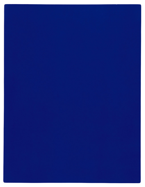
The explanation of the conditions that led me to pictorial sensibility is to be found in the intrinsic power of the monochromes of my blue period of 1957. This period of blue monochromes was the fruit of my quest for the indefinable in painting, which Delacroix the master could already intimate in this time.

From 1946 to 1956, my monochrome experiments, tried with various other colors than blue, never allowed me to lose sight of the fundamental truth of our time — namely that form, henceforth, would no longer be a simple linear value, but rather a value of impregnation. Once, in 1946, while still an adolescent, I was to sign my name on the other side of the sky during a fantastic “realistico-imaginary” journey. That day, as I lay stretched upon the beach of Nice, I began to feel hatred for birds which flew back and forth across my blue sky, cloudless sky, because they tried to bore holes in my greatest and most beautiful work.

Birds must be eliminated.

Thus, we humans will have acquired the right to evolve in full liberty without any physical and spiritual constraint.

Neither missiles nor rockets nor sputniks will render man the “conquistador” of space.

Those means derive only from the phantom of today’s scientists who still live in the romantic and sentimental spirit of the XIX century.

Man will only be able to take possession of space through the terrifying forces, the ones imprinted with peace and sensibility. He will be able to conquer space — truly his greatest desire — only after having realized the impregnation of space by his own sensibility. His sensibility can even read into the memory of nature, be it of the past, of the present and of the future!

It is our true extra-dimensional capacity for action!

If proofs, precedents or predecessors are needed, let me then cite Dante, who in the Divine Comedy, described with absolute precision what no traveler of his time could reasonably have discovered, the invisible constellation of the Northern Hemisphere known as the Southern Cross;

Jonathan Swift, in his Voyage to Laputa, gave the distances and periods of rotation of the satellites of Mars though they were unknown at the time;

When the American astronomer, Asoph Hall, discovered them in 1877, he realized his measurements were the same as those of Swift. Seized by panic, he named them Phobos and Deimos, Fear and Terror! With these two words — Fear and Terror — I find myself before you in the year 1946, ready to dive into the void.

Long Live the Immaterial!

And now,

Thank you for your kind attention.” – Yves Klein, Hotel Chelsea, New York, 1961
Ellsworth Kelly


Ellsworth Kelly

Work from his oeuvre.

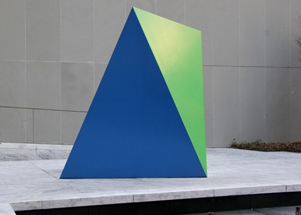
“American artist Ellsworth Kelly is universally recognized as one of the most important purveyors of American abstraction. Born in Newburgh, New York, Kelly studied at the Pratt Institute in Brooklyn until he was drafted into the U.S. Army at the age of 20, spending the majority of his military service in Europe. From 1948 through 1954, he lived in France, teaching, traveling and studying art and architecture. French abstraction greatly influenced the young artist, whose style changed drastically during this early moment in his career. He abandoned figuration and easel painting, choosing instead to develop a vocabulary of simple geometric shapes and swatches of pure, vibrant color.

Ellsworth Kelly: Prints and Paintings is the first retrospective examination of Kelly’s exceedingly prolific print practice since 1988. The exhibition includes over 100 prints, the majority from the collection of Jordan D. Schnitzer and his Family Foundation, and five paintings.  The exhibition is organized thematically in order to explore Kelly’s mastery of key formal motifs: grids, contrast and curves. In the words of catalogue raisonné author Richard Axsom, Kelly’s prints “exchange the totemic presence, the tangible physicality and public assertiveness of the paintings and sculptures for the qualities no less genuine in registering Kelly’s vision: intimacy, delicacy, and in nearly immaterial veils of shape and color, an unmatched ethereality.”” – Los Angeles County Museum of Art

Ole Martin Lund Bø

Ole Martin Lund Bø

Work from With Day for Night.

“…The title refers to a cinematographic technique used to simulate a night scene, while shooting at day time.

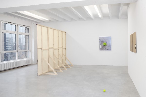
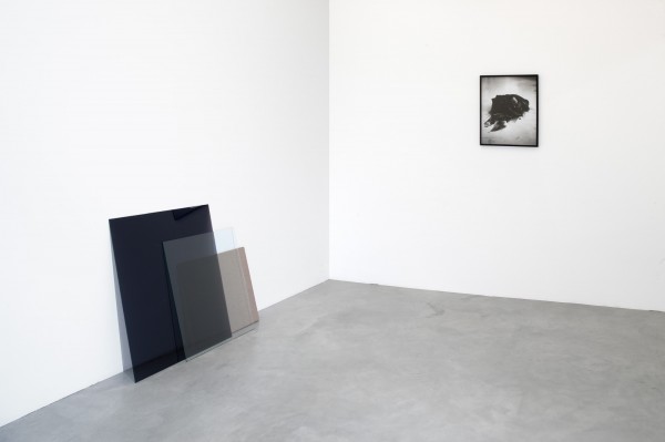
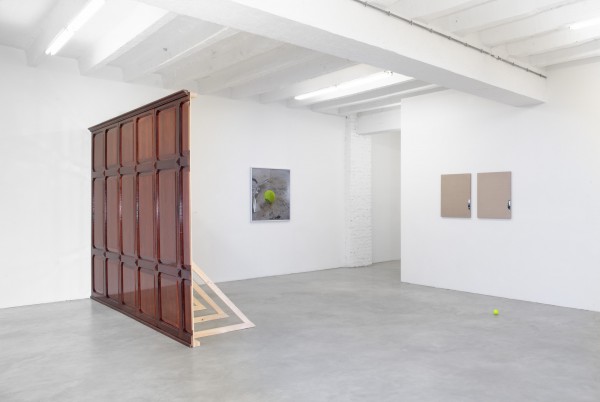
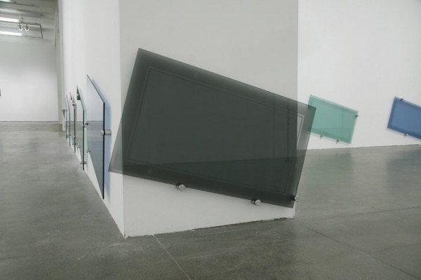
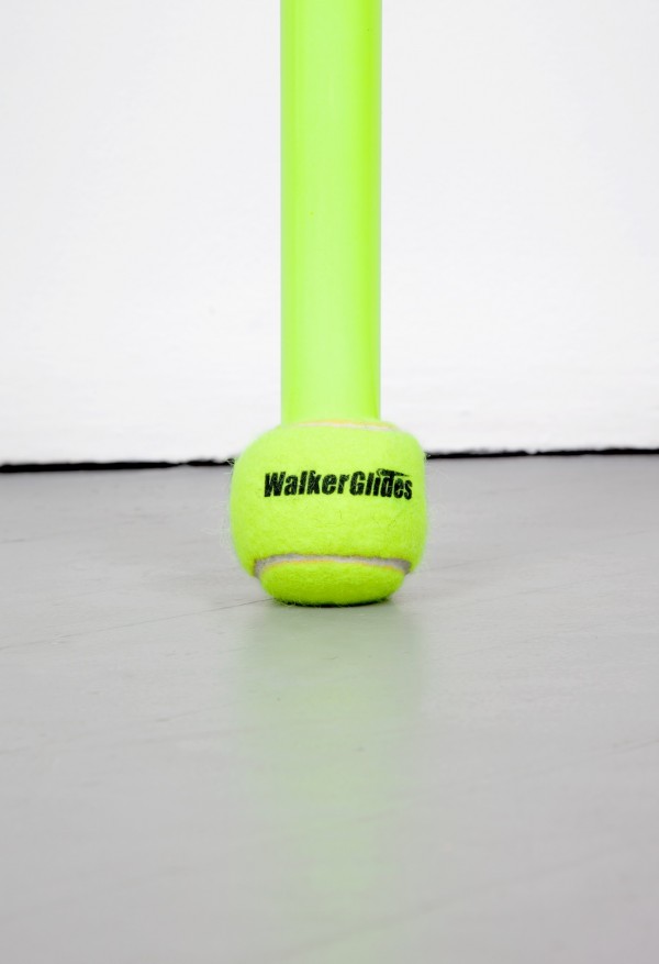
Tinted glass, metallic foil, dark wooden boards, a furry tennis ball. Familiar features from storefronts, lowriders, executive offices and clay courts. These works are extractions, rather than abstractions – a variety of veils and windows from the corporate skin of our contemporary cities. Appearances can be deceptive: The transparent surface of an institutional building does not guarantee a similar transparency in its affairs. 
 In Lund Bø´s works, the monochrome surfaces are considered for their concrete material qualities as well as external connotations, short circuiting the idea of a self referential abstraction. A massive mahogany wall and a ruffled metallic foil both suggest clandestine activities; be it financial or sexual. These monochrome surfaces are stage sets, codes and catalysts, producing their own specific rules of engagement. Materials inscribed with meaning, radiating power and desire. There is a sleazy aura to these material arrangements; cheap goods borrowing the shine of a more exclusive relative. Or visa versa. 
 The assemblages have flawless, unspoiled quality in contrast to the rifts and scratches apparent in the photographic works. Like clocks, they impose a timescale on their surroundings. The patina of a grey vinyl floor becomes a relief; a superficial archeological index of human activities with a bright yellow tennis ball as an unpredictable punctum.” – Jan Freuchen 


Bethan Hews

Bethan Hews

Work from her oeuvre.

“‘Piss off I’m a fountain!’ an abusive notice board proclaims in white plastic letters on a black ground. Are these the words of an offended ornament that we have mistaken for a urinal? Or are they the angry reaction of a readymade that feels it has not been identified promptly enough as a Duchampian paradigm? In fact, there is no object in sight to which the text might refer: in this piece, entitled Word (2003), Bethan Huws plays with the mere possibility of an object, a situation, a perception. Formerly used for official announcements in offices, these sober blackboards with their aluminium frames and moveable white letters have, for the past eight years, served Huws for her polysemantic language pictures. One might say she writes scripts for potential encounters with possible art works.

Huws grew up speaking both Welsh and English; she employs various media, but her work is always based on a special relationship with language. She often references names of artists and titles of art works associated with the history of the readymade and Conceptual art. Her oeuvre skilfully links the mythology of the Duchampian industrial object that was once upended and signed, with an ironic questioning of the story of its creation. She is concerned with exploring her own creativity: how does one arrive at an artistic action that brings about an altered perception of things? Huws takes the approach of an ethnologist tracing the origin and identity of readymades….” – Burkhard Meltzer translated by Nicholas Grindell for Frieze Magazine.

via Piet Mondriaan.

Chadwick Rantanen


Chadwic Rantanen

Work from his oeuvre.

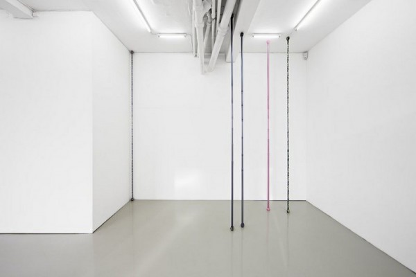
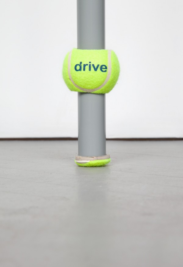
“The objects are easily transportable, erectable and dismountable. What’s more, in an exhibition context they are visually reticent. Like Barnett Newman’s zips or Fred Sandback’s yarn vectors, they oscillate between asserting themselves as figures in the foreground and receding as gaps or spatial incisions. In pictures (and perhaps too in our imaginations) they lean towards the latter; in reality, their fragile relation to our clumsy bodies tilts them towards the former. These are awkward, shy sculptures; Rantanen has spoken of them as ‘fighting visuality’.

Their aesthetic indeterminacy was compounded when he added decorative patterns to the poles; at first these were simply taken from found images, modified for the purpose. The designs were applied to the aluminium with an anodized dye-sublimation process that literally fused the image with the object. The images – multi-coloured bows, or tartan – were intended to be as innocuous as possible, the pattern’s repetition ensuring that viewers needed to see no more than a small area to establish that the rest of the object was essentially the same. There were no surprises here. In one instance, the artist created a perforated sticker printed with images of various kinds of metal finishes. The tautology of matching the image to the support was, for Rantanen, a way of prioritising neither.”- Jonathan Griffin

Kazimir Malevich

Kazimir Malevich

Work from his oeuvre.

“…In 1911, when Kandinsky speaks in “On the Spiritual in Art” about the reduction of all painterly mimesis, all representation of the world—the reduction that reveals that all paintings are actually combinations of colors and shapes—he wants to guarantee the survival of his vision of painting through all possible future cultural transformations, including even the most revolutionary ones. The world that a painting represents can disappear, but the painting’s own combination of colors and shapes will not. In this sense, Kandinsky believes that all images already created in the past or to be created in the future can also be seen as his own paintings—because regardless of what the images were, are, or could be, they necessarily remain combinations of certain colors and shapes. And that relates not only to painting, but also to all other media including photography and cinema. Kandinsky did not want to create his own individual style, but rather used his paintings as a school for the spectator’s gaze—a school that would allow the spectator to see the invariable components of all possible artistic variations, the repetitive patterns underlying the images of historical change. In this sense, Kandinsky does understand his own art as being timeless.

Later, with the Black Square, Malevich undertakes an even more radical reduction of the image to a pure relationship between image and frame, between contemplated object and field of contemplation, between one and zero. In fact, we cannot escape the black square—whatever image we see is simultaneously the black square. The same can be said about the readymade gesture introduced by Duchamp—whatever we want to exhibit and whatever we see as being exhibited presupposes this gesture.

Even now, one can hear at exhibitions of avant-garde art: “Why should this painting,” let’s say by Malevich, “be here in the museum if my child can do it—and maybe even does?” On the one hand, this reaction to Malevich is, of course, correct. It shows that his works are still experienced by the wider public as weak images, notwithstanding their art-historical celebration. But, on the other hand, the conclusion that the majority of the exhibition visitors draw from this comparison is wrong: one thinks that this comparison discredits Malevich, whereas the comparison could instead be used as a means of admiring one’s child. Indeed, through his work, Malevich opened the door into the sphere of art for weak images—in fact, for all possible weak images. But this opening can be understood only if Malevich’s self-erasure is duly appreciated—if his images are seen as transcendental and not as empirical images. If the visitor to Malevich’s exhibition cannot appreciate the painting of his or her own child, then neither can this visitor truly appreciate the opening of a field of art that allows the paintings of this child to be appreciated…” – Boris Groys for e-flux

Michal Kohút

Michal Kohút

Work from 0,1.

“The average blink occurs in just 100-400 milliseconds–so fast that we barely acknowledge the world going black ten times a minute. Blinking is an ingenious, semi-autonomic function that allows us all to worry about bigger problems than perpetually rewetting our eyeballs.

“0, 1” is an installation by Michal Kohút (with help from Michal Matouš and Jakub Hybler) that makes one person’s blinks into a shared experience. Put on a pair of glasses, and the lights turn off in tandem with every blink you make.” – fastcodesign.com

Carol Bove

Carol Bove

Work from her oeuvre.

“…The focus of her artistic endeavor is an immense research project: by means of enquiring into the social history and art of the late 1960s and early 1970s, she relates the latter to the present and lends it greater depth. Here, she is as much interested in popular literature and the most popular avant-garde magazines of that period as she is in its architecture, music, art and design. For her, the former mark the influential and lasting social changes of that era, as evidenced, for example in the women’s movement, the peace movement, the notion of liberated sexuality and the liberation of the individual through both psychological and physical practices of consciousness expanding.

In her exhibitions, Carol Bove forges atmospherically charged installations with artifacts and reconstructive creations that echo and convey the style and history of that period, as well as identifying its current validity…” – Georg Kargl Gallery

Michael Bell-Smith


Michael Bell-Smith

Work from “mbs_fp_090712” at Foxy Productions, New York.

“It is impossible to identify a beginning or end to any ofMichael Bell-Smith’s four new videos. By convention they should be called loops, but the word feels wrong here. A loop creates the impression of an image fallen out of time through repetition, whereas Bell-Smith evokes timelessness not with recognizably repeated sequences but with chains of transitions and variations. The eponymous digits of Magic Hands (all works 2012) conjure sounds and flashes of light, to-do lists, and balls of crumpled paper. Backgrounds fold and shift as fluidly as the objects before them appear and vanish. Similar in structure, De-employed adds a word to each of its slide-show tableaux of images and effects. Any consecutive pair of words makes sense as a phrase, but each connection pivots in a new direction. The video’s zigzag path deflects syntax; its restlessness suggests a screen saver’s fidgety visuals.

A screen saver masks a still image to keep it from burning a permanent trace on the screen. In White Room—the only work shown on a monitor rather than as a projection—the moving image thwarts inscription again and again. Three-dimensional models of a DVD, a book, an envelope, and other data carriers dance across the screen, demonstrating a catalogue of simulated textures: Wood, stone, embossed tin, and other seductively tactile patterns coat their surfaces. A streak of colored paint defaces each object, but they nimbly shrug it off, moving as the graffiti clings to an empty plane and then fades away. Substrates, surfaces, and traces flake apart, as if to describe the screen’s blank indifference toward the signs it displays and its disposition toward constant motion. Presiding over the exhibition, Wave Clock keeps time for the gallery with a working digital image of an analog clock that slowly meanders over a video of crashing surf. The mechanics of clockwork model nature’s cycles. Like the round clock face, the spliced reel of the film loop symbolizes a temporality that its physical shape can’t contain. The loop operation that keeps Bell-Smith’s videos going mimics that circle in name but its action unfolds in the invisible space of software. His moving images skim the waves of information’s boundless oceans.” – Brian Droitcour, Art Forum


Color Chart

Color Chart

Exhibition at MOMA (2008). The above works are (in order) Christopher Williams, François Morollet, On Kawara, Gerhard Richter and Richard Serra.

“When I started learning about the art of the 1960s, about ten years ago, the period seemed book-ended by two texts: Clement Greenberg’s After Abstract Expressionism (1962), which accounted for the importance of colour in the paintings of Barnett Newman and Mark Rothko, and Lucy Lippard’s Six Years (1972), which chronicled the work of countless Conceptual artists. Colour seemed anathema to the latter group, who, one initially supposed, banished it from their work. But once one took a closer look at Lippard’s artists, it became clear that almost all of them were interested in colour – just not in the way that had been important to their predecessors. Colour instead was interesting as a ready-made material, as a product of new industries and technologies. Colour was something to be not so much mixed on the palette as found on cars and clothing or in domestic interiors. Curator Ann Temkin’s ‘Color Chart’ examines at this alternative approach to colour, concentrating on the 1960s but looking back to Marcel Duchamp (the colour swatches in Tu’m, 1918) and forward too.

The first few galleries were the strongest parts of the show: it was wonderful to see Tu’m and Robert Rauschenberg’s Rebus (1955) in one glance and clever too, to have Frank Stella’s six-part suite of paintings from 1962 (once owned by Andy Warhol) brought together with a set of Warhol’s six smallish Marilyns (1962), a chromatic juxtaposition that did much to undermine any residual claims that posit a complete separation between Minimalism and Pop.

One of the show’s strongest arguments was to indicate how colour became a battlefield on which younger artists confronted their elders. The ways in which they fought revealed much about their sensibilities. Bas Jan Ader’s arrangements of flowers in Piet Mondrian’s colours (Primary Time, 1974) was a tender skirmish, and a witty one (all those green stalks would have infuriated the Dutchman). By contrast Richard Serra fought Joseph Albers (his former teacher) more aggressively. In Color-Aid (1970–1), shown as a video but which makes better sense as a film, Serra let the camera frame be filled with a single colour. From time to time his finger intrudes into the frame to remove the colour, which we realize is a sheet of card in a stack of the kind that Albers used to teach with. As each sheet is removed, we begin to concentrate less on the papers’ colours than on Serra’s fingers. As they press down, blood drains out, turning them from pink to yellow, but the dirt under his nails is pretty constant. Serra thus exchanges the colour combinations that the cards might provide with the real colour of the body.

‘Color Chart’ also revealed how the most seemingly ordered and anti-subjective approaches to colour generated unexpected affects. Blinky Palermo bought off-the-shelf cloth and simply stitched lengths together, but the straightforwardness of this process belies the optical play generated where a blue meets a red in Untitled (1969). Alighiero Boetti had square panels coated with industrial paint whose brand names he then attached to the panels, using letters made of painted cork. For all that this seemed to be about doubling (the work presents both a colour and its name), brand names such as ‘Oro Longchamp’ don’t just identify the colour: they set our thoughts on metals and racecourses. This vaguely humorous operation was picked up by John Baldessari and especially Bruce Nauman, whose photocopy of a colour chart replaced its colour with a range of greys that have since turned to browns.

It was a surprise that Temkin decided not to include the work of Brazilians working so intently with colour at this time. Even if they did not use colour charts, the ‘rules’ of her exhibition seemed flexible enough to have included, for instance, Lygia Pape’s Wheel of Delights (1968), a circle of bowls of unpredictably flavoured coloured water. Such quibbles aside, the historical parts of the show made significant arguments that will surely alter the way this period is understood. The latter sections were more problematic (around a third of the space was devoted to work of the last 15 years). It was certainly important to indicate the ways in which more recent artists have addressed colour and race together, but some of the works did little to demonstrate really new thinking about colour. Thankfully, the show closed with a piece whose quirky humour matched its experimental intelligence. In 2000 Christopher Williams attempted to record the brand colours of Agfa, Kodak and Fuji by using film and developing materials produced by each company to photograph a dishwasher stacked with plates whose colours corresponded to the companies’ logos. (For Kodak the plates are mainly yellow with some red.) This investigation into the connection between commerce and colour picked up a strand from the earlier part of the show, but Williams was also able to point to a moment of failure: Agfa’s products cannot, he realized, accurately reproduce the company’s own brand colours, which come out too red. If many artists in the show seemed to celebrate the new colours of an industrial world, by pointing to this tiniest discrepancy between a brand’s image and its product, Williams laid the confidence of capital to question.” – Mark Godfrey for Frieze.