Curtis Mann


Curtis Mann

Work from Modifications.

“The original imagery in Curtis Mann’s Modifications series is copied from a variety of sources: online auctions, photo-sharing websites and estate sales, in a sense creating a fictional archive through the artist’s selection and collection of other people’s photographs. Mann’s appropriated archive is acquired in digital form. He first makes very minor adjustments with Photoshop and then orders several conventional chemical color prints from an online printing service used by hobbyists. He then paints varnish as a resist over areas of the print he decides to preserve, using standard household bleach to remove the rest. The varnish remains on the final print. He then hand works the isolated objects and people, taking the camera based image into the manual realm of painting and drawing. He adds details such as lines that suggest a stage or platform or forms that seem to replicate comic strip thought balloons.

Mann is interested in how the slightest adjustment in either the production or final use of the photograph can produce an entirely new set implications.

In the Modifications series, Mann is interested in how the slightest adjustment in either the production or final use of the photograph can produce an entirely new set implications, only some, or even none, of which may have the slightest connection to the facts of the world in front of the camera. In a sense he is replicating the judgmental action of our eyes as we initially scan a photograph, or an archive, for familiar evidence, grasping what we prefer to see and allowing the unfamiliar and unknown to disappear.

When asked how he would like people to perceive this work, Mann states, “I want them to move through the pieces slowly, maybe on different levels. Minimalism from a distance, some odd color on closer inspection, different textures—‘what’s going on here, painting or photography?’ Then they see the more subtle handmade marks, wrinkles, relief of the varnish resist, then details of the original appropriated photograph, then start over with, ‘What is going on here?’ in a larger sense.”” – MoCP

Xavier Damon


Xavier Damon

Work from his oeuvre.

“think back to the instant after you close your eyelids against the bright summer sun, 
or a moment when you catch yourself dreaming with your eyes open …

our body relaxes and seems to suspend its routine activities.
this is the moment when – quite unexpectedly – a subtler light shapes our view of the world.
our gaze softens and blurs, while our pupil seems to amuse itself just opening and closing.

in these moments of absence the eyes aren’t distracted by exactness: colors play together,
forms dance by as the physical world is transformed into emotion. how long will this instinctive
state last before life calls us back, and objects resume their identity ?

with his instant photographs, xavier damon captures these elusive moments …” – Xavier Damon

Richard Prince


Richard Prince

Work From Untitled (Publicities).

“Richard Prince has heard America singing, and it is not in tune. The paradoxically beautiful, seamless 30-year survey of his work at the Guggenheim Museum catches many of our inharmonious country’s discontents and refracts them back to us. The central message of this array of about 160 photographs, drawings, paintings and sculptures, most of which incorporate images or objects cribbed from popular culture, is that we won’t be getting along any time soon. But in Mr. Prince’s view, little of life’s cacophony is real except the parts deep inside all of us that are hardest to reach.

Mr. Prince has devoted his career to this surface unreality, attempting to collect, count and order its ways. He has said that his goal is “a virtuoso real,” something beyond real that is patently fake. But his art is inherently corrosive; it eats through things. His specialty is a carefully constructed hybrid that is also some kind of joke, charged by conflicting notions of high, low and lower.

Frequent targets include the art world, straight American males and middle-class virtue, complacency and taste. His work disturbs, amuses and then splinters in the mind. It unsettles assumptions about art, originality and value, class and sexual difference and creativity.
The work in the Guggenheim exhibition opening today, subtitled “Spiritual America,” defines the nation’s culture as a series of weird, isolated subcultures — from modernist abstraction to stand-up comedy to pulp-fiction cover art — and gives them equal dignity. It begins on the ground floor with “American Prayer,” a magnificent, haunting new sculpture for which the chassis of a 1969 Charger, a classic muscle car, has been stripped bare and cantilevered above the floor by a large block that merges with its hood. As aerodynamic as a bird’s skull and as commodious as a double coffin, it is not on blocks but lodged in one, like a stray bullet. Its bulky support suggests a pedestal, a Minimalist box, an anchorage and an altar. It is spackled and Bondoed, ready for its final, shiny coat, unlike the rest of the car. Together they form a memorial to custom cars presented as an abstracted body awaiting resurrection or a truncated crucifix lying in state.

Mr. Prince’s ancestors include Duchamp, Jasper Johns and especially Andy Warhol. But unlike Warhol, he is much less interested in the stars than in the audience. Thus he is just as much an heir to Walker Evans and Carson McCullers, with their awareness of the common person.
Over the years, Mr. Prince has shown himself to be in touch with the same shamed, shameless side of America that gave us tell-too-much talk shows, reality TV and the current obsession with celebrity. Practically every last American could find something familiar, if usually a bit unsettling, in his work. If he were the Statue of Liberty, the words inscribed on his base might read: Give me your tired, your poor, but also your traveling salesmen and faithless wives; your biker girlfriends, porn stars, custom-car aficionados and wannabe celebrities; as well as your first-edition book collectors (of which he is one).

It often seems that Mr. Prince has never met a piece of contemporary Americana he couldn’t use. Customized checks with images of SpongeBob SquarePants or Jimi Hendrix? He pastes them to canvas and paints on them. Mail-order fiberglass hoods for muscle cars? He hangs them on the wall — instant blue-collar Minimalist reliefs. Planters made of sliced and splayed truck tires? There’s one at the Guggenheim, cast in white resin, where the fountain should be. Is it a comment on the work of Matthew Barney, a gallery-mate who had his own Guggenheim fete? Probably. But from above it resembles a plastic toy crown or the after-splash of milk in that famous stop-action Harold Edgerton photograph.

And borscht belt jokes? They are a signature staple that runs rampant in the show, appearing on modernist monochromes, on fields of checks and as arbitrary punch lines for postwar New Yorker or Playboy cartoons. These examples of a better class of humor are variously whole, fragmented, steeped in white or piled into colorful, nearly abstract patterns yet still retain their familiarity. The same jokes occur in different works, alternately writ big or little, sharp or fading, straight or rippled as if spoken by someone on a bender.

“My father was never home, he was always drinking booze. He saw a sign saying ‘Drink Canada Dry.’ So he went up there.” “I went to see a psychiatrist. He said, ‘Tell me everything.’ I did, and now he’s doing my act.”

Mr. Prince’s act has been one of continual breakouts and surprises, some better than others, and of increasing command. Selected and expertly installed by Nancy Spector, the Guggenheim’s chief curator, with considerable input from Mr. Prince, the show includes examples from nearly 20 series of works, but it also skips a lot of weaker efforts, tryouts and rehearsals. It sums up more than recounts the path of a brilliant artist whose sense of visual style is matched by an ear for language, as he progresses from hip, hermetic mind games to hip, inclusive generosity and even tenderness.

Mr. Prince was born in the Panama Canal Zone in 1949 and has shown in New York since the late 1970s. He is a leading member of the sprawling appropriation generation of the early ’80s that included artists like Barbara Kruger, Cindy Sherman and Jeff Koons and that continues to add new recruits, like Wade Guyton and Kelley Walker.

In a sense his career has been a process of self-liberation by expanding upon an esoteric mode that he helped invent. His early work, the essence of orthodox postmodern appropriation, consists of influential yet hermetic rephotographs of the ads and fashion spreads in glossy magazines. Cropped, enlarged and grouped according to subject and pose, these images exposed with almost anthropological precision advertising’s subliminal codes and stereotypes. For all its elegance, the early work had a spindly endgame air that seemed to disdain anything as touch-feely as making an actual art object. But that is just what Mr. Prince proceeded to do, regularly introducing new subjects, mediums and techniques.

The primness of the early photographs gives way to the Technicolor flamboyance of the Cowboy series, pirated from the famous Marlboro Country campaign. Then come the grainy, clustered “gangs,” as he called them, of related magazine images — big-wheeled trucks, rock bands, surfers’ waves. Surprisingly, Mr. Prince’s latest camera works reject appropriation altogether. They are dour yet lyrical images of the hardscrabble area in upstate New York where he lives.

His paintings have become similarly free, or perhaps traditional, as evinced by his pulp-fiction-cover Nurse series. But the final gallery leaves him working at new extremes. On the one hand he seems to be painting for all his worth in his garish new reprises of de Kooning’s “Women,” in which most of the girls are guys who look a little too much like Jar Jar Binks. On the other are his latest straight-out ready-mades: the American English series simply and suavely juxtaposes American and English editions of books like Lenny Bruce’s “How to Talk Dirty and Influence People” or Bob Dylan’s “Tarantula,” creating a subtle exegesis of the national character of design.

Early in the show an especially imposing joke painting offers a summation of his ambition. “I Know a Guy” (2000) has a snowy surface powdered with eminently touchy-feely plumes of pastel but starkly divided by a horizontal band of large black Helvetica type, all caps and hand-stenciled. In a crowded rush, the words inject a twitching dose of stand-up monologue: “I knew a guy who was so rich he could ski uphill. Another one, I told my mother-in-law my house is your house. Last week she sold it. Another one … ”

The clincher here is the urgent aside “another one,” which has echoes in subsequent joke paintings: “Again.” “One more.” It turns these paintings into portraits of the artist at work, sweating it out, honing his material and timing, egging himself on to come up with another one and then another one until he gets our full attention, cracks us up and, in stand-up parlance, kills.

That, in a nutshell, might be the story of Mr. Prince’s career, one of nonstop production, of collecting, editing and honing, of sifting and shifting styles and techniques, and getting better all the time. Among other things, it means that the Nurse and the de Kooning series, if continued, can only improve.” – Roberta Smith

Trevor Paglen


Trevor Paglen

Work from The Other Night Sky and Symbology.

“‘The Other Night Sky’ is a project to track and photograph classified American satellites in Earth orbit, a total of 189 covert spacecraft. To develop the body of work, I was assisted by observational data produced by an international network of amateur “satellite observers.” To translate the observational data into a useable form, I spent almost two years working with a team of computer scientists and engineers at the Eyebeam Center for Art + Technology to develop a software model to describe the orbital motion of classified spacecraft.

With these tools, I am able to calculate the position and timing of overhead reconnaissance satellite transits and photograph them with telescopes and large-format cameras using a computer-guided mechanical mount. The resultant skyscapes are marked by trails of sunlight reflected from the hulls of obscure spacecraft hurtling through the night.

In developing this project, I have been primarily inspired by the methods of early astronomers like Kepler and Galileo, who documented previously-unseen moons of Jupiter in the early 17th Century. Like contemporary reconnaissance satellites, Jupiter’s moons weren’t supposed to “exist,” but were nonetheless there. With this series, I want to ask what it means to see the traces of “secret moons” in the contemporary night sky.”

___________________________

Symbology (Volume I) 

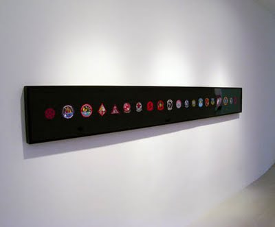
“Military culture is filled with a totemic visual language consisting of symbols and insignia that signify everything from various unit and command affiliations to significant events, and noteworthy programs. A typical uniform will sport patches identifying its wearer’s job, program affiliation, achievements and place within the military hierarchy. These markers of identity and program heraldry begin to create a peculiar symbolic regime when they depict one’s affiliation with what defense-industry insiders call the “black world” – the world of classified programs, projects, and places, whose outlines, even existence, are deeply-held secrets. Nonetheless, the Pentagon’s “black world” is replete with the rich symbolic language that characterizes other, less obscure, military activities.

The symbols and insignia shown in the Symbology series provide a glimpse into how contemporary military units answer questions that have historically been the purview of mystery cults, secret societies, religions, and mystics: How does one represent that which, by definition, must not be represented?”

Mitch Robertson


Mitch Robertson

Work from Economies of Good and Evil.

“When I get a hold of Toronto artist Mitch Robertson at Saint Mary’s University Art Gallery in Halifax, he’s just returned from dropping off his son. The father and son team had been getting the gallery ready for Robertson’s show 5,6,7: Economies of Good & Evil. But being three years old, Robertson’s son was having more fun dirtying the Plexiglas containers than cleaning them.

Robertson’s son was a big influence on 5,6,7, which was exhibited in Oakville and Winnipeg last year. Most of the work in the show was made at a time when Robertson was struggling with how to raise a family. In Winners and Losers (2005-07) and From Good to Bad (2006) Robertson plays with our concepts of good and evil. By colouring one cowboy’s hat black and another’s white he exposes how subjective our morals can be. The concept is explored further in photos of groups of men, where their shirts are coloured in grey scale from black and white.

When the show premiered in Winnipeg’s Plug In ICA, Robertson’s exclusive use of white men drew charges of sexism and racism. “They wanted to know why I was so focused on the white male. But isn’t that obvious? That’s me. It’s a whole show about me. This is what I’m going through. It’s when I’m trying to raise children. It’s when I’m trying to understand morality, and community,” says Robertson.

‘If I had a good guy and a bad guy and I called a black guy, or a woman, the bad guy that’s a whole different ball game. Just having a bunch of white guys who are good or bad let’s you get passed the more obvious things.’

The show developed the way most of Robertson’s work does—through his love of collecting. After two years of collecting church cookbooks from the ’70s, he ended up making a series of paintings that are in the show based on the churches that appeared on the covers of these books.

“I have thousands and thousands of other people’s vacation slides. I buy them at estate sales. And I have no project in mind, but at some point it will dawn on me, ‘that’s why I’ve been collecting those.’”

Robertson then needed to collect these individual projects before he found the themes connecting a miniature wooden chapel (Modular Church) and twenty-four statues of Jesus coloured like the Pepsi logo (Pepsijesus). Assembled together the show is broken into three groups, five for man, six the devil, and seven for God.

“The shows more about questioning aspects of, say, religion in a commercial sense. The business of spirituality, I suppose, but more focused on community overall, and an idea of how we interact with each other.”

Robin Metcalf, Director/Curator at the SMU Art Gallery, says his favourite piece at the show is 666— a series of charcoal rubbings of houses with the street number 666. Robertson scoured South Western Ontario to find these haunting numerals.

After opening the exhibition in Halifax, Robertson will fly back to Toronto to open a show of new works at Birch Libralato gallery, which he’s calling Uphellyaa. Building on the themes of morality and the commodification of spiritual activities, Robertson is exploring how community and ritual evolve amid globalization. The show will feature two large photographs Robertson took at night at the Uphellyaa festival on the Shetland Islands. The photos capture the ritual burning of large Viking ships, and the teams of torchbearers setting ablaze. Accompanying the larger photos are 5×8 photos of four torchbearer teams as they get ready for the festival. The centrepiece of the show, however, is four wooden miniature Viking boats.

Robertson’s plan for the exhibition is for collectors to purchase the miniature boats, and keep them on their mantle for the better part of the year. Robertson says he will then visit the collectors’ home next winter to commemorate the burning of the model ship in their fireplace, just as he commemorated the original festival burning. The collector will receive a large photo of the burning along with a 5×8 photo of the group that took part in the celebration.

“I’m proposing the North American consumerist, family-serving sized version of [Uphellyaa]. Where it keeps parts of those ideas but gets rid of some as well.”

One idea Robertson’s show leaves out is the dangerous act of walking around in high winds at night with a homemade torch of burlap wrapped around a 2×2 dipped in paraffin. Robertson says it’s only a matter of time before the festival is tamed of its pagan origins.

“[Uphellyaa] just wouldn’t fly in Canada. We’re so uptight about safety. There’s no fire trucks [at Uphellyaa]. There’s no extinguishers on hand. Everyone just pats each other out. All that has to change as they get more and more savvy at making money at it.”

There have already been signs of globalization-style timidity moving in. If you think homemade torches are dangerous, well, they used to roll barrels of oil down a hill to set the boats ablaze. And while costumes worn in Uphellyaa have long been of devils and Vikings, it’s now common to find troupes of torchbearers dressed like Indiana Jones.

The show does hinge on audience participation. Robertson says he’s more excited about the show than of dealers and collectors, and, although it’s a nice show to look at, it fails if nobody buys the ships.

‘It seems like a great idea that I really have to convince everyone else of—not that it’s a great idea, but that they have to accept and be willing to sell something that will be destroyed, which is so counterintuitive to most art making.'” – Mike Landry

Laurel Woodcock


Laurel Woodcock

Work from Walkthrough 3.0.

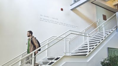
“‘walkthrough’ is an ongoing series of site-specific, text-based interventions into public architecture that create a convergence of cinema and everyday life. The project takes its title from the pre-production term for rehearsals where performers speak their lines, practice cues and movements, but no shooting occurs. The font and formatting of the adhesive vinyl lettering correspond with the script writing software Final Draft. The playfully conceptual series does not address the cinema through moving images; rather, I produce wall text that is drawn from written dialogue and instructional directions in screenplays.

Initially produced as interventions during a residency at The Banff Centre for the Arts, Curator Kitty Scott commissioned 10 new editions of the series for an exhibition to celebrate the 75th anniversary of The Banff Centre for the Arts featuring a project by Kim Adams in the gallery space, and site interventions by Mark Clintberg and myself. The neon work ‘two love songs’ was also commissioned and displayed on the gallery wall acing into the corridor.” – Laurel Woodcock

Sarah Oppenheimer


Sarah Oppenheimer

Work from various installations.

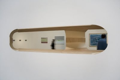
I saw the Horizontal Roll installation in St. Louis about a year ago, it was a great piece that interacted extremely well with the environment.

“Sarah Oppenheimer creates social experiments in her videos and architectural installations, exploring how individuals navigate constructed space. Folding is the primary exercise in Oppenheimer’s works and something of a personal obsession; her website, FoldingPatterns.com, contains an index of triangular forms, illustrating the multitude of shapes that can be generated from a combination of creased lines.

Oppenheimer’s conceptual investigations have attracted high honors this year: she has been awarded both a Guggenheim Fellowship and the American Academy of Arts and Letters Award in Art. Her interests in folded forms and spatial perception began when she was a student in Yale’s MFA program in the late ’90s. For her 2001 project Behavior Study, Oppenheimer observed subjects’ pace and patterns of movement through a room and then created a system of shelving units based on those measurements.

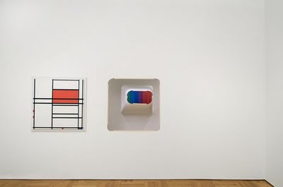
In her recent practice, Oppenheimer has been creating plywood modular forms, generating their structures from algorithms. At New York’s P.P.O.W. Gallery in September of 2006, she premiered 554-5251, a massive installation made from interlocking sheets of folded 4′ x 8′ plywood. By lining the walls with plywood veneer and constructing a succession of elevated, white-walled throughways, Oppenheimer turned the gallery space inside out. 554-5251 is the first in a series of works based on an algorithmic process; each of the seven numbers in the work’s title denotes an operation that determines the object’s form. 552-1251, shown at the American Academy of Arts and Letters last spring, is a wood-lined aperture in a gallery wall that opens sight lines into three different rooms. A portal between previously distinct spaces, the opening counteracts the rigid integrity of a traditional room and makes possible new interactions between gallery visitors.” HGM for artkrush

Lucia Ganieva


Lucia Ganieva

Work from Attendants of Hermitage and Factory.

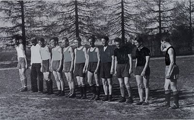
Attendants of Hermitage is a series of portraits of docents from the Hermitage Museum in St. Petersburg with their favorite work of art.

Factory – “A series of photographs made in a textile factory in the town of Ivanovo, some 275 km north-east of Moscow. The town was called the “town of brides” because the population counted almost only women, working in the textile branch. 
During the regime of the czars, this town was the centre of textile industry in Russia. There were approximately 30 different plants where all kinds of fabrics were manufactured, mostly based on cotton and linen. In the course of time, due to the competition of low labor-cost countries, such as China, almost all of the plants had to close down. At the present time, only a handful are active, but it is to be expected that they will not last long. 

The factory where I made my series, the ‘Kombinat,’ named after F.N.Samoilova, was a very big plant, where a complete range of fabrics were produced, but now it has restricted its activities. Now, only the bleaching and printing of the fabrics continues. 

My intention was to make a portrait of the factory, by combining its interior, the fabrics they work up, and the women doing the work. The fabrics portrayed come from different collections over the years – old and new – as with the interior images, showcasing older and newer equipment, and the same applies for the workers, who are women of different ages.” – Lucia Ganieva

Bernd Kleinheisterkamp


Bernd Kleinheisterkamp

Work from Stills and Things.

“‘Stills and Things’ deals with the appearance of things.

‘Stills’ plays with the variety of possible ensembles that we identify and accept as a authentic, evident situation. Something that seems to make sense in its limits of time and context.

‘Things’ looks for the undeniable magic inherited in all things. The useless effort to define them, to capture their essence. And still – it isn’t useless to give another try.” – Bernd Kleinheisterkamp

Teresa Solar Abboud and Carlos Fernández-Pello

Teresa Solar Abboud and Carlos Fernández-Pello

Work from Dibujando un Espacio.

“The 3 exercises on space and language were the first attempt of the authors working together.

The idea arised from the situation the authors lived, one being in Barcelona and the other one in Madrid and spending quite a lot of their time sharing their ideas through out the telephone.

This piece is divided into a two channel video projection, a two channel audio-only conversation, and a diaporama set to project on an upper corner of the installation room. Each of the pieces is located in separate corners in the exhibition space.

The projection piece, “drawing a space (between madrid and barcelona)”, comprises two video pieces recorded while speaking on the phone, synchronising images and making them interact while being 500 km. apart.

The audio piece, “a conversation in corner” , recollects the conversations of the authors on the whole project, working as an audio puzzle with fragments of both sides of the phone interfering with one and other.

The third piece “limits”, projects onto a physical limit ( a corner ) different spatial limitations such as other corners, dictionaries, people and symbols of territoriality.” – Teresa Solar Abboud and Carlos Fernández-Pello

via New Art